


Luc(as) de Groot, LucasFonts
@lucasfonts.com
Ditching Calibri as a “wasteful diversity” font is both hilarious and sad.
Here's a quick reminder of what Calibri actually is and why it matters. (1/2)
Here's a quick reminder of what Calibri actually is and why it matters. (1/2)


December 11, 2025 at 5:22 PM
Ditching Calibri as a “wasteful diversity” font is both hilarious and sad.
Here's a quick reminder of what Calibri actually is and why it matters. (1/2)
Here's a quick reminder of what Calibri actually is and why it matters. (1/2)
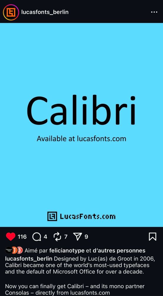
Designed by Luc(as) de Groot in 2006, Calibri became one of the world’s most-used typefaces and the default of Microsoft Office for over a decade. Now you can finally get Calibri – and its mono partner Consolas – directly from our shop.
www.lucasfonts.com/fonts/calibr...
www.lucasfonts.com/fonts/calibr...

December 11, 2025 at 5:11 PM
Designed by Luc(as) de Groot in 2006, Calibri became one of the world’s most-used typefaces and the default of Microsoft Office for over a decade. Now you can finally get Calibri – and its mono partner Consolas – directly from our shop.
www.lucasfonts.com/fonts/calibr...
www.lucasfonts.com/fonts/calibr...
Thank you!

And indeed, Calibri is a great typeface by a fantastic type designer, Lucas de Groot. @lucasfonts.bsky.social
December 11, 2025 at 4:44 PM
Thank you!
! New Child in the Corpid Family:
Corpid Mono retains the same humanistic nature as Corpid but also includes the mechanical quirks (or charm) of monospaced fonts.
#fontrelease #corpidmono #corpid #lucasfonts #typedesign
Corpid Mono retains the same humanistic nature as Corpid but also includes the mechanical quirks (or charm) of monospaced fonts.
#fontrelease #corpidmono #corpid #lucasfonts #typedesign
February 18, 2025 at 7:31 AM
! New Child in the Corpid Family:
Corpid Mono retains the same humanistic nature as Corpid but also includes the mechanical quirks (or charm) of monospaced fonts.
#fontrelease #corpidmono #corpid #lucasfonts #typedesign
Corpid Mono retains the same humanistic nature as Corpid but also includes the mechanical quirks (or charm) of monospaced fonts.
#fontrelease #corpidmono #corpid #lucasfonts #typedesign
Hi Bluesky! We are LucasFonts, an independent and bustling type studio with a small, dedicated team of designers and type technicians. We’ll be sharing plenty about letters and the tiniest yet most crucial aspects of type design.
February 17, 2025 at 6:24 AM
Hi Bluesky! We are LucasFonts, an independent and bustling type studio with a small, dedicated team of designers and type technicians. We’ll be sharing plenty about letters and the tiniest yet most crucial aspects of type design.