Ross Dahlke
@rossdahlke.bsky.social
11K followers 4.4K following 360 posts
asst. prof. @uwsjmc.bsky.social rossdahlke.com
Posts Media Videos Starter Packs
rossdahlke.bsky.social
I am excited to present as part of the #TSRConf 2025 Conference Proceedings of the Journal of Online Trust and Safety at @stanfordcyber.bsky.social. Happy to have this paper published doi.org/10.54501/jot...
Ross Dahlke. Speaker. Join me at the Trust & Safety Research Conference. September 25-26. Stanford University Alumni Center. 
Image description
Journal of Online Trust & Safety. Volume 3, Issue 1. September 2025. ISSN: 2770-3142. 
Image description
Vol. 3 No. 1 (2025)
Untrustworthy Website Exposure and Election Beliefs: Selective Exposure and Ideological Asymmetry
Peer-reviewed Articles
https://doi.org/10.54501/jots.v3i1.250
Published 2025-09-12
Authors
Ross Dahlke
University of Wisconsin-Madison
https://orcid.org/0000-0002-5179-2525
Jeffrey Hancock
https://orcid.org/0000-0001-5367-2677

Keywords
Digital trace data
double machine learning
data science
false beliefs
causal inference
Categories
Conference Proceedings
How to Cite
Dahlke, R., & Hancock, J. (2025). Untrustworthy Website Exposure and Election Beliefs: Selective Exposure and Ideological Asymmetry. Journal of Online Trust and Safety, 3(1). https://doi.org/10.54501/jots.v3i1.250
Image description
Figure 1. Timeline of data collection.
rossdahlke.bsky.social
In an experiment with ~4% of the electorate of Cyprus, personalized affinity information increased electoral participation and encouraged party consideration but did not shift voting intentions, finds Ioannidis doi.org/10.1080/1933...
Screenshot of a journal article titled “The power of alignment: how personalized information shapes voter decisions” by Nikandros Ioannidis in the Journal of Information Technology & Politics. The abstract summarizes a field experiment using a Voting Advice Application (VAA) during Cyprus’s 2021 elections, finding that personalized political information boosted participation by up to 10 percentage points, but did not meaningfully shift vote intention toward more ideologically congruent parties.
Image description
Flowchart of the experimental design. Participants (N ≈ 17,000) were randomly assigned to one of five groups: control, Party Rankings, Map Eco-Social, Map Eco-CyProb, or Map CyProb-Social. All groups were asked about demographics, policy preferences, and past vote. Treatments received personalized VAA output and were later surveyed on vote intentions.
Image description
Top panel shows number of VAA users per day from May 21–30, 2021, peaking on May 22. Bottom panel shows cumulative number of users, rising steadily across the same period. Below, a horizontal bar chart shows sample VAA output: seven parties with positive affinity scores (yellow bars) and two parties with negative affinity (red bars). Scores range from −37 to +40.
Image description
Coefficient plot from probit models predicting election participation across four treatment arms: Party Rankings, Map Eco/Social, Map Eco/CyProb, and Map Cyprob/Social. All treatments show positive effects on turnout likelihood compared to control, with Party Rankings showing the largest and most precise effect.
rossdahlke.bsky.social
While an urban-rural divide persists in policy priorities, partisan affiliation is a stronger predictor of priorities than geographic location, finds Yildirim & Solvig in @psrm.bsky.social doi.org/10.1017/psrm...
Screenshot of a journal article titled “The urban–rural divide in policy priorities across time and space” by Yildirim and Solvig in Political Science Research and Methods. The abstract summarizes an analysis of 850 U.S. surveys (1939–2020) showing persistent but modest urban–rural differences in top policy concerns, with partisan identity more predictive than geography. Keywords include partisanship, geography, and public opinion.
Image description
Six line graphs showing urban–rural gaps in prioritization of budget deficit, agriculture, moral values, immigration, economy, and tax issues from 1960 to 2020. Rural residents more often prioritize budget, agriculture, values, and immigration. Urban and rural trends on economy and tax converge more closely. Rural lines are generally above urban, indicating stronger issue salience.
Image description
Six-panel plot showing how partisanship and residence jointly shape issue priorities over time (1960–2020). Rural Republicans rank budget, values, and immigration highest. Urban and rural Democrats differ little from each other and show lower prioritization of conservative-coded issues. Economy and tax are prioritized similarly across groups, with convergence over time.

⸻
Image description
Six-panel plot showing partisanship × geography effects on civil rights, crime, education, foreign policy, health, and drugs (1960–2020). Urban/rural gaps are small relative to partisan gaps. Republicans (urban and rural) consistently prioritize crime and drugs more than Democrats. Democrats emphasize civil rights, education, and health more. Foreign policy converges by 2020.
rossdahlke.bsky.social
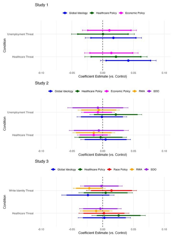
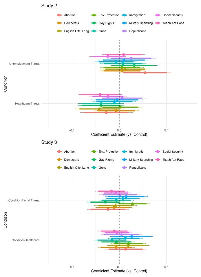
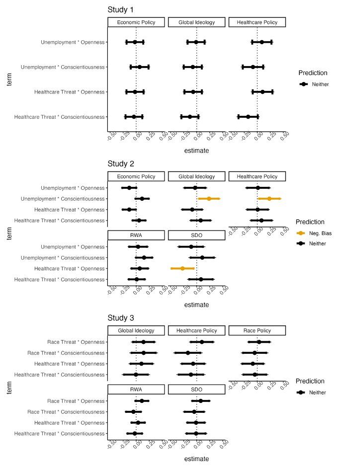
Experimental manipulation of threat exposure has a null effect on ideological conservatism, finds @abbycassario.bsky.social
et al. osf.io/preprints/ps...
Screenshot of study abstract titled “Does threat increase conservatism?” summarizing three large U.S. experiments (Ns = 1000, 889, 843) testing threat effects on ideology. Despite successful threat manipulations, no effects are found on conservatism or personality × threat interactions. Concludes field should move beyond threat-based explanations.
Bar plots from three studies testing effects of threat on ideology. Each plot shows coefficient estimates for two threat conditions vs. control across ideological outcomes. Study 1 shows null effects on global ideology, healthcare, and economic policy. Study 2 adds measures like Right-Wing Authoritarianism (RWA) and Social Dominance Orientation (SDO), also showing no threat effects. Study 3 adds race threat and race policy; again, no consistent significant effects. Two panels of coefficient plots from Studies 2 and 3 showing threat effects on specific policy attitudes (e.g., abortion, immigration, guns). Each dot represents a treatment effect estimate vs. control. Across dozens of items, no consistent ideological shifts emerge in response to unemployment, healthcare, or race threats. Interaction plots from all three studies testing if personality (openness, conscientiousness) moderates threat effects on ideology. Across economic, global, and healthcare ideology—as well as RWA and SDO—no consistent threat × personality interactions emerge. One weak effect in Study 2 flagged for negative bias, but generally null.
rossdahlke.bsky.social
Yeahhhh, I literally texted my wife during it that I was on a manel
rossdahlke.bsky.social
Excited to be on this panel discussing surveillance capitalism today!
World Salon Surveillance Capitalism: Who owns your data? www.world-salon.com
Reposted by Ross Dahlke
cccr.bsky.social
🚨 CCCR has a new survey report out today! 🚨

"100 Days Under Trump: Public Reactions to Attacks on American Governance & Institutions"

The report draws on our Apr/May YouGov panel survey of US adults, following our Oct 2024 survey w/ recontacts + a sample refresh. 1/
cccr.wisc.edu/wp-content/u...
CCCR logo, 100 Days Under Trump: Public Reactions to Attacks on American Governance & Institutions
rossdahlke.bsky.social
Excited to see the research brief option!
Reposted by Ross Dahlke
icacm.bsky.social
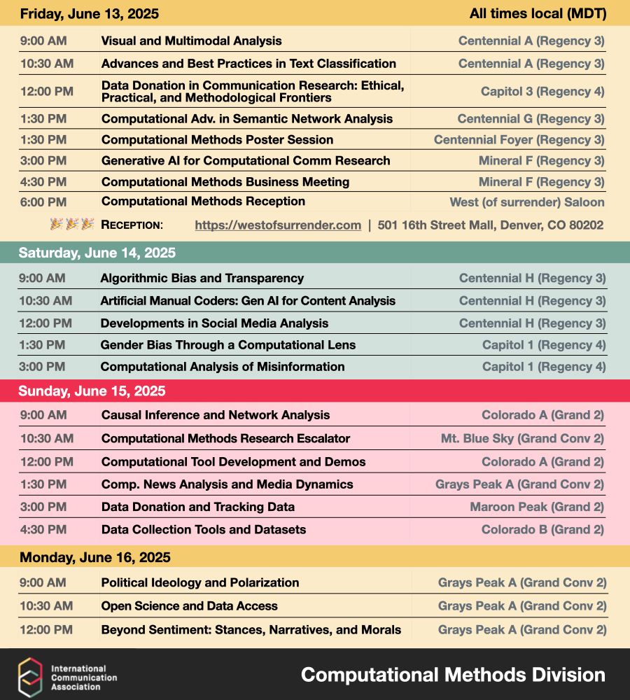
So many great Computational Methods sessions coming up at #ICA25!!

Check them out, and we look forward to seeing you there!
👇👇👇
rossdahlke.bsky.social
People negatively evaluate AI moderators that use emotional arguments rather than rational arguments, finds Silver, Williams-Ceci, & @informor.bsky.social doi.org/10.1145/3706...
AI is Perceived as Less Trustworthy and Less Effective when Using Emotional Arguments to Moderate Misinformation
Image description
Figure 1. Perceived quality by moderator identity and argument type
Three bar plots show perceived credibility, informativeness, and transparency as a function of moderator identity (human vs. AI) and argument type (rational vs. emotional). Rational arguments are rated significantly higher than emotional ones across all dimensions (p < .001), and human moderators are rated higher than AI within each argument type. Error bars reflect 95% confidence intervals.
Image description
Two bar plots display mean perceived trustworthiness. The left panel shows human moderators are rated more trustworthy than AI (p = .004). The right panel shows rational arguments are rated as more trustworthy than emotional ones (p = .005). Error bars represent 95% confidence intervals.
Image description
Figure 3. Efficacy across misinformation contexts by moderator and argument type
Five panels show perceived efficacy of moderation across different misinformation scenarios (GMO, general, aligned beliefs), comparing human and AI moderators using rational vs. emotional arguments. Human moderators using rational arguments are rated as significantly more effective in several contexts (p < .05), with AI-emotional combinations rated lowest overall.
rossdahlke.bsky.social
When Community Notes inform users about falsehoods on X posts, the replies to the post have more negativity, anger, distrust, and moral outrage, finds Chuai ‪et al. dl.acm.org/doi/10.1145/...
Community Fact-Checks Trigger Moral Outrage in Replies to Misleading Posts on Social Media 
Image description
Figure 2. Summary statistics for misleading posts and replies before and after fact-check display
Panel (a) shows a time series line chart of the rolling average number of misleading source posts with community notes from January to April 2023, trending upward over time. Panel (b) displays two horizontal bars comparing the proportion of positive vs. negative sentiment in source posts, with negative sentiment dominating. Panel (c) contains horizontal bars comparing six emotions (anger, disgust, fear, joy, sadness, surprise) in source posts, with anger and disgust most prevalent. Panels (d–f) show CCDFs: (d) total reply count per post, (e) post age at the time of community note display, and (f) the proportion of replies that occurred before vs. after the display. Panels (g–i) present line charts tracking hourly averages of reply sentiment/emotion (negative, anger, surprise) from 16 hours before to 16 hours after note display, showing modest increases after the note appears.
Image description
Figure 4. Predicted effects of note display on sentiments and emotions in replies
Panels (a–h) are separate line charts with scatter overlays, each representing one sentiment or emotion. The x-axis spans from -16 to +16 hours relative to the display of a community note. Each chart includes a blue line for pre-display averages, a yellow line for post-display averages, and a shaded 95% confidence interval around the predicted effect. Predicted increases are most visible in anger (c), disgust (d), and negative sentiment (b), with flat or minimal changes for joy (f), sadness (g), and positive sentiment (a).
Image description
Figure 6. Regression estimates for reply sentiment and emotion after community note display
Eight coefficient plots (panels a–h) showing the estimated effects of key predictors—including whether a note was displayed, post age, and source sentiment—on each type of sentiment or emotion in replies. The estimates are split by whether the source post was political or not, with red and blue error bars representing separate groups. Vertical lines represent the 95% confidence intervals around each coefficient. Displaying a community note is positively associated with anger, disgust, and negative sentiment, especially for political posts.

⸻
rossdahlke.bsky.social
Higher problematic social media use is correlated with engaging false information online, finds Meshi & Molina t.co/NokaLxCGVn
Problematic social media use is associated with believing in and engaging with fake news
Image description
Figure: Interaction between problematic social media use and engagement with false vs. real content.
Five panels (A–E) show line graphs with problematic social media use on the x-axis and outcome variables on the y-axis: credibility (A), intention to click (B), like (C), comment (D), and share (E). Each graph shows separate lines for false (blue dashed) and real (red solid) content. In panels A, B, and E, false content shows stronger increases in credibility and engagement as problematic use rises, with significant or marginal interaction effects. In panels C and D, both content types rise similarly, with only main effects significant. Results suggest that problematic social media use is associated with higher belief in and engagement with false news, more so than real news in some cases.
rossdahlke.bsky.social
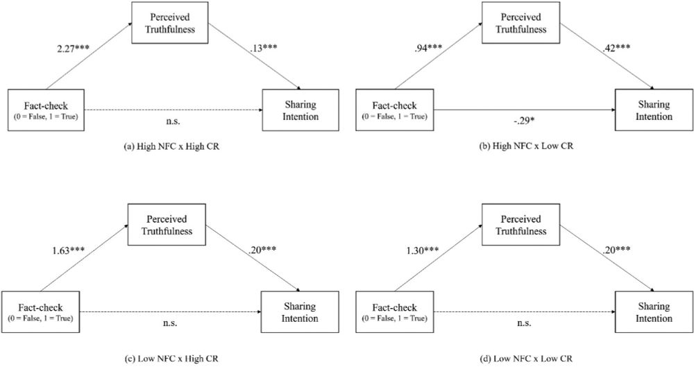
Those high in need for cognition and cognitive reflection ability are more receptive to fact checks, finds Lee & Chung doi.org/10.1080/2167...
Thinking Hard, Thinking Smart: How News Users’ Cognitive Traits Guide Their Responses to Fact-Checks
Image description
A flowchart diagram illustrating a randomized controlled experiment with three arms: (1) a treatment group split into two subconditions—Forewarning and No-Forewarning—and (2) a Control group.
• Participants in the treatment subgroups receive either a forewarning or a filler before viewing four news articles, each accompanied by a fact-check.
• Control group participants receive filler content, followed by the same four news articles without fact-checks.
• All participants complete a post-test questionnaire at the end.
Image description
A bar chart with the y-axis labeled “Perceived Truthfulness” (range 0 to 6) and four x-axis groups representing combinations of two traits: Need for Cognition (NFC: high or low) and Cognitive Reflection (CR: high or low).
• Each group contains two bars—dark gray for “Fact-check True” and light gray for “Fact-check False.”
• In all groups, True-rated items are perceived as more truthful than False-rated ones, but the difference is largest for participants high in both NFC and CR.
• Differences in perceived truthfulness between fact-check conditions diminish among participants low in NFC or CR.
Image description
Four path models labeled (a) through (d), each showing a mediation analysis by trait group:
(a) High NFC × High CR
(b) High NFC × Low CR
(c) Low NFC × High CR
(d) Low NFC × Low CR
• Each diagram includes three variables—Fact-check (0=False, 1=True), Perceived Truthfulness, and Sharing Intention—connected by arrows with regression coefficients.
• In all four panels, Fact-check strongly predicts Perceived Truthfulness (significant in all groups).
• Perceived Truthfulness significantly predicts Sharing Intention in all models.
• Direct effects of Fact-check on Sharing Intention are only significant in panel (b), where a negative coefficient suggests that High NFC but Low CR participants reduce sharing when content is marked false.
rossdahlke.bsky.social
In a political era of Super PACs, congressional candidates seek to maintain control over their visual image through visual "b-roll", effectively subsidizing outside organizations, finds ‪@gfoysutherland.bsky.social‬ doi.org/10.1177/1532...
Candidate B-Roll as Super PAC Subsidy
Image description
Table 1: Visual Resource Provision by Chamber as a Proportion of Total Races, 2018-2022 Cycles.
Image description
Table 4, Breakdown of Advertising Employing Candidate/Party-Provided Visual Resources 2018-2020.
Image description
Table 2, Division of Red Boxing/Visual Resource Permission by Candidate in Cycle 2018-2022.
rossdahlke.bsky.social
Fascinating look at decentralized, multi-directional propaganda efforts in China by Lu et al. doi.org/10.1111/ajps...
Decentralized propaganda in the era of digital media: The massive presence of the Chinese state on Douyin
Yingdan Lu, Jennifer Pan, Xu Xu, Yiqing Xu
First published: 23 May 2025 https://doi.org/10.1111/ajps.12990 Horizontal stacked bar chart with three rows comparing the share of six content categories in Douyin videos. For “Trending videos (non-regime accounts)” the bar is ≈95 % blue, showing that non-regime trending content is almost entirely entertainment/sensational. The two rows for regime accounts (“Trending videos” and “All videos”) display a much more diverse palette: roughly 35–40 % moral-society (salmon), 20–25 % pink announcements, 20 % blue entertainment, and smaller slices of orange nationalism, dark-red party-line propaganda, and grey other content. The x-axis spans 0–100 % share of videos.
Image description
Horizontal stacked bar chart with four rows—central, provincial, city, and county government Douyin accounts—each broken into the same six categories. Across all levels, moral-society posts (salmon) form the largest block (≈40–50 %), followed by pink announcements. Entertainment (blue) and “other” (grey) grow slightly from central to county level, while nationalism (orange) and party-line propaganda (dark red) occupy small (<15 %) but visible segments throughout.
Image description
Two proportional rectangles connected by arrows illustrate bidirectional reposting.
• Top rectangle labelled “Central videos with local matches”: 59 514 central-origin videos, split into 32 930 grey (central videos that appear in local feeds) and 26 584 blue (central originals that stay central only). A thick blue arrow points downward, indicating central content flowing to local accounts.
• Bottom rectangle labelled “Local videos with central matches”: 59 514 local-origin videos that re-appear on central accounts, broken into 12 458 yellow (province), 13 076 orange (city), 7 396 brown (county), and 26 584 grey (central re-uploads). Three upward arrows, color-matched to the provincial, city, and county segments, represent local content travelling upward to the central level.
rossdahlke.bsky.social
Access to high-speed internet increases addictive internet usage, reduces time allotted to sleep, homework, and social interactions, and leads to increases in mental health diagnoses and suicides, among adolescents in Spain, finds @estherarenasarroyo.bsky.social et al. doi.org/10.1016/j.jh...
High Speed Internet and the Widening Gender Gap in Adolescent Mental Health: Evidence from Spanish Hospital Records*
Image description
Map of Spanish provinces shaded by quintiles of fiber-optic broadband penetration. Darker shades indicate higher fiber penetration (first quintile), while lighter shades indicate lower penetration (fifth quintile). Provinces like León, Málaga, and Castellón fall in the highest quintile of fiber penetration, while provinces such as Madrid, Cuenca, and the Balearic Islands are in the lowest.
Two-panel figure showing the relationship between fiber penetration and adolescent mental health issues. Panel a displays a scatterplot of province-year residuals for mental health against residuals for fiber penetration, showing a slightly positive trend. Panel b presents a fixed effects regression showing a positive association between higher fiber penetration (in five categories) and behavioral and mental health problems, with error bars indicating statistical uncertainty.
Image description
Eight-panel event study graphs showing estimated effects of fiber rollout on various outcomes from 2009 to 2019. Panel a shows increasing mental health problems after 2014. Panel b shows a decreasing trend in population density. Other panels include population, GDP, GDP per capita, an interaction term (GDP per capita × population density), divorce rate, and employment rate—none showing consistent significant trends, reinforcing the specificity of the mental health effects.
rossdahlke.bsky.social
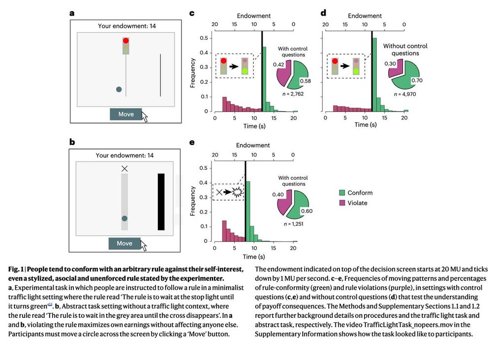
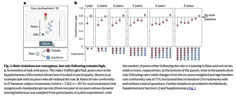
A majority of people follow "costly" rules, even in settings in which they are anonymous, alone, and violations are harmless because of respect for rules and social expectations, even though rule violation is moderately contagious, finds Gächter et al., www.nature.com/articles/s41...
Why people follow rules
Image description
Figure 1: People tend to conform to an arbitrary rule against their self-interest, even a stylized, asocial, and unforced rule stated by the experimenter.
Image description
Figure 2 rules generate social expectations and conditional conformity with them, even in a minimalist setup.
Image description
Figure 3: Rule violations are contagious, but rule-following remains high.
rossdahlke.bsky.social
Some really fascinating articles in this new issue edited by @lindsaypalmer.bsky.social
Editor’s Note
Lindsay Palmer
University of Wisconsin-Madison
School of Journalism and Mass Communication Volume 27 Issue 2, June 2025

Editor’s Note
Editor’s Note
Lindsay Palmer
Free accessEditorialFirst published May 15, 2025pp. 88–90


Editor’s Note
Commentaries
A Critical Time for Critical Race Theory Research
Meredith D. Clark
Free accessArticle commentaryFirst published May 15, 2025pp. 91–102


A Critical Time for Critical Race Theory Research
A Seat at the Table: Struggling for Access as an Asian American Race and Media Scholar
David C. Oh
Free accessArticle commentaryFirst published May 15, 2025pp. 103–110


A Seat at the Table: Struggling for Access as an Asian American Race and Media Scholar
Research Beyond the “Two Class Theory”
Melita M. Garza
Free accessArticle commentaryFirst published May 15, 2025pp. 111–118


Research Beyond the “Two Class Theory”
Academic Writing and Strategic Activist Multiplicity
Lori Kido Lopez
Free accessArticle commentaryFirst published May 15, 2025pp. 119–126


Academic Writing and Strategic Activist Multiplicity
Complicated Utopias: Latinx in Mainstream Media
Angharad N. Valdivia
Free accessArticle commentaryFirst published May 15, 2025pp. 127–137


Complicated Utopias: Latinx in Mainstream Media
Researching Resistance: The Challenges and Responsibilities of Documenting Race, Media, and Justice
Allissa V. Richardson
Free accessArticle commentaryFirst published May 15, 2025pp. 138–145


Researching Resistance: The Challenges and Responsibilities of Documenting Race, Media, and Justice
Indigenizing Mainstream News Coverage of Native Americans
Patty Loew
Free accessArticle commentaryFirst published May 15, 2025pp. 146–155


Indigenizing Mainstream News Coverage of Native Americans
On Resisting in Media Studies
Cristina Mislán
Free accessArticle commentaryFirst published May 15, 2025pp. 156–165
rossdahlke.bsky.social
Across four experiments in two countries, broken campaign promises decrease domain-specific evaluations but not overall performance, have limited effects on those with strong priors, and are downplayed by ingroup members, finds @alonzoizner.bsky.social & Amsalem doi.org/10.1177/1940...
When Do Broken Campaign Promises Matter? Evidence From Four Experiments. Campaign promises are a central mechanism for voters to hold politicians accountable, and information about their breakage or fulfillment features prominently in the media during election campaigns. Despite the importance of campaign promises, previous research yields conflicting expectations regarding their influence on citizens. Some theories suggest citizens vote based on policy performance and, therefore, consistently penalize actors who break their promises. Other theoretical accounts, however, argue that exposure to information during election campaigns often has minimal effects on citizens due to strongly held prior beliefs and partisan motivations. The goal of the current study is to address these competing claims by systematically testing the conditions under which citizens penalize politicians for breaking promises. We conducted four experiments (total N = 7,030), three of them preregistered.
Image description
Table 1. Table showing an overview of four experiments. Studies 1 and 3 involved U.S. participants; Study 2 used Israeli participants; Study 4 used U.S. participants with a fictitious leader. Studies varied by promise type (real or fictitious), leader (e.g., Biden, Trump, Netanyahu, fictitious Paul Miller), and issue type (partisan or bipartisan). Fielding dates ranged from March 2021 to February 2022, with sample sizes between 1,354 and 1,942. Note indicates U.S. participants were recruited via Lucid and Israeli participants via iPanel.
Image description
Figure 1. Two side-by-side dot-and-whisker plots show estimated treatment effects from four studies on three outcomes—policy approval, general approval, and warmth—separately for ingroup (left panel) and outgroup (right panel) targets. Each estimate is color-coded by study (Study 1–4) and includes a 95% confidence interval. In both panels, ingroup and outgroup effects from Studies 1–3 cluster near zero or positive, while Study 4 consistently shows negative effects across all outcomes, especially for warmth and policy approval. The x-axis shows effect sizes from -0.6 to 0.6. A vertical dashed line marks zero.
Image description
Figure 2. Two side-by-side dot-and-whisker plots show effects of four studies on two cognitive mechanisms—Decoupling and Rationalization—for ingroup (left) and outgroup (right) evaluations. Each study (1–4) is color-coded and includes 95% confidence intervals. In the ingroup panel, all studies show small positive effects for both mechanisms, especially Study 1. In the outgroup panel, effects are generally near zero, with confidence intervals overlapping the null. X-axis represents effect size from -0.2 to 0.2; a vertical dashed line indicates zero.
rossdahlke.bsky.social
Both "cheap" and "deep" fakes suggesting a sex, corruption, or prejudice scandal caused reputational damage for an innocent politician, but a journalistic fact-check reduced the effect, finds @vioreladan.bsky.social doi.org/10.1177/1940...
Deepfakes as a Democratic Threat: Experimental Evidence Shows Noxious Effects That Are Reducible Through Journalistic Fact Checks. Concerns have been raised over AI-generated deepfakes and their impact on democracy. Unlike earlier forms of disinformation relying on text or traditional video-editing techniques (cheapfakes), deepfakes employ artificial intelligence, provoking speculations that they may be even more persuasive and harder to debunk. Using an experiment with a multiple-message design (N = 2,085), we found that fake videos suggesting a sex, corruption, or prejudice scandal—but not text-only fakes—elicited substantial reputational damage for an innocent politician, regardless of whether the underlying technique was “cheap” or “deep.” This was visible in altered attitudes, emotions, and voting intentions. However, exposure to a journalistic fact-check substantially reduced and even eliminated the detrimental effects. These findings have important implications for our theoretic
Image description
Figure 1. Three bar plots (Panels A, B, and C) display the effects of different message formats on attitudes, voting intentions, and negative emotions. Each panel shows mean values with error bars across seven conditions: Control, Text, Cheapfake, Deepfake Basic, Deepfake Moderate, Deepfake Advanced, and Authentic.

Panel A (Attitudes): The highest attitudes are reported in the Control and Text conditions (around 4.5), followed by lower ratings in the Cheapfake condition and all Deepfake and Authentic conditions (around 3.0–3.2), indicating a drop in attitudes as the message becomes more visually manipulated.

Panel B (Voting Intentions): Voting intentions are highest in the Control and Text conditions (around 4.0), while the Deepfake and Authentic formats show lower intentions (around 2.8–3.0), with the lowest in Deepfake Basic and Deepfake Moderate.

Panel C (Negative Emotions): The Control group reports the lowest negative emotions (around 2.7), while all other formats, particularly
Image description
Figure 2. Figure 2. Three line graphs (Panels A, B, and C) show the effects of format and fact-checking on attitudes, voting intentions, and negative emotions. The x-axis in all panels includes six message formats: Text, Cheapfake, Deepfake Basic, Deepfake Moderate, Deepfake Advanced. Two groups are shown: No Fact-Checking (black circles with solid lines) and Fact-Checking (black squares with solid lines).

Panel A (Attitudes): Attitudes are highest in the Text format for both groups. Without fact-checking, attitudes decline substantially across deepfake conditions, remaining lowest in Deepfake Basic and Moderate. With fact-checking, attitudes remain relatively stable across formats and higher than the No Fact-Checking group, especially in Deepfake Advanced.

Panel B (Voting Intentions): Voting intentions follow a similar pattern. The No Fact-Checking group sees sharp declines across formats, with the lowest voting intentions in Deepfake Advanced. The Fact-Checking group maintains high
rossdahlke.bsky.social
News authentication--proactive verification of news--is more prevalent in the U.S. and Hong Kong than in the Netherlands, with political efficacy and institutional trust being individual-level predictors, finds @qfzhu.bsky.social Peng & Zhang
doi.org/10.1177/1940...
How Do Individual and Societal Factors Shape News Authentication? Comparing Misinformation Resilience Across Hong Kong, the Netherlands, and the United States
Table summarizing standardized coefficients from structural equation models predicting interpersonal and institutional authentication across Hong Kong (HK), Netherlands (NL), and United States (US). Key predictors include news consumption, political interest, political efficacy, and institutional trust—each positively associated with both forms of authentication. Age is negatively associated. In HK, conservative ideology predicts lower authentication; this effect is not significant in NL or US. Goodness-of-fit indices (CFI ≈ 0.83–0.86, RMSEA = 0.07–0.08) suggest acceptable model fit. Sample sizes range from 1,562 (HK) to 2,180 (US).
rossdahlke.bsky.social
Fascinting new study in 14 countries across Asia examining the media trust gap by Guo & @yuzhelei.bsky.social doi.org/10.1177/1940...
Despite the increasing reliance on online media for news consumption, people generally exhibit lower levels of trust in online news relative to traditional media. To explain the preference disparities in media trust and their potential cross-national variations, this article examines individuals’ trust gap between newspapers and Internet news across 14 countries and regions in East, South, and Southeast Asia. Drawing on nationally representative data and other country-level data (2018–2021), we test two underlying mechanisms, political trust transfer and alternative information orientation, that account for the media trust gap, as well as their boundary conditions. Multilevel analysis reveals that political trust positively correlates with people’s relative trust in newspapers, which is pronounced in societies with lower levels of polarization and limited press freedom. Besides, using the Internet and social media as the main channels of political information seeking may increase people’s relative trust in Internet news, especially in societies with higher levels of press freedom and political polarization. Our findings offer systematic explanations for news trust preferences by combining political characteristics and their contextual conditions, which have implications for understanding today’s media trust crisis. Figure 1 is a bar and point plot comparing trust in newspaper and Internet news across 14 Asian societies. Trust levels are shown for each country with two markers: a black circle for newspapers and a black triangle for Internet news. Countries include Myanmar, Mainland China, India, Japan, Malaysia, Singapore, Mongolia, Indonesia, Thailand, Philippines, Vietnam, South Korea, Taiwan, and Hong Kong. The gap between the two points for each country represents the “trust gap,” with newspaper trust generally higher than Internet news trust, especially in Myanmar and China. The smallest or reversed gaps are seen in Taiwan and Hong Kong.

Table 2 presents results from three multilevel regression models predicting the media trust gap (defined as newspaper trust minus Internet news trust). Model 1 includes only fixed effects, Model 2 adds controls, and Model 3 includes interaction terms. Key predictors include political trust (positive, significant in all models), alternative information orientation (negative and significant in Models 1 and 2), and several significant interaction terms with press freedom and political polarization in Model 3. Model fit improves across models, as shown by decreasing AIC and BIC values. Marginal and conditional R² increase from Model 1 (0.035/0.112) to Model 3 (0.059/0.222), indicating better explanatory power. The note clarifies that coefficients are unstandardized and controls include various demographic and political variables. Asterisks denote significance at ***p < .001. Two marginal effects plots show how the effect of political trust on the media trust gap varies by (a) press freedom and (b) political polarization. The y-axis in both panels is labeled “Marginal Effect of Political Trust.”

In Panel (a), the x-axis represents press freedom, ranging from 0.2 to 0.8. The marginal effect of political trust on the media trust gap decreases as press freedom increases. The slope is negative and crosses the zero line, with a shaded gray area indicating 95% confidence intervals. A histogram at the bottom shows the distribution of press freedom across countries.

In Panel (b), the x-axis represents political polarization, ranging from approximately -1.5 to 3.5. The marginal effect of political trust decreases as polarization increases, with a consistently positive but declining slope. Again, shaded areas indicate 95% confidence intervals, and a histogram at the bottom displays the distribution of polarization scores across countries. Two marginal effects plots illustrate how the effect of alternative information orientation on the media trust gap changes depending on (a) press freedom and (b) political polarization. The y-axis in both panels is labeled “Marginal Effect of Alternative Information Orientation,” with values decreasing from 0 at the top to more negative values at the bottom.

In Panel (a), the x-axis shows levels of press freedom from 0.2 to 0.8. As press freedom increases, the marginal effect of alternative information orientation becomes more negative, suggesting that in countries with greater press freedom, the negative association between alternative information orientation and trust in mainstream media is stronger. A shaded area around the line represents the 95% confidence interval. A histogram below the x-axis displays the distribution of press freedom across countries.

In Panel (b), the x-axis represents political polarization ranging from approximately -1.5 to 3.5. The marginal effect of alternative information orientation becomes more negative as political polarization increases, again indicating a stronger negative effect in more polarized contexts. A histogram at the bottom shows the distribution of polarization values. The shaded area reflects 95% confidence intervals around the trend line.
rossdahlke.bsky.social
Sudden collective economic shocks can increase far-right vote share, with preexisting public service deprivation moderating the effects, finds @simonecremaschi.bsky.social Bariletto @catherinedevries.bsky.social in the case of a plant disease epidemic in Italy doi.org/10.1017/S000...
Without Roots: The Political Consequences of Collective Economic Shocks. While an abundance of scholarly work investigates how economic shocks influence the political behavior of affected individuals, we know much less about their collective effects. Exploiting the sudden onset of a plant disease epidemic in Puglia, Italy—where the plant pathogen Xylella fastidiosa devastated centuries-old olive groves—we explore the collective effects of economic shocks. By combining quantitative difference-in-differences analysis of municipal data with a novel case selection strategy for qualitative fieldwork, we document the hardship caused by the outbreak, and estimate a 2.2-percentage-point increase in far-right vote share. We show that preexisting public service deprivation moderates the shock’s political consequences through a community narrative of state neglect. These findings highlight that preexisting community conditions shape the political consequences of economic shocks, and that plant...
Image description
Figure 1. Four-panel figure titled “The Xylella Outbreak” depicting spatial and temporal aspects of infection in the Puglia region of Italy.
(a) Map of Italy highlighting Puglia, with treatment and control areas marked in red and yellow, respectively.
(b) Map of olive cultivation in 2010 across Puglia, with municipalities shaded by the percentage of land used for olive cultivation, from 10% (yellow) to 40% (dark blue).
(c) Map showing timing of Xylella infection by municipality, with colors indicating the date of infection from April 2014 (dark blue) to May 2019 (light yellow), and gray for not infected.
(d) Sequence plot of infection timing by municipality ordered by latitude (Gallipoli to Bari), showing declared infection dates over time from 2014 to 2022. Vertical lines mark the outbreak declaration and an election.
Note: Panel (a) uses 2022 provincial and municipal borders; panels (b), (c), and (d) use 2022 municipal borders.
Image description
Two-panel figure titled “TWFE Event Study of Far-Right Vote Share, 2001–22.”
Panel (a) shows the average treatment effect on the treated (ATT) and control mean for far-right vote share over the total number of valid votes by election year (2001–2022). The top graph displays ATT with point estimates and confidence intervals. The bottom graph shows the control group’s mean vote share, which rises steeply after 2013.
Panel (b) shows the same information but for far-right vote share over the number of votes cast for the right-wing bloc. The ATT plot shows increasing effects after 2013, while the control mean plot indicates a sharp rise in far-right share from 2013 to 2022. The 2013 election year is marked with an open circle. Gray shading highlights the post-2013 period.
Image description
 Two-panel figure titled “Staggered Event-Study Plots for Two Indicators of Economic and Sociocultural Hardship.”
Panel (a) shows average treatment effects (ATT) on pre-tax income per capita (2008–2020) in euros on an arcsinh scale, plotted by years relative to infection (from -5 to +5). Estimates are near zero before infection, with negative effects appearing after infection, especially from year 1 onward.
Panel (b) shows ATT on the share of Italian residents aged 20 to 35 (2002–2019), also on an arcsinh scale. Estimates are near zero before infection and become increasingly negative in the years following infection. Each dot represents an ATT estimate with vertical lines for confidence intervals. Year -1 is marked with an open circle. The post-infection period is shaded in gray.
rossdahlke.bsky.social
During the 2019 Canadian Election, partisan differences in online news consumption were small, with news consumption characteristics being more predictive of news consumption, finds @ericmerkley.bsky.social doi.org/10.31219/osf...
Bar chart showing the share of respondents who used various online news outlets during a four-week tracking period. The chart is divided into two panels: domestic and international sources (left panel) and American sources (right panel).

In the left panel, top-used domestic sources include CBC, Global, and CTV, with over 25% of respondents using CBC. Some outlets are labeled with ideological leanings (e.g., National Observer – Left, Rebel – Right).

In the right panel, American outlets with the highest usage include CNN, Washington Post (WaPo), and New York Times (NYT), all used by less than 10% of respondents. Numerous lower-use outlets are labeled with political leanings, such as Breitbart (Right), Vox (Left), and Daily Caller (Right).

A note below the chart explains that CBC includes Radio-Canada and that local newspapers encompass a broad range of regional publications in Canada. TV5 and TVA are Quebec-based French-language broadcasters. Table titled “Partisan differences in online partisan news exposure,” listing 24 online news outlets along with their ideological slant (Left or Right), average exposure by left- and right-leaning individuals, and the absolute difference between those values.

Outlets with the largest partisan exposure gaps include Fox News (Right; Left: 3.9, Right: 6.7, Diff.: 2.8), Raw Story (Left; Diff.: 2.3), and Slate (Left; Diff.: 1.6). Most right-leaning outlets show greater usage by right-leaning respondents, while most left-leaning outlets show greater usage by left-leaning respondents.

Some rows are italicized (e.g., Info Wars, MSNBC, Washington Examiner, Breitbart, Salon), indicating “wrong-signed” partisan differences—i.e., higher exposure among the ideological out-group. A note explains that differences are expressed as absolute values and italicization denotes these unexpected exposure patterns. Figure 3 presents six panels displaying predicted partisan media use based on different political and psychological traits. The y-axis in all panels represents the predicted probability of partisan news use, with values ranging from approximately -0.1 to 0.4. Each panel includes point estimates with 95% confidence intervals.

In the top-left panel, partisan strength is grouped into three categories—none, weak/fairly strong, and strong. There is no clear pattern across these categories, as the predicted probability of partisan media use appears relatively flat with overlapping confidence intervals. The top-center panel shows ideological extremity on a scale from 0 to 5 and reveals a positive relationship: individuals with higher ideological extremity are more likely to use partisan news sources. In the top-right panel, political ideology is plotted on a 0 to 10 scale, and the relationship is slightly negative, suggesting that as individuals move along this ideological scale, their predicted use of partisan media slightly declines.

The bottom-left panel displays standardized scores for populism and shows a negative relationship, with greater populism associated with lower predicted use of partisan news. The bottom-center panel, focused on conspiratorial thinking (also standardized), similarly shows a negative trend: as conspiratorial thinking increases, the predicted use of partisan media decreases. In contrast, the bottom-right panel, which depicts media distrust (standardized), shows a slight positive relationship, indicating that individuals with higher media distrust are somewhat more likely to consume partisan news.

Across all panels, the plotted trends are accompanied by vertical error bars indicating the 95% confidence intervals for each estimate.