


Robert Simmon
@rsimmon.bsky.social
Data Visualization. Ex-Planet & NASA Earth Observatory. Blue Marble, Earth at Night, color, cartography, occasionally skewed views of Earth. Looking for a job.

February 7, 2026 at 12:43 AM
Last year, Vantor (née Maxar, née Digital Globe) and China’s Chang Guang Satellite Co. got into a game of one-upmanship imaging reconnaissance satellites from orbit.


February 2, 2026 at 9:22 PM
Last year, Vantor (née Maxar, née Digital Globe) and China’s Chang Guang Satellite Co. got into a game of one-upmanship imaging reconnaissance satellites from orbit.
This is neat. SatVu is using their high-resolution thermal infrared satellite imagery to monitor data center activity. www.satellitevu.com/news/satvu-r...
🛰️🔥
🛰️🔥


February 2, 2026 at 9:05 PM
This is neat. SatVu is using their high-resolution thermal infrared satellite imagery to monitor data center activity. www.satellitevu.com/news/satvu-r...
🛰️🔥
🛰️🔥
I made some maps to help @climate.us explain how we’re still getting winter storms — sometimes big ones! — despite Global Warming. www.climate.us/news-and-fea...


February 2, 2026 at 8:55 PM
I made some maps to help @climate.us explain how we’re still getting winter storms — sometimes big ones! — despite Global Warming. www.climate.us/news-and-fea...
To give a sense of scale to the peat mining detailed by @elisewang.bsky.social here’s are Sentinel-2 satellite images of the (red) peat bogs near Athlone, Ireland, compared to New York City at the same scale (15 × 15 km).
bsky.app/profile/elis...
bsky.app/profile/elis...


January 30, 2026 at 6:29 PM
To give a sense of scale to the peat mining detailed by @elisewang.bsky.social here’s are Sentinel-2 satellite images of the (red) peat bogs near Athlone, Ireland, compared to New York City at the same scale (15 × 15 km).
bsky.app/profile/elis...
bsky.app/profile/elis...
Huh. New York Times snow forecast graphic from yesterday vs. today.


January 23, 2026 at 7:00 PM
Huh. New York Times snow forecast graphic from yesterday vs. today.
If you’re picking colors with a tool that has precise control over hue, chroma, and lightness it’s possible to abruptly shift hue while maintaining even steps in lightness. This creates an unmistakeable transition that’s still monotonic!

January 23, 2026 at 4:20 AM
If you’re picking colors with a tool that has precise control over hue, chroma, and lightness it’s possible to abruptly shift hue while maintaining even steps in lightness. This creates an unmistakeable transition that’s still monotonic!
While we’re being bombarded with weather maps, I thought I’d revisit one of my favorite color palette tricks. Sometimes it’s important to emphasize a boundary, perhaps between moderate (< 6") and severe (>8") snowfall. You could reset the palette, like the NYT, but there’s a better way.
📊🗺️🎨
📊🗺️🎨
January 23, 2026 at 4:20 AM
While we’re being bombarded with weather maps, I thought I’d revisit one of my favorite color palette tricks. Sometimes it’s important to emphasize a boundary, perhaps between moderate (< 6") and severe (>8") snowfall. You could reset the palette, like the NYT, but there’s a better way.
📊🗺️🎨
📊🗺️🎨

Academic vs. media representations of a new Antarctic under-ice dataset. The sequential (University of Grenoble-Alpes) palette emphasizes overall structure, divergent (BBC) emphasizes the extremes.
From Science & the BBC/@erwanrivault.com
www.science.org/doi/10.1126/
www.bbc.com/news/article...
📊
From Science & the BBC/@erwanrivault.com
www.science.org/doi/10.1126/
www.bbc.com/news/article...
📊


January 16, 2026 at 3:09 PM
Academic vs. media representations of a new Antarctic under-ice dataset. The sequential (University of Grenoble-Alpes) palette emphasizes overall structure, divergent (BBC) emphasizes the extremes.
From Science & the BBC/@erwanrivault.com
www.science.org/doi/10.1126/
www.bbc.com/news/article...
📊
From Science & the BBC/@erwanrivault.com
www.science.org/doi/10.1126/
www.bbc.com/news/article...
📊
I’m looking for this chart:

January 14, 2026 at 10:50 PM
I’m looking for this chart:

January 14, 2026 at 7:41 PM


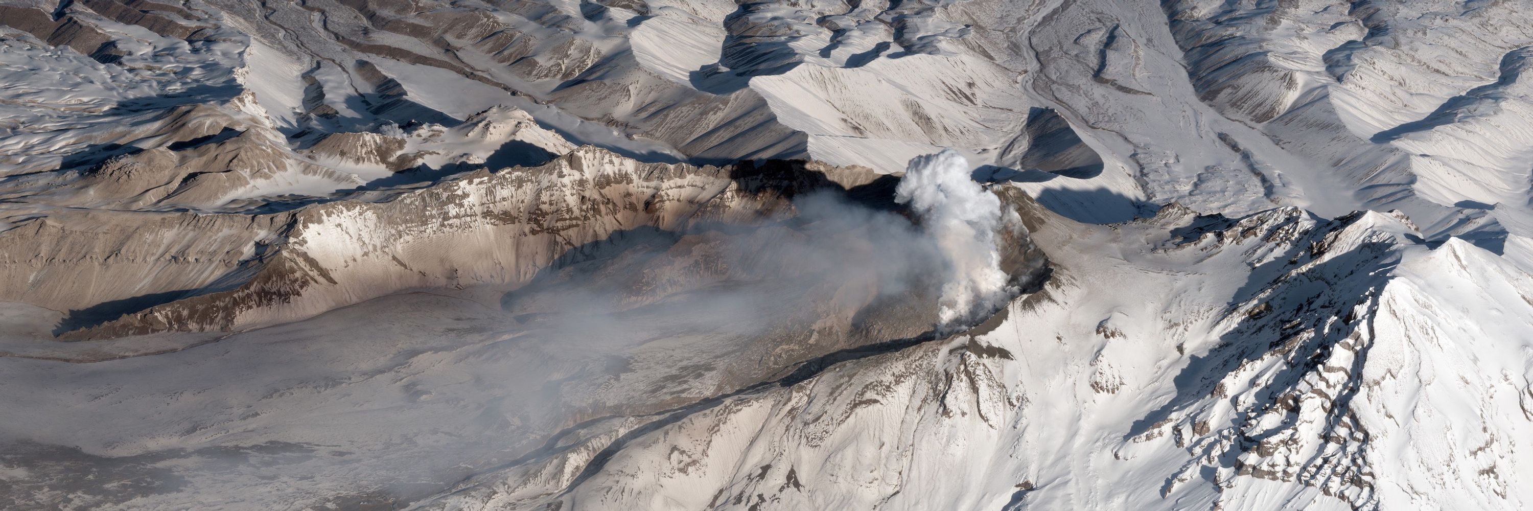
One of the places in the world that’s instantly recognizable.

January 10, 2026 at 1:42 AM
One of the places in the world that’s instantly recognizable.
Still one one my favorite artists. Thanks @greatdismal.bsky.social !

January 8, 2026 at 11:47 PM
Still one one my favorite artists. Thanks @greatdismal.bsky.social !
Interesting to see support for the hypothesis that the rainbow palette isn’t inherently ordered (the colors don’t map to "more" or "less").
www.sciencedirect.com/science/arti...
#dataviz 📊 #color 🎨
www.sciencedirect.com/science/arti...
#dataviz 📊 #color 🎨

January 6, 2026 at 12:59 AM
Interesting to see support for the hypothesis that the rainbow palette isn’t inherently ordered (the colors don’t map to "more" or "less").
www.sciencedirect.com/science/arti...
#dataviz 📊 #color 🎨
www.sciencedirect.com/science/arti...
#dataviz 📊 #color 🎨
Eight ways of smoothing/interpolating irregular data, and not one of them is a heat map. From Cartography by @kennethfield.bsky.social
Here’s Ken’s discussion of heat maps, which are a type of statistical display: cartonerd.blogspot.com/2015/02/when...
Here’s Ken’s discussion of heat maps, which are a type of statistical display: cartonerd.blogspot.com/2015/02/when...

January 5, 2026 at 10:15 PM
Eight ways of smoothing/interpolating irregular data, and not one of them is a heat map. From Cartography by @kennethfield.bsky.social
Here’s Ken’s discussion of heat maps, which are a type of statistical display: cartonerd.blogspot.com/2015/02/when...
Here’s Ken’s discussion of heat maps, which are a type of statistical display: cartonerd.blogspot.com/2015/02/when...
I particularly like this one — not only for the jaunty uniforms, but also because it shows a distribution, not just an average, for each category.
#dataviz 📊
#dataviz 📊

January 5, 2026 at 5:44 PM
I particularly like this one — not only for the jaunty uniforms, but also because it shows a distribution, not just an average, for each category.
#dataviz 📊
#dataviz 📊

December 29, 2025 at 9:16 PM
Baby landslide above Lake Chabot. I wonder if it’s just from the rain, or triggered by an #earthquake.

December 20, 2025 at 7:43 PM
Baby landslide above Lake Chabot. I wonder if it’s just from the rain, or triggered by an #earthquake.
Tule fog, Sutter Buttes, California. Captured by Sentinel-2C on December 14, 2025.
🛰️🖼️
🛰️🖼️

December 18, 2025 at 4:25 PM
Tule fog, Sutter Buttes, California. Captured by Sentinel-2C on December 14, 2025.
🛰️🖼️
🛰️🖼️
I *just* noticed this detail in Cartography by @kennethfield.bsky.social & I literally LOLed (there may even be a few tears of laughter on my cheek right now). What a delightful easter egg.

December 15, 2025 at 5:22 PM
I *just* noticed this detail in Cartography by @kennethfield.bsky.social & I literally LOLed (there may even be a few tears of laughter on my cheek right now). What a delightful easter egg.
Brilliant choice of bivariate color palette in this map of water stress from @wriclimate.bsky.social & ESRI.
I love how it draws attention to areas with high demand for water with saturated colors, & distinguishes low & high availability with a striking change in hue.
via @dantoearth.bsky.social
I love how it draws attention to areas with high demand for water with saturated colors, & distinguishes low & high availability with a striking change in hue.
via @dantoearth.bsky.social


December 15, 2025 at 4:16 PM
Brilliant choice of bivariate color palette in this map of water stress from @wriclimate.bsky.social & ESRI.
I love how it draws attention to areas with high demand for water with saturated colors, & distinguishes low & high availability with a striking change in hue.
via @dantoearth.bsky.social
I love how it draws attention to areas with high demand for water with saturated colors, & distinguishes low & high availability with a striking change in hue.
via @dantoearth.bsky.social
Dark mode maps are attractive & engaging, but present design difficulties. It’s harder for us to parse light on dark than dark on light, and the way we interpret variation in lightness as differences in transparency compounds the difficulty.
📊🗺️🎨
From: www.bloomberg.com/graphics/202...
📊🗺️🎨
From: www.bloomberg.com/graphics/202...


December 9, 2025 at 5:18 PM
Dark mode maps are attractive & engaging, but present design difficulties. It’s harder for us to parse light on dark than dark on light, and the way we interpret variation in lightness as differences in transparency compounds the difficulty.
📊🗺️🎨
From: www.bloomberg.com/graphics/202...
📊🗺️🎨
From: www.bloomberg.com/graphics/202...