Robert Simmon
@rsimmon.bsky.social
Data Visualization. Ex-Planet & NASA Earth Observatory. Blue Marble, Earth at Night, color, cartography, occasionally skewed views of Earth. Looking for a job.
Reposted by Robert Simmon
Meltwater #Antarctica
Close-up 📸🛰 #Sentinel2
Wider view 📸🛰 #sentinel3
Click 🖼️ 🖼️ and enlarge ↔️↕️
Footage: @sentinelonline.bsky.social
link.dataspace.copernicus.eu/grq5
Close-up 📸🛰 #Sentinel2
Wider view 📸🛰 #sentinel3
Click 🖼️ 🖼️ and enlarge ↔️↕️
Footage: @sentinelonline.bsky.social
link.dataspace.copernicus.eu/grq5


January 26, 2026 at 11:49 PM
Meltwater #Antarctica
Close-up 📸🛰 #Sentinel2
Wider view 📸🛰 #sentinel3
Click 🖼️ 🖼️ and enlarge ↔️↕️
Footage: @sentinelonline.bsky.social
link.dataspace.copernicus.eu/grq5
Close-up 📸🛰 #Sentinel2
Wider view 📸🛰 #sentinel3
Click 🖼️ 🖼️ and enlarge ↔️↕️
Footage: @sentinelonline.bsky.social
link.dataspace.copernicus.eu/grq5
The @nws.noaa.gov provides downloads in GeoTIFF! Yeah! www.nohrsc.noaa.gov/snowfall/
National Gridded Snowfall Analysis - NOHRSC - The ultimate source for snow information
www.nohrsc.noaa.gov
January 26, 2026 at 7:31 PM
The @nws.noaa.gov provides downloads in GeoTIFF! Yeah! www.nohrsc.noaa.gov/snowfall/
Reposted by Robert Simmon

Animation showing the plunge of cold Arctic air which is causing disruption to flights and has left almost a million people without power
Read
Martha Muir and Ilya Gridneff's report
www.ft.com/content/8757...
Read
Martha Muir and Ilya Gridneff's report
www.ft.com/content/8757...
January 26, 2026 at 4:53 PM
Animation showing the plunge of cold Arctic air which is causing disruption to flights and has left almost a million people without power
Read
Martha Muir and Ilya Gridneff's report
www.ft.com/content/8757...
Read
Martha Muir and Ilya Gridneff's report
www.ft.com/content/8757...
“…we felt like climate.gov wasn’t just a job, it was a mission,” says Lindsey. “We believed in the service that we were providing to the American public: trying to help people understand climate science and data, and how it’s collected, and what it means for our future.”

Our project director Rebecca Lindsey features in a new TIME story, “The Women Saving America’s Climate Data.” The article features our efforts to save content created on behalf of NOAA and the Fifth National Climate Assessment.
You can access the full article through Climate.us "In the Press" page.
You can access the full article through Climate.us "In the Press" page.
January 26, 2026 at 3:39 PM
“…we felt like climate.gov wasn’t just a job, it was a mission,” says Lindsey. “We believed in the service that we were providing to the American public: trying to help people understand climate science and data, and how it’s collected, and what it means for our future.”
Reposted by Robert Simmon

@cartoguophy.bsky.social is a cartographic wizard and he made this fantastic map of the winter storm (do we have a name for this event?) cartoguophy.com/winter-storm/
U.S. Winter Storm Visualization
cartoguophy.com
January 25, 2026 at 7:28 PM
@cartoguophy.bsky.social is a cartographic wizard and he made this fantastic map of the winter storm (do we have a name for this event?) cartoguophy.com/winter-storm/

Reposted by Robert Simmon
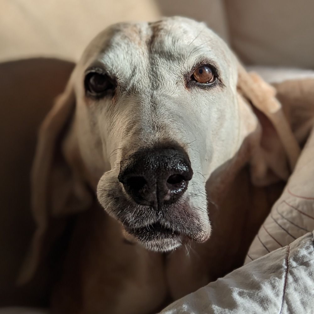
I've been out of cell phone service for most of the day. Come back to find all this and it's a lot. I'm more than furious. But for anyone else who needs a cup pup picture, here's copper being skeptical about winter:

January 25, 2026 at 2:44 AM
I've been out of cell phone service for most of the day. Come back to find all this and it's a lot. I'm more than furious. But for anyone else who needs a cup pup picture, here's copper being skeptical about winter:
Reposted by Robert Simmon
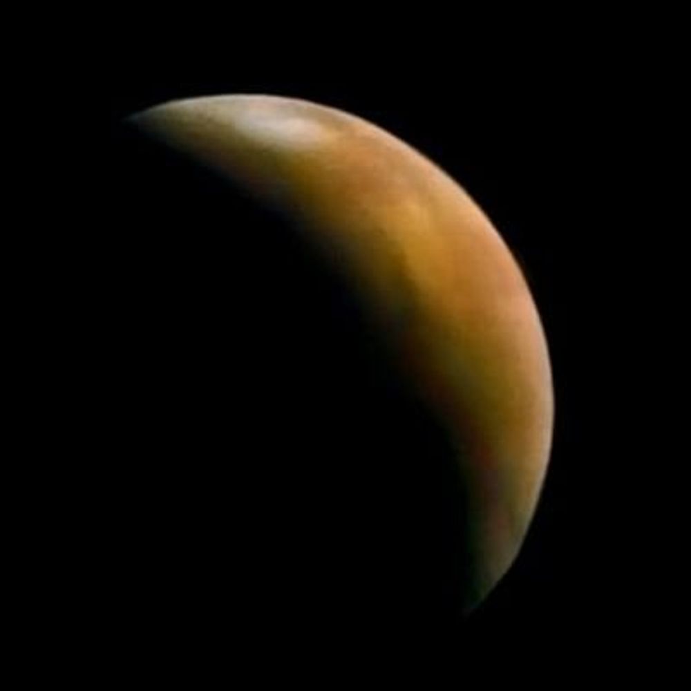
Today in 1986, Voyager 2 made humanity's first and only encounter with Uranus, revealing its clouds, rings, and fascinating zoo of moons.


January 24, 2026 at 5:18 PM
Today in 1986, Voyager 2 made humanity's first and only encounter with Uranus, revealing its clouds, rings, and fascinating zoo of moons.
Reposted by Robert Simmon

I love how this graphic is totally unhelpful for determining whether you're going to get 30 inches of snow or half an inch of ice.

January 23, 2026 at 8:57 PM
I love how this graphic is totally unhelpful for determining whether you're going to get 30 inches of snow or half an inch of ice.
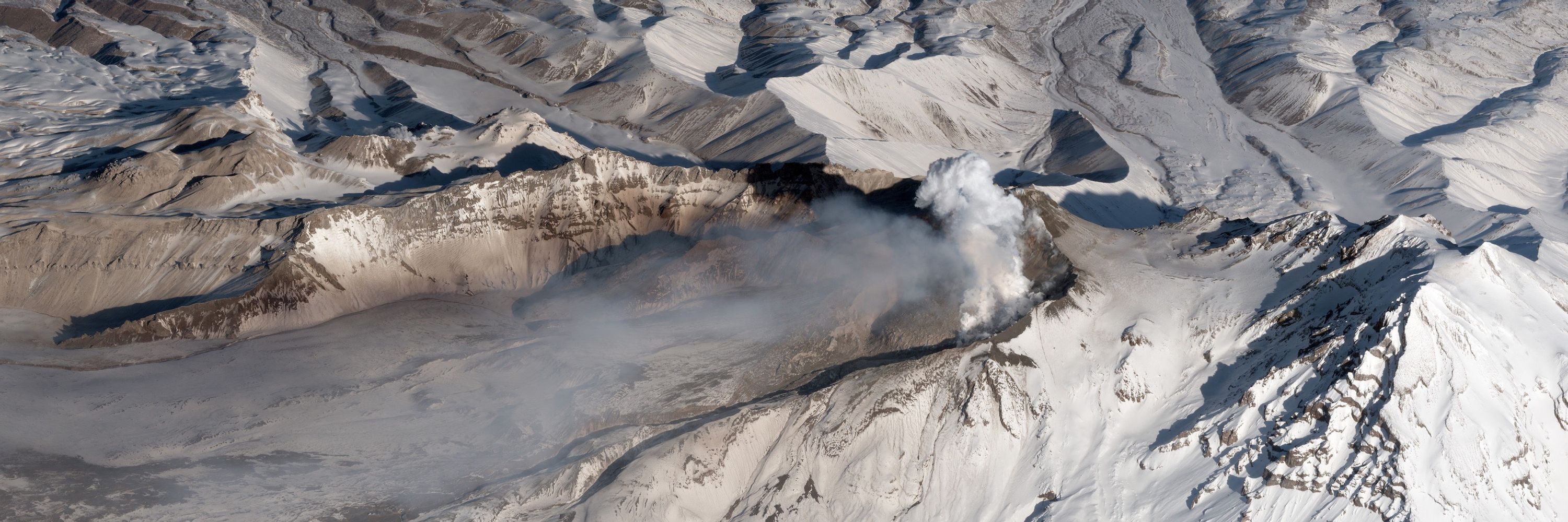
V2 cam is showing lava way above the caldera rim: www.youtube.com/live/fiyttmA...
January 24, 2026 at 10:01 PM
V2 cam is showing lava way above the caldera rim: www.youtube.com/live/fiyttmA...
I can’t get over the fact that the same political movement that thinks the government insisting a rancher pays his range fees is government overreach thinks peaceable assembly is worthy of a summary death penalty.
January 24, 2026 at 8:05 PM
I can’t get over the fact that the same political movement that thinks the government insisting a rancher pays his range fees is government overreach thinks peaceable assembly is worthy of a summary death penalty.
Reposted by Robert Simmon

The people who'll tell you today's murder victim in Minnesota shouldn't have turned up to a protest carrying a gun are the same people who said Kyle Rittenhouse was perfectly entitled to do the same thing.
January 24, 2026 at 5:58 PM
The people who'll tell you today's murder victim in Minnesota shouldn't have turned up to a protest carrying a gun are the same people who said Kyle Rittenhouse was perfectly entitled to do the same thing.
Reposted by Robert Simmon

Alex from our time working together, while he was in nursing school. Later, he moved to ICU, working as a nurse to support critically ill Veterans. He had such a great attitude. We’d chat between patients about trying to get in a mountain bike ride together. Will never happen now

January 24, 2026 at 7:39 PM
Alex from our time working together, while he was in nursing school. Later, he moved to ICU, working as a nurse to support critically ill Veterans. He had such a great attitude. We’d chat between patients about trying to get in a mountain bike ride together. Will never happen now
Reposted by Robert Simmon
Beautiful illustrations of iron interacting with rocks, from the publication of a paper, "On the Disposition of Iron in Variegated Strata", delivered by the botanist and geologist George Maw to the Geological Society on April 22nd 1868: publicdomainreview.org/collection/o...


January 24, 2026 at 5:46 PM
Beautiful illustrations of iron interacting with rocks, from the publication of a paper, "On the Disposition of Iron in Variegated Strata", delivered by the botanist and geologist George Maw to the Geological Society on April 22nd 1868: publicdomainreview.org/collection/o...
Shortly after I post a critique of this map’s color palette, Andrew demonstrates one of its features — the segmented hues of spectral palettes help viewers identify & call out salient features, like the heavy snowfall expected over Western New York.
That red spot is the Tug hill Plateau and it's one of the snowiest parts of the country.
Winds here blow West to East- first over the Great Lakes picking up moisture, then getting forced upwards like a ski jump into the THP. Air gets colder at elevation and can't hold anymore water so it snows.
Winds here blow West to East- first over the Great Lakes picking up moisture, then getting forced upwards like a ski jump into the THP. Air gets colder at elevation and can't hold anymore water so it snows.

Godspeed lil red area in NY.
January 24, 2026 at 12:46 AM
Shortly after I post a critique of this map’s color palette, Andrew demonstrates one of its features — the segmented hues of spectral palettes help viewers identify & call out salient features, like the heavy snowfall expected over Western New York.
Reposted by Robert Simmon
Attention folks in the weather, climate, disaster, wildfire, and Earth science communities: NSF has just published a new "Dear Colleague" letter inviting feedback (by Mar 13) on the proposal to dismantle the National Center for Atmospheric Research (NCAR). www.nsf.gov/funding/...
January 23, 2026 at 9:57 PM
Attention folks in the weather, climate, disaster, wildfire, and Earth science communities: NSF has just published a new "Dear Colleague" letter inviting feedback (by Mar 13) on the proposal to dismantle the National Center for Atmospheric Research (NCAR). www.nsf.gov/funding/...
Nice introduction to the new (version3.11 and later), almost completely revised, GDAL command line interface (with some bonus updates to the Python API, too) from @samroy.bsky.social
datacommons.substack.com/p/installing...
datacommons.substack.com/p/installing...

Installing & Updating to GDAL 3.11.0 on Ubuntu: A Ground Up Rewrite
How GDAL 3.11 Finally Fixed the Thing That's Been Broken for 27 Years and how to install this on a Ubuntu system with a single script
datacommons.substack.com
January 23, 2026 at 9:22 PM
Nice introduction to the new (version3.11 and later), almost completely revised, GDAL command line interface (with some bonus updates to the Python API, too) from @samroy.bsky.social
datacommons.substack.com/p/installing...
datacommons.substack.com/p/installing...
“From one perspective, the story isn’t about the ridges. It’s about that Depression/WW2/immigrant-exclusion valley. That valley contrasts surrounding terrain to make them look like booms. That valley echoes forward with a smaller Gen-X population.”


January 23, 2026 at 8:31 PM
“From one perspective, the story isn’t about the ridges. It’s about that Depression/WW2/immigrant-exclusion valley. That valley contrasts surrounding terrain to make them look like booms. That valley echoes forward with a smaller Gen-X population.”
Huh. New York Times snow forecast graphic from yesterday vs. today.


January 23, 2026 at 7:00 PM
Huh. New York Times snow forecast graphic from yesterday vs. today.
Reposted by Robert Simmon
If you’re picking colors with a tool that has precise control over hue, chroma, and lightness it’s possible to abruptly shift hue while maintaining even steps in lightness. This creates an unmistakeable transition that’s still monotonic!

January 23, 2026 at 4:20 AM
If you’re picking colors with a tool that has precise control over hue, chroma, and lightness it’s possible to abruptly shift hue while maintaining even steps in lightness. This creates an unmistakeable transition that’s still monotonic!
While we’re being bombarded with weather maps, I thought I’d revisit one of my favorite color palette tricks. Sometimes it’s important to emphasize a boundary, perhaps between moderate (< 6") and severe (>8") snowfall. You could reset the palette, like the NYT, but there’s a better way.
📊🗺️🎨
📊🗺️🎨
January 23, 2026 at 4:20 AM
While we’re being bombarded with weather maps, I thought I’d revisit one of my favorite color palette tricks. Sometimes it’s important to emphasize a boundary, perhaps between moderate (< 6") and severe (>8") snowfall. You could reset the palette, like the NYT, but there’s a better way.
📊🗺️🎨
📊🗺️🎨

Reposted by Robert Simmon

A captivating display of the northern lights hung in the sky above the northern hemisphere for a couple of nights due to the recent severe geomagnetic storm from the Sun.

January 22, 2026 at 9:02 PM
A captivating display of the northern lights hung in the sky above the northern hemisphere for a couple of nights due to the recent severe geomagnetic storm from the Sun.
Reposted by Robert Simmon

As a #datavis this graph is *stunningly* bad.

We’re starting a new Abacus Data polling series focused on where Pierre Poilievre and the Conservative Party sit in public opinion right now, with the convention and leadership review just around the corner.
Here’s the baseline read. abacusdata.ca/where-the-c...
Here’s the baseline read. abacusdata.ca/where-the-c...

Where the Conservative Party and Pierre Poilievre Stand in Public Opinion - Abacus Data
%
abacusdata.ca
January 22, 2026 at 9:27 PM
As a #datavis this graph is *stunningly* bad.