


Pavel
@spavel.bsky.social
Raised gifted; non-practicing.
If your reply doesn't have alt text, I won't see it.
🌐 productpicnic.beehiiv.com 💼 UX Design 🟦 Sick of rectangles 🧑 he/him
If your reply doesn't have alt text, I won't see it.
🌐 productpicnic.beehiiv.com 💼 UX Design 🟦 Sick of rectangles 🧑 he/him
Playing around with lower baking temperature to let the bread rise longer before the crust forms.
This was at 425F; I might go even lower next time, but the ugly crack is mostly due to my bad scoring job.
This was at 425F; I might go even lower next time, but the ugly crack is mostly due to my bad scoring job.


December 12, 2025 at 6:18 PM
Playing around with lower baking temperature to let the bread rise longer before the crust forms.
This was at 425F; I might go even lower next time, but the ugly crack is mostly due to my bad scoring job.
This was at 425F; I might go even lower next time, but the ugly crack is mostly due to my bad scoring job.


Is it time? I unleash my ultimate attack:

December 12, 2025 at 12:17 AM
Is it time? I unleash my ultimate attack:
This is Manhattan, to me
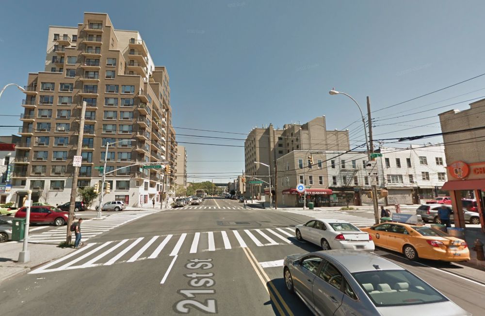
December 11, 2025 at 4:08 PM
This is Manhattan, to me
🧝♀️Sure, there's a 99% chance this folder is a mimic. But there is a 1% chance that it contains a rare file!
via ko-fi.com/s/3683ca94cb
via ko-fi.com/s/3683ca94cb
December 11, 2025 at 2:40 PM
🧝♀️Sure, there's a 99% chance this folder is a mimic. But there is a 1% chance that it contains a rare file!
via ko-fi.com/s/3683ca94cb
via ko-fi.com/s/3683ca94cb
True, but there are also cats

December 11, 2025 at 1:54 PM
True, but there are also cats

When you say "we don't need user research, I already know what users want" this is what you look like

December 10, 2025 at 11:04 PM
When you say "we don't need user research, I already know what users want" this is what you look like
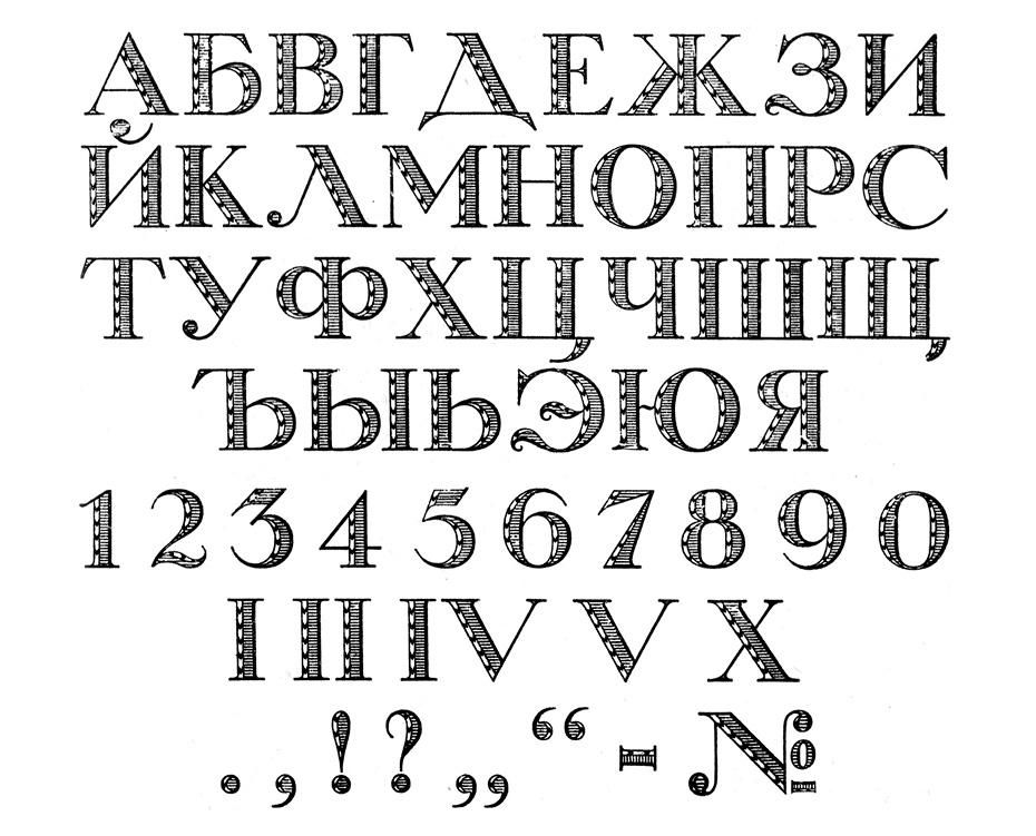
All ГОСТs are easy to find as PDFs online. Sadly the scan quality tends to be atrocious, and some of them get OCR'ed, which makes them useless for our purposes.
Below you can see a very okay quality list of all the typefaces that were available (Magazine Sans is the 2nd last on the first image).
Below you can see a very okay quality list of all the typefaces that were available (Magazine Sans is the 2nd last on the first image).


December 10, 2025 at 10:16 PM
All ГОСТs are easy to find as PDFs online. Sadly the scan quality tends to be atrocious, and some of them get OCR'ed, which makes them useless for our purposes.
Below you can see a very okay quality list of all the typefaces that were available (Magazine Sans is the 2nd last on the first image).
Below you can see a very okay quality list of all the typefaces that were available (Magazine Sans is the 2nd last on the first image).
As ГОСТ 3489 was revised, we start to see some original typefaces appear. Bannikova was based on Petrine letterforms (the same Peter I who instituted a beard tax and had a beard police also decided that all Russian typography had to be reformed, what a surprise).

December 10, 2025 at 10:14 PM
As ГОСТ 3489 was revised, we start to see some original typefaces appear. Bannikova was based on Petrine letterforms (the same Peter I who instituted a beard tax and had a beard police also decided that all Russian typography had to be reformed, what a surprise).
Which brings us back to the post-war era and ГОСТ 3489. Although it would continue to evolve, many typefaces survived until 1991 and even beyond. "Regular" got a new cut in "Regular New." Elizabetinskaya lives on as Elizabeth. In place of Uchebnaya, we got Schkolnaya and Bukvarnaya.


December 10, 2025 at 10:12 PM
Which brings us back to the post-war era and ГОСТ 3489. Although it would continue to evolve, many typefaces survived until 1991 and even beyond. "Regular" got a new cut in "Regular New." Elizabetinskaya lives on as Elizabeth. In place of Uchebnaya, we got Schkolnaya and Bukvarnaya.
And before you think that it was all boring body copy typography, there were also some fun display ones. Russian-speaking readers, and those who want to flip through more photos of the types, can do so here: typejournal.ru/articles/OST...

December 10, 2025 at 9:57 PM
And before you think that it was all boring body copy typography, there were also some fun display ones. Russian-speaking readers, and those who want to flip through more photos of the types, can do so here: typejournal.ru/articles/OST...
Royal Grotesk and Akzidenz Grotesk (Helvetica's ancestor) were both included, and considered suitable for "readers of low qualification" due to their simplicity. Most children's books were set in Akzidenz. Today, Royal looks very odd to me, and definitely has that Zhurnalnaya "not quite right"ness.


December 10, 2025 at 9:56 PM
Royal Grotesk and Akzidenz Grotesk (Helvetica's ancestor) were both included, and considered suitable for "readers of low qualification" due to their simplicity. Most children's books were set in Akzidenz. Today, Royal looks very odd to me, and definitely has that Zhurnalnaya "not quite right"ness.
The original standardization leading up to OST 1337 was happening alongside mass literacy campaigns, so the complexity bar was pretty low.
This typeface - Palmyra - was tested on Red Army soldiers in 1928, and was found to increase cognitive overhead by being both old-fashioned and too newfangled.
This typeface - Palmyra - was tested on Red Army soldiers in 1928, and was found to increase cognitive overhead by being both old-fashioned and too newfangled.

December 10, 2025 at 9:54 PM
The original standardization leading up to OST 1337 was happening alongside mass literacy campaigns, so the complexity bar was pretty low.
This typeface - Palmyra - was tested on Red Army soldiers in 1928, and was found to increase cognitive overhead by being both old-fashioned and too newfangled.
This typeface - Palmyra - was tested on Red Army soldiers in 1928, and was found to increase cognitive overhead by being both old-fashioned and too newfangled.
Legibility was critical, and some of the old "bourgeois" typefaces were ruthlessly standardized. Pictured below is Berthold Akademisch and then the Academic that was included in OST 1337. A lot of its distinctiveness was wiped away, such as the italics-style t's (new style т, old style more like m).


December 10, 2025 at 9:53 PM
Legibility was critical, and some of the old "bourgeois" typefaces were ruthlessly standardized. Pictured below is Berthold Akademisch and then the Academic that was included in OST 1337. A lot of its distinctiveness was wiped away, such as the italics-style t's (new style т, old style more like m).
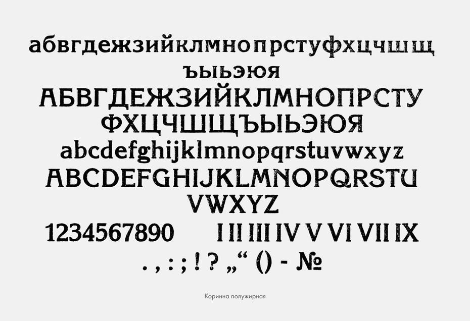
Unsurprisingly, on top of practical considerations there was a lot of ~*~ideology~*~ at play.
Another typeface from OST 1337 (Korinna, based on Berthold Korinna) was once marked it as a candidate for removal by a typographer because "the forms of а, б, ж, з, к, р, с and others are pretentious."
Another typeface from OST 1337 (Korinna, based on Berthold Korinna) was once marked it as a candidate for removal by a typographer because "the forms of а, б, ж, з, к, р, с and others are pretentious."

December 10, 2025 at 9:51 PM
Unsurprisingly, on top of practical considerations there was a lot of ~*~ideology~*~ at play.
Another typeface from OST 1337 (Korinna, based on Berthold Korinna) was once marked it as a candidate for removal by a typographer because "the forms of а, б, ж, з, к, р, с and others are pretentious."
Another typeface from OST 1337 (Korinna, based on Berthold Korinna) was once marked it as a candidate for removal by a typographer because "the forms of а, б, ж, з, к, р, с and others are pretentious."
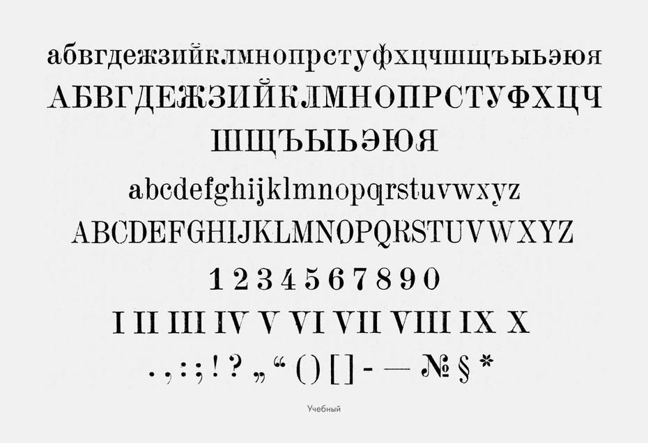
Other OST 1337 faces included Uchebnyi, Aldine, Latin (based on Berthold Latinisch). This copying was common; Magazine Sans was "inspired" by Erbar-Grotesk and Berhtold-Grotesk.
Latin would become Literaturnaya, responsible for around 50% of all Soviet publication before being displaced by Times.
Latin would become Literaturnaya, responsible for around 50% of all Soviet publication before being displaced by Times.


December 10, 2025 at 9:49 PM
Other OST 1337 faces included Uchebnyi, Aldine, Latin (based on Berthold Latinisch). This copying was common; Magazine Sans was "inspired" by Erbar-Grotesk and Berhtold-Grotesk.
Latin would become Literaturnaya, responsible for around 50% of all Soviet publication before being displaced by Times.
Latin would become Literaturnaya, responsible for around 50% of all Soviet publication before being displaced by Times.
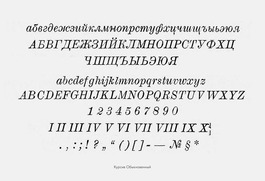
ГОСТ 3489 replaced OST 1337 from 1932. When OST 1337 was set, there was a large variety of type punches still left over from the Russian Empire, which was cut down to just 31 cuts. Pictured below is a typeface creatively called "Regular", containing seven fonts, three of which are shown here.

December 10, 2025 at 9:45 PM
ГОСТ 3489 replaced OST 1337 from 1932. When OST 1337 was set, there was a large variety of type punches still left over from the Russian Empire, which was cut down to just 31 cuts. Pictured below is a typeface creatively called "Regular", containing seven fonts, three of which are shown here.
Fonts are in the news, so I'm going to take the opportunity to port over an old thread: what was typography like in the Soviet Union?
Spoiler: they did not just have 1 font everyone had to use. As a matter of fact, there were 39.
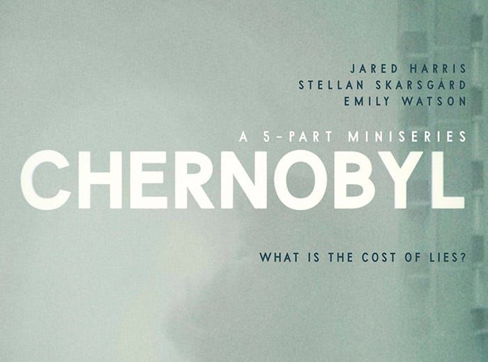
One of them, you can see here, used to great effect for "Chernobyl."
Spoiler: they did not just have 1 font everyone had to use. As a matter of fact, there were 39.
One of them, you can see here, used to great effect for "Chernobyl."
December 10, 2025 at 9:37 PM
Fonts are in the news, so I'm going to take the opportunity to port over an old thread: what was typography like in the Soviet Union?
Spoiler: they did not just have 1 font everyone had to use. As a matter of fact, there were 39.
One of them, you can see here, used to great effect for "Chernobyl."
Spoiler: they did not just have 1 font everyone had to use. As a matter of fact, there were 39.
One of them, you can see here, used to great effect for "Chernobyl."


Tired: Seeing a logo redesign and immediately going to social media to complain about it
Wired: Seeing a logo redesign and immediately going to social media to complain about the people you assume must be complaining about it
(personally I think it's fine)
Wired: Seeing a logo redesign and immediately going to social media to complain about the people you assume must be complaining about it
(personally I think it's fine)

December 9, 2025 at 4:38 PM
Tired: Seeing a logo redesign and immediately going to social media to complain about it
Wired: Seeing a logo redesign and immediately going to social media to complain about the people you assume must be complaining about it
(personally I think it's fine)
Wired: Seeing a logo redesign and immediately going to social media to complain about the people you assume must be complaining about it
(personally I think it's fine)
These actually kind of slap ngl

December 9, 2025 at 3:33 PM
These actually kind of slap ngl
This sign can't stop me because I can't read

December 9, 2025 at 12:17 AM
This sign can't stop me because I can't read