Steven Ruggles
@stevenruggles.bsky.social
170 followers 81 following 320 posts
Historical demographer and data impresario Wired profile: https://www.wired.com/1995/03/ruggles/ Publications: https://users.pop.umn.edu/~ruggl001/ Data: https://www.ipums.org/
Posts Media Videos Starter Packs
Pinned
stevenruggles.bsky.social
Our paper on the politics of Census Bureau technology argues that Clinton's radical downsizing of the federal workforce led to a loss of expertise that had taken decades to build, massive outsourcing to the private sector, and an explosion of costs.
academic.oup.com/jah/article/...
Graph of executive branch employment , showing massive decline in the 1990s.
Reposted by Steven Ruggles
paulisci.bsky.social
A Brief History of Men are Becoming Less Manly

🧵
Reposted by Steven Ruggles
adamscochran.bsky.social
1/10

So the fake claims of "trans" and "antifa" symbols comes from both ammo stamps and casing inscriptions wrongly reported.

They try to paint Tyler as left, but like Crooks this is a fringe right wing Groyper.

Here's the details on registered Republican, Tyler Robinson:
x.com/adamscochra...
Reposted by Steven Ruggles
iwillnotbesilenced.bsky.social
MSNBC fires political analyst Matthew Dowd for having a thoughtful and rational take.
Reposted by Steven Ruggles
wajali.bsky.social
@matthewjdowd.bsky.social said nothing wrong. Go read his quote. On point. Pathetic move by MSNBC leadership.
stevenruggles.bsky.social
As I recall, they began the day by opening mail and reading correspondence. Then fire up the Selectric and write responses. Once the correspondence is done, turn to whatever ongoing research project or grading. Pretty much the same as now.
Reposted by Steven Ruggles
jfallows.bsky.social
I'll say again: This matters.

For months NYT has been pushing "Harvard is about to cave" line. That line is 100% in MAGA's interest. Every other institution will think, "If not even Harvard can stand up, how could we."

Today, NYT: Oh, I guess it's a disagreement WITHIN THE TRUMP TEAM.
jfallows.bsky.social
Online this morning, NYT update from "Harvard is about to cave" team.

Today's update: Well, actually..... See headline below. www.nytimes.com/2025/09/06/u...

For context of this narrative, please see my piece yesterday fallows.substack.com/p/harvard-vs... (Full timeline before paywall.)
Headline: Settlement Talks Stall Between Harvard and the Trump Administration..

Subhead: "One major reason is said to be an emerging divide within the administration over whether the currrent framework is too favorable to Harvard."
stevenruggles.bsky.social
This graph uses CPS 1962-2024 and decennial earlier, from www.ipums.org.
stevenruggles.bsky.social
Actually, this graph isn't the percent of households with a married couple. It turns out to be percent of households with a married-spouse-present householder or household head, which is a bit lower. Also 1950 is not the all-time high. We can observe this back to 1850, and that is the high point.
Reposted by Steven Ruggles
saletan.bsky.social
On CNN, Vought repeats his lie: "They [NIH] in some respects caused the pandemic by their own research, for gain-of-function research."

Fact check: The viruses involved in NIH-funded research
"were genetically distant from SARS-CoV-2 and could not have been the source of the COVID-19 pandemic."
www.gao.gov
Reposted by Steven Ruggles
stevenruggles.bsky.social
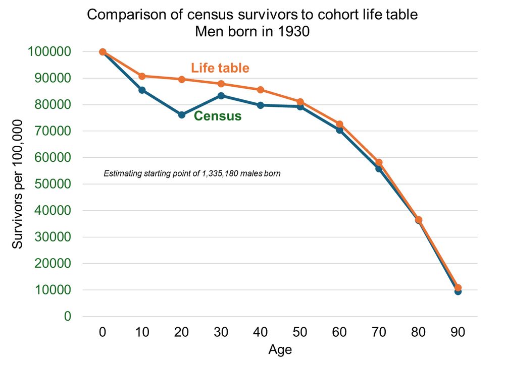
I replicated the graph using a cohort life table (available here: www.ssa.gov/oact/NOTES/a...), for all races. Very close fit after age 50, still a big mismatch at younger ages, especially age 20 (1950 census). Looks like a major undercount of young men 1940-1970. 1/2
stevenruggles.bsky.social
They are just a rearrangement of period life tables. Not hard to do, but you need a really long series of period tables, and they aren't complete until everyone is dead.
stevenruggles.bsky.social
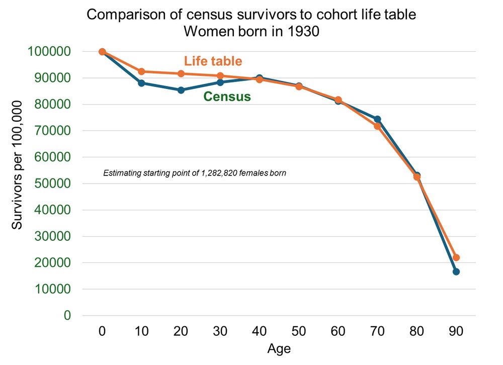
I made another one for women. still a significant undercount at ages 10 and 20, but not nearly as bad.
stevenruggles.bsky.social
I replicated the graph using a cohort life table (available here: www.ssa.gov/oact/NOTES/a...), for all races. Very close fit after age 50, still a big mismatch at younger ages, especially age 20 (1950 census). Looks like a major undercount of young men 1940-1970. 1/2
Reposted by Steven Ruggles
cnn.com
CNN @cnn.com · Jul 25
Two high-ranking officials at NOAA were placed on leave. While the reasoning behind the move is not clear, they led the investigation into whether NOAA’s scientific integrity policies were violated during the so-called "Sharpiegate" scandal of President Trump’s first term: cnn.it/452GqJZ
Two senior NOAA officials were just placed on leave. Both led ‘Sharpiegate’ inquiry | CNN
While the reasoning behind the move is not clear, the two officials affected led the investigation into whether NOAA’s scientific integrity policies were violated during the so-called Sharpiegate scan...
cnn.it
stevenruggles.bsky.social
The upward bumps at ages 30 and 50 seem odd.
stevenruggles.bsky.social
I see--you followed the birth cohort across censuses. I should read more carefully. That comparison would make sense if you used a cohort life table instead of period.