


Xan Gregg
@xangregg.bsky.social
Engineering Fellow at JMP, focused on #DataViz, preferring smoothers over fitted lines. Creator of JMP #GraphBuilder and #PackedBars chart type for high-cardinality Pareto data. #TieDye #LessIsMore
My "discovery" was discussed 30 years earlier in a research note by Martin Mächler (see lowess.ps in his unpublished manuscripts folder) people.math.ethz.ch/~maechler/

November 6, 2025 at 5:57 PM
My "discovery" was discussed 30 years earlier in a research note by Martin Mächler (see lowess.ps in his unpublished manuscripts folder) people.math.ethz.ch/~maechler/
Right, I assume the mean of the line is based on the data. The paper mentions σ as 3000 steps. Perhaps each line is a hypothetical average of a few thousand such movers, but I can't find any such explanation.
August 20, 2025 at 12:21 PM
Right, I assume the mean of the line is based on the data. The paper mentions σ as 3000 steps. Perhaps each line is a hypothetical average of a few thousand such movers, but I can't find any such explanation.
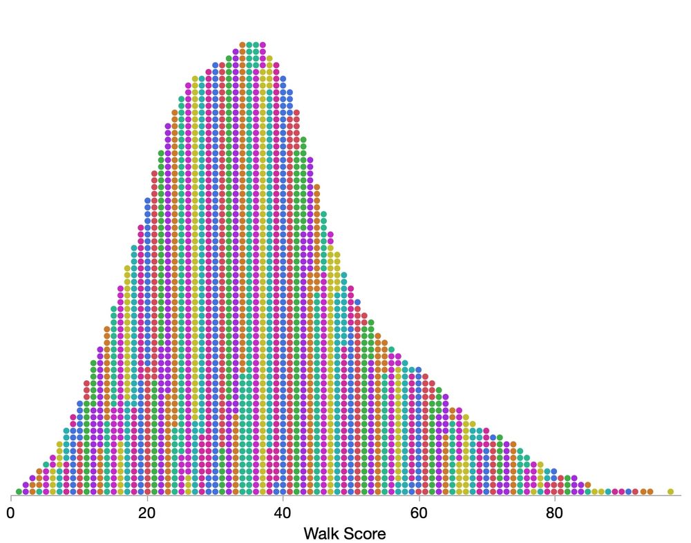
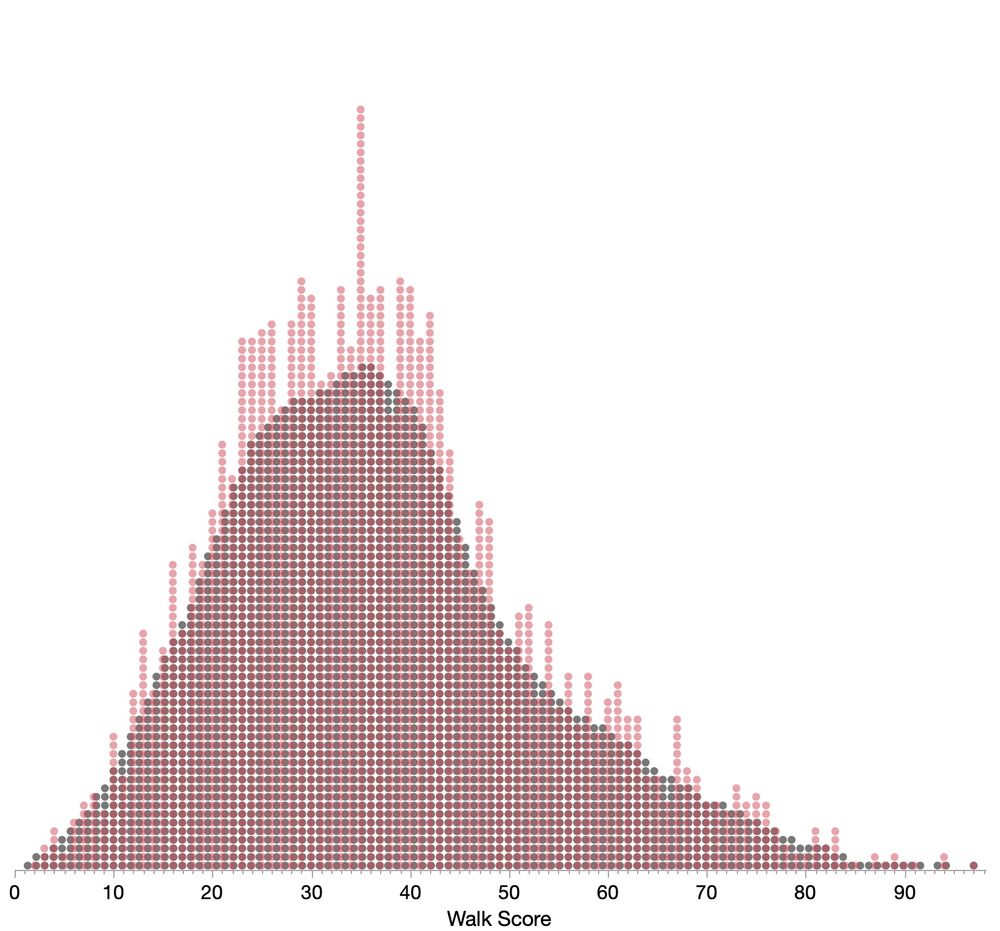
Here's the smoothed grid with dots colored by their values's ones digit (walkScore % 10), and a superposition attempt, with smoothed in gray. (I didn't quite get the walk score per dot width to be an exact number of pixels.) Hope these capture the diagnostic you're looking for.
August 17, 2025 at 8:59 PM
Here's the smoothed grid with dots colored by their values's ones digit (walkScore % 10), and a superposition attempt, with smoothed in gray. (I didn't quite get the walk score per dot width to be an exact number of pixels.) Hope these capture the diagnostic you're looking for.
It can't be a ratio of the changes since the denominator could be very small, even 0. However, using (total + first)/(total+latest) is no good since base is so much bigger. It seems like some smoothing/annualizing is happening. Closest I could get was a 12-month cumulative error versus the total.

August 13, 2025 at 2:32 PM
It can't be a ratio of the changes since the denominator could be very small, even 0. However, using (total + first)/(total+latest) is no good since base is so much bigger. It seems like some smoothing/annualizing is happening. Closest I could get was a 12-month cumulative error versus the total.
Better alternative?:
The datasets and code have been escrowed with the publisher (checksum xxx). They will be shared upon request to the corresponding author cc publisher for the following purposes: x, y, z. If no response within n days, notify the publisher and the paper will be retracted.
The datasets and code have been escrowed with the publisher (checksum xxx). They will be shared upon request to the corresponding author cc publisher for the following purposes: x, y, z. If no response within n days, notify the publisher and the paper will be retracted.
August 10, 2025 at 5:12 PM
Better alternative?:
The datasets and code have been escrowed with the publisher (checksum xxx). They will be shared upon request to the corresponding author cc publisher for the following purposes: x, y, z. If no response within n days, notify the publisher and the paper will be retracted.
The datasets and code have been escrowed with the publisher (checksum xxx). They will be shared upon request to the corresponding author cc publisher for the following purposes: x, y, z. If no response within n days, notify the publisher and the paper will be retracted.
1. Email addresses change.
2. Author becomes unavailable (retire, get busy, ...)
3. No definition of reasonable.
4. No way to verify that any supplied data is the actual data.
5. The supplied data may not be complete.
6. No penalty for breaking promise.
2. Author becomes unavailable (retire, get busy, ...)
3. No definition of reasonable.
4. No way to verify that any supplied data is the actual data.
5. The supplied data may not be complete.
6. No penalty for breaking promise.
August 10, 2025 at 5:09 PM
1. Email addresses change.
2. Author becomes unavailable (retire, get busy, ...)
3. No definition of reasonable.
4. No way to verify that any supplied data is the actual data.
5. The supplied data may not be complete.
6. No penalty for breaking promise.
2. Author becomes unavailable (retire, get busy, ...)
3. No definition of reasonable.
4. No way to verify that any supplied data is the actual data.
5. The supplied data may not be complete.
6. No penalty for breaking promise.
That's a good way to put it. That example is mostly for those with a strict rule. I think my internal rule matches yours: the bar origin should be a "meaningful baseline" such that 2x bar height is a 2x effect from the baseline.
July 23, 2025 at 12:54 PM
That's a good way to put it. That example is mostly for those with a strict rule. I think my internal rule matches yours: the bar origin should be a "meaningful baseline" such that 2x bar height is a 2x effect from the baseline.
The originals could serve as fodder for some #dataviz guides. When the zero-origin rule breaks down or when to use dots/lines instead of bars.

July 23, 2025 at 12:25 PM
The originals could serve as fodder for some #dataviz guides. When the zero-origin rule breaks down or when to use dots/lines instead of bars.
Great improvement sequence, but for me, it's harder to verify which categories are changing after putting their bars in separate groups. I see it's a trade-off with simplifying the coloring. Here's a try at sticking with the original ordering, at the cost of an imperfect time legend.

July 16, 2025 at 12:11 PM
Great improvement sequence, but for me, it's harder to verify which categories are changing after putting their bars in separate groups. I see it's a trade-off with simplifying the coloring. Here's a try at sticking with the original ordering, at the cost of an imperfect time legend.
Not mine, just to be clear. But, yes, very nice!
June 30, 2025 at 8:55 PM
Not mine, just to be clear. But, yes, very nice!
This article by Don Wheeler has a good discussion of Grubbs' test and others. www.qualitydigest.com/inside/stati... [free reg reqd]
He's a control charts expert, which explains the sequence-based context and small data sizes.
He's a control charts expert, which explains the sequence-based context and small data sizes.

June 30, 2025 at 7:22 PM
This article by Don Wheeler has a good discussion of Grubbs' test and others. www.qualitydigest.com/inside/stati... [free reg reqd]
He's a control charts expert, which explains the sequence-based context and small data sizes.
He's a control charts expert, which explains the sequence-based context and small data sizes.