


Xan Gregg
@xangregg.bsky.social
Engineering Fellow at JMP, focused on #DataViz, preferring smoothers over fitted lines. Creator of JMP #GraphBuilder and #PackedBars chart type for high-cardinality Pareto data. #TieDye #LessIsMore
Trying the same thing with JMP 19's constrained p-splines. Nicely similar to the R GAMs, but JMP's CIs are bootstrapped instead of analytical, which is why they're not symmetric. #dataviz

November 13, 2025 at 1:30 PM
Trying the same thing with JMP 19's constrained p-splines. Nicely similar to the R GAMs, but JMP's CIs are bootstrapped instead of analytical, which is why they're not symmetric. #dataviz
Did you know (robust) loess fitting can fail if the data is already smooth? I made a notebook that shows the flawed fit (red) along with a possible improvement (blue), using Cleveland's original demonstration curve. #stats
observablehq.com/@xangregg/lo...
observablehq.com/@xangregg/lo...

November 6, 2025 at 5:50 PM
Did you know (robust) loess fitting can fail if the data is already smooth? I made a notebook that shows the flawed fit (red) along with a possible improvement (blue), using Cleveland's original demonstration curve. #stats
observablehq.com/@xangregg/lo...
observablehq.com/@xangregg/lo...
New blog post looking at some recently-shared NCAA football player data. The scatterplot is percent drafted to NFL against average player high school rating by college. Also trying out inward-jittered, smoothed dot plots.
rawdatastudies.com/2025/10/26/n...
rawdatastudies.com/2025/10/26/n...


October 27, 2025 at 2:14 PM
New blog post looking at some recently-shared NCAA football player data. The scatterplot is percent drafted to NFL against average player high school rating by college. Also trying out inward-jittered, smoothed dot plots.
rawdatastudies.com/2025/10/26/n...
rawdatastudies.com/2025/10/26/n...
Dot plot #dataviz comparison: ratings of FIDE chess Grand Masters via Tidy Tuesday.
1 Nearest stacks (Wilkinson)
2 Smoothed stacks
3 Smoothed hexagonal grid
4 Exact position (beeswarm)
Smoothing trades delta-x for spikiness (deviation from kernel density estimate).
1 Nearest stacks (Wilkinson)
2 Smoothed stacks
3 Smoothed hexagonal grid
4 Exact position (beeswarm)
Smoothing trades delta-x for spikiness (deviation from kernel density estimate).


September 27, 2025 at 12:17 PM
Dot plot #dataviz comparison: ratings of FIDE chess Grand Masters via Tidy Tuesday.
1 Nearest stacks (Wilkinson)
2 Smoothed stacks
3 Smoothed hexagonal grid
4 Exact position (beeswarm)
Smoothing trades delta-x for spikiness (deviation from kernel density estimate).
1 Nearest stacks (Wilkinson)
2 Smoothed stacks
3 Smoothed hexagonal grid
4 Exact position (beeswarm)
Smoothing trades delta-x for spikiness (deviation from kernel density estimate).
JMP 19 is out (free trial available), and I wrote a blog post about the main things I worked on. Constrained smoothers, jitter options, easier arrows, parallel y axes, ... #dataviz
community.jmp.com/t5/JMPer-Cab...
community.jmp.com/t5/JMPer-Cab...

September 19, 2025 at 12:53 PM
JMP 19 is out (free trial available), and I wrote a blog post about the main things I worked on. Constrained smoothers, jitter options, easier arrows, parallel y axes, ... #dataviz
community.jmp.com/t5/JMPer-Cab...
community.jmp.com/t5/JMPer-Cab...
Nice wxdu.org set tonight from @gavinyamey.bsky.social, especially the spoken word pieces.
wxdu.org
WXDU 88.7 FM Durham - Duke University Radio
wxdu.org
September 11, 2025 at 11:53 PM
Nice wxdu.org set tonight from @gavinyamey.bsky.social, especially the spoken word pieces.
Yay, I was able to reproduce the lines in this chart precisely from the raw data. The original shows summary dots where mine shows raw data dots, and at a couple zoom levels. The power of statistics; signal and noise. www.nature.com/articles/s41...


August 22, 2025 at 7:26 PM
Yay, I was able to reproduce the lines in this chart precisely from the raw data. The original shows summary dots where mine shows raw data dots, and at a couple zoom levels. The power of statistics; signal and noise. www.nature.com/articles/s41...
What to make of a paper that shares a ton of well-organized data and code for its charts, but not enough detail for analysis? PII concerns, maybe.
Curiously, these line charts are random data, suggesting steadier step counts. www.nature.com/articles/s41...
Curiously, these line charts are random data, suggesting steadier step counts. www.nature.com/articles/s41...

![Screenshot from a Python notebook shared with the paper. Code part reads:
with plt.rc_context({'figure.autolayout': True}):
fig, ax = plt.subplots(figsize=(4, 2));
pre_x = range(-35, -5);
y = np.random.normal(loc=from_df.loc[from_df['from_loc'] == 'Seattle, WA', 'pre_avg'], scale=50., size=(len(pre_x), ));
plt.plot(pre_x, y, lw=5., c='#aa3939');
plt.ylim(5800, 7000);
ax.grid(False);
for item in ([ax.xaxis.label, ax.yaxis.label] + ax.get_xticklabels() + ax.get_yticklabels()):
item.set_fontsize(axis_fontsize);
ax.set(xlabel=r'Days from Move $\left(t - t_{move}\right)$', ylabel='Daily Steps', xticks=range(-35, -4, 10));
fig.tight_layout()
plt.savefig('../output/fig1b_subplots/seattle_from.png',
dpi=600);](https://cdn.bsky.app/img/feed_thumbnail/plain/did:plc:vum7yuqczgryxehx6ozitxjg/bafkreifl6rfkiphf3g3ryzskgo4vg6vj2pw7wcwhh4e3jr6rxf52434bqy@jpeg)
August 20, 2025 at 12:48 AM
What to make of a paper that shares a ton of well-organized data and code for its charts, but not enough detail for analysis? PII concerns, maybe.
Curiously, these line charts are random data, suggesting steadier step counts. www.nature.com/articles/s41...
Curiously, these line charts are random data, suggesting steadier step counts. www.nature.com/articles/s41...
Quick dot plot #dataviz study with 2500 US city Walk Scores. Plain dot plot (exact because scores are integers), with smoothing (±1), and with hexagonal placement (±0.75). Data from www.walkscore.com


August 17, 2025 at 4:57 PM
Quick dot plot #dataviz study with 2500 US city Walk Scores. Plain dot plot (exact because scores are integers), with smoothing (±1), and with hexagonal placement (±0.75). Data from www.walkscore.com
A week ago I was crazy enough to email a paper's corresponding author for the data. No response.
"The datasets used and/or analyzed during the current study are available from the corresponding author on reasonable request."
Why is this data availability statement evil? A few reasons: ...
"The datasets used and/or analyzed during the current study are available from the corresponding author on reasonable request."
Why is this data availability statement evil? A few reasons: ...
August 10, 2025 at 5:08 PM
A week ago I was crazy enough to email a paper's corresponding author for the data. No response.
"The datasets used and/or analyzed during the current study are available from the corresponding author on reasonable request."
Why is this data availability statement evil? A few reasons: ...
"The datasets used and/or analyzed during the current study are available from the corresponding author on reasonable request."
Why is this data availability statement evil? A few reasons: ...
Rare sighting of letter-values plots in the wild. Nicely described in the caption as "plots which first identify the median, then extend boxes outward, each covering half of the remaining data." n=2.9M, so regular box plots would be swamped with outliers. #dataviz
arxiv.org/pdf/2402.14583
arxiv.org/pdf/2402.14583

August 1, 2025 at 12:13 PM
Rare sighting of letter-values plots in the wild. Nicely described in the caption as "plots which first identify the median, then extend boxes outward, each covering half of the remaining data." n=2.9M, so regular box plots would be swamped with outliers. #dataviz
arxiv.org/pdf/2402.14583
arxiv.org/pdf/2402.14583
Need to get the raw data behind a chart? Here's a walk-through of my PDF → SVG → CSV → Data techinque. #dataviz
rawdatastudies.com/2025/07/21/d...
rawdatastudies.com/2025/07/21/d...
Data extraction challenge – Raw Data Studies
Throughout my quests for raw data, I've learned a few techniques for find data lurking behind the charts. This walk-through shows a few of them,
rawdatastudies.com
July 21, 2025 at 2:32 PM
Need to get the raw data behind a chart? Here's a walk-through of my PDF → SVG → CSV → Data techinque. #dataviz
rawdatastudies.com/2025/07/21/d...
rawdatastudies.com/2025/07/21/d...
The Secret of Data Science. I don't know if I'll ever get the chance to present this wisdom in public, so I'm sharing a rehearsal video from my rejected OutlierConf lightning talk submission. It really needs a live audience, though. #dataviz youtu.be/imRSlilIw5k

Secret of Data Science
YouTube video by The Graph Builder
youtu.be
July 11, 2025 at 5:20 PM
The Secret of Data Science. I don't know if I'll ever get the chance to present this wisdom in public, so I'm sharing a rehearsal video from my rejected OutlierConf lightning talk submission. It really needs a live audience, though. #dataviz youtu.be/imRSlilIw5k
I've written an explainer blog post for my "data strips" #dataviz workbench web app, trying alternative 1-D distribution summary plots. rawdatastudies.com/2025/07/05/d...

Data Strips Experiment
I built a “Data Strips” app to experiment with new ways of graphically summarizing the distribution of a single variable.. You can try it out or access the code on GitHub. This post wil…
rawdatastudies.com
July 6, 2025 at 3:52 PM
I've written an explainer blog post for my "data strips" #dataviz workbench web app, trying alternative 1-D distribution summary plots. rawdatastudies.com/2025/07/05/d...
Round 2 of my 1D #dataviz experiment at xangregg.github.io/data-strips/.
I realized my adaptive outlier idea was already done as Grubbs' test, which I've adapted for non-gaussian moments.
Added a couple thirds-based views. Here's 5000 random normal samples plus 2 outliers. The green ones use Grubbs.
I realized my adaptive outlier idea was already done as Grubbs' test, which I've adapted for non-gaussian moments.
Added a couple thirds-based views. Here's 5000 random normal samples plus 2 outliers. The green ones use Grubbs.

June 30, 2025 at 6:55 PM
Round 2 of my 1D #dataviz experiment at xangregg.github.io/data-strips/.
I realized my adaptive outlier idea was already done as Grubbs' test, which I've adapted for non-gaussian moments.
Added a couple thirds-based views. Here's 5000 random normal samples plus 2 outliers. The green ones use Grubbs.
I realized my adaptive outlier idea was already done as Grubbs' test, which I've adapted for non-gaussian moments.
Added a couple thirds-based views. Here's 5000 random normal samples plus 2 outliers. The green ones use Grubbs.
6 old and 7 new 1D #dataviz. Trying Shortest Half with a twist: one break is allowed. Also half-sample mode & count-adaptive outlier thresholds. Here's 1000 random normal points plus two outliers. The green ones are new. Try it at xangregg.github.io/data-strips/

June 23, 2025 at 5:02 PM
6 old and 7 new 1D #dataviz. Trying Shortest Half with a twist: one break is allowed. Also half-sample mode & count-adaptive outlier thresholds. Here's 1000 random normal points plus two outliers. The green ones are new. Try it at xangregg.github.io/data-strips/
Reposted by Xan Gregg

I am not at #Outlier2025 but I am sure there are many perspectives shared that I also care deeply about and I also want to point out that tomorrow I'll be giving insight into my personal thoughts on #dataviz at the Data+Women online data art episode 3.
usergroups.tableau.com/events/detai...
usergroups.tableau.com/events/detai...

Data Art Episode 3 : Recalibrate | Tableau
Virtual Event - Data + Women Zurich
usergroups.tableau.com
June 11, 2025 at 3:13 PM
I am not at #Outlier2025 but I am sure there are many perspectives shared that I also care deeply about and I also want to point out that tomorrow I'll be giving insight into my personal thoughts on #dataviz at the Data+Women online data art episode 3.
usergroups.tableau.com/events/detai...
usergroups.tableau.com/events/detai...
This bilinear fit prompted me to try out a p-spline idea. P-splines are additive models that minimize adjacent slope differences. What if we relax the weight on the difference at the knot with highest curvature and re-optimize? ... Not bad.

June 11, 2025 at 6:59 PM
This bilinear fit prompted me to try out a p-spline idea. P-splines are additive models that minimize adjacent slope differences. What if we relax the weight on the difference at the knot with highest curvature and re-optimize? ... Not bad.
Adding to my collection of bold Data Availability statements. Malicious compliance, or am I missing something? alzres.biomedcentral.com/articles/10....
June 9, 2025 at 3:30 PM
Adding to my collection of bold Data Availability statements. Malicious compliance, or am I missing something? alzres.biomedcentral.com/articles/10....
Neil Sloane on Numberphile never disappoints. Founder of oeis.org Online Encyclopedia of Integer Sequences.
youtu.be/pAMgUB51XZA
youtu.be/pAMgUB51XZA

Amazing Graphs - Numberphile
YouTube video by Numberphile
youtu.be
May 26, 2025 at 9:06 PM
Neil Sloane on Numberphile never disappoints. Founder of oeis.org Online Encyclopedia of Integer Sequences.
youtu.be/pAMgUB51XZA
youtu.be/pAMgUB51XZA
The median lines for the two gray swarms look wrong, possibly swapped. And a couple outliers are dropped from the third group. Fig 3d from www.nature.com/articles/s41...


May 26, 2025 at 8:07 PM
The median lines for the two gray swarms look wrong, possibly swapped. And a couple outliers are dropped from the third group. Fig 3d from www.nature.com/articles/s41...
Remaking radar charts; nine planetary control variables over time (past and future-modeled). Thought I could get by with all lines the same color and style but did make the two fast climbers thicker. #dataviz
Original www.nature.com/articles/s41....
Original www.nature.com/articles/s41....
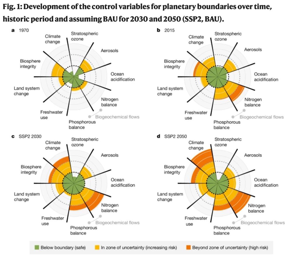
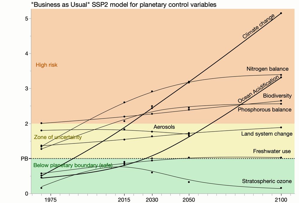
May 26, 2025 at 2:32 PM
Remaking radar charts; nine planetary control variables over time (past and future-modeled). Thought I could get by with all lines the same color and style but did make the two fast climbers thicker. #dataviz
Original www.nature.com/articles/s41....
Original www.nature.com/articles/s41....


Another experiment replacing summary bars of integer data with jittered dots having a violin profile. Original #dataviz from link.springer.com/article/10.1...

May 18, 2025 at 8:58 PM
Another experiment replacing summary bars of integer data with jittered dots having a violin profile. Original #dataviz from link.springer.com/article/10.1...
Reposted by Xan Gregg

One thing I’ve noticed as people move away from the rainbow palette is more use of divergent palettes for sequential data. That’s not *always* a bad idea, but often is. This example inadvertently de-emphasizes states (Colorado) where people hear about climate change more frequently.
#dataviz 📊
#dataviz 📊
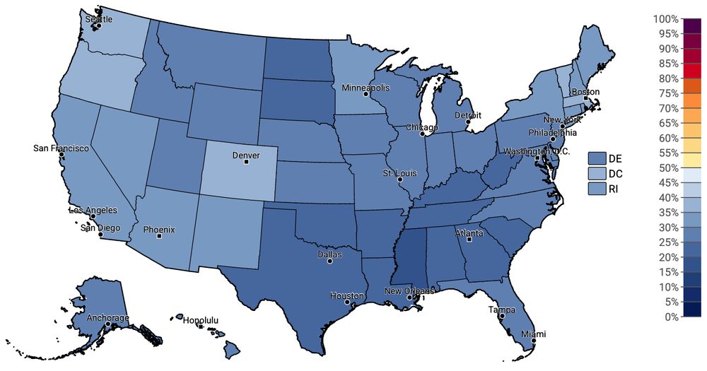
May 16, 2025 at 6:50 PM
One thing I’ve noticed as people move away from the rainbow palette is more use of divergent palettes for sequential data. That’s not *always* a bad idea, but often is. This example inadvertently de-emphasizes states (Colorado) where people hear about climate change more frequently.
#dataviz 📊
#dataviz 📊