

Fil
@fil.rezo.net
1.8K followers
1.5K following
130 posts
maps | data | code | journalism
#D3 & #Observable
👁️🗨️ https://observablehq.com/@fil
🌍 https://visionscarto.net/
Posts
Media
Videos
Starter Packs
Pinned

Reposted by Fil
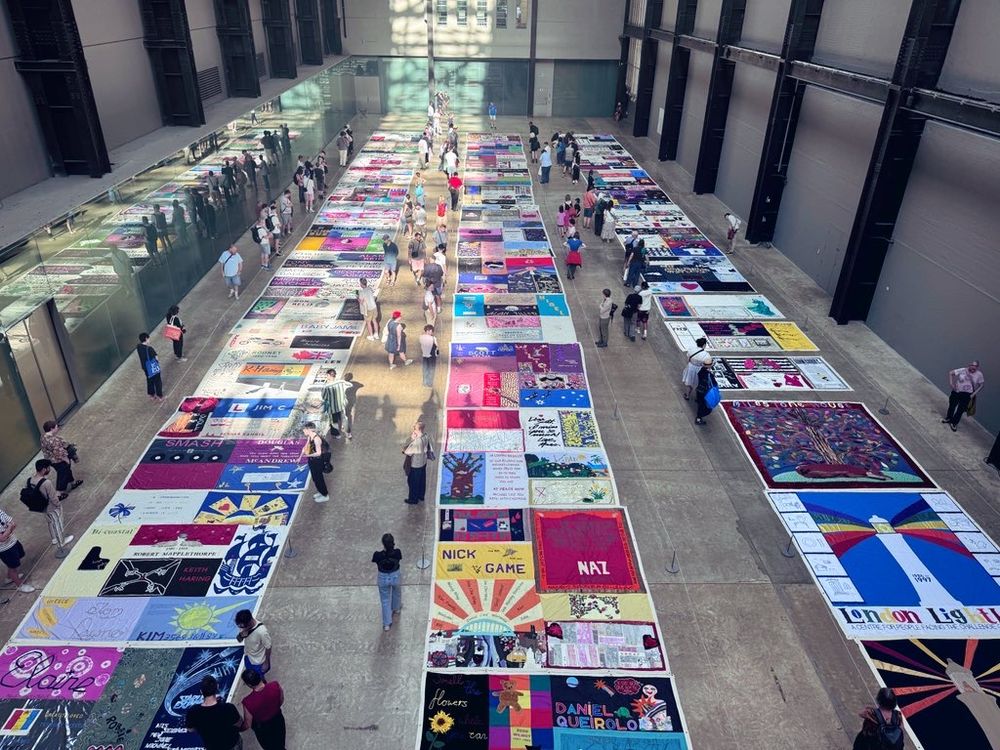
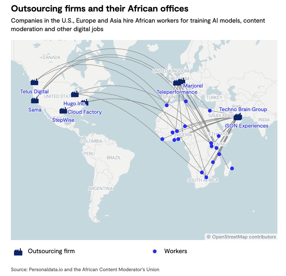
Yusuf
@yusufimaadkhan.com
· Aug 28


Reposted by Fil

Reposted by Fil


Reposted by Fil


Reposted by Fil


Reposted by Fil

Reposted by Fil

Reposted by Fil


Reposted by Fil


Reposted by Fil

Reposted by Fil


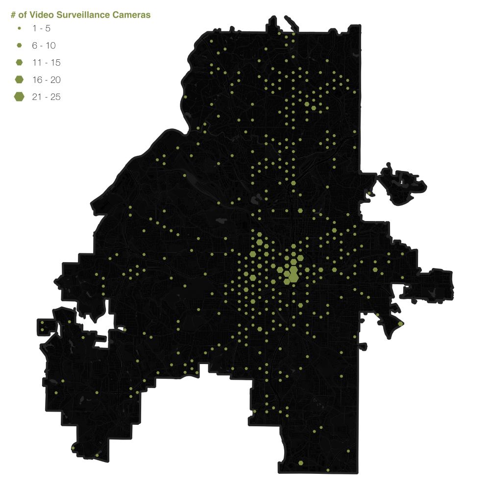
Fil
@fil.rezo.net
· May 18


Reposted by Fil

Reposted by Fil

Robert Simmon
@rsimmon.bsky.social
· May 10


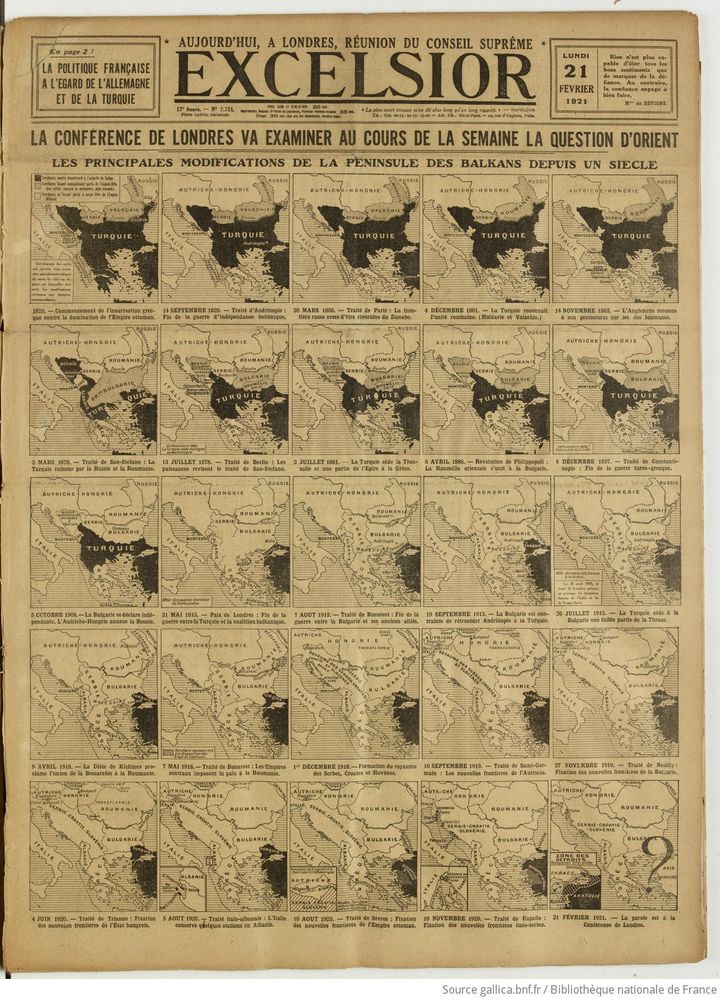
Fil
@fil.rezo.net
· May 8
Reposted by Fil


Reposted by Fil


Reposted by Fil
Reposted by Fil