


Caroline Holmes
@climatecaroline.bsky.social
Scientist at @bas.ac.uk ; all things Antarctic sea ice and climate.
Defy anywhere to outdo the penguin christmas jumper selection at the @bas.ac.uk christmas lunch 🐧❄️🎄
December 12, 2024 at 2:05 PM
Defy anywhere to outdo the penguin christmas jumper selection at the @bas.ac.uk christmas lunch 🐧❄️🎄

Reposted by Caroline Holmes
The first images coming in from Sentinel 1C! With these first examples over Svalbard offering a glimpse of the boon it will be for sea ice monitoring and process understanding
www.esa.int/Applications...
www.esa.int/Applications...
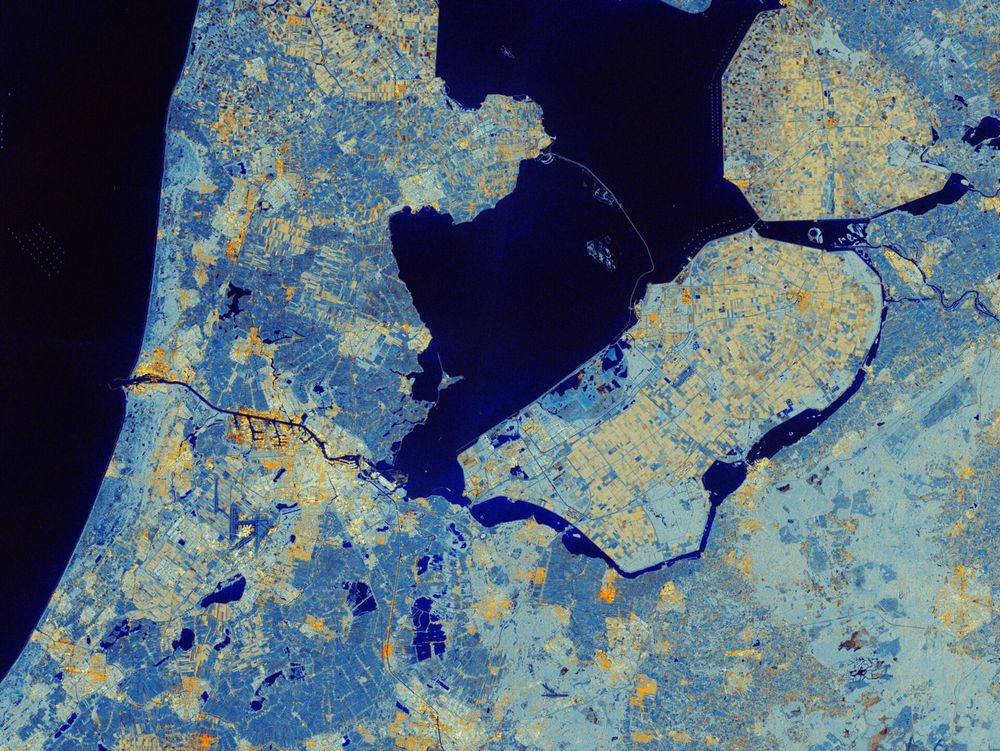
Sentinel-1C captures first radar images
Less than a week after its launch, the Copernicus Sentinel-1C satellite has delivered its first radar images of Earth – offering a glimpse into its capabilities for environmental monitoring. These ini...
www.esa.int
December 11, 2024 at 7:25 AM
The first images coming in from Sentinel 1C! With these first examples over Svalbard offering a glimpse of the boon it will be for sea ice monitoring and process understanding
www.esa.int/Applications...
www.esa.int/Applications...
Reposted by Caroline Holmes
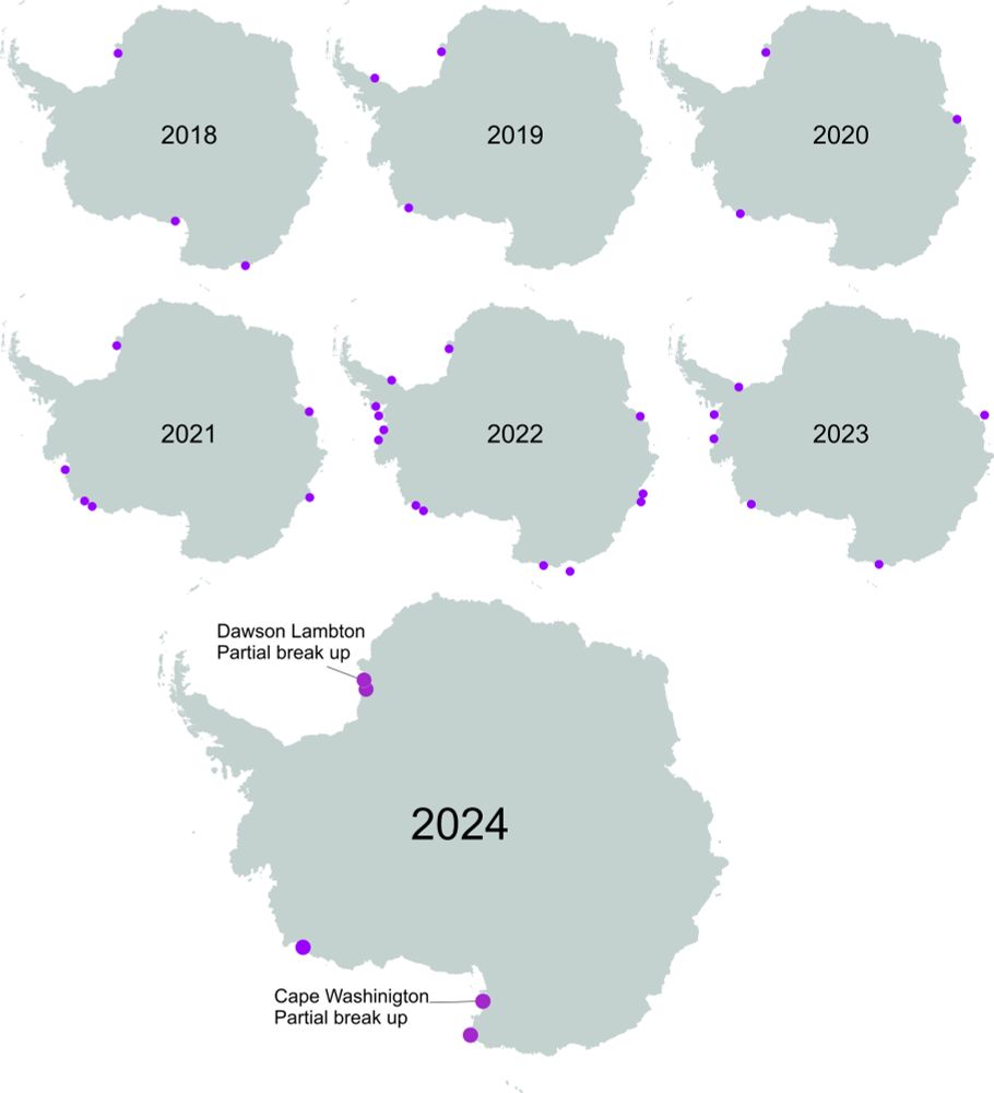
At the start of the emperor penguin chick fledging season five colonies have already been affected by early sea ice breakup. The purple dots below show which ones. Not as bad as the last two years, but worse than average.
December 9, 2024 at 1:08 PM
At the start of the emperor penguin chick fledging season five colonies have already been affected by early sea ice breakup. The purple dots below show which ones. Not as bad as the last two years, but worse than average.
Reposted by Caroline Holmes
This is oceanography the hard way.
Before any instruments or samplers are deployed, we hot water drill an access hole through several hundred metres of ice shelf. Don't dilly-dally though, freezing closes the hole in a day or two.
Before any instruments or samplers are deployed, we hot water drill an access hole through several hundred metres of ice shelf. Don't dilly-dally though, freezing closes the hole in a day or two.
November 26, 2024 at 2:26 PM
This is oceanography the hard way.
Before any instruments or samplers are deployed, we hot water drill an access hole through several hundred metres of ice shelf. Don't dilly-dally though, freezing closes the hole in a day or two.
Before any instruments or samplers are deployed, we hot water drill an access hole through several hundred metres of ice shelf. Don't dilly-dally though, freezing closes the hole in a day or two.
Hi Bluesky! We have a paper out today in The Cryosphere: doi.org/10.5194/tc-1... about Antarctic sea ice trends in observations and climate models (+huge thanks to co-authors, not on BlueSky) (thread: 1/6)

Brief communication: New perspectives on the skill of modelled sea ice trends in light of recent Antarctic sea ice loss
Abstract. Most climate models do not reproduce the 1979–2014 increase in Antarctic sea ice cover. This was a contributing factor in successive Intergovernmental Panel on Climate Change reports allocat...
doi.org
December 5, 2024 at 9:29 AM
Hi Bluesky! We have a paper out today in The Cryosphere: doi.org/10.5194/tc-1... about Antarctic sea ice trends in observations and climate models (+huge thanks to co-authors, not on BlueSky) (thread: 1/6)