


Hugh Millward
@hmillward.bsky.social
Professor Emeritus of geography & environmental studies, Saint Mary's University, Canada.
Interested in mapping, urban planning, transportation, time use, Nova Scotia
#geography #location #maps #transportation #urban
Interested in mapping, urban planning, transportation, time use, Nova Scotia
#geography #location #maps #transportation #urban
Reposted by Hugh Millward

On Sunday, Line 5 Eglinton opens! To better understand this corridor, we layered the route alignment relative to surrounding building footprints; space for cars, bikes & pedestrians; zoning; green space; pop. density; household income & senior populations https://ow.ly/ojyb50YaunQ

February 6, 2026 at 9:09 PM
On Sunday, Line 5 Eglinton opens! To better understand this corridor, we layered the route alignment relative to surrounding building footprints; space for cars, bikes & pedestrians; zoning; green space; pop. density; household income & senior populations https://ow.ly/ojyb50YaunQ


Reposted by Hugh Millward

#GIS #Geography Asked everyone who has come into lab (or interviewed for work/grad school) "who invented GIS, when, where & why?" No one. Not one person knew of late friend & mentor Dr. Roger Tomlinson OC FRCGS. This. This should be mandatory viewing for incoming classes!
www.nfb.ca/film/data_fo...
www.nfb.ca/film/data_fo...

Data for Decision
This short documentary is a portrait of the early era of computing and the process and implications of the digitization of large amounts of information. Examining the arduous …
www.nfb.ca
February 6, 2026 at 5:21 PM
#GIS #Geography Asked everyone who has come into lab (or interviewed for work/grad school) "who invented GIS, when, where & why?" No one. Not one person knew of late friend & mentor Dr. Roger Tomlinson OC FRCGS. This. This should be mandatory viewing for incoming classes!
www.nfb.ca/film/data_fo...
www.nfb.ca/film/data_fo...
Reposted by Hugh Millward
Brazil map showing Land cover for year 2000 🇧🇷 with Amazon Forest dominating — Making it Earth's Lungs
🗺️ Hemed Juma Lungo | Datasource GLC2000 ~ from DIVAGIS
#gischat #Brazil #LandCover #GIS #Cartography #RemoteSensing #Biodiversity
🗺️ Hemed Juma Lungo | Datasource GLC2000 ~ from DIVAGIS
#gischat #Brazil #LandCover #GIS #Cartography #RemoteSensing #Biodiversity

February 5, 2026 at 10:09 AM
Brazil map showing Land cover for year 2000 🇧🇷 with Amazon Forest dominating — Making it Earth's Lungs
🗺️ Hemed Juma Lungo | Datasource GLC2000 ~ from DIVAGIS
#gischat #Brazil #LandCover #GIS #Cartography #RemoteSensing #Biodiversity
🗺️ Hemed Juma Lungo | Datasource GLC2000 ~ from DIVAGIS
#gischat #Brazil #LandCover #GIS #Cartography #RemoteSensing #Biodiversity

Recent growth mostly in Sunbelt and Mountain West.
www.visualcapitalist.com/us-populatio...
www.visualcapitalist.com/us-populatio...

Mapped: U.S. Population Growth by State (2020-2025)
Population growth by state since 2020 shows which states gained and lost the most residents, and how the U.S. map is changing.
www.visualcapitalist.com
February 6, 2026 at 6:36 PM
Recent growth mostly in Sunbelt and Mountain West.
www.visualcapitalist.com/us-populatio...
www.visualcapitalist.com/us-populatio...
Reposted by Hugh Millward

"Geographical Definitions Illustrated, 1893" This is probably still the best visualisation of its kind that I've ever seen! Source: buff.ly/CMe6rYn

February 6, 2026 at 3:05 PM
"Geographical Definitions Illustrated, 1893" This is probably still the best visualisation of its kind that I've ever seen! Source: buff.ly/CMe6rYn
Reposted by Hugh Millward

The latest animation of weather systems keeps the storms passing well south until at least next Thursday. So fine overall but on the cold side. North winds trigger occasional snow off Fundy & Gulf. Then could be some snow next Thursday... but OK for the following weekend?
February 6, 2026 at 12:21 PM
The latest animation of weather systems keeps the storms passing well south until at least next Thursday. So fine overall but on the cold side. North winds trigger occasional snow off Fundy & Gulf. Then could be some snow next Thursday... but OK for the following weekend?
Reposted by Hugh Millward

Some interesting ECMWF ensemble trends for northern Europe lately.
Firstly, toward higher pressure to the north late next week, with low pressure tracking further south & a greater incursion of cold air across north-western Europe. A notable snow risk for the UK & Ireland.
Firstly, toward higher pressure to the north late next week, with low pressure tracking further south & a greater incursion of cold air across north-western Europe. A notable snow risk for the UK & Ireland.
February 6, 2026 at 12:23 PM
Some interesting ECMWF ensemble trends for northern Europe lately.
Firstly, toward higher pressure to the north late next week, with low pressure tracking further south & a greater incursion of cold air across north-western Europe. A notable snow risk for the UK & Ireland.
Firstly, toward higher pressure to the north late next week, with low pressure tracking further south & a greater incursion of cold air across north-western Europe. A notable snow risk for the UK & Ireland.
Reposted by Hugh Millward

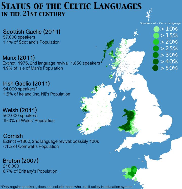
Modern Distribution of Celtic Languages In The 21st Century
More about them: brilliantmaps.com/celtic-la...
More about them: brilliantmaps.com/celtic-la...
February 6, 2026 at 1:01 PM
Modern Distribution of Celtic Languages In The 21st Century
More about them: brilliantmaps.com/celtic-la...
More about them: brilliantmaps.com/celtic-la...

Reposted by Hugh Millward

And even where it is legal, midrise is the most expensive form of construction there is, so it tends to price out families.

February 4, 2026 at 8:36 PM
And even where it is legal, midrise is the most expensive form of construction there is, so it tends to price out families.
Reposted by Hugh Millward
20 years ago, I bought a new 1,200 sq. ft., 3-bedroom, single-detached home. We no longer build these in most of Canada. In today's episode, we examine why and how young people are often unable to move out of their small apartments.
Watch here: www.youtube.com/watc...
Watch here: www.youtube.com/watc...

February 4, 2026 at 2:38 PM
20 years ago, I bought a new 1,200 sq. ft., 3-bedroom, single-detached home. We no longer build these in most of Canada. In today's episode, we examine why and how young people are often unable to move out of their small apartments.
Watch here: www.youtube.com/watc...
Watch here: www.youtube.com/watc...
Reposted by Hugh Millward

Indian government allocated $32 b for capital expenditures on its railways in 2026. This includes initial funds for 7 additional high-speed lines on 2,500 mi, adding to the 316 mi Mumbai–Ahmedabad Line, now under construction (the US Northeast Corridor is 450 mi). www.railjournal.com/passenger/hi...

February 5, 2026 at 1:37 PM
Indian government allocated $32 b for capital expenditures on its railways in 2026. This includes initial funds for 7 additional high-speed lines on 2,500 mi, adding to the 316 mi Mumbai–Ahmedabad Line, now under construction (the US Northeast Corridor is 450 mi). www.railjournal.com/passenger/hi...
Reposted by Hugh Millward

🛣️ Maximum speed limits around the world.

February 5, 2026 at 1:44 PM
🛣️ Maximum speed limits around the world.
Reposted by Hugh Millward

February 4, 2026 at 8:01 PM
Reposted by Hugh Millward
The Global Dispersal of Humankind From Africa to Everywhere (Numbers Are Thousands of Years Ago)
Estimated Population Figures Over Time: brilliantmaps.com/human-exp...
Estimated Population Figures Over Time: brilliantmaps.com/human-exp...

February 4, 2026 at 9:01 PM
The Global Dispersal of Humankind From Africa to Everywhere (Numbers Are Thousands of Years Ago)
Estimated Population Figures Over Time: brilliantmaps.com/human-exp...
Estimated Population Figures Over Time: brilliantmaps.com/human-exp...
Reposted by Hugh Millward
How salty is your bit of ocean? The Mediterranean is very salty. Where rivers flow into the ocean water is less salty. Fascinating map to study. Source: buff.ly/knrOS7J

February 4, 2026 at 6:05 PM
How salty is your bit of ocean? The Mediterranean is very salty. Where rivers flow into the ocean water is less salty. Fascinating map to study. Source: buff.ly/knrOS7J
Reposted by Hugh Millward

February 4, 2026 at 4:01 PM
Reposted by Hugh Millward
Sharp division in European temperature this afternoon. A feel of early spring in the air across S UK and France.
After a mild December this winter is becoming very cold in E-NE Europe with no end in sight to strong freeze.
After a mild December this winter is becoming very cold in E-NE Europe with no end in sight to strong freeze.

February 4, 2026 at 4:03 PM
Sharp division in European temperature this afternoon. A feel of early spring in the air across S UK and France.
After a mild December this winter is becoming very cold in E-NE Europe with no end in sight to strong freeze.
After a mild December this winter is becoming very cold in E-NE Europe with no end in sight to strong freeze.
Reposted by Hugh Millward


Useful. But what about north of 49° ?

The Utah Historical Society just produced a new, excellent map of "The Peoples of North America in 1776." Great resource for anyone teaching, writing, presenting about Native peoples as part of their 250th work. america250.utah.gov/power-of-pla...

February 4, 2026 at 2:28 PM
Useful. But what about north of 49° ?

Interesting. But should focus on dwellings per household, not dwellings per capita www.policyalternatives.ca/news-researc...

The numbers don’t lie: The housing crisis is not caused by a supply shortage - CCPA
Financialization, not demographics, caused the cost of housing to explode
www.policyalternatives.ca
February 4, 2026 at 2:09 PM
Interesting. But should focus on dwellings per household, not dwellings per capita www.policyalternatives.ca/news-researc...