


Juliana Taube
@julianataube.bsky.social
phd student @ georgetown • aspiring infectious disease modeler • she/her
jtaube.github.io
jtaube.github.io
Reposted by Juliana Taube
Late advertisement of our new pre-print:
Contact structure and population immunity shape the selective advantage of emerging variants www.medrxiv.org/content/10.1...
Contact structure and population immunity shape the selective advantage of emerging variants www.medrxiv.org/content/10.1...

November 27, 2025 at 10:15 AM
Late advertisement of our new pre-print:
Contact structure and population immunity shape the selective advantage of emerging variants www.medrxiv.org/content/10.1...
Contact structure and population immunity shape the selective advantage of emerging variants www.medrxiv.org/content/10.1...
Reposted by Juliana Taube
One week left to apply to the UVA Biology PhD program! If you or someone you know are interested in contagion from a complex systems perspective, please reach out! I'm looking for a grad student! bio.as.virginia.edu/how-apply-gr...
How to Apply to the Graduate Program
bio.as.virginia.edu
November 25, 2025 at 4:31 PM
One week left to apply to the UVA Biology PhD program! If you or someone you know are interested in contagion from a complex systems perspective, please reach out! I'm looking for a grad student! bio.as.virginia.edu/how-apply-gr...
Reposted by Juliana Taube
A new postdoc position just opened in our group at NAU! We are looking for someone to lead our current forecasting activities and the development of our next generation AI/ML models! Don't hesitate to reach out to me with any questions! careers.nau.edu/jobs/postdoc...

Postdoctoral Scholar - Flagstaff, Arizona, United States
Special Information
This position is an on-site position which requires the incumbent to complete their work primarily at an NAU site, campus, or facility with or without accommodation. Opportunities...
careers.nau.edu
November 4, 2025 at 9:46 PM
A new postdoc position just opened in our group at NAU! We are looking for someone to lead our current forecasting activities and the development of our next generation AI/ML models! Don't hesitate to reach out to me with any questions! careers.nau.edu/jobs/postdoc...
Reposted by Juliana Taube

This month, no colloquium but a special session about careers in network science! Join us and an all-star panel on October 29. Register here for a Zoom link: iu.zoom.us/webinar/regi...

October 13, 2025 at 8:45 PM
This month, no colloquium but a special session about careers in network science! Join us and an all-star panel on October 29. Register here for a Zoom link: iu.zoom.us/webinar/regi...
Reposted by Juliana Taube
We are currently accepting submissions for lightning talks to showcase the wide variety of tools and visualizations people have created. All formats are welcome (dashboards, animations, graphics, story-driven websites, etc.). See the website for more info!

October 10, 2025 at 2:26 PM
We are currently accepting submissions for lightning talks to showcase the wide variety of tools and visualizations people have created. All formats are welcome (dashboards, animations, graphics, story-driven websites, etc.). See the website for more info!
Reposted by Juliana Taube

I'm v excited to be recruiting a PhD student to work on badger behaviour and ecology! Starting date is March 2026; see the ad here, or message me for more details: www.gregalbery.me/s/March-2026...

October 3, 2025 at 2:05 PM
I'm v excited to be recruiting a PhD student to work on badger behaviour and ecology! Starting date is March 2026; see the ad here, or message me for more details: www.gregalbery.me/s/March-2026...
Reposted by Juliana Taube
Newly expanded version of my guide to scientific writing -- known as the “15 steps” -- published in PLOS Computational Biology. Special thanks to Éric Marty for creating a fantastic visualization.
Check it out: journals.plos.org/ploscompbiol...
#ScientificWriting #PLOSComputationalBiology
Check it out: journals.plos.org/ploscompbiol...
#ScientificWriting #PLOSComputationalBiology

September 24, 2025 at 5:54 PM
Newly expanded version of my guide to scientific writing -- known as the “15 steps” -- published in PLOS Computational Biology. Special thanks to Éric Marty for creating a fantastic visualization.
Check it out: journals.plos.org/ploscompbiol...
#ScientificWriting #PLOSComputationalBiology
Check it out: journals.plos.org/ploscompbiol...
#ScientificWriting #PLOSComputationalBiology
Reposted by Juliana Taube

Hear more about it tomorrow at noon eastern in a webinar hosted by the @midas-network.bsky.social trainee network!
georgetown.zoom.us/meeting/regi...
georgetown.zoom.us/meeting/regi...
September 24, 2025 at 11:57 PM
Hear more about it tomorrow at noon eastern in a webinar hosted by the @midas-network.bsky.social trainee network!
georgetown.zoom.us/meeting/regi...
georgetown.zoom.us/meeting/regi...
Reposted by Juliana Taube
Ever read a paper & think, "wow 🤩 that was well written"?
Learn how to write your own *wow* paper with @midas-network.bsky.social trainees on Thurs 9/25 @ noon ET.
We'll hear from @jdrakephd.bsky.social on strategies for crafting & communicating a good story.
🔗 georgetown.zoom.us/meeting/regi...
Learn how to write your own *wow* paper with @midas-network.bsky.social trainees on Thurs 9/25 @ noon ET.
We'll hear from @jdrakephd.bsky.social on strategies for crafting & communicating a good story.
🔗 georgetown.zoom.us/meeting/regi...

September 11, 2025 at 6:03 PM
Ever read a paper & think, "wow 🤩 that was well written"?
Learn how to write your own *wow* paper with @midas-network.bsky.social trainees on Thurs 9/25 @ noon ET.
We'll hear from @jdrakephd.bsky.social on strategies for crafting & communicating a good story.
🔗 georgetown.zoom.us/meeting/regi...
Learn how to write your own *wow* paper with @midas-network.bsky.social trainees on Thurs 9/25 @ noon ET.
We'll hear from @jdrakephd.bsky.social on strategies for crafting & communicating a good story.
🔗 georgetown.zoom.us/meeting/regi...
Reposted by Juliana Taube
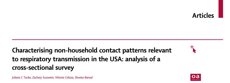
Our paper on US contact patterns is now published in The Lancet Digital Health!
doi.org/10.1016/j.la...
Thanks to my brilliant coauthors @zsusswein.bsky.social, @vcolizza.bsky.social, & @bansallab.bsky.social for their help with this project.
Read on for an overview of our findings... 🧵
doi.org/10.1016/j.la...
Thanks to my brilliant coauthors @zsusswein.bsky.social, @vcolizza.bsky.social, & @bansallab.bsky.social for their help with this project.
Read on for an overview of our findings... 🧵
September 12, 2025 at 4:36 PM
Our paper on US contact patterns is now published in The Lancet Digital Health!
doi.org/10.1016/j.la...
Thanks to my brilliant coauthors @zsusswein.bsky.social, @vcolizza.bsky.social, & @bansallab.bsky.social for their help with this project.
Read on for an overview of our findings... 🧵
doi.org/10.1016/j.la...
Thanks to my brilliant coauthors @zsusswein.bsky.social, @vcolizza.bsky.social, & @bansallab.bsky.social for their help with this project.
Read on for an overview of our findings... 🧵
September 12, 2025 at 4:36 PM
Our paper on US contact patterns is now published in The Lancet Digital Health!
doi.org/10.1016/j.la...
Thanks to my brilliant coauthors @zsusswein.bsky.social, @vcolizza.bsky.social, & @bansallab.bsky.social for their help with this project.
Read on for an overview of our findings... 🧵
doi.org/10.1016/j.la...
Thanks to my brilliant coauthors @zsusswein.bsky.social, @vcolizza.bsky.social, & @bansallab.bsky.social for their help with this project.
Read on for an overview of our findings... 🧵
Ever read a paper & think, "wow 🤩 that was well written"?
Learn how to write your own *wow* paper with @midas-network.bsky.social trainees on Thurs 9/25 @ noon ET.
We'll hear from @jdrakephd.bsky.social on strategies for crafting & communicating a good story.
🔗 georgetown.zoom.us/meeting/regi...
Learn how to write your own *wow* paper with @midas-network.bsky.social trainees on Thurs 9/25 @ noon ET.
We'll hear from @jdrakephd.bsky.social on strategies for crafting & communicating a good story.
🔗 georgetown.zoom.us/meeting/regi...
September 11, 2025 at 6:03 PM
Ever read a paper & think, "wow 🤩 that was well written"?
Learn how to write your own *wow* paper with @midas-network.bsky.social trainees on Thurs 9/25 @ noon ET.
We'll hear from @jdrakephd.bsky.social on strategies for crafting & communicating a good story.
🔗 georgetown.zoom.us/meeting/regi...
Learn how to write your own *wow* paper with @midas-network.bsky.social trainees on Thurs 9/25 @ noon ET.
We'll hear from @jdrakephd.bsky.social on strategies for crafting & communicating a good story.
🔗 georgetown.zoom.us/meeting/regi...
Reposted by Juliana Taube
MIDAS Trainee Network Hosts Event on How to Write a Strong Manuscript.
Register: georgetown.zoom.us/meeting/regi...
Register: georgetown.zoom.us/meeting/regi...

September 10, 2025 at 12:50 PM
MIDAS Trainee Network Hosts Event on How to Write a Strong Manuscript.
Register: georgetown.zoom.us/meeting/regi...
Register: georgetown.zoom.us/meeting/regi...
Reposted by Juliana Taube
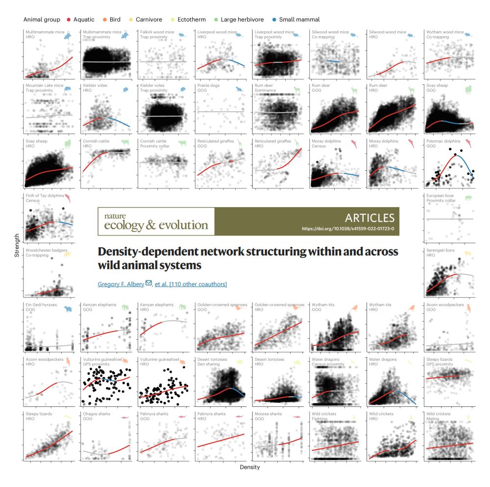
Celebrating the publication of our big collaborative spatial-social meta-analysis of density-dependent transmission effects, out now in Nature Eco Evo! doi.org/10.1038/s415... (or rdcu.be/eD6eB)
September 8, 2025 at 2:53 PM
Celebrating the publication of our big collaborative spatial-social meta-analysis of density-dependent transmission effects, out now in Nature Eco Evo! doi.org/10.1038/s415... (or rdcu.be/eD6eB)
Reposted by Juliana Taube
Enough is enough. The health of the country is in danger. Read our resignation letters: insidemedicine.substack.com/p/breaking-n...
Breaking News: Read three top CDC officials' resignation emails.
The end of an era.
insidemedicine.substack.com
August 28, 2025 at 3:38 AM
Enough is enough. The health of the country is in danger. Read our resignation letters: insidemedicine.substack.com/p/breaking-n...
Reposted by Juliana Taube
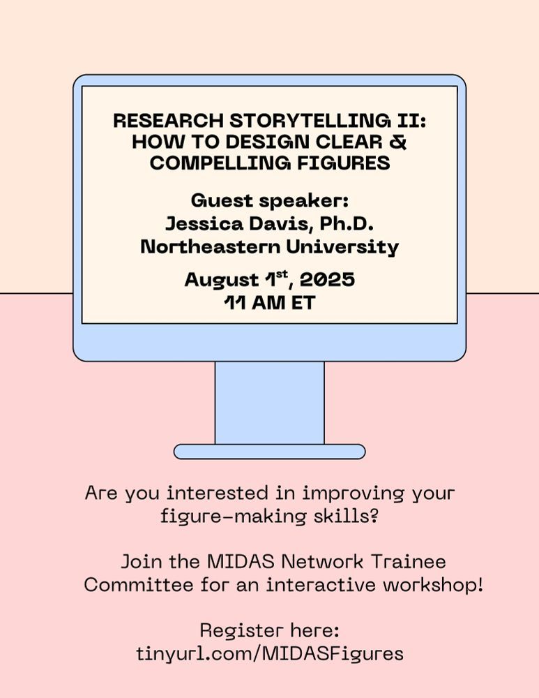
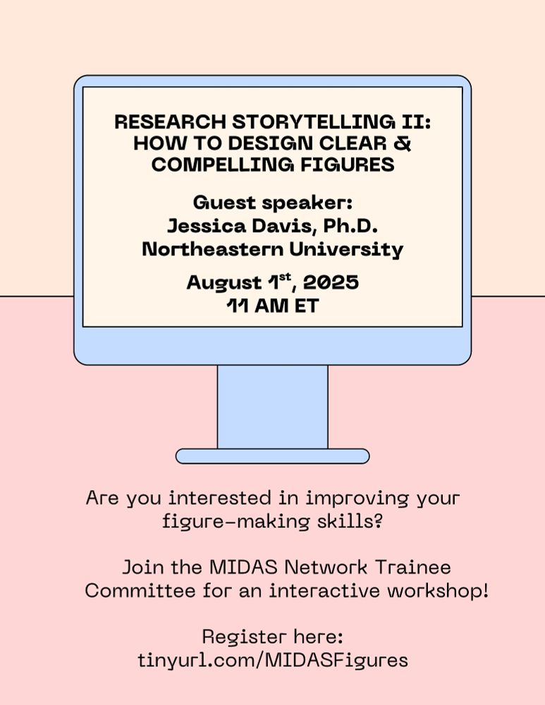
Join the MIDAS Network Trainee Committee for an interactive workshop.
Register: tinyurl.com/MIDASFigures
Register: tinyurl.com/MIDASFigures
July 29, 2025 at 12:46 PM
Join the MIDAS Network Trainee Committee for an interactive workshop.
Register: tinyurl.com/MIDASFigures
Register: tinyurl.com/MIDASFigures
📊🤔 Are your scientific figures cluttered or confusing?
Join @midas-network.bsky.social trainees & speaker @jessica-davis.bsky.social at 11AM ET on Aug 1 to practice designing visuals that effectively tell your story.
Bring a figure draft to revise!
Register: tinyurl.com/MIDASFigures
Join @midas-network.bsky.social trainees & speaker @jessica-davis.bsky.social at 11AM ET on Aug 1 to practice designing visuals that effectively tell your story.
Bring a figure draft to revise!
Register: tinyurl.com/MIDASFigures
July 21, 2025 at 6:32 PM
📊🤔 Are your scientific figures cluttered or confusing?
Join @midas-network.bsky.social trainees & speaker @jessica-davis.bsky.social at 11AM ET on Aug 1 to practice designing visuals that effectively tell your story.
Bring a figure draft to revise!
Register: tinyurl.com/MIDASFigures
Join @midas-network.bsky.social trainees & speaker @jessica-davis.bsky.social at 11AM ET on Aug 1 to practice designing visuals that effectively tell your story.
Bring a figure draft to revise!
Register: tinyurl.com/MIDASFigures
Reposted by Juliana Taube

To me, this is one of the most frightening moves so far in the dismantling of public health - stacking ACIP so it'll fall in line. Americans deserve evidence-based vaccine policy, lest we return to an age when childhood polio deaths were a routine event.
As expected, RFK Jr. was lying during his confirmation hearing and now is ratfucking the vaccination system in the US.
The vast majority of the public does not want this and yet again it’s clear that the Republican administration does not serve the electorate.
The vast majority of the public does not want this and yet again it’s clear that the Republican administration does not serve the electorate.

Kennedy Removes All C.D.C. Vaccine Panel Experts
www.nytimes.com
June 10, 2025 at 12:36 AM
To me, this is one of the most frightening moves so far in the dismantling of public health - stacking ACIP so it'll fall in line. Americans deserve evidence-based vaccine policy, lest we return to an age when childhood polio deaths were a routine event.
Reposted by Juliana Taube
Don't forget about tomorrow's MIDAS Trainee Workshop.

June 5, 2025 at 12:59 PM
Don't forget about tomorrow's MIDAS Trainee Workshop.
Reposted by Juliana Taube
Nearly 11 million Americans could lose health insurance as a result of the administration's effort to cut spending in order to finance tax cuts for the wealthy, the congressional budget office estimates. www.statnews.com/2025/06/04/t...

10.9 million people would lose health insurance under Trump’s tax cut bill, CBO projects
'Big, beautiful bill' would result in 10.9 million people losing health insurance, primarily Medicaid.
www.statnews.com
June 4, 2025 at 2:42 PM
Nearly 11 million Americans could lose health insurance as a result of the administration's effort to cut spending in order to finance tax cuts for the wealthy, the congressional budget office estimates. www.statnews.com/2025/06/04/t...
Reposted by Juliana Taube
If you burn down a forest, you don't miss out on lumber for just that season. You have to replant all the trees, nurture them, and wait for them to grow.
The science and research budget cuts happening now are wanton, senseless arson. Recovery, if it ever happens, will take generations.
The science and research budget cuts happening now are wanton, senseless arson. Recovery, if it ever happens, will take generations.
June 3, 2025 at 9:02 PM
If you burn down a forest, you don't miss out on lumber for just that season. You have to replant all the trees, nurture them, and wait for them to grow.
The science and research budget cuts happening now are wanton, senseless arson. Recovery, if it ever happens, will take generations.
The science and research budget cuts happening now are wanton, senseless arson. Recovery, if it ever happens, will take generations.
Reposted by Juliana Taube
Don't forget about the MIDAS Trainee Network workshop this week.
Want to make your research presentations more compelling and accessible? Join @midas-network.bsky.social trainees for a workshop on how to give an effective research talk!
We'll hear from @anaisabelbento.bsky.social on how to tailor talks for different audiences & then apply what we've learned.
We'll hear from @anaisabelbento.bsky.social on how to tailor talks for different audiences & then apply what we've learned.

June 2, 2025 at 12:41 PM
Don't forget about the MIDAS Trainee Network workshop this week.
Want to make your research presentations more compelling and accessible? Join @midas-network.bsky.social trainees for a workshop on how to give an effective research talk!
We'll hear from @anaisabelbento.bsky.social on how to tailor talks for different audiences & then apply what we've learned.
We'll hear from @anaisabelbento.bsky.social on how to tailor talks for different audiences & then apply what we've learned.
May 27, 2025 at 2:19 PM
Want to make your research presentations more compelling and accessible? Join @midas-network.bsky.social trainees for a workshop on how to give an effective research talk!
We'll hear from @anaisabelbento.bsky.social on how to tailor talks for different audiences & then apply what we've learned.
We'll hear from @anaisabelbento.bsky.social on how to tailor talks for different audiences & then apply what we've learned.
Reposted by Juliana Taube

Must-read post by Your Local Epidemiologist on new FDA COVID vax policy.
👉 "This is about how decisions are made—and who gets to make them. FDA political appointees are sidelining expert panels, bypassing transparency, & turning public health into a performance."
open.substack.com/pub/yourloca...
👉 "This is about how decisions are made—and who gets to make them. FDA political appointees are sidelining expert panels, bypassing transparency, & turning public health into a performance."
open.substack.com/pub/yourloca...
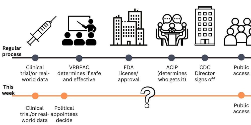
Covid-19 vaccines, what just happened at the FDA, and why it matters
This is not how vaccine policy should be made.
open.substack.com
May 21, 2025 at 3:44 PM
Must-read post by Your Local Epidemiologist on new FDA COVID vax policy.
👉 "This is about how decisions are made—and who gets to make them. FDA political appointees are sidelining expert panels, bypassing transparency, & turning public health into a performance."
open.substack.com/pub/yourloca...
👉 "This is about how decisions are made—and who gets to make them. FDA political appointees are sidelining expert panels, bypassing transparency, & turning public health into a performance."
open.substack.com/pub/yourloca...
Reposted by Juliana Taube
ATTENTION: NSF GRANT RECIPIENTS
We received a heads up from a trusted source that you should proactively download/print/screen shot any documentation on research.gov pertaining to your NSF awards, both those that are current and any that have closed in the last 5-6 years.
1/n
We received a heads up from a trusted source that you should proactively download/print/screen shot any documentation on research.gov pertaining to your NSF awards, both those that are current and any that have closed in the last 5-6 years.
1/n

a cartoon of a man holding a frying pan and a spoon with red alert written above him
ALT: a cartoon of a man holding a frying pan and a spoon with red alert written above him
media.tenor.com
April 24, 2025 at 9:09 PM
ATTENTION: NSF GRANT RECIPIENTS
We received a heads up from a trusted source that you should proactively download/print/screen shot any documentation on research.gov pertaining to your NSF awards, both those that are current and any that have closed in the last 5-6 years.
1/n
We received a heads up from a trusted source that you should proactively download/print/screen shot any documentation on research.gov pertaining to your NSF awards, both those that are current and any that have closed in the last 5-6 years.
1/n