


Juuso Koponen
@juusokoponen.bsky.social
📊 Information designer/data journalist, Koponen+Hildén
Co-author, “Data Visualization Handbook”
Teacher, data journalism & visualization at Haaga-Helia etc.
DJ
❤️ Maurizio, XCOM 2, GitS, Vernaccia di S. Gimignano
Output in 🇫🇮🇬🇧
Input also in 🇸🇪🇮🇹
Co-author, “Data Visualization Handbook”
Teacher, data journalism & visualization at Haaga-Helia etc.
DJ
❤️ Maurizio, XCOM 2, GitS, Vernaccia di S. Gimignano
Output in 🇫🇮🇬🇧
Input also in 🇸🇪🇮🇹
The NSFW detection AI is giving some DJ Assault vibes 🍑🍉🍉

here's my first test at annotating/blurring a video. It needs some work to be less flickery but it's a start.
November 26, 2025 at 10:04 AM
The NSFW detection AI is giving some DJ Assault vibes 🍑🍉🍉
Yle haastatteli Etlan ennustepäällikkö Päivi Puontia, jonka mukaan ”noin 44 % työttömyyden kasvusta selittyy maahanmuutolla”.
Vaikka väite perustuu sinänsä pätevään tilastotietoon ja luku kertoo todellisesta, kiinnostavasta ilmiöstä, väite sellaisenaan ei ole useammastakaan syystä tosi. 1/11
Vaikka väite perustuu sinänsä pätevään tilastotietoon ja luku kertoo todellisesta, kiinnostavasta ilmiöstä, väite sellaisenaan ei ole useammastakaan syystä tosi. 1/11
November 25, 2025 at 1:45 PM
Yle haastatteli Etlan ennustepäällikkö Päivi Puontia, jonka mukaan ”noin 44 % työttömyyden kasvusta selittyy maahanmuutolla”.
Vaikka väite perustuu sinänsä pätevään tilastotietoon ja luku kertoo todellisesta, kiinnostavasta ilmiöstä, väite sellaisenaan ei ole useammastakaan syystä tosi. 1/11
Vaikka väite perustuu sinänsä pätevään tilastotietoon ja luku kertoo todellisesta, kiinnostavasta ilmiöstä, väite sellaisenaan ei ole useammastakaan syystä tosi. 1/11
Hard agree. Vaikka ”ultraprosessoitu” ruoka on usein terveydelle haitallista, prosessoinnin määrä ei suoraan kerro miten terveellistä ruoka on.
”[Nova-luokituksessa] Ultraprosessoiduiksi luokittuvat esimerkiksi monet täysjyväleivät – – runsassuolainen voi, sokeri ja vähäkuituinen leipä eivät”
”[Nova-luokituksessa] Ultraprosessoiduiksi luokittuvat esimerkiksi monet täysjyväleivät – – runsassuolainen voi, sokeri ja vähäkuituinen leipä eivät”

Lukijan mielipide | Suurin osa ruoasta tulee prosessoida, jotta se on syötävää
Ultraprosessoitujen tuotteiden kieltäminen ei paranna kouluruokailun ravitsemuksen laatua.
www.hs.fi
November 23, 2025 at 5:10 PM
Hard agree. Vaikka ”ultraprosessoitu” ruoka on usein terveydelle haitallista, prosessoinnin määrä ei suoraan kerro miten terveellistä ruoka on.
”[Nova-luokituksessa] Ultraprosessoiduiksi luokittuvat esimerkiksi monet täysjyväleivät – – runsassuolainen voi, sokeri ja vähäkuituinen leipä eivät”
”[Nova-luokituksessa] Ultraprosessoiduiksi luokittuvat esimerkiksi monet täysjyväleivät – – runsassuolainen voi, sokeri ja vähäkuituinen leipä eivät”
📊 Gemini 3 Pro Image seems quite good at qualitative infographics already. (With quantitative stuff it still tends to get the numbers wrong, except when using the more expensive “Thinking with 3 Pro” mode.) Interesting to see if the capabilities keep improving further, or if there is a plateau.
Testing Gemini 3 Pro Image.
This is a surprisingly impressive result. Prompt in alt. The typeface isn't exactly Garamond!
The Finnish translation is interesting, because the text was obviously done in a step separately from the graphics. Third pic both overlaid.
cc: @simonwillison.net
This is a surprisingly impressive result. Prompt in alt. The typeface isn't exactly Garamond!
The Finnish translation is interesting, because the text was obviously done in a step separately from the graphics. Third pic both overlaid.
cc: @simonwillison.net


November 21, 2025 at 8:51 AM
📊 Gemini 3 Pro Image seems quite good at qualitative infographics already. (With quantitative stuff it still tends to get the numbers wrong, except when using the more expensive “Thinking with 3 Pro” mode.) Interesting to see if the capabilities keep improving further, or if there is a plateau.
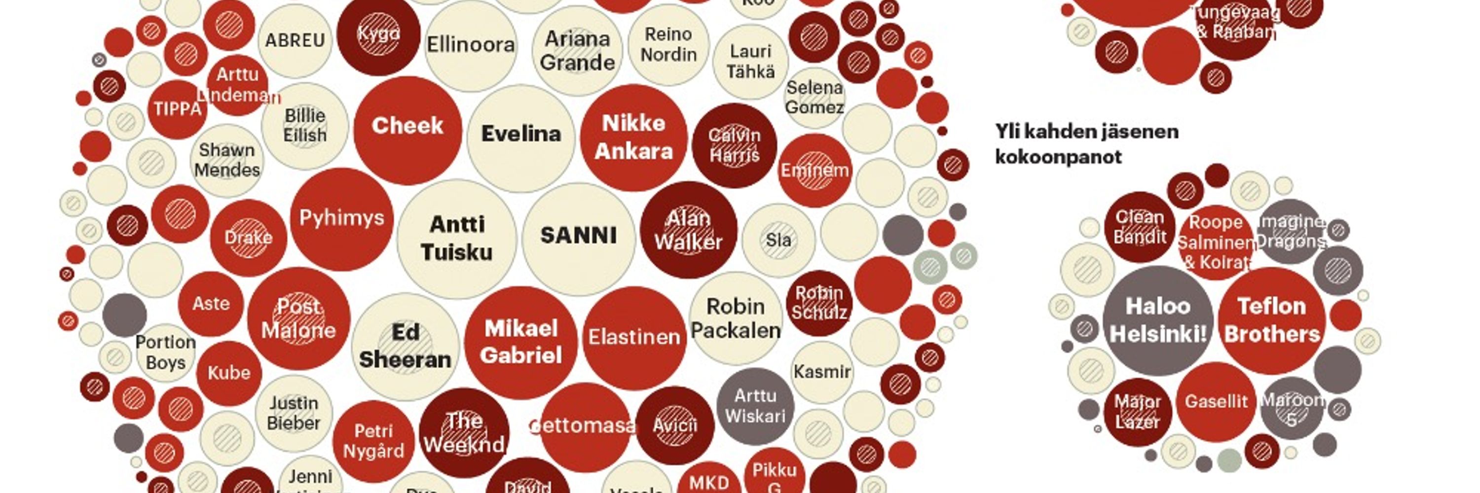
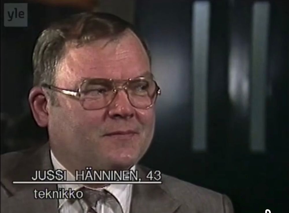
Väite: Ihmiset olivat ennen vanhoja nuorempina.
Todistuskappale 1: Hittimittarin raati vuodelta 1985. Ohessa pari poimintaa.
Todistuskappale 1: Hittimittarin raati vuodelta 1985. Ohessa pari poimintaa.

November 19, 2025 at 7:56 PM
Väite: Ihmiset olivat ennen vanhoja nuorempina.
Todistuskappale 1: Hittimittarin raati vuodelta 1985. Ohessa pari poimintaa.
Todistuskappale 1: Hittimittarin raati vuodelta 1985. Ohessa pari poimintaa.
HS.fi: ”Forssell sanoo, että hyvään alkuun pääsee, jos malttaa harjoitella etu- ja takaperin kaatumista esimerkiksi 20 kertaa päivässä.
– Vaikka kymmenen kertaa ennen kuin nousee sängystä aamutoimille ja kymmenen kertaa ennen nukkumaanmenoa sekä aina muutaman kerran ennen kuin käy istumaan sohvalle”
– Vaikka kymmenen kertaa ennen kuin nousee sängystä aamutoimille ja kymmenen kertaa ennen nukkumaanmenoa sekä aina muutaman kerran ennen kuin käy istumaan sohvalle”
November 19, 2025 at 3:47 PM
HS.fi: ”Forssell sanoo, että hyvään alkuun pääsee, jos malttaa harjoitella etu- ja takaperin kaatumista esimerkiksi 20 kertaa päivässä.
– Vaikka kymmenen kertaa ennen kuin nousee sängystä aamutoimille ja kymmenen kertaa ennen nukkumaanmenoa sekä aina muutaman kerran ennen kuin käy istumaan sohvalle”
– Vaikka kymmenen kertaa ennen kuin nousee sängystä aamutoimille ja kymmenen kertaa ennen nukkumaanmenoa sekä aina muutaman kerran ennen kuin käy istumaan sohvalle”
TIL että Helsingin kaupungin liikenne (HKL) on edelleen olemassa, vaikka suurin osa sen toiminnasta on siirretty Kaupunkiliikenne-yhtiöön 2022. Syynä on, että HKL on Siemensin vastapuolena oikeudenkäynnissä pieleen menneestä metron automatisoinnista. #vainkunnallisbyrokratiajutut
November 18, 2025 at 9:34 AM
TIL että Helsingin kaupungin liikenne (HKL) on edelleen olemassa, vaikka suurin osa sen toiminnasta on siirretty Kaupunkiliikenne-yhtiöön 2022. Syynä on, että HKL on Siemensin vastapuolena oikeudenkäynnissä pieleen menneestä metron automatisoinnista. #vainkunnallisbyrokratiajutut
📊 A nice selection of Swedish post-war infographics made for school use.
Here you are attilabatorfy.substack.com/p/the-cooles...
November 17, 2025 at 7:11 PM
📊 A nice selection of Swedish post-war infographics made for school use.
”Olemme seuraamassa slummien ja katujengien syntyä maassamme.”
Tämä tuntuu jutun kontekstissa tosi oudolta väitteeltä. Jatkuva väkivallan uhka ja jo kouluikäisten sisäistämä pelon maantiede on kaukana nykypäivän tilanteesta, ainakin täällä pahamaineisessa Itä-Helsingissä, jossa itse asun. 1/
Tämä tuntuu jutun kontekstissa tosi oudolta väitteeltä. Jatkuva väkivallan uhka ja jo kouluikäisten sisäistämä pelon maantiede on kaukana nykypäivän tilanteesta, ainakin täällä pahamaineisessa Itä-Helsingissä, jossa itse asun. 1/

Tunne Suomi | Toimittaja Anna-Stina Nykänen palasi huumelähiöön ja selvitti, mitä sille tapahtui
Maunula oli pelätty helsinkiläinen huumelähiö, nyt se on keskiluokan unelma. Kaksi entistä asukasta palasi juurilleen ja selvitti, miksi alueelle kävi näin. Syntyi lista oivalluksia.
www.hs.fi
November 16, 2025 at 3:40 PM
”Olemme seuraamassa slummien ja katujengien syntyä maassamme.”
Tämä tuntuu jutun kontekstissa tosi oudolta väitteeltä. Jatkuva väkivallan uhka ja jo kouluikäisten sisäistämä pelon maantiede on kaukana nykypäivän tilanteesta, ainakin täällä pahamaineisessa Itä-Helsingissä, jossa itse asun. 1/
Tämä tuntuu jutun kontekstissa tosi oudolta väitteeltä. Jatkuva väkivallan uhka ja jo kouluikäisten sisäistämä pelon maantiede on kaukana nykypäivän tilanteesta, ainakin täällä pahamaineisessa Itä-Helsingissä, jossa itse asun. 1/
Reposted by Juuso Koponen
Sankari.
”En tee tätä kiusan vuoksi, vaan toivon, että metsätalous on vastuullista. Samalla arvostan sitä, että metsäyhtiöt ovat sitoutuneet tiukempaan FSC-sertifikaattiin.”
www.hs.fi/alueet/art-2...
”En tee tätä kiusan vuoksi, vaan toivon, että metsätalous on vastuullista. Samalla arvostan sitä, että metsäyhtiöt ovat sitoutuneet tiukempaan FSC-sertifikaattiin.”
www.hs.fi/alueet/art-2...

HS Jyväskylässä | Tuuli Hakulinen on piikki metsäyhtiöiden lihassa
Luonnonsuojeluliiton metsäkartoittaja kiertää hakkuualueita ympäri Suomea ja selvittää, noudatetaanko metsäsertifikaatin kriteerejä.
www.hs.fi
November 15, 2025 at 9:46 AM
Sankari.
”En tee tätä kiusan vuoksi, vaan toivon, että metsätalous on vastuullista. Samalla arvostan sitä, että metsäyhtiöt ovat sitoutuneet tiukempaan FSC-sertifikaattiin.”
www.hs.fi/alueet/art-2...
”En tee tätä kiusan vuoksi, vaan toivon, että metsätalous on vastuullista. Samalla arvostan sitä, että metsäyhtiöt ovat sitoutuneet tiukempaan FSC-sertifikaattiin.”
www.hs.fi/alueet/art-2...
Kommentoimme @jhilden.bsky.social kanssa Vuoden Graafikon (2024) auktoriteetillä eduskunnan joulukorttia @iltalehti.fi’dessä. Tykkäsimme kortista enemmän kuin jutussa nimettömänä kommentoivat kansanedustajat!
www.iltalehti.fi/politiikka/a...
www.iltalehti.fi/politiikka/a...

Eduskunnan joulukortissa alastomia hahmoja – ”Aivan järkyttävä”
Iltalehti kysyi asiantuntijoilta, mitä mieltä he ovat eduskunnan uudesta joulukortista, josta kansanedustajilla on selvä mielipide.
www.iltalehti.fi
November 13, 2025 at 2:49 PM
Kommentoimme @jhilden.bsky.social kanssa Vuoden Graafikon (2024) auktoriteetillä eduskunnan joulukorttia @iltalehti.fi’dessä. Tykkäsimme kortista enemmän kuin jutussa nimettömänä kommentoivat kansanedustajat!
www.iltalehti.fi/politiikka/a...
www.iltalehti.fi/politiikka/a...
Helsingin Sanomissa oli kiinnostava Der Spiegelistä käännetty juttu ”kauneusbuumista”. Seuraava väite kiinnitti huomioni:
”Tuoreen tutkimuksen mukaan ihmiset käyttävät keskimäärin neljä tuntia päivässä ulkonäkönsä hoitamiseen.”
Luku on valtavan suuri. Voiko se pitää oikeasti paikkansa? 1/11
”Tuoreen tutkimuksen mukaan ihmiset käyttävät keskimäärin neljä tuntia päivässä ulkonäkönsä hoitamiseen.”
Luku on valtavan suuri. Voiko se pitää oikeasti paikkansa? 1/11

Ulkonäkö | Lukiota käyvä Sofia haluaa näyttää täydelliseltä, sillä vähempi ei riitä
Kauneusbuumi leviää yhä nuorempiin ikäluokkiin. Se voi muuttaa yhteiskuntaa tavalla, jota on vaikea ennakoida.
www.hs.fi
November 10, 2025 at 12:17 PM
Helsingin Sanomissa oli kiinnostava Der Spiegelistä käännetty juttu ”kauneusbuumista”. Seuraava väite kiinnitti huomioni:
”Tuoreen tutkimuksen mukaan ihmiset käyttävät keskimäärin neljä tuntia päivässä ulkonäkönsä hoitamiseen.”
Luku on valtavan suuri. Voiko se pitää oikeasti paikkansa? 1/11
”Tuoreen tutkimuksen mukaan ihmiset käyttävät keskimäärin neljä tuntia päivässä ulkonäkönsä hoitamiseen.”
Luku on valtavan suuri. Voiko se pitää oikeasti paikkansa? 1/11
XCOM 2: War of the Chosen


November 9, 2025 at 2:29 PM
XCOM 2: War of the Chosen
Reposted by Juuso Koponen

fun to realize how Our World in Data basically has accomplished what Hans Rosling called for in his classic Ted talk.

The new display of the search results on @ourworldindata.org is next level.
November 7, 2025 at 7:28 PM
fun to realize how Our World in Data basically has accomplished what Hans Rosling called for in his classic Ted talk.
😮
"Here is the graph, which is so wild, the climate scientist had to call a colleague & check it"
It is true actually! In the Global Carbon Budget we do not usually show the LUC like this, because of interannual variability & uncertainty. But it is what the data says!
politiken.dk/klima/art106...
It is true actually! In the Global Carbon Budget we do not usually show the LUC like this, because of interannual variability & uncertainty. But it is what the data says!
politiken.dk/klima/art106...

November 6, 2025 at 8:55 AM
😮
JFC what

This is quite a story: the US employed every strongarm tactic available, including personal threats against delegates and their families, to derail an agreement on reducing shipping emissions that was almost finalized. on.ft.com/47lq3dZ


November 3, 2025 at 7:43 PM
JFC what
Päivän ikäviä uutisia lukiessa juolahti mieleen, että tutkimukseen kohdistuvien tietopääomaa rapauttavien leikkausten vaikutusta voisi kenties loiventaa laajentamalla puolustusvoimien rahoittamaa tutkimustyötä, jonka kustannukset käsittääkseni luetaan mukaan Naton 3,5 prosentin tavoitteeseen. 1/5
November 3, 2025 at 11:19 AM
Päivän ikäviä uutisia lukiessa juolahti mieleen, että tutkimukseen kohdistuvien tietopääomaa rapauttavien leikkausten vaikutusta voisi kenties loiventaa laajentamalla puolustusvoimien rahoittamaa tutkimustyötä, jonka kustannukset käsittääkseni luetaan mukaan Naton 3,5 prosentin tavoitteeseen. 1/5
Enpä ole tajunnut, miten surkea työllisyystilanne muotoilualoilla on. Graafisten ja multimediasuunnittelijoiden työttömyysaste 33,7 %, tuote- ja vaatesuunnittelijoilla 35,7 %. Ja luvut ovat olleet samaa suuruusluokkaa myös 2015 ja 2020! Ei siis vain suhdanneluontoista.
yle.fi/a/74-20191367
yle.fi/a/74-20191367

Näillä aloilla on nyt tarjolla eniten työpaikkoja – katso koneesta oman alasi tilanne
Tästä jutusta voit tutkia, mikä on oman alasi avointen työpaikkojen määrä ja työttömyystilanne.
yle.fi
November 3, 2025 at 9:29 AM
Enpä ole tajunnut, miten surkea työllisyystilanne muotoilualoilla on. Graafisten ja multimediasuunnittelijoiden työttömyysaste 33,7 %, tuote- ja vaatesuunnittelijoilla 35,7 %. Ja luvut ovat olleet samaa suuruusluokkaa myös 2015 ja 2020! Ei siis vain suhdanneluontoista.
yle.fi/a/74-20191367
yle.fi/a/74-20191367
Reposted by Juuso Koponen

Ilmastopaneeli julkaisi vähän aikaa sitten 14 kohdan paketin ilmastotoimista, joilla Suomi voisi päästä lähemmäs päästötavoitteitaan.
Ehdotukset ovat järkeviä, ja niihin kannattaa tarttua heti.
Huomioita ketjussa 🧵
1/10
Ehdotukset ovat järkeviä, ja niihin kannattaa tarttua heti.
Huomioita ketjussa 🧵
1/10

Suomen nettopäästöjen vähentäminen edellyttää toimia. Ilmastopaneelin tänään julkaisemat suositukset ovat nopeasti käyttöön otettavia keinoja kuroa kuilua kansallisiin tavoitteisiin ja EU-velvoitteisiin.
Tiedote ➡️ ilmastopaneeli.fi/ilmastopanee...
Tiedote ➡️ ilmastopaneeli.fi/ilmastopanee...

October 31, 2025 at 8:11 AM
Ilmastopaneeli julkaisi vähän aikaa sitten 14 kohdan paketin ilmastotoimista, joilla Suomi voisi päästä lähemmäs päästötavoitteitaan.
Ehdotukset ovat järkeviä, ja niihin kannattaa tarttua heti.
Huomioita ketjussa 🧵
1/10
Ehdotukset ovat järkeviä, ja niihin kannattaa tarttua heti.
Huomioita ketjussa 🧵
1/10
Cocq-Caulax, Rauvanne-Nyillémy, Yoénnesoux… 😅

What it would look like if Finnish followed French orthography.
As someone who probably still goes as Mrs. Yanne in some French records, this somehow breaks my brain :D.
(BTW still bigly mad that literary Finnish wasn't codified based on Savo dialect. It would've been gloriously silly.)
As someone who probably still goes as Mrs. Yanne in some French records, this somehow breaks my brain :D.
(BTW still bigly mad that literary Finnish wasn't codified based on Savo dialect. It would've been gloriously silly.)

October 31, 2025 at 9:35 AM
Cocq-Caulax, Rauvanne-Nyillémy, Yoénnesoux… 😅
Reposted by Juuso Koponen
Merivirtojen mahdollinen äkillinen romahdus ilmaston kuumenemisen seurauksena on ollut viime aikoina otsikoissa.
Mistä on kyse ja mitä sillä on väliä?
Ennen kaikkea: mitä asialle voi tehdä?
Tiivistys ketjussa 👇
1/30
Mistä on kyse ja mitä sillä on väliä?
Ennen kaikkea: mitä asialle voi tehdä?
Tiivistys ketjussa 👇
1/30

Ilmastonmuutos | Suomen katastrofaalisen kylmenemisen riski tuli juuri lähemmäksi, sanoo tunnettu tutkija
Professori Stefan Rahmstorf luovutti vuosi sitten poliitikoille varoituskirjeen Pohjolaa lämmittävien merivirtojen pysähtymisestä. Sen jälkeen tilannekuva on pahentunut.
www.hs.fi
October 30, 2025 at 2:46 PM
Merivirtojen mahdollinen äkillinen romahdus ilmaston kuumenemisen seurauksena on ollut viime aikoina otsikoissa.
Mistä on kyse ja mitä sillä on väliä?
Ennen kaikkea: mitä asialle voi tehdä?
Tiivistys ketjussa 👇
1/30
Mistä on kyse ja mitä sillä on väliä?
Ennen kaikkea: mitä asialle voi tehdä?
Tiivistys ketjussa 👇
1/30
Post a perfect album from 1989, a perfect music year.

October 29, 2025 at 1:56 PM
Post a perfect album from 1989, a perfect music year.
Erinomainen idea.
”Biologin silmin paras ratkaisu olisi rajaseudun luontokäytävä, joka olisi suojeltujen ja ennallistettujen soiden ja metsien mosaiikki. Vanhat, tiheät metsät tarjoaisivat suojaa luontokappaleille ja drooneilta piiloutuville taistelijoille.”
suomenkuvalehti.fi/paajutut/ei-...
”Biologin silmin paras ratkaisu olisi rajaseudun luontokäytävä, joka olisi suojeltujen ja ennallistettujen soiden ja metsien mosaiikki. Vanhat, tiheät metsät tarjoaisivat suojaa luontokappaleille ja drooneilta piiloutuville taistelijoille.”
suomenkuvalehti.fi/paajutut/ei-...

”Ei kukaan hullu siitä hyökkää” – Biologi suunnitteli itärajalle upottavan panssariesteen
Biologi Risto Sulkava ehdottaa ennallistettavaksi 50 ojitettua suoaluetta itärajalta. Ne toimisivat panssariesteinä ja hiilinieluina.
suomenkuvalehti.fi
October 29, 2025 at 8:42 AM
Erinomainen idea.
”Biologin silmin paras ratkaisu olisi rajaseudun luontokäytävä, joka olisi suojeltujen ja ennallistettujen soiden ja metsien mosaiikki. Vanhat, tiheät metsät tarjoaisivat suojaa luontokappaleille ja drooneilta piiloutuville taistelijoille.”
suomenkuvalehti.fi/paajutut/ei-...
”Biologin silmin paras ratkaisu olisi rajaseudun luontokäytävä, joka olisi suojeltujen ja ennallistettujen soiden ja metsien mosaiikki. Vanhat, tiheät metsät tarjoaisivat suojaa luontokappaleille ja drooneilta piiloutuville taistelijoille.”
suomenkuvalehti.fi/paajutut/ei-...
Reposted by Juuso Koponen

🦧📉 Why are there colorful apes in my #dataviz workshops?
📸 The photo taken years ago by my friend Richard Strozynski has become a tradition in my client projects and courses.
I like to recolor it with different palettes to show how palette design affects perception.
Thread 👇
📸 The photo taken years ago by my friend Richard Strozynski has become a tradition in my client projects and courses.
I like to recolor it with different palettes to show how palette design affects perception.
Thread 👇

October 28, 2025 at 4:32 PM
🦧📉 Why are there colorful apes in my #dataviz workshops?
📸 The photo taken years ago by my friend Richard Strozynski has become a tradition in my client projects and courses.
I like to recolor it with different palettes to show how palette design affects perception.
Thread 👇
📸 The photo taken years ago by my friend Richard Strozynski has become a tradition in my client projects and courses.
I like to recolor it with different palettes to show how palette design affects perception.
Thread 👇
Reposted by Juuso Koponen
Punainen kirja kertoo lajien uhanalaisuuden. Evaluoituja lajeja on 48 600 ja näistä uhanalaisia on 28 %. Läheskään kaikkien maailman lajien tilanne ei ole tiedossa.
Tämä on faktaa, jonka tiedämme. Tiedämme mitä pitäisi tehdä. Toistaiseksi olemme ihmiskuntana olleet aika huonoja pelastamaan luontoa.
Tämä on faktaa, jonka tiedämme. Tiedämme mitä pitäisi tehdä. Toistaiseksi olemme ihmiskuntana olleet aika huonoja pelastamaan luontoa.

October 27, 2025 at 5:43 PM
Punainen kirja kertoo lajien uhanalaisuuden. Evaluoituja lajeja on 48 600 ja näistä uhanalaisia on 28 %. Läheskään kaikkien maailman lajien tilanne ei ole tiedossa.
Tämä on faktaa, jonka tiedämme. Tiedämme mitä pitäisi tehdä. Toistaiseksi olemme ihmiskuntana olleet aika huonoja pelastamaan luontoa.
Tämä on faktaa, jonka tiedämme. Tiedämme mitä pitäisi tehdä. Toistaiseksi olemme ihmiskuntana olleet aika huonoja pelastamaan luontoa.