


Voilà: Francis Gagnon
@chezvoila.com
Information design and data visualization studio focused on the environment, social development, and governance.
Montreal (since 2013).
English and French
Interactives, dashboards, reports, presentations, training
Posts by Francis Gagnon, founder
Montreal (since 2013).
English and French
Interactives, dashboards, reports, presentations, training
Posts by Francis Gagnon, founder
Pinned
Voilà: Francis Gagnon
@chezvoila.com
· Sep 1
Here you go. 🫡
Please share widely to help develop the dataviz community of Bluesky. 📊
go.bsky.app/R3nSyyy
Please share widely to help develop the dataviz community of Bluesky. 📊
go.bsky.app/R3nSyyy
Reposted by Voilà: Francis Gagnon

This is starting to get like universal basic income where every single objective study shows the same result but the people who don't like that result go "uh, well there's just really no way to know"

HARVARD BUSINESS REVIEW: “.. In our in-progress research, we discovered that AI tools didn’t reduce work, they consistently intensified it.”
hbr.org/2026/02/ai-d...
hbr.org/2026/02/ai-d...

February 10, 2026 at 3:06 PM
This is starting to get like universal basic income where every single objective study shows the same result but the people who don't like that result go "uh, well there's just really no way to know"
Well, five years later it's still one of my favourite books on data and I think it will stay that way a long time.

When I released this book 5 years ago, I joked with my publisher that maybe people would figure out how to use data in less selfish and destructive ways, and the book would become irrelevant.
AHAHAHAHAHAHAHAHAHAH
www.mcnallyjackson.com/book/9781250...
AHAHAHAHAHAHAHAHAHAH
www.mcnallyjackson.com/book/9781250...

February 10, 2026 at 2:53 PM
Well, five years later it's still one of my favourite books on data and I think it will stay that way a long time.
Might use this to show how much annotations you can put on a chart. 📊
February 10, 2026 at 2:06 PM
Might use this to show how much annotations you can put on a chart. 📊
Reposted by Voilà: Francis Gagnon

Going great! news.gallup.com/poll/702125/...

February 10, 2026 at 1:37 PM
Going great! news.gallup.com/poll/702125/...
Reposted by Voilà: Francis Gagnon

This object is a legitimate masterpiece of design


February 8, 2026 at 7:32 PM
This object is a legitimate masterpiece of design
Reposted by Voilà: Francis Gagnon

All my students would immediately read the scale!!
A 1% increase (if that, do we trust that number..?) ..
#GraphCrimes #ChartsAgainstHumanity #DataVis
A 1% increase (if that, do we trust that number..?) ..
#GraphCrimes #ChartsAgainstHumanity #DataVis

February 6, 2026 at 11:48 AM
All my students would immediately read the scale!!
A 1% increase (if that, do we trust that number..?) ..
#GraphCrimes #ChartsAgainstHumanity #DataVis
A 1% increase (if that, do we trust that number..?) ..
#GraphCrimes #ChartsAgainstHumanity #DataVis
She hasn't posted in 6 months, but at least @monachalabi.bsky.social has an account on Bluesky. 📊
February 6, 2026 at 5:51 PM
She hasn't posted in 6 months, but at least @monachalabi.bsky.social has an account on Bluesky. 📊
Conveying the polarity of charts can be a challenge (is higher better or worse?), especially in a contexte where there are several charts. 📊
Ann K. Emery suggests a few methods that rely on annotations.
www.youtube.com/watch?v=ajp1...
Ann K. Emery suggests a few methods that rely on annotations.
www.youtube.com/watch?v=ajp1...

"Higher is better" context for dynamic dashboards (STORYTELLING + ACCESSIBILITY WINS)
YouTube video by Ann K. Emery
www.youtube.com
February 6, 2026 at 5:50 PM
Conveying the polarity of charts can be a challenge (is higher better or worse?), especially in a contexte where there are several charts. 📊
Ann K. Emery suggests a few methods that rely on annotations.
www.youtube.com/watch?v=ajp1...
Ann K. Emery suggests a few methods that rely on annotations.
www.youtube.com/watch?v=ajp1...
Reposted by Voilà: Francis Gagnon

China's decarbonizing its transport sector WAY FASTER than the US.


February 6, 2026 at 2:29 PM
China's decarbonizing its transport sector WAY FASTER than the US.
Nicely done chart. I like the white bands on grey background. 📊
Interesting that they define the first and last correspond with a legend. Maybe it wasn’t obvious enough to some.
The 2019 annotation looks like it was hard to position.
Ordering unclear.
Interesting that they define the first and last correspond with a legend. Maybe it wasn’t obvious enough to some.
The 2019 annotation looks like it was hard to position.
Ordering unclear.


February 6, 2026 at 3:15 PM
Nicely done chart. I like the white bands on grey background. 📊
Interesting that they define the first and last correspond with a legend. Maybe it wasn’t obvious enough to some.
The 2019 annotation looks like it was hard to position.
Ordering unclear.
Interesting that they define the first and last correspond with a legend. Maybe it wasn’t obvious enough to some.
The 2019 annotation looks like it was hard to position.
Ordering unclear.
Thank you thank you

DVS Welcomes New Board Members for the 2026-2027 Term — Data Visualization Society
Every year, six board of directors roles are opened for application. After a thorough interview process and member vote on the final slate of candidates, we’re excited to share that the 2026-2027 slat...
www.datavisualizationsociety.org
February 5, 2026 at 10:48 PM
Thank you thank you
Reposted by Voilà: Francis Gagnon

News: I was cut yesterday in a newsroom-wide layoff affecting 300+ staff at The Washington Post.
I spent the last decade leading and building the award-winning Graphics team. I'll miss them.
I'm now exploring senior graphics, cartography, or leadership roles. Intros welcome.
timmeko.com
I spent the last decade leading and building the award-winning Graphics team. I'll miss them.
I'm now exploring senior graphics, cartography, or leadership roles. Intros welcome.
timmeko.com
Tim Meko - Visual Journalist & Graphics Editor - Tim Meko
timmeko.com
February 5, 2026 at 7:15 PM
News: I was cut yesterday in a newsroom-wide layoff affecting 300+ staff at The Washington Post.
I spent the last decade leading and building the award-winning Graphics team. I'll miss them.
I'm now exploring senior graphics, cartography, or leadership roles. Intros welcome.
timmeko.com
I spent the last decade leading and building the award-winning Graphics team. I'll miss them.
I'm now exploring senior graphics, cartography, or leadership roles. Intros welcome.
timmeko.com

Reposted by Voilà: Francis Gagnon
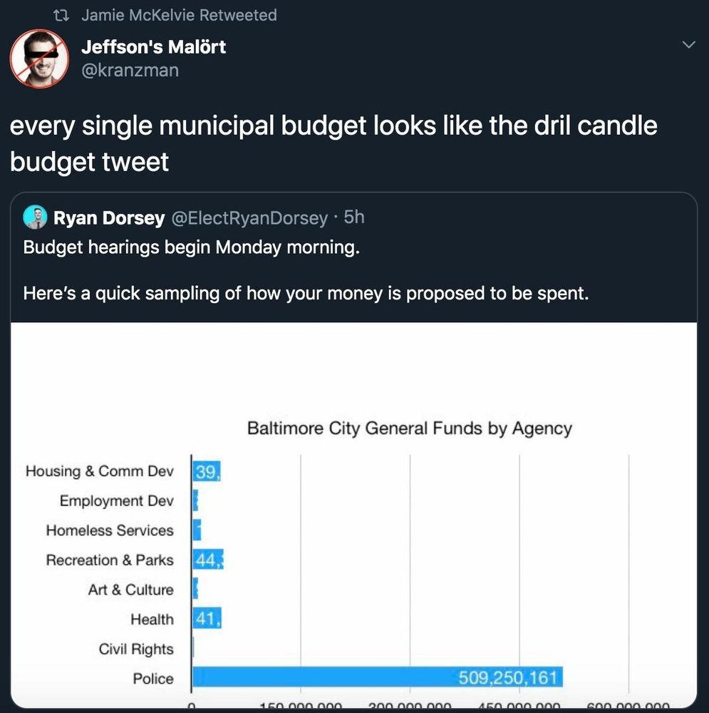
Another example of a basic, amateurish chart going viral because it makes a point really well. I wonder if it would be more or even as popular if it was polished. Honest question.

When people talk about how systemic and structural issues don't exist but the data all looks like this.
August 6, 2025 at 2:26 AM
Another example of a basic, amateurish chart going viral because it makes a point really well. I wonder if it would be more or even as popular if it was polished. Honest question.
Reposted by Voilà: Francis Gagnon

The Wayback is now so load-bearing we should be protecting it with our actual lives

They closed the CIA World Factbook and deleted it entirely.
February 5, 2026 at 12:07 AM
The Wayback is now so load-bearing we should be protecting it with our actual lives
Reposted by Voilà: Francis Gagnon

The CIA just stopped publishing their World Factbook and took every page, including the archived copies of previous versions!
This sucks. It was public domain, so I recovered the 2020 edition (the last one published as a zip file) and shared it to GitHub simonwillison.net/2026/Feb/5/t...
This sucks. It was public domain, so I recovered the 2020 edition (the last one published as a zip file) and shared it to GitHub simonwillison.net/2026/Feb/5/t...

Spotlighting The World Factbook as We Bid a Fond Farewell
Somewhat devastating news today from the CIA: One of CIA’s oldest and most recognizable intelligence publications, The World Factbook, has sunset. There's not even a hint as to why they …
simonwillison.net
February 5, 2026 at 12:25 AM
The CIA just stopped publishing their World Factbook and took every page, including the archived copies of previous versions!
This sucks. It was public domain, so I recovered the 2020 edition (the last one published as a zip file) and shared it to GitHub simonwillison.net/2026/Feb/5/t...
This sucks. It was public domain, so I recovered the 2020 edition (the last one published as a zip file) and shared it to GitHub simonwillison.net/2026/Feb/5/t...
Reposted by Voilà: Francis Gagnon

It is apparently not good. I've seen at least three posts from folks laid off from the Graphics team, and they all mention that a "huge chunk" of the team was impacted. :(
February 4, 2026 at 5:01 PM
It is apparently not good. I've seen at least three posts from folks laid off from the Graphics team, and they all mention that a "huge chunk" of the team was impacted. :(
Stephanie Evergreen has an interesting suggestion about how to structure a dashboard: organise it along the sequence of your theory of change. 📊
Probably won't always work, but it can help a lot thinking about why you want to include a given metric.
Probably won't always work, but it can help a lot thinking about why you want to include a given metric.

Dashboards Should Mirror Theories of Change
A theory of change plots out how an initiative is going to reach desired outcomes... which makes it a perfect model for your data dashboard.
stephanieevergreen.com
February 4, 2026 at 7:22 PM
Stephanie Evergreen has an interesting suggestion about how to structure a dashboard: organise it along the sequence of your theory of change. 📊
Probably won't always work, but it can help a lot thinking about why you want to include a given metric.
Probably won't always work, but it can help a lot thinking about why you want to include a given metric.
Do we know yet what happened to the data journalism team at the Washington Post?

The Washington Post embarked on severe cuts despite appeals by the newsroom to owner Jeff Bezos. The paper is to narrow its focus largely to politics and national security. n.pr/4qAlWBj

Bezos orders deep job cuts at 'Washington Post'
The Washington Post embarked on severe cuts despite appeals by the newsroom to owner Jeff Bezos. The paper is to narrow its focus largely to politics and national security.
n.pr
February 4, 2026 at 4:58 PM
Do we know yet what happened to the data journalism team at the Washington Post?
Just ordered issue 5 to complete our collection. Ours got lost in the mail. It's such a nice publication and truly a moment in time for the dataviz community. 📊

We’re clearing out our warehouse inventory and everything must go! Get 20% OFF all print issues of Nightingale through February 14.
⚠️ Important: We do not plan on reprinting these issues. Once they’re gone, they are gone for good.
🎟️ Code: SAVE20 🛒 Shop here: shop.datavisualizationsociety.org
⚠️ Important: We do not plan on reprinting these issues. Once they’re gone, they are gone for good.
🎟️ Code: SAVE20 🛒 Shop here: shop.datavisualizationsociety.org

February 3, 2026 at 9:44 PM
Just ordered issue 5 to complete our collection. Ours got lost in the mail. It's such a nice publication and truly a moment in time for the dataviz community. 📊
Outlier, the annual conference of the @datavizsociety.bsky.social, will be held virtually this year, on June 24-26. 📊
The theme, "The Final Draft", is about iteration, feedback, constraints, context, etc.
They are now accepting applications.
www.datavisualizationsociety.org/outlier
The theme, "The Final Draft", is about iteration, feedback, constraints, context, etc.
They are now accepting applications.
www.datavisualizationsociety.org/outlier

February 3, 2026 at 9:36 PM
Outlier, the annual conference of the @datavizsociety.bsky.social, will be held virtually this year, on June 24-26. 📊
The theme, "The Final Draft", is about iteration, feedback, constraints, context, etc.
They are now accepting applications.
www.datavisualizationsociety.org/outlier
The theme, "The Final Draft", is about iteration, feedback, constraints, context, etc.
They are now accepting applications.
www.datavisualizationsociety.org/outlier
Very good chart. 📊 Fascinating how you can find so many stories.
- The big 3 era
- New era since 2023
- Nadal’s dominance in Paris
- Djokovic’s dominance in Australia
- Federer’s dip in 2013-2016 then back
And more. 👌🏻
- The big 3 era
- New era since 2023
- Nadal’s dominance in Paris
- Djokovic’s dominance in Australia
- Federer’s dip in 2013-2016 then back
And more. 👌🏻

Carlos Alcaraz has the career Grand Slam at age 22!
That's 9 straight majors for Sincaraz
That's 9 straight majors for Sincaraz

February 1, 2026 at 4:57 PM
Very good chart. 📊 Fascinating how you can find so many stories.
- The big 3 era
- New era since 2023
- Nadal’s dominance in Paris
- Djokovic’s dominance in Australia
- Federer’s dip in 2013-2016 then back
And more. 👌🏻
- The big 3 era
- New era since 2023
- Nadal’s dominance in Paris
- Djokovic’s dominance in Australia
- Federer’s dip in 2013-2016 then back
And more. 👌🏻
Reposted by Voilà: Francis Gagnon

Great work from the FT's John Burn-Murdoch www.ft.com/content/b474...

January 31, 2026 at 4:18 PM
Great work from the FT's John Burn-Murdoch www.ft.com/content/b474...
Reposted by Voilà: Francis Gagnon

We use a spreadsheet at work where cells are coloured to show status. Two members of the team will just colour the entire row - all 16k columns - rather than just the necessary cells. It's a petty thing, but I want to murder both of them.
January 30, 2026 at 10:20 PM
We use a spreadsheet at work where cells are coloured to show status. Two members of the team will just colour the entire row - all 16k columns - rather than just the necessary cells. It's a petty thing, but I want to murder both of them.
Can't deny it: it's always nice to see your work mentioned in the Visualising Data Newsletter by @visualisingdata.com. It's such a must read every month.
Subscribe here.
visualisingdata.com/newsletter
Subscribe here.
visualisingdata.com/newsletter

January 30, 2026 at 10:05 PM
Can't deny it: it's always nice to see your work mentioned in the Visualising Data Newsletter by @visualisingdata.com. It's such a must read every month.
Subscribe here.
visualisingdata.com/newsletter
Subscribe here.
visualisingdata.com/newsletter