


Mitchell Thorson
@mitchellthorson.com
Lead data visualization engineer. Otherwise reading books, riding bikes, listening to music, or talking a walk.
Brooklyn, NY
mitchellthorson.com
Brooklyn, NY
mitchellthorson.com
Pinned
Mitchell Thorson
@mitchellthorson.com
· Oct 28


Today @urbaninstitute.bsky.social launches a new data tool: The American Affordability Tracker. We're collecting data that tracks the rising costs of a secure lifestyle, and indicators of financial distress that are contributing to a growing crisis. See the data here: www.urban.org/data-tools/a...
📊
📊
Reposted by Mitchell Thorson

demonschool credits all 145 people who touched the game over the course of its multi-year dev cycle AND explains what exactly they contributed. the rest of the games industry, which commonly omits people from credits entirely, should be taking notes
![“We worked [on Hyper Gunsport] with a localization company that refused to give the names of the people that actually did the work; they just wanted to have their company name in there,” Sheffield said. “They say they do that because ‘It's the standard’ and ‘to avoid poaching’ or whatever, but I hate that and think it's total BS. … I've also seen a lot of folks complain about how they weren't credited on a game because they'd left the studio before the game they worked on was finished. And indeed, our lead 3D artist left two years ago. But he's still the first artist credited because he set the style and visual tone for a lot of the game. Not working on the game to the very end doesn't negate the work he did.”
The more Sheffield thought about how to meet the needs of so many different types of contributors – and discussed the matter on social media – the more a comprehensive, detail-oriented approach to crediting started to make sense.
“That had all been percolating in the back of my mind as we got close to finishing, and then it just sort of hit me as it came time for me to write the credits,” he said. “I discussed this approach with the team and everyone was fine with it, so we just went for it. We always want to credit everyone that touched the game, so even though the core team was 7 or 8 people at any given time, we credited around 145 people in Demonschool. Who cares if it's a lot of people? Who cares if it's long? They all did something and they deserve credit. And you basically can tell who the core team was by reading the descriptions. None of us are precious about that anyway.”](https://cdn.bsky.app/img/feed_thumbnail/plain/did:plc:5gdejlhcswjbzraadoltdpps/bafkreibksibak2xsgvbrid7evym3utz6yzfccilowfs7apv7b2sddssd3q@jpeg)
November 25, 2025 at 7:32 PM
demonschool credits all 145 people who touched the game over the course of its multi-year dev cycle AND explains what exactly they contributed. the rest of the games industry, which commonly omits people from credits entirely, should be taking notes
This is a nice guide to music discovery sans algorithms, with shoutouts to @hearingthingsco.bsky.social, @afantano.bsky.social, @bandcamp.com, flowstate.fm, and other great sources of human-powered curation.
I think the internet works best when it facilitates humans sharing things with each other!
I think the internet works best when it facilitates humans sharing things with each other!

How to find music you will love without the algorithm

How to find music you will love without the algorithm
To find music you will love, stop letting the algorithm take the reins and start listening with intention.
buff.ly
November 20, 2025 at 4:05 PM
This is a nice guide to music discovery sans algorithms, with shoutouts to @hearingthingsco.bsky.social, @afantano.bsky.social, @bandcamp.com, flowstate.fm, and other great sources of human-powered curation.
I think the internet works best when it facilitates humans sharing things with each other!
I think the internet works best when it facilitates humans sharing things with each other!
Yo this game looks awesome

EXCLUSIVE PREVIEW: We sit down with Demonschool's @brandon.insertcredit.com to talk about the SEGA Saturn influences, economical battle system and football-like endzones of this exciting new Tactics RPG.
WATCH: youtu.be/EQnXp0koywc
WATCH: youtu.be/EQnXp0koywc

EXCKUSIVE: Demonschool's Developer Details This Exciting New Tactics RPG - noclip_2
YouTube video by noclip_2
youtu.be
November 19, 2025 at 4:25 AM
Yo this game looks awesome
Reposted by Mitchell Thorson

My new big visualization project is out: The Trans News Initiative, a collaboration between UM's School of Communication, the Trans Journalists Association, and Polygraph (The Pudding): transnewsinitiative.org Here's a piece about it in the Columbia Journalism Review: www.cjr.org/news/visuali...

Trans News Initiative
A database and analysis of news coverage affecting trans communities.
transnewsinitiative.org
November 18, 2025 at 5:56 PM
My new big visualization project is out: The Trans News Initiative, a collaboration between UM's School of Communication, the Trans Journalists Association, and Polygraph (The Pudding): transnewsinitiative.org Here's a piece about it in the Columbia Journalism Review: www.cjr.org/news/visuali...
Really enjoying 'Winds Gate' by John Thayer this week. A gorgeous, contemplative album that draws from the landscape and geology of the Hudson Valley. Something that resonates very deeply for me.
auralcanyonmusic.bandcamp.com/album/winds-...
auralcanyonmusic.bandcamp.com/album/winds-...

Winds Gate, by John Thayer
10 track album
auralcanyonmusic.bandcamp.com
November 18, 2025 at 4:37 PM
Really enjoying 'Winds Gate' by John Thayer this week. A gorgeous, contemplative album that draws from the landscape and geology of the Hudson Valley. Something that resonates very deeply for me.
auralcanyonmusic.bandcamp.com/album/winds-...
auralcanyonmusic.bandcamp.com/album/winds-...
I spent a pretty big chunk of time this weekend trying to figure out how to make #atproto oauth work in a SvelteKit app. I got it working and I feel like I have experienced an important rite of passage.


November 17, 2025 at 7:12 PM
I spent a pretty big chunk of time this weekend trying to figure out how to make #atproto oauth work in a SvelteKit app. I got it working and I feel like I have experienced an important rite of passage.
The scale and sophistication of the modern data surveillance machine is terrifying. The way that so many large corporations are happy to feed this beast for their share of the spoils is not surprising but is clearly maximizing the harmful potential of these tools.
New: this app lets ICE track vehicles and owners across the country. ICE uses phone to scan license plates, add to a database of billions of records. Thomson Reuters then enriches that with marriage, voter, other info. Can predict where a car will be in the future
www.404media.co/this-app-let...
www.404media.co/this-app-let...

This App Lets ICE Track Vehicles and Owners Across the Country
Material viewed by 404 Media shows data giant Thomson Reuters enriches license plate data with marriage, voter, and ownership records. The tool can predict where a car may be in the future.
www.404media.co
November 17, 2025 at 3:49 PM
The scale and sophistication of the modern data surveillance machine is terrifying. The way that so many large corporations are happy to feed this beast for their share of the spoils is not surprising but is clearly maximizing the harmful potential of these tools.
Got an instance of multi-scrobbler up and running on my home server. Recent tunes now on my pds: pdsls.dev/at://did:plc...
November 15, 2025 at 10:45 PM
Got an instance of multi-scrobbler up and running on my home server. Recent tunes now on my pds: pdsls.dev/at://did:plc...
The more I use/think about atproto, the more I have been wondering this same thing. What happens if/when Bluesky can't or won't host most of the data for most atproto apps? Is it really possible to scale this up and keep things free for most people?

Please tell me I have nothing to fear, because I quite like it here #ATproto

I just can't shake this feeling...
Why is all of this free? What's the plan here? Cui Bono?
wecanjustdothings.leaflet.pub
November 15, 2025 at 2:54 PM
The more I use/think about atproto, the more I have been wondering this same thing. What happens if/when Bluesky can't or won't host most of the data for most atproto apps? Is it really possible to scale this up and keep things free for most people?
I like the look of the little linux cube pc. I would like a little linux cube pc plugged into my tv for gaming/streaming.

I have been pouring over the details of Valve's announcements yesterday and I needed to write a blog about how smart a lot of them are for @aftermath.site aftermath.site/steam-machin...

The Steam Machine, Frame, And Controller Are Full Of Good Design Choices
Valve is making a lot of moves with their hardware. I like what I see.
aftermath.site
November 14, 2025 at 5:22 PM
I like the look of the little linux cube pc. I would like a little linux cube pc plugged into my tv for gaming/streaming.
I've started mirroring some of my personal repositories on @tangled.org because it is simply very cool. Here's my personal website's SvelteKit codebase, atproto style: tangled.org/@mitchelltho...
tangled.org
November 12, 2025 at 8:53 PM
I've started mirroring some of my personal repositories on @tangled.org because it is simply very cool. Here's my personal website's SvelteKit codebase, atproto style: tangled.org/@mitchelltho...
Reposted by Mitchell Thorson

The Bipartisan Infrastructure Law passed 4 years ago. In new research @urbaninstitute.bsky.social we study its effects.
US transport spending increased by 30%, but:
—Funding for non-highway projects flatlined
—Construction cost increases resulted in no actual increase in infrastructure
US transport spending increased by 30%, but:
—Funding for non-highway projects flatlined
—Construction cost increases resulted in no actual increase in infrastructure

Federal Infrastructure Spending on Transportation, Four Years after the Infrastructure Investment and Jobs Act
The Bipartisan Infrastructure Law is up for reauthorization in 2026. New analysis shows that the act increased spending on transportation infrastructure, but…
www.urban.org
November 12, 2025 at 5:32 PM
The Bipartisan Infrastructure Law passed 4 years ago. In new research @urbaninstitute.bsky.social we study its effects.
US transport spending increased by 30%, but:
—Funding for non-highway projects flatlined
—Construction cost increases resulted in no actual increase in infrastructure
US transport spending increased by 30%, but:
—Funding for non-highway projects flatlined
—Construction cost increases resulted in no actual increase in infrastructure
Reposted by Mitchell Thorson

What would happen if the Amazon rainforest collapsed?
Our look at deforestation and feedback loops.
Also, the perfect occasion to make use of our new MapLibre/Protomaps scroller component.
#maps #dataviz #ddj
www.spiegel.de/wissenschaft...
Our look at deforestation and feedback loops.
Also, the perfect occasion to make use of our new MapLibre/Protomaps scroller component.
#maps #dataviz #ddj
www.spiegel.de/wissenschaft...
November 12, 2025 at 10:22 AM
What would happen if the Amazon rainforest collapsed?
Our look at deforestation and feedback loops.
Also, the perfect occasion to make use of our new MapLibre/Protomaps scroller component.
#maps #dataviz #ddj
www.spiegel.de/wissenschaft...
Our look at deforestation and feedback loops.
Also, the perfect occasion to make use of our new MapLibre/Protomaps scroller component.
#maps #dataviz #ddj
www.spiegel.de/wissenschaft...
Super interesting interview here. Great context for how the vision for atproto has come to life in the wake of real-world events and pressures as well as the guiding principles that have been foundational in that process.

The latest interview up at the Protocol Oral History Project is a @bsky.app hometown hero: Protocol Engineer @bnewbold.net. I'm so grateful for his time and care in sharing his experience building the foundation for not only this app but many more: protocol.ecologies.info/interviews/n...

Bryan Newbold: Protocol engineering
A protocol engineer at the social-media platform Bluesky describes building an open protocol around a fast-growing social media platform.
protocol.ecologies.info
November 12, 2025 at 2:01 PM
Super interesting interview here. Great context for how the vision for atproto has come to life in the wake of real-world events and pressures as well as the guiding principles that have been foundational in that process.
Reposted by Mitchell Thorson

Very nice network diagram in here mapping the many connections between Silicon Valley VC firms, Trump administration, and top defense contractors.

November 10, 2025 at 7:21 PM
Very nice network diagram in here mapping the many connections between Silicon Valley VC firms, Trump administration, and top defense contractors.
Not gonna lie, I am growing more excited and curious about the things that atproto makes possible by the day. Seeing the number of new ideas and experiments gaining traction right now is inspiring.

On Tuesday night, you may have noticed something a little different on Bluesky. Here's a peek behind the scenes of how the election feed came together. Endlessly grateful for this collaboration with @wnyc.org/@gothamist.com & @bsky.app!

About The Other Night...
How Graze is defining the next era of a decentralized, open social attention economy.
graze.leaflet.pub
November 10, 2025 at 5:58 PM
Not gonna lie, I am growing more excited and curious about the things that atproto makes possible by the day. Seeing the number of new ideas and experiments gaining traction right now is inspiring.
It's always fascinating to me to see the local geographic breakdown of how New York votes. Great election-district level map from @thecity.nyc www.thecity.nyc/2025/11/04/e...

November 5, 2025 at 1:12 PM
It's always fascinating to me to see the local geographic breakdown of how New York votes. Great election-district level map from @thecity.nyc www.thecity.nyc/2025/11/04/e...
Reposted by Mitchell Thorson

The stream has begun. Join us: www.youtube.com/live/fKA4Vpk...
November 5, 2025 at 1:04 AM
The stream has begun. Join us: www.youtube.com/live/fKA4Vpk...
Reposted by Mitchell Thorson

You now get double the amount of the 404 Media Podcast. We're airing two episodes a week now, with one of those being an interview with someone we've crossed paths with. This week, Joshua Aaron, creator of ICEBlock. Subs get early access.
Apple/Spotify/YouTube: www.404media.co/the-crackdow...
Apple/Spotify/YouTube: www.404media.co/the-crackdow...

The Crackdown on ICE Spotting Apps (with Joshua Aaron)
We speak to the creator of ICEBlock about Apple banning their app, and what this means for people trying to access information about ICE.
www.404media.co
November 3, 2025 at 3:43 PM
You now get double the amount of the 404 Media Podcast. We're airing two episodes a week now, with one of those being an interview with someone we've crossed paths with. This week, Joshua Aaron, creator of ICEBlock. Subs get early access.
Apple/Spotify/YouTube: www.404media.co/the-crackdow...
Apple/Spotify/YouTube: www.404media.co/the-crackdow...
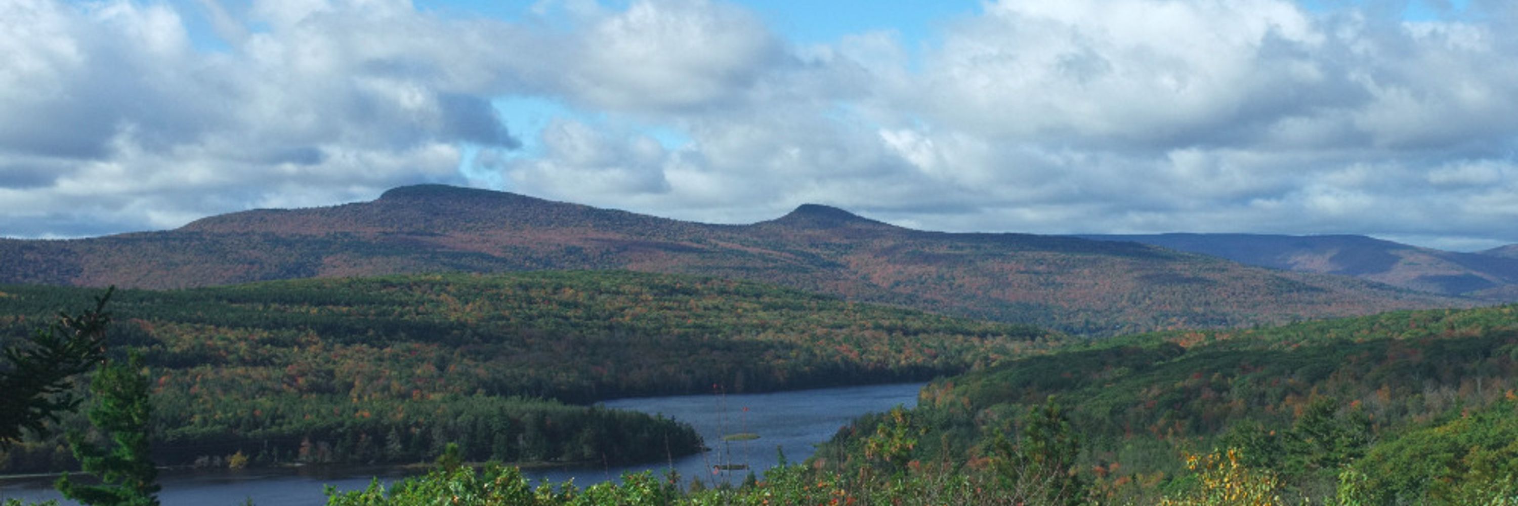
Spent the weekend visiting family in the DC suburbs. What an absolutely perfect time of year.


November 3, 2025 at 3:41 PM
Spent the weekend visiting family in the DC suburbs. What an absolutely perfect time of year.
Good morning from the Amtrak Northeast Regional. Truly one of my favorite places to think, read, write and work on projects. The best way to travel and it’s not even close.

October 31, 2025 at 1:39 PM
Good morning from the Amtrak Northeast Regional. Truly one of my favorite places to think, read, write and work on projects. The best way to travel and it’s not even close.
Tailscale is genuinely one of the most useful tools I've adopted over the past few years. It simplified a piece of the puzzle enough to push me over the edge and start making my own self-hosted web tools all the time. Knowing I can securely access apps hosted in my apartment from anywhere rules.

Tailscale Services is now in beta!
This new feature makes hosting and scaling internal applications simpler and more secure than ever.
Blog: tailscale.com/blog/service...
Video: www.youtube.com/watch?v=mELA...
Webinar 1pm EDT 10/30 on all the Fall Update things: tailscale.com/events-webin...
This new feature makes hosting and scaling internal applications simpler and more secure than ever.
Blog: tailscale.com/blog/service...
Video: www.youtube.com/watch?v=mELA...
Webinar 1pm EDT 10/30 on all the Fall Update things: tailscale.com/events-webin...

October 30, 2025 at 7:55 PM
Tailscale is genuinely one of the most useful tools I've adopted over the past few years. It simplified a piece of the puzzle enough to push me over the edge and start making my own self-hosted web tools all the time. Knowing I can securely access apps hosted in my apartment from anywhere rules.
Just landed a pretty big refactor of the Svelte-powered @urbaninstitute.bsky.social data viz component library that fully embraces runes syntax across all of our components. Svelte continues to be a flexible and powerful tool for our work.
Check out our code on Github github.com/UrbanInstitu...
Check out our code on Github github.com/UrbanInstitu...

October 30, 2025 at 7:40 PM
Just landed a pretty big refactor of the Svelte-powered @urbaninstitute.bsky.social data viz component library that fully embraces runes syntax across all of our components. Svelte continues to be a flexible and powerful tool for our work.
Check out our code on Github github.com/UrbanInstitu...
Check out our code on Github github.com/UrbanInstitu...
Reposted by Mitchell Thorson
The US federal government's spending on housing—directly through the budget, or through tax expenditures—amounts to more than $400 billion a year.
Only about 1/4 of that goes to low-income renters. The majority is spent on subsidizing higher-income homeowners.
www.urban.org/research/pub...
Only about 1/4 of that goes to low-income renters. The majority is spent on subsidizing higher-income homeowners.
www.urban.org/research/pub...

October 30, 2025 at 1:46 PM
The US federal government's spending on housing—directly through the budget, or through tax expenditures—amounts to more than $400 billion a year.
Only about 1/4 of that goes to low-income renters. The majority is spent on subsidizing higher-income homeowners.
www.urban.org/research/pub...
Only about 1/4 of that goes to low-income renters. The majority is spent on subsidizing higher-income homeowners.
www.urban.org/research/pub...
Today @urbaninstitute.bsky.social launches a new data tool: The American Affordability Tracker. We're collecting data that tracks the rising costs of a secure lifestyle, and indicators of financial distress that are contributing to a growing crisis. See the data here: www.urban.org/data-tools/a...
📊
📊
October 28, 2025 at 3:31 PM
Today @urbaninstitute.bsky.social launches a new data tool: The American Affordability Tracker. We're collecting data that tracks the rising costs of a secure lifestyle, and indicators of financial distress that are contributing to a growing crisis. See the data here: www.urban.org/data-tools/a...
📊
📊