


AI is reshaping how we work with data. But, as Ben Welsh (Data Editor, Reuters) shared in our December webinar, AI won’t replace the creativity behind great graphics anytime soon.
Watch the recording for more insights from top data journalists: buff.ly/Y8ZrG0a
Watch the recording for more insights from top data journalists: buff.ly/Y8ZrG0a
January 12, 2026 at 5:01 PM
AI is reshaping how we work with data. But, as Ben Welsh (Data Editor, Reuters) shared in our December webinar, AI won’t replace the creativity behind great graphics anytime soon.
Watch the recording for more insights from top data journalists: buff.ly/Y8ZrG0a
Watch the recording for more insights from top data journalists: buff.ly/Y8ZrG0a
We ❤️ this Observable Notebook from @rreusser.bsky.social exploring yoga class attendance, with calendars and charts made with Observable Plot! Read Ricky's reflections, and see how they use a notebook import to repurpose an existing Plot component: buff.ly/nRync53

January 9, 2026 at 8:30 PM
We ❤️ this Observable Notebook from @rreusser.bsky.social exploring yoga class attendance, with calendars and charts made with Observable Plot! Read Ricky's reflections, and see how they use a notebook import to repurpose an existing Plot component: buff.ly/nRync53
Happy 2026 from the Observable team!
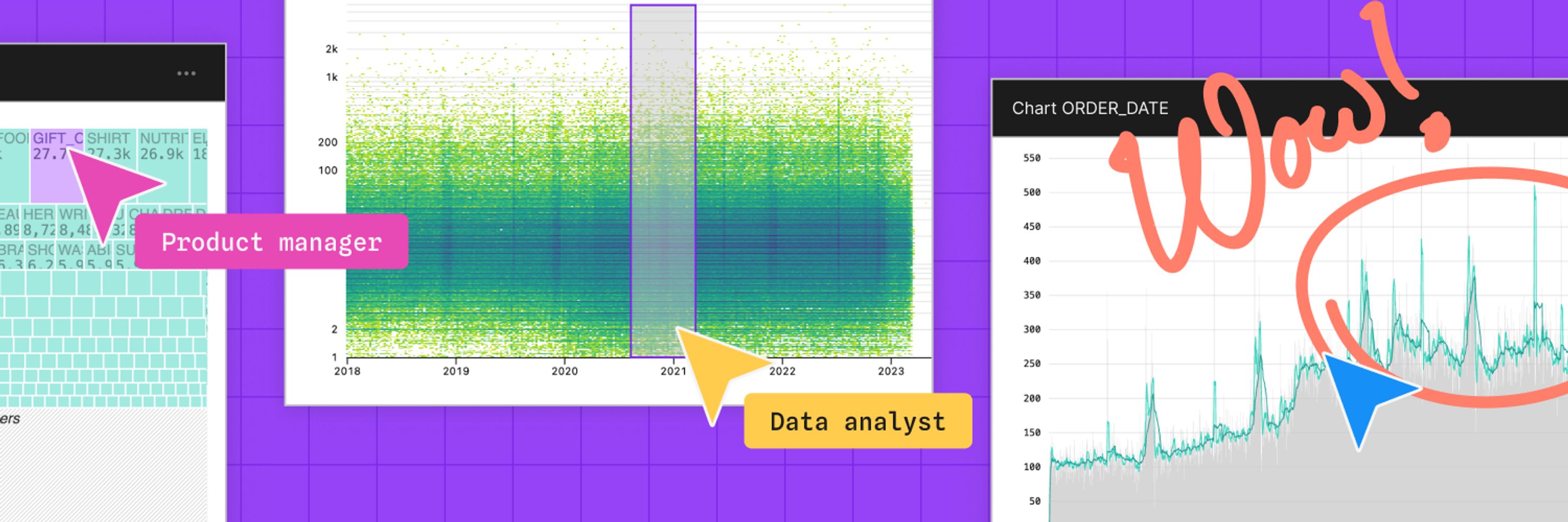
With the start of the new year, we're reminded that time flies and there's always a need to understand how things change as it does. Learn about 8 charts that clarify patterns, reveal anomalies, and help you track performance with time series data👇
With the start of the new year, we're reminded that time flies and there's always a need to understand how things change as it does. Learn about 8 charts that clarify patterns, reveal anomalies, and help you track performance with time series data👇
January 7, 2026 at 9:31 PM
Happy 2026 from the Observable team!
With the start of the new year, we're reminded that time flies and there's always a need to understand how things change as it does. Learn about 8 charts that clarify patterns, reveal anomalies, and help you track performance with time series data👇
With the start of the new year, we're reminded that time flies and there's always a need to understand how things change as it does. Learn about 8 charts that clarify patterns, reveal anomalies, and help you track performance with time series data👇
✨ As 2025 comes to a close, we’re celebrating a big year at Observable — new products (Observable Canvases & Notebooks 2.0!), inspiring events, and innovative work from our community.
Read our 2025 Year in Review for highlights, and to hear what we’re excited about in 2026 🎉
👉
Read our 2025 Year in Review for highlights, and to hear what we’re excited about in 2026 🎉
👉

Observable’s 2025 year in review
It’s been a transformative and inspiring year here at Observable! Read our recap of major product launches, live events, and top community highlights, plus hear what our team is looking forward to in…
buff.ly
December 31, 2025 at 4:30 PM
✨ As 2025 comes to a close, we’re celebrating a big year at Observable — new products (Observable Canvases & Notebooks 2.0!), inspiring events, and innovative work from our community.
Read our 2025 Year in Review for highlights, and to hear what we’re excited about in 2026 🎉
👉
Read our 2025 Year in Review for highlights, and to hear what we’re excited about in 2026 🎉
👉
🥧 We're not saying you're sick of pie (charts) these days, but there are other appetizing ways to visualize parts of a whole. In Observable Canvases, it's just a few clicks to advanced, interactive charts like treemaps, circle packing charts, and more: buff.ly/pI8mYII
December 29, 2025 at 8:30 PM
🥧 We're not saying you're sick of pie (charts) these days, but there are other appetizing ways to visualize parts of a whole. In Observable Canvases, it's just a few clicks to advanced, interactive charts like treemaps, circle packing charts, and more: buff.ly/pI8mYII
🔎 Exploratory data analysis (EDA) is a critical part of any data workflow, but it can also be time consuming.
Learn how our transparent, verifiable AI speeds up EDA in Observable Canvases by quickly profiling data, automating data wrangling, & prototyping charts 👇
Learn how our transparent, verifiable AI speeds up EDA in Observable Canvases by quickly profiling data, automating data wrangling, & prototyping charts 👇
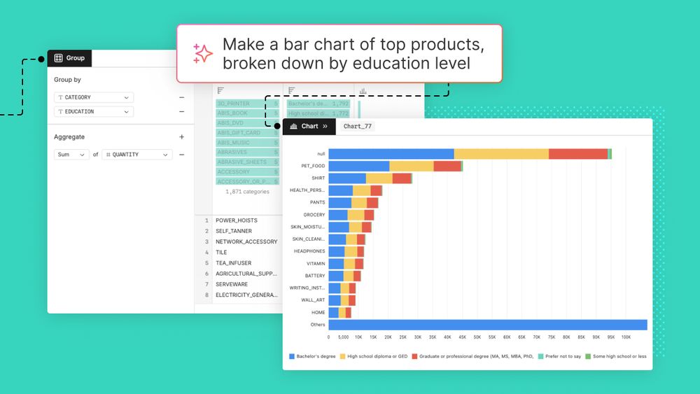
Three ways to use AI for exploratory data analysis
Data teams are rapidly adopting AI tools to boost analysis workflows, from exploration to dashboard development. Learn three ways that AI can improve exploratory data analysis.
buff.ly
December 22, 2025 at 8:30 PM
🔎 Exploratory data analysis (EDA) is a critical part of any data workflow, but it can also be time consuming.
Learn how our transparent, verifiable AI speeds up EDA in Observable Canvases by quickly profiling data, automating data wrangling, & prototyping charts 👇
Learn how our transparent, verifiable AI speeds up EDA in Observable Canvases by quickly profiling data, automating data wrangling, & prototyping charts 👇
✨ Observable’s Year in Review ✨
2025 was a big year at Observable, with new launches like Observable Canvases and Notebooks 2.0, inspiring events, and incredible work from our community. As we head into 2026, here's a look back at highlights from the past year:
2025 was a big year at Observable, with new launches like Observable Canvases and Notebooks 2.0, inspiring events, and incredible work from our community. As we head into 2026, here's a look back at highlights from the past year:
Observable’s 2025 year in review
It’s been a transformative and inspiring year here at Observable! Read our recap of major product launches, live events, and top community highlights, plus hear what our team is looking forward to in…
buff.ly
December 18, 2025 at 8:30 PM
✨ Observable’s Year in Review ✨
2025 was a big year at Observable, with new launches like Observable Canvases and Notebooks 2.0, inspiring events, and incredible work from our community. As we head into 2026, here's a look back at highlights from the past year:
2025 was a big year at Observable, with new launches like Observable Canvases and Notebooks 2.0, inspiring events, and incredible work from our community. As we head into 2026, here's a look back at highlights from the past year:
Before diving headfirst into a new dataset, Jared Whalen (The Pudding) reminds us to first ask why the data exists, & how it’s already been used.
Catch more expert insights from top data journalists in our recent “Storytelling with Graphics” webinar 👉 buff.ly/6PmuD06
Catch more expert insights from top data journalists in our recent “Storytelling with Graphics” webinar 👉 buff.ly/6PmuD06
December 16, 2025 at 4:31 PM
Before diving headfirst into a new dataset, Jared Whalen (The Pudding) reminds us to first ask why the data exists, & how it’s already been used.
Catch more expert insights from top data journalists in our recent “Storytelling with Graphics” webinar 👉 buff.ly/6PmuD06
Catch more expert insights from top data journalists in our recent “Storytelling with Graphics” webinar 👉 buff.ly/6PmuD06
🚀 We recently rolled out improvements to the SQL node in Observable Canvases, making it even easier to write & iterate on custom queries. Learn about dialect-aware autocompletion, improved error handling, & UI refinements in the SQL node, plus get a preview of what's coming in 2026:

Recent improvements to the SQL node in Observable Canvases
Over the past two months we’ve made big updates to the SQL node in Observable Canvases. Learn about the friction points we’ve addressed, the solutions we’ve implemented, and what’s in the pipeline.
buff.ly
December 12, 2025 at 4:54 PM
🚀 We recently rolled out improvements to the SQL node in Observable Canvases, making it even easier to write & iterate on custom queries. Learn about dialect-aware autocompletion, improved error handling, & UI refinements in the SQL node, plus get a preview of what's coming in 2026:
Did you miss last week’s webinar featuring leading data journalists from Reuters, Axios, and The Pudding?
Check out our recap blog post for key takeaways from the discussion and a behind-the-scenes look into impactful graphics by our panelists:
Check out our recap blog post for key takeaways from the discussion and a behind-the-scenes look into impactful graphics by our panelists:

Webinar recap: Storytelling with graphics:
On December 4th, leading data journalists, Jared Whalen (Polygraph/The Pudding), Ben Welsh (Reuters), and Kavya Beheraj (Axios), gave us a peek behind the curtain on their process.
buff.ly
December 11, 2025 at 9:30 PM
Did you miss last week’s webinar featuring leading data journalists from Reuters, Axios, and The Pudding?
Check out our recap blog post for key takeaways from the discussion and a behind-the-scenes look into impactful graphics by our panelists:
Check out our recap blog post for key takeaways from the discussion and a behind-the-scenes look into impactful graphics by our panelists:
In last week's Storytelling with Graphics webinar, we went behind the scenes with leading data journalists to learn how they transform messy datasets into informative and impactful stories. Catch the full discussion here: buff.ly/6PmuD06
December 9, 2025 at 5:30 PM
In last week's Storytelling with Graphics webinar, we went behind the scenes with leading data journalists to learn how they transform messy datasets into informative and impactful stories. Catch the full discussion here: buff.ly/6PmuD06
When Karim Douieb shares a new data visualization, it travels far and fast, sparking meaningful conversation along the way. In our latest Creator Spotlight, we dive into the anatomy of an impactful visualization with Karim, and how he designs for clarity, impact, and emotion:

Creator spotlight: The anatomy of an impactful data visualization with Karim Douieb
Explore how data viz designer Karim Douieb creates impactful data visualizations. Learn his five principles behind visuals that clarify, connect, and spark insight.
buff.ly
December 8, 2025 at 8:30 PM
When Karim Douieb shares a new data visualization, it travels far and fast, sparking meaningful conversation along the way. In our latest Creator Spotlight, we dive into the anatomy of an impactful visualization with Karim, and how he designs for clarity, impact, and emotion:
Newsrooms have long pushed the boundaries of what data visualization can do — crafting charts and infographics that don’t just inform, but move people. TOMORROW: Our webinar with expert data journalists provides a peek behind the curtain on their process.
🔗
🔗

Storytelling with graphics: From raw data to reader impact
Newsrooms have long been the frontier of data visualization, turning messy datasets into clear, powerful stories that resonate with broad audiences. In this panel, leading data journalists will take…
buff.ly
December 3, 2025 at 11:30 PM
Newsrooms have long pushed the boundaries of what data visualization can do — crafting charts and infographics that don’t just inform, but move people. TOMORROW: Our webinar with expert data journalists provides a peek behind the curtain on their process.
🔗
🔗
🚀 Big SQL upgrades just landed in Observable Canvases. From dialect-aware autocomplete to helpful error messages and a smoother UI, it's now faster and easier to work in the SQL node. Catch up on what’s new, and learn what's coming next →
Recent improvements to the SQL node in Observable Canvases
Over the past two months we’ve made big updates to the SQL node in Observable Canvases. Learn about the friction points we’ve addressed, the solutions we’ve implemented, and what’s in the pipeline.
buff.ly
December 3, 2025 at 4:54 PM
🚀 Big SQL upgrades just landed in Observable Canvases. From dialect-aware autocomplete to helpful error messages and a smoother UI, it's now faster and easier to work in the SQL node. Catch up on what’s new, and learn what's coming next →
In our recent webinar, Data Visualization Developer Kelsey Nanan shared how low-code tools speed up testing, design, and iteration. See how Observable Canvases help analysts get from big databases to fast, interactive charts in just a few clicks: buff.ly/HkV5RVR
December 1, 2025 at 8:30 PM
In our recent webinar, Data Visualization Developer Kelsey Nanan shared how low-code tools speed up testing, design, and iteration. See how Observable Canvases help analysts get from big databases to fast, interactive charts in just a few clicks: buff.ly/HkV5RVR
Readers have come to expect engaging data visualizations and infographics from their news sources. On Dec 4, experts from Reuters, Axios, and The Pudding will unpack what makes a visualization clear, credible, and emotional. Register for the webinar:

Storytelling with graphics: From raw data to reader impact
Newsrooms have long been the frontier of data visualization, turning messy datasets into clear, powerful stories that resonate with broad audiences. In this panel, leading data journalists will take…
buff.ly
November 25, 2025 at 11:30 PM
Readers have come to expect engaging data visualizations and infographics from their news sources. On Dec 4, experts from Reuters, Axios, and The Pudding will unpack what makes a visualization clear, credible, and emotional. Register for the webinar:
Missed our “Art + science” webinar? Don’t worry — we have the highlights on our blog. Be sure to check it out, and hear their takes on choosing the “right” chart, personal influence, and their approach to collaborating with others:

Webinar recap: Art + science: Blending creativity and analysis in data viz
On Nov 11, we hosted Art + science: Blending creativity and analysis in data visualization, a webinar on how three data visualization leaders — Kelsey Nanan, Tanya Shapiro, and Shirley Wu — strike…
buff.ly
November 24, 2025 at 11:30 PM
Missed our “Art + science” webinar? Don’t worry — we have the highlights on our blog. Be sure to check it out, and hear their takes on choosing the “right” chart, personal influence, and their approach to collaborating with others:
What makes a data visualization not only inform, but resonate deeply with audiences?According to @karimdouieb.bsky.social, there are 5 essential ingredients. In this Creator Spotlight, Karim walks us through each of these elements & shares concrete examples from his work. Read more:
Creator spotlight: The anatomy of an impactful data visualization with Karim Douieb
Explore how data viz designer Karim Douieb creates impactful data visualizations. Learn his five principles behind visuals that clarify, connect, and spark insight.
buff.ly
November 21, 2025 at 9:37 PM
What makes a data visualization not only inform, but resonate deeply with audiences?According to @karimdouieb.bsky.social, there are 5 essential ingredients. In this Creator Spotlight, Karim walks us through each of these elements & shares concrete examples from his work. Read more:
How do data journalists turn raw data into stories that inform and inspire? Join experts from Reuters, Axios, and The Pudding on Dec 4 for a behind-the-scenes look at how newsrooms approach storytelling with graphics. Register now:
Storytelling with graphics: From raw data to reader impact
Newsrooms have long been the frontier of data visualization, turning messy datasets into clear, powerful stories that resonate with broad audiences. In this panel, leading data journalists will take…
buff.ly
November 20, 2025 at 10:30 PM
How do data journalists turn raw data into stories that inform and inspire? Join experts from Reuters, Axios, and The Pudding on Dec 4 for a behind-the-scenes look at how newsrooms approach storytelling with graphics. Register now:
“When researchers can see their data, they start asking better questions.”
In our latest Creator Spotlight, Dr. Philip Bogden shows how his data app helped oncology researchers move beyond spreadsheets to unlock richer, interactive data exploration.
Read 👇
In our latest Creator Spotlight, Dr. Philip Bogden shows how his data app helped oncology researchers move beyond spreadsheets to unlock richer, interactive data exploration.
Read 👇

Making science visible: Dr. Philip Bogden on bringing data visualization to cancer research
How Dr. Philip Bogden uses Observable to build interactive data tools, helping oncologists explore and visualize patient data.
buff.ly
November 19, 2025 at 9:30 PM
“When researchers can see their data, they start asking better questions.”
In our latest Creator Spotlight, Dr. Philip Bogden shows how his data app helped oncology researchers move beyond spreadsheets to unlock richer, interactive data exploration.
Read 👇
In our latest Creator Spotlight, Dr. Philip Bogden shows how his data app helped oncology researchers move beyond spreadsheets to unlock richer, interactive data exploration.
Read 👇
Want to show how your data adds up? 📊 Meet 6 chart types for visualizing parts of a whole — from treemaps to streamgraphs — plus tips on when each may be a good fit for your data. Learn how you can create the featured charts & many more in Observable Canvases, each in under a minute: buff.ly/RtIRpxT
November 14, 2025 at 4:31 PM
Want to show how your data adds up? 📊 Meet 6 chart types for visualizing parts of a whole — from treemaps to streamgraphs — plus tips on when each may be a good fit for your data. Learn how you can create the featured charts & many more in Observable Canvases, each in under a minute: buff.ly/RtIRpxT
[TOMORROW] Get ready for our webinar: Art + science: Blending creativity and analysis in data visualization 🎨📊
Our guests will share their perspectives on chart choices, interactivity, AI, and more.
Our guests will share their perspectives on chart choices, interactivity, AI, and more.

Art + science: Blending creativity and analysis in data visualization
Great data visualization lives at the intersection of art and science. By bridging rigorous data analysis with creative design, data visualization has the power to make complex ideas easier to…
buff.ly
November 11, 2025 at 12:02 AM
[TOMORROW] Get ready for our webinar: Art + science: Blending creativity and analysis in data visualization 🎨📊
Our guests will share their perspectives on chart choices, interactivity, AI, and more.
Our guests will share their perspectives on chart choices, interactivity, AI, and more.
In Observable Canvases, users can freely arrange charts and analysis across two dimensions for unconstrained, branching data exploration. Learn how we designed custom connectors that keep data flow clear and manageable at any scale: buff.ly/aEfiuLx

November 7, 2025 at 4:54 PM
In Observable Canvases, users can freely arrange charts and analysis across two dimensions for unconstrained, branching data exploration. Learn how we designed custom connectors that keep data flow clear and manageable at any scale: buff.ly/aEfiuLx
Want to make visuals that don’t just inform — but resonate? Join us on Nov 11 for Art + science: Blending creativity and analysis in data visualization, and learn how experts balance clarity, creativity, and collaboration.
🎙️@shirleywu.studio
🎙️@tanyashapiro.bsky.social
🎙️Kelsey Nanan
🎙️@shirleywu.studio
🎙️@tanyashapiro.bsky.social
🎙️Kelsey Nanan
Art + science: Blending creativity and analysis in data visualization
Great data visualization lives at the intersection of art and science. By bridging rigorous data analysis with creative design, data visualization has the power to make complex ideas easier to…
buff.ly
November 6, 2025 at 10:30 PM
Want to make visuals that don’t just inform — but resonate? Join us on Nov 11 for Art + science: Blending creativity and analysis in data visualization, and learn how experts balance clarity, creativity, and collaboration.
🎙️@shirleywu.studio
🎙️@tanyashapiro.bsky.social
🎙️Kelsey Nanan
🎙️@shirleywu.studio
🎙️@tanyashapiro.bsky.social
🎙️Kelsey Nanan
What happens when a computer scientist helps oncologists visualize patient-survey data?
Read how Dr. Philip Bogden’s interactive data app turned messy spreadsheets into insights — and reshaped collaboration in medical research.
buff.ly/kRyB12U
Read how Dr. Philip Bogden’s interactive data app turned messy spreadsheets into insights — and reshaped collaboration in medical research.
buff.ly/kRyB12U

November 5, 2025 at 10:45 PM
What happens when a computer scientist helps oncologists visualize patient-survey data?
Read how Dr. Philip Bogden’s interactive data app turned messy spreadsheets into insights — and reshaped collaboration in medical research.
buff.ly/kRyB12U
Read how Dr. Philip Bogden’s interactive data app turned messy spreadsheets into insights — and reshaped collaboration in medical research.
buff.ly/kRyB12U