


AI is reshaping how we work with data. But, as Ben Welsh (Data Editor, Reuters) shared in our December webinar, AI won’t replace the creativity behind great graphics anytime soon.
Watch the recording for more insights from top data journalists: buff.ly/Y8ZrG0a
Watch the recording for more insights from top data journalists: buff.ly/Y8ZrG0a
January 12, 2026 at 5:01 PM
AI is reshaping how we work with data. But, as Ben Welsh (Data Editor, Reuters) shared in our December webinar, AI won’t replace the creativity behind great graphics anytime soon.
Watch the recording for more insights from top data journalists: buff.ly/Y8ZrG0a
Watch the recording for more insights from top data journalists: buff.ly/Y8ZrG0a
We ❤️ this Observable Notebook from @rreusser.bsky.social exploring yoga class attendance, with calendars and charts made with Observable Plot! Read Ricky's reflections, and see how they use a notebook import to repurpose an existing Plot component: buff.ly/nRync53

January 9, 2026 at 8:30 PM
We ❤️ this Observable Notebook from @rreusser.bsky.social exploring yoga class attendance, with calendars and charts made with Observable Plot! Read Ricky's reflections, and see how they use a notebook import to repurpose an existing Plot component: buff.ly/nRync53
Happy 2026 from the Observable team!
With the start of the new year, we're reminded that time flies and there's always a need to understand how things change as it does. Learn about 8 charts that clarify patterns, reveal anomalies, and help you track performance with time series data👇
With the start of the new year, we're reminded that time flies and there's always a need to understand how things change as it does. Learn about 8 charts that clarify patterns, reveal anomalies, and help you track performance with time series data👇
January 7, 2026 at 9:31 PM
Happy 2026 from the Observable team!
With the start of the new year, we're reminded that time flies and there's always a need to understand how things change as it does. Learn about 8 charts that clarify patterns, reveal anomalies, and help you track performance with time series data👇
With the start of the new year, we're reminded that time flies and there's always a need to understand how things change as it does. Learn about 8 charts that clarify patterns, reveal anomalies, and help you track performance with time series data👇
🥧 We're not saying you're sick of pie (charts) these days, but there are other appetizing ways to visualize parts of a whole. In Observable Canvases, it's just a few clicks to advanced, interactive charts like treemaps, circle packing charts, and more: buff.ly/pI8mYII
December 29, 2025 at 8:30 PM
🥧 We're not saying you're sick of pie (charts) these days, but there are other appetizing ways to visualize parts of a whole. In Observable Canvases, it's just a few clicks to advanced, interactive charts like treemaps, circle packing charts, and more: buff.ly/pI8mYII
Before diving headfirst into a new dataset, Jared Whalen (The Pudding) reminds us to first ask why the data exists, & how it’s already been used.
Catch more expert insights from top data journalists in our recent “Storytelling with Graphics” webinar 👉 buff.ly/6PmuD06
Catch more expert insights from top data journalists in our recent “Storytelling with Graphics” webinar 👉 buff.ly/6PmuD06
December 16, 2025 at 4:31 PM
Before diving headfirst into a new dataset, Jared Whalen (The Pudding) reminds us to first ask why the data exists, & how it’s already been used.
Catch more expert insights from top data journalists in our recent “Storytelling with Graphics” webinar 👉 buff.ly/6PmuD06
Catch more expert insights from top data journalists in our recent “Storytelling with Graphics” webinar 👉 buff.ly/6PmuD06
In last week's Storytelling with Graphics webinar, we went behind the scenes with leading data journalists to learn how they transform messy datasets into informative and impactful stories. Catch the full discussion here: buff.ly/6PmuD06
December 9, 2025 at 5:30 PM
In last week's Storytelling with Graphics webinar, we went behind the scenes with leading data journalists to learn how they transform messy datasets into informative and impactful stories. Catch the full discussion here: buff.ly/6PmuD06
In our recent webinar, Data Visualization Developer Kelsey Nanan shared how low-code tools speed up testing, design, and iteration. See how Observable Canvases help analysts get from big databases to fast, interactive charts in just a few clicks: buff.ly/HkV5RVR
December 1, 2025 at 8:30 PM
In our recent webinar, Data Visualization Developer Kelsey Nanan shared how low-code tools speed up testing, design, and iteration. See how Observable Canvases help analysts get from big databases to fast, interactive charts in just a few clicks: buff.ly/HkV5RVR
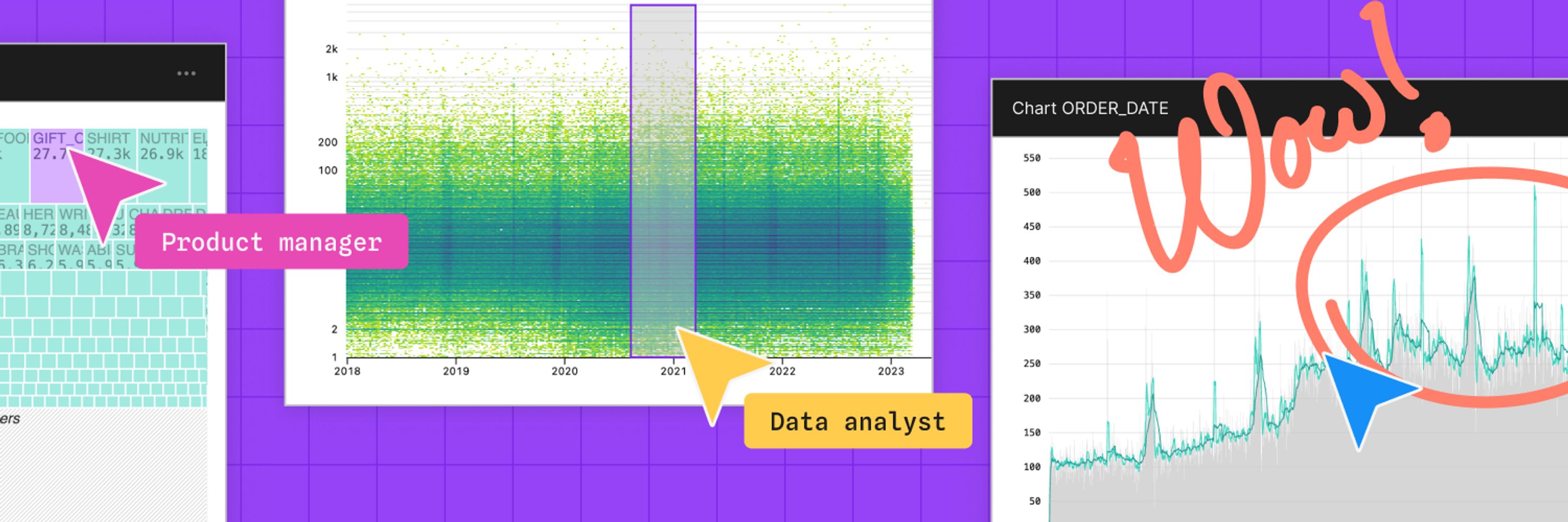
Want to show how your data adds up? 📊 Meet 6 chart types for visualizing parts of a whole — from treemaps to streamgraphs — plus tips on when each may be a good fit for your data. Learn how you can create the featured charts & many more in Observable Canvases, each in under a minute: buff.ly/RtIRpxT
November 14, 2025 at 4:31 PM
Want to show how your data adds up? 📊 Meet 6 chart types for visualizing parts of a whole — from treemaps to streamgraphs — plus tips on when each may be a good fit for your data. Learn how you can create the featured charts & many more in Observable Canvases, each in under a minute: buff.ly/RtIRpxT
In Observable Canvases, users can freely arrange charts and analysis across two dimensions for unconstrained, branching data exploration. Learn how we designed custom connectors that keep data flow clear and manageable at any scale: buff.ly/aEfiuLx

November 7, 2025 at 4:54 PM
In Observable Canvases, users can freely arrange charts and analysis across two dimensions for unconstrained, branching data exploration. Learn how we designed custom connectors that keep data flow clear and manageable at any scale: buff.ly/aEfiuLx
What happens when a computer scientist helps oncologists visualize patient-survey data?
Read how Dr. Philip Bogden’s interactive data app turned messy spreadsheets into insights — and reshaped collaboration in medical research.
buff.ly/kRyB12U
Read how Dr. Philip Bogden’s interactive data app turned messy spreadsheets into insights — and reshaped collaboration in medical research.
buff.ly/kRyB12U

November 5, 2025 at 10:45 PM
What happens when a computer scientist helps oncologists visualize patient-survey data?
Read how Dr. Philip Bogden’s interactive data app turned messy spreadsheets into insights — and reshaped collaboration in medical research.
buff.ly/kRyB12U
Read how Dr. Philip Bogden’s interactive data app turned messy spreadsheets into insights — and reshaped collaboration in medical research.
buff.ly/kRyB12U
It's now even easier to build on-brand data visualizations in Observable Canvases. 🎨 With our new data-driven colors, you can quickly define custom color scales based on categories in your data. Learn how Observable helps you create fast, consistently branded charts: buff.ly/YCkFGLB
November 3, 2025 at 8:31 PM
It's now even easier to build on-brand data visualizations in Observable Canvases. 🎨 With our new data-driven colors, you can quickly define custom color scales based on categories in your data. Learn how Observable helps you create fast, consistently branded charts: buff.ly/YCkFGLB
🕸️ For our final Observa-bite of the month we are adding radar charts (aka spider charts) to Observable Canvases. Check out radar charts, and all of our advanced chart types, available in canvases: buff.ly/l76pX6m
October 30, 2025 at 3:54 PM
🕸️ For our final Observa-bite of the month we are adding radar charts (aka spider charts) to Observable Canvases. Check out radar charts, and all of our advanced chart types, available in canvases: buff.ly/l76pX6m
Great data viz is both art and science. 🎨📊 Join Observable’s @allisonhorst.bsky.social + our powerhouse panel for an inspiring discussion on where the two converge.
🎙️@shirleywu.studio
🎙️@tanyashapiro.bsky.social
🎙️Kelsey Nanan
buff.ly/GuvF7c2
🎙️@shirleywu.studio
🎙️@tanyashapiro.bsky.social
🎙️Kelsey Nanan
buff.ly/GuvF7c2

October 24, 2025 at 6:37 PM
Great data viz is both art and science. 🎨📊 Join Observable’s @allisonhorst.bsky.social + our powerhouse panel for an inspiring discussion on where the two converge.
🎙️@shirleywu.studio
🎙️@tanyashapiro.bsky.social
🎙️Kelsey Nanan
buff.ly/GuvF7c2
🎙️@shirleywu.studio
🎙️@tanyashapiro.bsky.social
🎙️Kelsey Nanan
buff.ly/GuvF7c2
Observable’s built-in charts are designed by top data visualization developers, interactive by default, & fast — even with big data. We’ve expanded our suite of advanced types to include Sankeys, beeswarms, arc maps & more. Meet our state-of-the-art data visualizations 👉 buff.ly/eZYyQYd
October 24, 2025 at 3:54 PM
Observable’s built-in charts are designed by top data visualization developers, interactive by default, & fast — even with big data. We’ve expanded our suite of advanced types to include Sankeys, beeswarms, arc maps & more. Meet our state-of-the-art data visualizations 👉 buff.ly/eZYyQYd
Table nodes in Observable Canvases are powerful for fast, UI-based data wrangling. In addition to interactive filtering and column management, you can now derive new columns, convert data types, and limit rows — all in the same place. Learn more: buff.ly/l76pX6m
October 23, 2025 at 7:30 PM
Table nodes in Observable Canvases are powerful for fast, UI-based data wrangling. In addition to interactive filtering and column management, you can now derive new columns, convert data types, and limit rows — all in the same place. Learn more: buff.ly/l76pX6m
🔍 Data exploration should inspire new questions & analyses. But some BI tools make exploration cumbersome, and discourage alternate exploration paths.
Observable Canvases are designed for fast, iterative data exploration and analysis. Meet 8 canvas features that make it possible: buff.ly/oVZDhLX
Observable Canvases are designed for fast, iterative data exploration and analysis. Meet 8 canvas features that make it possible: buff.ly/oVZDhLX

October 17, 2025 at 3:54 PM
🔍 Data exploration should inspire new questions & analyses. But some BI tools make exploration cumbersome, and discourage alternate exploration paths.
Observable Canvases are designed for fast, iterative data exploration and analysis. Meet 8 canvas features that make it possible: buff.ly/oVZDhLX
Observable Canvases are designed for fast, iterative data exploration and analysis. Meet 8 canvas features that make it possible: buff.ly/oVZDhLX
🪄 Chart theming is here! Now, in Observable Canvases, you can apply custom color palettes and fonts to create dashboards that are automatically on-brand. Get started with dashboards and chart theming here: buff.ly/I1nu82R
October 14, 2025 at 3:54 PM
🪄 Chart theming is here! Now, in Observable Canvases, you can apply custom color palettes and fonts to create dashboards that are automatically on-brand. Get started with dashboards and chart theming here: buff.ly/I1nu82R
We have lots of exciting treats in store for the month of October! Check back each Tuesday for new features and functionality in Observable Canvases. The first new feature drops tomorrow (and it's a big one!).

October 6, 2025 at 11:00 PM
We have lots of exciting treats in store for the month of October! Check back each Tuesday for new features and functionality in Observable Canvases. The first new feature drops tomorrow (and it's a big one!).
🐝 Beeswarm charts are a powerful way to explore quantitative variable distributions, and a useful alternative to more aggregated options like histograms & box plots. Meet our expanding library of state-of-the-art, interactive charts in Observable Canvases: buff.ly/SLQY7SD
October 3, 2025 at 3:31 PM
🐝 Beeswarm charts are a powerful way to explore quantitative variable distributions, and a useful alternative to more aggregated options like histograms & box plots. Meet our expanding library of state-of-the-art, interactive charts in Observable Canvases: buff.ly/SLQY7SD
Slow-loading tables and overworked browsers can bog down analysis when you're exploring large datasets. In our new post, we explain how table virtualization in Observable Canvas keeps data work fast and fluid — even with big data, and when viewing complex, branching analyses: buff.ly/7cfqsQA
September 18, 2025 at 3:54 PM
Slow-loading tables and overworked browsers can bog down analysis when you're exploring large datasets. In our new post, we explain how table virtualization in Observable Canvas keeps data work fast and fluid — even with big data, and when viewing complex, branching analyses: buff.ly/7cfqsQA
Treemaps help you go beyond donut charts and stacked bars to visualize parts of a whole for hierarchical data. Learn how canvases put state-of-the-art, interactive charts like treemaps, Sankey diagrams, beeswarms, bump charts, and more at your fingertips: buff.ly/DaE8zgO
September 17, 2025 at 7:31 PM
Treemaps help you go beyond donut charts and stacked bars to visualize parts of a whole for hierarchical data. Learn how canvases put state-of-the-art, interactive charts like treemaps, Sankey diagrams, beeswarms, bump charts, and more at your fingertips: buff.ly/DaE8zgO
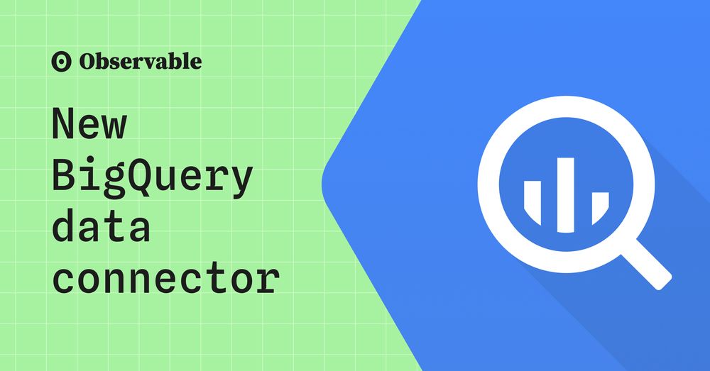
Observable Canvases now support BigQuery making it easy for more companies to connect, query, and build. Get started today at: buff.ly/DaE8zgO
September 15, 2025 at 11:00 PM
Observable Canvases now support BigQuery making it easy for more companies to connect, query, and build. Get started today at: buff.ly/DaE8zgO
Sankey diagrams make it easy to see how quantities flow through a system, but they're tough to build from scratch.
In Observable Canvases, you can create Sankey diagrams (plus arc maps, beeswarms, & more) in minutes — all optimized for clarity and performance: buff.ly/gsd0cpg
In Observable Canvases, you can create Sankey diagrams (plus arc maps, beeswarms, & more) in minutes — all optimized for clarity and performance: buff.ly/gsd0cpg
September 11, 2025 at 7:31 PM
Sankey diagrams make it easy to see how quantities flow through a system, but they're tough to build from scratch.
In Observable Canvases, you can create Sankey diagrams (plus arc maps, beeswarms, & more) in minutes — all optimized for clarity and performance: buff.ly/gsd0cpg
In Observable Canvases, you can create Sankey diagrams (plus arc maps, beeswarms, & more) in minutes — all optimized for clarity and performance: buff.ly/gsd0cpg
Bump charts show how rankings shift over time, and are a great option when order matters more than absolute values. In Observable Canvases, you can now build & share responsive bump charts with just a few clicks. See what's new in our summer release: buff.ly/ZDxrAvt
September 9, 2025 at 7:30 PM
Bump charts show how rankings shift over time, and are a great option when order matters more than absolute values. In Observable Canvases, you can now build & share responsive bump charts with just a few clicks. See what's new in our summer release: buff.ly/ZDxrAvt
For one of the most common operations in all of data wrangling, implementing UI-based data joins is anything but straightforward. Software engineer Tony Sullivan shares some unexpected challenges behind joins and how we handle them in Observable Canvases: buff.ly/4FRU9C9
September 4, 2025 at 7:30 PM
For one of the most common operations in all of data wrangling, implementing UI-based data joins is anything but straightforward. Software engineer Tony Sullivan shares some unexpected challenges behind joins and how we handle them in Observable Canvases: buff.ly/4FRU9C9