


Pablo Almunia
@pabloalmunia.bsky.social
Spanish professional in Brussels. Studied Philosophy, Computer Science, and Business Administration. Now, I am focused on data visualization at GRAPHERY.
Reposted by Pablo Almunia

🌍 The highest adult obesity rates are mostly in the Pacific.
🇦🇸 American Samoa leads with 75.21% (WHO, 2022). Diet shifts and sedentary habits are key factors.
👉 See how this chart was made: playground.grapper.io/editor/gggov...
#HealthData #Obesity #DataViz #Grapper
🇦🇸 American Samoa leads with 75.21% (WHO, 2022). Diet shifts and sedentary habits are key factors.
👉 See how this chart was made: playground.grapper.io/editor/gggov...
#HealthData #Obesity #DataViz #Grapper

November 4, 2025 at 2:56 PM
🌍 The highest adult obesity rates are mostly in the Pacific.
🇦🇸 American Samoa leads with 75.21% (WHO, 2022). Diet shifts and sedentary habits are key factors.
👉 See how this chart was made: playground.grapper.io/editor/gggov...
#HealthData #Obesity #DataViz #Grapper
🇦🇸 American Samoa leads with 75.21% (WHO, 2022). Diet shifts and sedentary habits are key factors.
👉 See how this chart was made: playground.grapper.io/editor/gggov...
#HealthData #Obesity #DataViz #Grapper
Reposted by Pablo Almunia
🌡️ Radial Temperature
Chart showing how min (blue) and max (red) temps change through the year. The shaded area shows their average variation and seasonal contrast.
👉 Made with Grapper: playground.grapper.io/editor/gu5oy...
#DataViz #Climate #RadialChart #Grapper
Chart showing how min (blue) and max (red) temps change through the year. The shaded area shows their average variation and seasonal contrast.
👉 Made with Grapper: playground.grapper.io/editor/gu5oy...
#DataViz #Climate #RadialChart #Grapper

October 31, 2025 at 8:23 AM
🌡️ Radial Temperature
Chart showing how min (blue) and max (red) temps change through the year. The shaded area shows their average variation and seasonal contrast.
👉 Made with Grapper: playground.grapper.io/editor/gu5oy...
#DataViz #Climate #RadialChart #Grapper
Chart showing how min (blue) and max (red) temps change through the year. The shaded area shows their average variation and seasonal contrast.
👉 Made with Grapper: playground.grapper.io/editor/gu5oy...
#DataViz #Climate #RadialChart #Grapper
Reposted by Pablo Almunia
🔴 1 in 5 Europeans at risk
21.4% of the EU population faces poverty or social exclusion.
Inequality persists — inclusion and social protection are essential for a fairer Europe.
📊 Made with Grapper → playground.grapper.io/editor/gimsz...
#DataViz #EU #Inequality #Grapper
21.4% of the EU population faces poverty or social exclusion.
Inequality persists — inclusion and social protection are essential for a fairer Europe.
📊 Made with Grapper → playground.grapper.io/editor/gimsz...
#DataViz #EU #Inequality #Grapper

October 16, 2025 at 7:10 AM
🔴 1 in 5 Europeans at risk
21.4% of the EU population faces poverty or social exclusion.
Inequality persists — inclusion and social protection are essential for a fairer Europe.
📊 Made with Grapper → playground.grapper.io/editor/gimsz...
#DataViz #EU #Inequality #Grapper
21.4% of the EU population faces poverty or social exclusion.
Inequality persists — inclusion and social protection are essential for a fairer Europe.
📊 Made with Grapper → playground.grapper.io/editor/gimsz...
#DataViz #EU #Inequality #Grapper
Reposted by Pablo Almunia
🔹 Reactivity & data visualization made simple
With Grapper, the g-bind: directive updates your SVGs automatically when data changes — speeding dev, keeping code clean, and enabling dynamic, reactive visuals.
🔗 Read more: blog.grapper.io/understandin...
#DataViz #Frontend #SVG #Reactivity #Grapper
With Grapper, the g-bind: directive updates your SVGs automatically when data changes — speeding dev, keeping code clean, and enabling dynamic, reactive visuals.
🔗 Read more: blog.grapper.io/understandin...
#DataViz #Frontend #SVG #Reactivity #Grapper

October 14, 2025 at 7:38 AM
🔹 Reactivity & data visualization made simple
With Grapper, the g-bind: directive updates your SVGs automatically when data changes — speeding dev, keeping code clean, and enabling dynamic, reactive visuals.
🔗 Read more: blog.grapper.io/understandin...
#DataViz #Frontend #SVG #Reactivity #Grapper
With Grapper, the g-bind: directive updates your SVGs automatically when data changes — speeding dev, keeping code clean, and enabling dynamic, reactive visuals.
🔗 Read more: blog.grapper.io/understandin...
#DataViz #Frontend #SVG #Reactivity #Grapper
Reposted by Pablo Almunia
⚡ Speed is UX.
In real-time data viz, every ms counts.
Our SVG-based micro-framework achieves sub-ms reactivity — no virtual DOM, no extra renders.
Performance is design.
🔗 blog.grapper.io/speed-and-us...
#UX #DataViz #Grapper
In real-time data viz, every ms counts.
Our SVG-based micro-framework achieves sub-ms reactivity — no virtual DOM, no extra renders.
Performance is design.
🔗 blog.grapper.io/speed-and-us...
#UX #DataViz #Grapper

October 9, 2025 at 9:14 AM
⚡ Speed is UX.
In real-time data viz, every ms counts.
Our SVG-based micro-framework achieves sub-ms reactivity — no virtual DOM, no extra renders.
Performance is design.
🔗 blog.grapper.io/speed-and-us...
#UX #DataViz #Grapper
In real-time data viz, every ms counts.
Our SVG-based micro-framework achieves sub-ms reactivity — no virtual DOM, no extra renders.
Performance is design.
🔗 blog.grapper.io/speed-and-us...
#UX #DataViz #Grapper

Reposted by Pablo Almunia
🚀 Meet Grapper: a lightweight, open-source micro-framework for data viz.
- SVG + directives
- No compilers
- Fast & reactive
From weekend prototype → now powering 100s of custom visualizations.
🔗 medium.com/graphane/why...
#DataViz #OpenSource #SVG
- SVG + directives
- No compilers
- Fast & reactive
From weekend prototype → now powering 100s of custom visualizations.
🔗 medium.com/graphane/why...
#DataViz #OpenSource #SVG

Why Grapper
The Graphery team developed Grapper out of frustration with existing solutions for crafting creative data visualizations.
medium.com
September 16, 2025 at 10:21 AM
🚀 Meet Grapper: a lightweight, open-source micro-framework for data viz.
- SVG + directives
- No compilers
- Fast & reactive
From weekend prototype → now powering 100s of custom visualizations.
🔗 medium.com/graphane/why...
#DataViz #OpenSource #SVG
- SVG + directives
- No compilers
- Fast & reactive
From weekend prototype → now powering 100s of custom visualizations.
🔗 medium.com/graphane/why...
#DataViz #OpenSource #SVG
Reposted by Pablo Almunia

🏔️ Exploring Scotland’s Munros
For #TidyTuesday, I charted the 5 highest and 5 lowest Munros.
🥇 The tallest is Ben Nevis (1,345m), while some Munros barely cross the 3,000 ft mark.
Made with #Graphane:
playground.graphane.dev/editor/guf14...
#DataViz #Scotland #Mountains
For #TidyTuesday, I charted the 5 highest and 5 lowest Munros.
🥇 The tallest is Ben Nevis (1,345m), while some Munros barely cross the 3,000 ft mark.
Made with #Graphane:
playground.graphane.dev/editor/guf14...
#DataViz #Scotland #Mountains

August 19, 2025 at 9:08 AM
🏔️ Exploring Scotland’s Munros
For #TidyTuesday, I charted the 5 highest and 5 lowest Munros.
🥇 The tallest is Ben Nevis (1,345m), while some Munros barely cross the 3,000 ft mark.
Made with #Graphane:
playground.graphane.dev/editor/guf14...
#DataViz #Scotland #Mountains
For #TidyTuesday, I charted the 5 highest and 5 lowest Munros.
🥇 The tallest is Ben Nevis (1,345m), while some Munros barely cross the 3,000 ft mark.
Made with #Graphane:
playground.graphane.dev/editor/guf14...
#DataViz #Scotland #Mountains
Reposted by Pablo Almunia
🌋 Seismic Events at Mount Vesuvius
For this week’s #TidyTuesday, I visualized seismic depths from 2013–2024.
Each circle shows an event, with its size reflecting how far the shockwave could spread from the epicenter.
You can see this in #Graphane:
playground.graphane.dev/editor/gazn7...
#DataViz
For this week’s #TidyTuesday, I visualized seismic depths from 2013–2024.
Each circle shows an event, with its size reflecting how far the shockwave could spread from the epicenter.
You can see this in #Graphane:
playground.graphane.dev/editor/gazn7...
#DataViz
May 13, 2025 at 8:32 AM
🌋 Seismic Events at Mount Vesuvius
For this week’s #TidyTuesday, I visualized seismic depths from 2013–2024.
Each circle shows an event, with its size reflecting how far the shockwave could spread from the epicenter.
You can see this in #Graphane:
playground.graphane.dev/editor/gazn7...
#DataViz
For this week’s #TidyTuesday, I visualized seismic depths from 2013–2024.
Each circle shows an event, with its size reflecting how far the shockwave could spread from the epicenter.
You can see this in #Graphane:
playground.graphane.dev/editor/gazn7...
#DataViz
Reposted by Pablo Almunia
📈📅30 charts in 30 days.
A month of exploring stories through data.
Grateful for the ride — and for everyone who followed along.
Big thanks to #Graphane for being the canvas behind every chart. 📊🖤
You can see it in my gallery:
playground.graphane.dev/gallery/@cod...
#30DayChartChallenge #DataViz
A month of exploring stories through data.
Grateful for the ride — and for everyone who followed along.
Big thanks to #Graphane for being the canvas behind every chart. 📊🖤
You can see it in my gallery:
playground.graphane.dev/gallery/@cod...
#30DayChartChallenge #DataViz
April 30, 2025 at 11:04 AM
📈📅30 charts in 30 days.
A month of exploring stories through data.
Grateful for the ride — and for everyone who followed along.
Big thanks to #Graphane for being the canvas behind every chart. 📊🖤
You can see it in my gallery:
playground.graphane.dev/gallery/@cod...
#30DayChartChallenge #DataViz
A month of exploring stories through data.
Grateful for the ride — and for everyone who followed along.
Big thanks to #Graphane for being the canvas behind every chart. 📊🖤
You can see it in my gallery:
playground.graphane.dev/gallery/@cod...
#30DayChartChallenge #DataViz
Reposted by Pablo Almunia
Day 30 of the #30DayChartChallenge! 📊
Today's theme: National Geographic 🌍
I traced the vanishing path of Arctic sea ice, 1999–2014.
Once perennial, now ephemeral.
Based on a National Geographic article.
#DataViz #Graphane #ClimateCrisis
See it here:
playground.graphane.dev/editor/ggvdl...
Today's theme: National Geographic 🌍
I traced the vanishing path of Arctic sea ice, 1999–2014.
Once perennial, now ephemeral.
Based on a National Geographic article.
#DataViz #Graphane #ClimateCrisis
See it here:
playground.graphane.dev/editor/ggvdl...
April 30, 2025 at 9:42 AM
Day 30 of the #30DayChartChallenge! 📊
Today's theme: National Geographic 🌍
I traced the vanishing path of Arctic sea ice, 1999–2014.
Once perennial, now ephemeral.
Based on a National Geographic article.
#DataViz #Graphane #ClimateCrisis
See it here:
playground.graphane.dev/editor/ggvdl...
Today's theme: National Geographic 🌍
I traced the vanishing path of Arctic sea ice, 1999–2014.
Once perennial, now ephemeral.
Based on a National Geographic article.
#DataViz #Graphane #ClimateCrisis
See it here:
playground.graphane.dev/editor/ggvdl...
Reposted by Pablo Almunia

📆 30 Days.
📊 30 Charts.
💻 1 Dataset.
The 2025 #30DayChartChallenge is done ✅
Blog post coming soon!
#30DayChartChallenge #RStats #DataViz #ggplot2 #D3 #Python
📊 30 Charts.
💻 1 Dataset.
The 2025 #30DayChartChallenge is done ✅
Blog post coming soon!
#30DayChartChallenge #RStats #DataViz #ggplot2 #D3 #Python

April 30, 2025 at 10:31 AM
📆 30 Days.
📊 30 Charts.
💻 1 Dataset.
The 2025 #30DayChartChallenge is done ✅
Blog post coming soon!
#30DayChartChallenge #RStats #DataViz #ggplot2 #D3 #Python
📊 30 Charts.
💻 1 Dataset.
The 2025 #30DayChartChallenge is done ✅
Blog post coming soon!
#30DayChartChallenge #RStats #DataViz #ggplot2 #D3 #Python
Reposted by Pablo Almunia

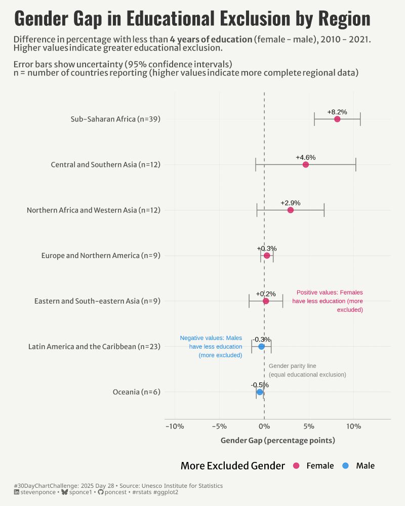
📊 2025 #30DayChartChallenge | day 28 | uncertainties | inclusion
.
🔗: stevenponce.netlify.app/data_visuali...
.
#rstats | #r4ds | #dataviz | #ggplot2
.
🔗: stevenponce.netlify.app/data_visuali...
.
#rstats | #r4ds | #dataviz | #ggplot2
April 28, 2025 at 8:29 AM
📊 2025 #30DayChartChallenge | day 28 | uncertainties | inclusion
.
🔗: stevenponce.netlify.app/data_visuali...
.
#rstats | #r4ds | #dataviz | #ggplot2
.
🔗: stevenponce.netlify.app/data_visuali...
.
#rstats | #r4ds | #dataviz | #ggplot2
The #30DayChartChallenge is interesting. Some of the charts we have made are mediocre, but others are quite interesting. We have tested the #graphane micro-framework with many forms of visualization and we are satisfied with the result.
playground.graphane.dev/gallery/@pal...
playground.graphane.dev/gallery/@pal...

April 30, 2025 at 6:07 AM
The #30DayChartChallenge is interesting. Some of the charts we have made are mediocre, but others are quite interesting. We have tested the #graphane micro-framework with many forms of visualization and we are satisfied with the result.
playground.graphane.dev/gallery/@pal...
playground.graphane.dev/gallery/@pal...
Discover the fascinating timeline of Methuselah, the world's oldest tree! 🌳 From the Great Pyramid to the Moon Landing.
Day 30 | Uncertainties - theme day: national geographic | #30DayChartChallenge
#DataVisualization made with #Graphane
playground.graphane.dev/editor/gr0vb...
Day 30 | Uncertainties - theme day: national geographic | #30DayChartChallenge
#DataVisualization made with #Graphane
playground.graphane.dev/editor/gr0vb...

April 30, 2025 at 5:49 AM
Discover the fascinating timeline of Methuselah, the world's oldest tree! 🌳 From the Great Pyramid to the Moon Landing.
Day 30 | Uncertainties - theme day: national geographic | #30DayChartChallenge
#DataVisualization made with #Graphane
playground.graphane.dev/editor/gr0vb...
Day 30 | Uncertainties - theme day: national geographic | #30DayChartChallenge
#DataVisualization made with #Graphane
playground.graphane.dev/editor/gr0vb...
Reposted by Pablo Almunia
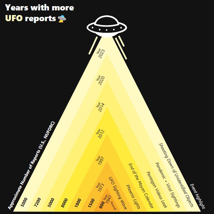
Day 29 of the #30DayChartChallenge! 👽
Today's theme: Extraterrestrial 🛸
A timeline of Earth’s most UFO-obsessed years, based on real sighting reports.
Turns out the skies get busier when the world gets weirder.
#DataViz #Charts #Graphane #UFO
See it here:
playground.graphane.dev/editor/gj9xw...
Today's theme: Extraterrestrial 🛸
A timeline of Earth’s most UFO-obsessed years, based on real sighting reports.
Turns out the skies get busier when the world gets weirder.
#DataViz #Charts #Graphane #UFO
See it here:
playground.graphane.dev/editor/gj9xw...
April 29, 2025 at 1:13 PM
Day 29 of the #30DayChartChallenge! 👽
Today's theme: Extraterrestrial 🛸
A timeline of Earth’s most UFO-obsessed years, based on real sighting reports.
Turns out the skies get busier when the world gets weirder.
#DataViz #Charts #Graphane #UFO
See it here:
playground.graphane.dev/editor/gj9xw...
Today's theme: Extraterrestrial 🛸
A timeline of Earth’s most UFO-obsessed years, based on real sighting reports.
Turns out the skies get busier when the world gets weirder.
#DataViz #Charts #Graphane #UFO
See it here:
playground.graphane.dev/editor/gj9xw...
Humans have launched a few objects into interstellar space. One of them may be found by aliens.
Day 29 | Uncertainties - extraterrestrial | #30DayChartChallenge
#DataVisualization made with #Graphane
playground.graphane.dev/editor/gn5f0...
Day 29 | Uncertainties - extraterrestrial | #30DayChartChallenge
#DataVisualization made with #Graphane
playground.graphane.dev/editor/gn5f0...

April 29, 2025 at 8:43 AM
Humans have launched a few objects into interstellar space. One of them may be found by aliens.
Day 29 | Uncertainties - extraterrestrial | #30DayChartChallenge
#DataVisualization made with #Graphane
playground.graphane.dev/editor/gn5f0...
Day 29 | Uncertainties - extraterrestrial | #30DayChartChallenge
#DataVisualization made with #Graphane
playground.graphane.dev/editor/gn5f0...
Reposted by Pablo Almunia

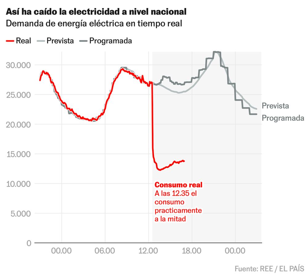
⚡ El brutal apagón, con datos y gráficos en tiempo real ⚡
Primer gráfico: la electricidad nacional colapsó DE GOLPE a la mitad.
Primer gráfico: la electricidad nacional colapsó DE GOLPE a la mitad.
April 28, 2025 at 3:50 PM
⚡ El brutal apagón, con datos y gráficos en tiempo real ⚡
Primer gráfico: la electricidad nacional colapsó DE GOLPE a la mitad.
Primer gráfico: la electricidad nacional colapsó DE GOLPE a la mitad.
Everyone is on the move and has to be integrated into a new place. See the dynamics of internal movements, migrants and immigrants in Spain.
Day 28 | Uncertainties - inclusion | #30DayChartChallenge
#DataVisualization made with #Graphane
playground.graphane.dev/editor/g218k...
Day 28 | Uncertainties - inclusion | #30DayChartChallenge
#DataVisualization made with #Graphane
playground.graphane.dev/editor/g218k...
April 28, 2025 at 9:51 PM
Everyone is on the move and has to be integrated into a new place. See the dynamics of internal movements, migrants and immigrants in Spain.
Day 28 | Uncertainties - inclusion | #30DayChartChallenge
#DataVisualization made with #Graphane
playground.graphane.dev/editor/g218k...
Day 28 | Uncertainties - inclusion | #30DayChartChallenge
#DataVisualization made with #Graphane
playground.graphane.dev/editor/g218k...
Day 28 | Uncertainties - inclusion | #30DayChartChallenge
Comprueba como es tu percepción de la #migración en #España en www.lamigracion.es
Comprueba como es tu percepción de la #migración en #España en www.lamigracion.es
April 28, 2025 at 9:03 AM
Day 28 | Uncertainties - inclusion | #30DayChartChallenge
Comprueba como es tu percepción de la #migración en #España en www.lamigracion.es
Comprueba como es tu percepción de la #migración en #España en www.lamigracion.es
Check out the average noise in #Madrid from 2011 to 2024
Day 27 | Uncertainties - noise | #30DayChartChallenge
#DataVisualization made with #Graphane
playground.graphane.dev/editor/gxtqn...
Day 27 | Uncertainties - noise | #30DayChartChallenge
#DataVisualization made with #Graphane
playground.graphane.dev/editor/gxtqn...
April 27, 2025 at 3:30 PM
Check out the average noise in #Madrid from 2011 to 2024
Day 27 | Uncertainties - noise | #30DayChartChallenge
#DataVisualization made with #Graphane
playground.graphane.dev/editor/gxtqn...
Day 27 | Uncertainties - noise | #30DayChartChallenge
#DataVisualization made with #Graphane
playground.graphane.dev/editor/gxtqn...
Reposted by Pablo Almunia
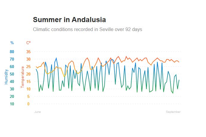
Day 27 of the #30DayChartChallenge! 📊
Today's theme: Noise 🌡️💦
Summer in Andalusia.
92 days of temperature and humidity recorded in Seville — patterns shaped by heatwaves and moisture shifts.
#DataViz #Charts #Graphane
See it here:
playground.graphane.dev/editor/go6k9...
Today's theme: Noise 🌡️💦
Summer in Andalusia.
92 days of temperature and humidity recorded in Seville — patterns shaped by heatwaves and moisture shifts.
#DataViz #Charts #Graphane
See it here:
playground.graphane.dev/editor/go6k9...
April 27, 2025 at 11:01 AM
Day 27 of the #30DayChartChallenge! 📊
Today's theme: Noise 🌡️💦
Summer in Andalusia.
92 days of temperature and humidity recorded in Seville — patterns shaped by heatwaves and moisture shifts.
#DataViz #Charts #Graphane
See it here:
playground.graphane.dev/editor/go6k9...
Today's theme: Noise 🌡️💦
Summer in Andalusia.
92 days of temperature and humidity recorded in Seville — patterns shaped by heatwaves and moisture shifts.
#DataViz #Charts #Graphane
See it here:
playground.graphane.dev/editor/go6k9...
Reposted by Pablo Almunia
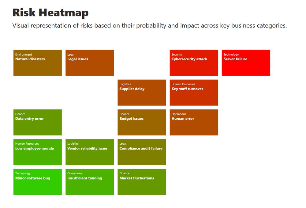
Day 25 of the #30DayChartChallenge! 📊
Today's theme: Risk ⚠️
Visualized business risks by probability and impact —
a heatmap of what could go wrong, and how bad it could be.
#DataViz #Charts #Graphane
See it here:
playground.graphane.dev/editor/gvi5x...
Today's theme: Risk ⚠️
Visualized business risks by probability and impact —
a heatmap of what could go wrong, and how bad it could be.
#DataViz #Charts #Graphane
See it here:
playground.graphane.dev/editor/gvi5x...
April 25, 2025 at 9:05 AM
Day 25 of the #30DayChartChallenge! 📊
Today's theme: Risk ⚠️
Visualized business risks by probability and impact —
a heatmap of what could go wrong, and how bad it could be.
#DataViz #Charts #Graphane
See it here:
playground.graphane.dev/editor/gvi5x...
Today's theme: Risk ⚠️
Visualized business risks by probability and impact —
a heatmap of what could go wrong, and how bad it could be.
#DataViz #Charts #Graphane
See it here:
playground.graphane.dev/editor/gvi5x...
Reposted by Pablo Almunia
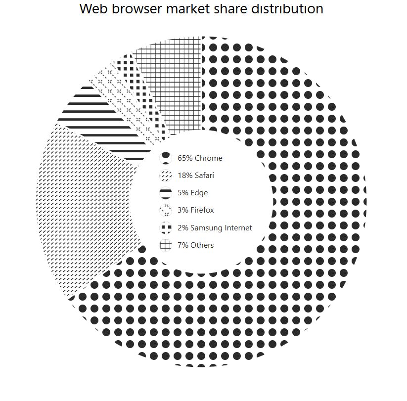
Day 26 of the #30DayChartChallenge! 📊
Today's theme: Monochrome ⚫⚪
A black & white donut chart, with old-school style, showing who’s winning the browser wars. Chrome takes the bite, but others still have a slice.
#DataViz #Charts #Graphane
See it here:
playground.graphane.dev/editor/gkrw3...
Today's theme: Monochrome ⚫⚪
A black & white donut chart, with old-school style, showing who’s winning the browser wars. Chrome takes the bite, but others still have a slice.
#DataViz #Charts #Graphane
See it here:
playground.graphane.dev/editor/gkrw3...
April 26, 2025 at 11:23 AM
Day 26 of the #30DayChartChallenge! 📊
Today's theme: Monochrome ⚫⚪
A black & white donut chart, with old-school style, showing who’s winning the browser wars. Chrome takes the bite, but others still have a slice.
#DataViz #Charts #Graphane
See it here:
playground.graphane.dev/editor/gkrw3...
Today's theme: Monochrome ⚫⚪
A black & white donut chart, with old-school style, showing who’s winning the browser wars. Chrome takes the bite, but others still have a slice.
#DataViz #Charts #Graphane
See it here:
playground.graphane.dev/editor/gkrw3...
Check out the population structure (over 16 year old) in #Spain
Day 26 | Uncertainties - monochrome | #30DayChartChallenge
#DataVisualization made with #Graphane
playground.graphane.dev/editor/gcllh...
Day 26 | Uncertainties - monochrome | #30DayChartChallenge
#DataVisualization made with #Graphane
playground.graphane.dev/editor/gcllh...

April 26, 2025 at 1:55 PM
Check out the population structure (over 16 year old) in #Spain
Day 26 | Uncertainties - monochrome | #30DayChartChallenge
#DataVisualization made with #Graphane
playground.graphane.dev/editor/gcllh...
Day 26 | Uncertainties - monochrome | #30DayChartChallenge
#DataVisualization made with #Graphane
playground.graphane.dev/editor/gcllh...