


Rees Cat Ophuls
@reescatophuls.bsky.social
Analytical Graphics for Climate Change and Planetary Boundaries. Some graphics risk being impenetrable ¯\_(ツ)_/¯
Fan of Williams' Rees, Catton, Ophuls
https://ParisAgreementTemperatureIndex.com/climate-graphics
Fan of Williams' Rees, Catton, Ophuls
https://ParisAgreementTemperatureIndex.com/climate-graphics
Pinned
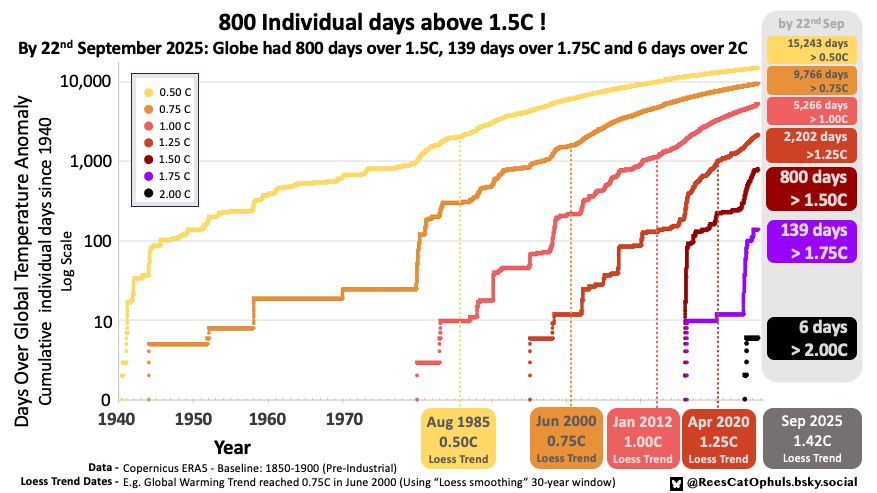
800 individual days have been at least 1.5C above the Pre-Industrial baseline
Summer 2025 was largely under 1.5C
> Will we pass 900 days in 2026?
> Will we pass 1000 days by 2027?
> Will the Loess 30-yr trend pass 1.5C before 2028?
Data: Copernicus ERA5 - Global Mean Surface Temperature Anomaly
Summer 2025 was largely under 1.5C
> Will we pass 900 days in 2026?
> Will we pass 1000 days by 2027?
> Will the Loess 30-yr trend pass 1.5C before 2028?
Data: Copernicus ERA5 - Global Mean Surface Temperature Anomaly
November 12, 2025 at 10:25 PM
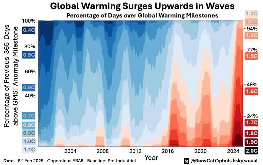
Global Warming surging upwards in waves.
The last 365 days:
* 100% over 1.0C
* 50% over 1.5C
* 4% over 1.8C
The post 2024 mega-surge hasn't fully bottomed out yet.
What will 2026 bring us?
#ClimateChange #GlobalBoiling
The last 365 days:
* 100% over 1.0C
* 50% over 1.5C
* 4% over 1.8C
The post 2024 mega-surge hasn't fully bottomed out yet.
What will 2026 bring us?
#ClimateChange #GlobalBoiling

November 9, 2025 at 2:28 PM
Global Warming surging upwards in waves.
The last 365 days:
* 100% over 1.0C
* 50% over 1.5C
* 4% over 1.8C
The post 2024 mega-surge hasn't fully bottomed out yet.
What will 2026 bring us?
#ClimateChange #GlobalBoiling
The last 365 days:
* 100% over 1.0C
* 50% over 1.5C
* 4% over 1.8C
The post 2024 mega-surge hasn't fully bottomed out yet.
What will 2026 bring us?
#ClimateChange #GlobalBoiling
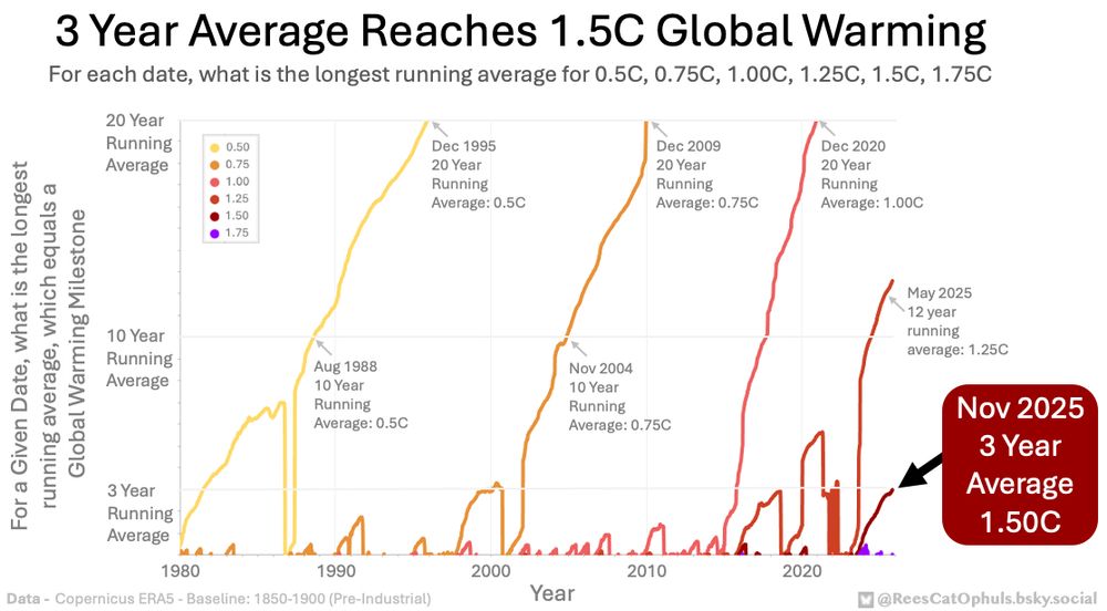
The 3 Year Average for Global Warming just passed 1.5C
The 2 Year Average passed 1.5C in November 2024
I wondered: what is the longest running average, that equals 1.5C for any given date
What about the other Global Warming Milestones: 0.5C, 0.75C, 1C, 1.25C, 1.75C
Data: ERA5
The 2 Year Average passed 1.5C in November 2024
I wondered: what is the longest running average, that equals 1.5C for any given date
What about the other Global Warming Milestones: 0.5C, 0.75C, 1C, 1.25C, 1.75C
Data: ERA5
November 6, 2025 at 9:39 AM
The 3 Year Average for Global Warming just passed 1.5C
The 2 Year Average passed 1.5C in November 2024
I wondered: what is the longest running average, that equals 1.5C for any given date
What about the other Global Warming Milestones: 0.5C, 0.75C, 1C, 1.25C, 1.75C
Data: ERA5
The 2 Year Average passed 1.5C in November 2024
I wondered: what is the longest running average, that equals 1.5C for any given date
What about the other Global Warming Milestones: 0.5C, 0.75C, 1C, 1.25C, 1.75C
Data: ERA5
Reposted by Rees Cat Ophuls
Just noticed that the Berkeley Earth data already has the 3-year average over 1.5C

October 22, 2025 at 6:14 PM
Just noticed that the Berkeley Earth data already has the 3-year average over 1.5C
800 individual days have been at least 1.5C above the Pre-Industrial baseline
Summer 2025 was largely under 1.5C
> Will we pass 900 days in 2026?
> Will we pass 1000 days by 2027?
> Will the Loess 30-yr trend pass 1.5C before 2028?
Data: Copernicus ERA5 - Global Mean Surface Temperature Anomaly
Summer 2025 was largely under 1.5C
> Will we pass 900 days in 2026?
> Will we pass 1000 days by 2027?
> Will the Loess 30-yr trend pass 1.5C before 2028?
Data: Copernicus ERA5 - Global Mean Surface Temperature Anomaly
September 24, 2025 at 8:07 AM
800 individual days have been at least 1.5C above the Pre-Industrial baseline
Summer 2025 was largely under 1.5C
> Will we pass 900 days in 2026?
> Will we pass 1000 days by 2027?
> Will the Loess 30-yr trend pass 1.5C before 2028?
Data: Copernicus ERA5 - Global Mean Surface Temperature Anomaly
Summer 2025 was largely under 1.5C
> Will we pass 900 days in 2026?
> Will we pass 1000 days by 2027?
> Will the Loess 30-yr trend pass 1.5C before 2028?
Data: Copernicus ERA5 - Global Mean Surface Temperature Anomaly
Reposted by Rees Cat Ophuls

The Northern Pacific Ocean is currently smashing temperature records.
And it is reaching these levels far earlier than the current generation of climate models had expected.
A short thread 🧵
And it is reaching these levels far earlier than the current generation of climate models had expected.
A short thread 🧵

September 18, 2025 at 10:44 AM
The Northern Pacific Ocean is currently smashing temperature records.
And it is reaching these levels far earlier than the current generation of climate models had expected.
A short thread 🧵
And it is reaching these levels far earlier than the current generation of climate models had expected.
A short thread 🧵
The #Arctic Annual Sea Ice Minimum isn't what it used to be.
There is now a huge area of ice under 1.5m thick, and only tiny patches over 3.5m thick.
@polarportal.bsky.social
There is now a huge area of ice under 1.5m thick, and only tiny patches over 3.5m thick.
@polarportal.bsky.social

September 12, 2025 at 3:11 PM
The #Arctic Annual Sea Ice Minimum isn't what it used to be.
There is now a huge area of ice under 1.5m thick, and only tiny patches over 3.5m thick.
@polarportal.bsky.social
There is now a huge area of ice under 1.5m thick, and only tiny patches over 3.5m thick.
@polarportal.bsky.social
Reposted by Rees Cat Ophuls

In Berlin wird es (wenig überraschend) auch wärmer. Ich finde folgende Darstellung ganz anschaulich. Mit dem Unterschied Nordost-Deutschland vs Südfrankreich kann denke ich jeder etwas anfangen.

June 21, 2025 at 9:09 PM
In Berlin wird es (wenig überraschend) auch wärmer. Ich finde folgende Darstellung ganz anschaulich. Mit dem Unterschied Nordost-Deutschland vs Südfrankreich kann denke ich jeder etwas anfangen.
Global warming surging upwards in waves.
The last 365 days:
* 100% over 1.2C
* 67% over 1.5C
* 5% over 1.8C
Last 100 days averages below 1.5C
First day below 1.25C in 700 days
The 2024 mega surge is over.
When will the next one be?
Details in Alt Text
#ClimateChange #GlobalBoiling
The last 365 days:
* 100% over 1.2C
* 67% over 1.5C
* 5% over 1.8C
Last 100 days averages below 1.5C
First day below 1.25C in 700 days
The 2024 mega surge is over.
When will the next one be?
Details in Alt Text
#ClimateChange #GlobalBoiling

June 7, 2025 at 5:03 PM
Global warming surging upwards in waves.
The last 365 days:
* 100% over 1.2C
* 67% over 1.5C
* 5% over 1.8C
Last 100 days averages below 1.5C
First day below 1.25C in 700 days
The 2024 mega surge is over.
When will the next one be?
Details in Alt Text
#ClimateChange #GlobalBoiling
The last 365 days:
* 100% over 1.2C
* 67% over 1.5C
* 5% over 1.8C
Last 100 days averages below 1.5C
First day below 1.25C in 700 days
The 2024 mega surge is over.
When will the next one be?
Details in Alt Text
#ClimateChange #GlobalBoiling
Reposted by Rees Cat Ophuls

Lowest global sea ice area for the date since 1979 🧪
(Just)
(Just)
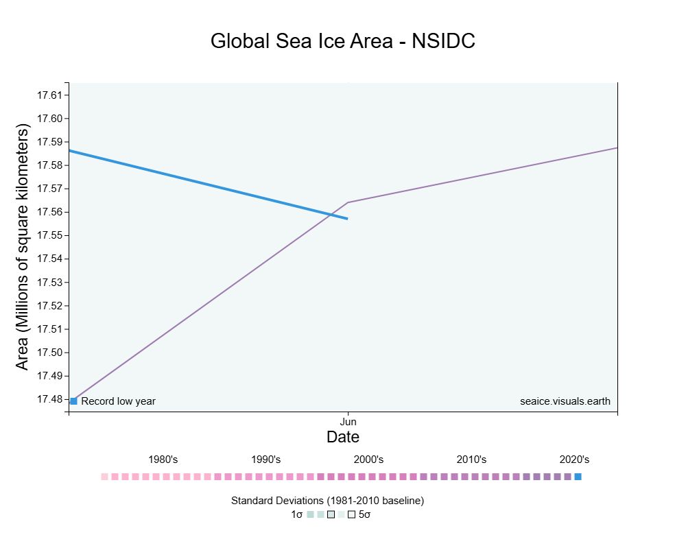
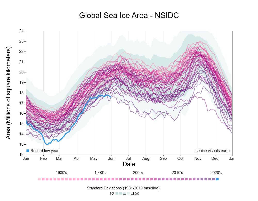
June 2, 2025 at 10:11 AM
Lowest global sea ice area for the date since 1979 🧪
(Just)
(Just)
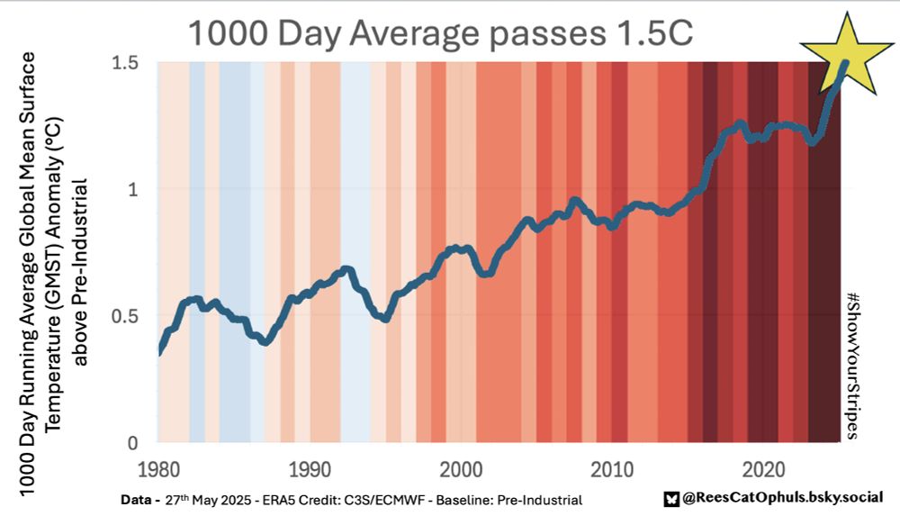
1000 Day Running Average crosses 1.5C
Details in Alt Text
#ShowYourStripes @copernicusecmwf.bsky.social
Details in Alt Text
#ShowYourStripes @copernicusecmwf.bsky.social
May 28, 2025 at 7:22 AM
1000 Day Running Average crosses 1.5C
Details in Alt Text
#ShowYourStripes @copernicusecmwf.bsky.social
Details in Alt Text
#ShowYourStripes @copernicusecmwf.bsky.social
Reposted by Rees Cat Ophuls

ENDLESS RECORD HEAT IN INDONESIA
In more than 2 years, not a single day has passed without heat records in Indonesia.
Today Tanah Merah broke BOTH its records of May highest minimum and maximum
with 25.9/36.4
It had already broken those of all months of 2023,2024 and 2025
Crazy
In more than 2 years, not a single day has passed without heat records in Indonesia.
Today Tanah Merah broke BOTH its records of May highest minimum and maximum
with 25.9/36.4
It had already broken those of all months of 2023,2024 and 2025
Crazy

May 13, 2025 at 12:31 PM
ENDLESS RECORD HEAT IN INDONESIA
In more than 2 years, not a single day has passed without heat records in Indonesia.
Today Tanah Merah broke BOTH its records of May highest minimum and maximum
with 25.9/36.4
It had already broken those of all months of 2023,2024 and 2025
Crazy
In more than 2 years, not a single day has passed without heat records in Indonesia.
Today Tanah Merah broke BOTH its records of May highest minimum and maximum
with 25.9/36.4
It had already broken those of all months of 2023,2024 and 2025
Crazy
Brutal temperatures forecast for Pakistan, by 15th May 2025.

May 9, 2025 at 12:51 PM
Brutal temperatures forecast for Pakistan, by 15th May 2025.
The #Arctic sea ice isn't what it used to be.
The area covered is similar, but now much thinner.
Details in Alt Text. @polarportal.bsky.social
The area covered is similar, but now much thinner.
Details in Alt Text. @polarportal.bsky.social

May 1, 2025 at 7:54 PM
The #Arctic sea ice isn't what it used to be.
The area covered is similar, but now much thinner.
Details in Alt Text. @polarportal.bsky.social
The area covered is similar, but now much thinner.
Details in Alt Text. @polarportal.bsky.social
I was wondering if the percentage-of-days above a global warming milestone was fairly steady, at the point the trend line passed that milestone.
I settled on using percent-of-days-in-previous-7-years that were over a given milestone.
An ugly, but interesting graph. Explanation in the Alt Text.
I settled on using percent-of-days-in-previous-7-years that were over a given milestone.
An ugly, but interesting graph. Explanation in the Alt Text.

April 14, 2025 at 9:04 PM
I was wondering if the percentage-of-days above a global warming milestone was fairly steady, at the point the trend line passed that milestone.
I settled on using percent-of-days-in-previous-7-years that were over a given milestone.
An ugly, but interesting graph. Explanation in the Alt Text.
I settled on using percent-of-days-in-previous-7-years that were over a given milestone.
An ugly, but interesting graph. Explanation in the Alt Text.
Global warming surging upwards in waves.
The ENSO 3.4 line shows that El Nino's line up well, with the warming surges.
The last 365 days:
* 100% over 1.3C
* 76% over 1.5C
* 5% over 1.8C
Details in Alt Text
#ClimateChange #GlobalBoiling
The ENSO 3.4 line shows that El Nino's line up well, with the warming surges.
The last 365 days:
* 100% over 1.3C
* 76% over 1.5C
* 5% over 1.8C
Details in Alt Text
#ClimateChange #GlobalBoiling

March 28, 2025 at 8:13 PM
Global warming surging upwards in waves.
The ENSO 3.4 line shows that El Nino's line up well, with the warming surges.
The last 365 days:
* 100% over 1.3C
* 76% over 1.5C
* 5% over 1.8C
Details in Alt Text
#ClimateChange #GlobalBoiling
The ENSO 3.4 line shows that El Nino's line up well, with the warming surges.
The last 365 days:
* 100% over 1.3C
* 76% over 1.5C
* 5% over 1.8C
Details in Alt Text
#ClimateChange #GlobalBoiling
Berkeley Earth Data shows that the Loess-15-year window trendline passed 1.5C in Jan 2025
Hyperbole warning: Other (less jumpy) trend line smoothing functions and other datasets won't get to 1.5 for a while
Interesting, for the climate data nerds though
Details in Alt Text
Hyperbole warning: Other (less jumpy) trend line smoothing functions and other datasets won't get to 1.5 for a while
Interesting, for the climate data nerds though
Details in Alt Text

February 9, 2025 at 7:13 PM
Berkeley Earth Data shows that the Loess-15-year window trendline passed 1.5C in Jan 2025
Hyperbole warning: Other (less jumpy) trend line smoothing functions and other datasets won't get to 1.5 for a while
Interesting, for the climate data nerds though
Details in Alt Text
Hyperbole warning: Other (less jumpy) trend line smoothing functions and other datasets won't get to 1.5 for a while
Interesting, for the climate data nerds though
Details in Alt Text
Every day in 2025 has been above 1.5C, so far.
Individual Days, where Global Warming is above 1.5C and 1.75C keep coming.
Details in Alt Text
Individual Days, where Global Warming is above 1.5C and 1.75C keep coming.
Details in Alt Text

February 9, 2025 at 11:08 AM
Every day in 2025 has been above 1.5C, so far.
Individual Days, where Global Warming is above 1.5C and 1.75C keep coming.
Details in Alt Text
Individual Days, where Global Warming is above 1.5C and 1.75C keep coming.
Details in Alt Text
Global warming surging upwards in waves
The last 365 days:
* 100% over 1.3C
* 77% over 1.5C
* 9% over 1.8C
Details in Alt Text
#ClimateChange #GlobalBoiling
CC: @marchudson.bsky.social @allouryesterdays.bsky.social
The last 365 days:
* 100% over 1.3C
* 77% over 1.5C
* 9% over 1.8C
Details in Alt Text
#ClimateChange #GlobalBoiling
CC: @marchudson.bsky.social @allouryesterdays.bsky.social
February 7, 2025 at 5:57 PM
Global warming surging upwards in waves
The last 365 days:
* 100% over 1.3C
* 77% over 1.5C
* 9% over 1.8C
Details in Alt Text
#ClimateChange #GlobalBoiling
CC: @marchudson.bsky.social @allouryesterdays.bsky.social
The last 365 days:
* 100% over 1.3C
* 77% over 1.5C
* 9% over 1.8C
Details in Alt Text
#ClimateChange #GlobalBoiling
CC: @marchudson.bsky.social @allouryesterdays.bsky.social
Carbon brief collected the Global Warming Datasets
Average is 1.54C
All relative to 1850-1900 baseline
1.47 C: Nasa GISTEMP
1.53 C: HadCRUT5
1.46 C: NOAA
1.62 C: Berkeley Earth
1.60 C: Copernicus ERA5
1.59 C: JRA-3Q
1.52 C: Japanese Met Agency
www.carbonbrief.org/state-of-the...
Average is 1.54C
All relative to 1850-1900 baseline
1.47 C: Nasa GISTEMP
1.53 C: HadCRUT5
1.46 C: NOAA
1.62 C: Berkeley Earth
1.60 C: Copernicus ERA5
1.59 C: JRA-3Q
1.52 C: Japanese Met Agency
www.carbonbrief.org/state-of-the...

January 10, 2025 at 4:38 PM
Carbon brief collected the Global Warming Datasets
Average is 1.54C
All relative to 1850-1900 baseline
1.47 C: Nasa GISTEMP
1.53 C: HadCRUT5
1.46 C: NOAA
1.62 C: Berkeley Earth
1.60 C: Copernicus ERA5
1.59 C: JRA-3Q
1.52 C: Japanese Met Agency
www.carbonbrief.org/state-of-the...
Average is 1.54C
All relative to 1850-1900 baseline
1.47 C: Nasa GISTEMP
1.53 C: HadCRUT5
1.46 C: NOAA
1.62 C: Berkeley Earth
1.60 C: Copernicus ERA5
1.59 C: JRA-3Q
1.52 C: Japanese Met Agency
www.carbonbrief.org/state-of-the...
Arctic Sea Ice Volume - Kind of amazing that for over 10 months of the year:
Either:
... 2005 was above the 2024 maximum (6 months)
Or:
... 2024 was below the 2005 minimum (4+ months)
#ClimateChange #Arctic
Either:
... 2005 was above the 2024 maximum (6 months)
Or:
... 2024 was below the 2005 minimum (4+ months)
#ClimateChange #Arctic

January 8, 2025 at 6:12 PM
Arctic Sea Ice Volume - Kind of amazing that for over 10 months of the year:
Either:
... 2005 was above the 2024 maximum (6 months)
Or:
... 2024 was below the 2005 minimum (4+ months)
#ClimateChange #Arctic
Either:
... 2005 was above the 2024 maximum (6 months)
Or:
... 2024 was below the 2005 minimum (4+ months)
#ClimateChange #Arctic
- 702 individual days above 1.5C Paris Agreement
(Cumulative since 1940)
- 76% days in 2024 over 1.5C
- When will loess trend line first cross 1.5C ?
parisagreementtemperatureindex.com/1000-day-cli...
Data: Copernicus ERA-5
Note: Trend line shifts as new data is added:
bsky.app/profile/rees...
(Cumulative since 1940)
- 76% days in 2024 over 1.5C
- When will loess trend line first cross 1.5C ?
parisagreementtemperatureindex.com/1000-day-cli...
Data: Copernicus ERA-5
Note: Trend line shifts as new data is added:
bsky.app/profile/rees...

January 7, 2025 at 3:15 PM
- 702 individual days above 1.5C Paris Agreement
(Cumulative since 1940)
- 76% days in 2024 over 1.5C
- When will loess trend line first cross 1.5C ?
parisagreementtemperatureindex.com/1000-day-cli...
Data: Copernicus ERA-5
Note: Trend line shifts as new data is added:
bsky.app/profile/rees...
(Cumulative since 1940)
- 76% days in 2024 over 1.5C
- When will loess trend line first cross 1.5C ?
parisagreementtemperatureindex.com/1000-day-cli...
Data: Copernicus ERA-5
Note: Trend line shifts as new data is added:
bsky.app/profile/rees...
I was wondering how long it takes from the first appearance of a global warming milestone, to it being a permanent fixture
Graph's data smoothing underplays 2024 raw data, which has 12 months over 1.25C and 11 months over 1.5C
parisagreementtemperatureindex.com/months-above...
Details in alt text
Graph's data smoothing underplays 2024 raw data, which has 12 months over 1.25C and 11 months over 1.5C
parisagreementtemperatureindex.com/months-above...
Details in alt text

December 29, 2024 at 3:58 PM
I was wondering how long it takes from the first appearance of a global warming milestone, to it being a permanent fixture
Graph's data smoothing underplays 2024 raw data, which has 12 months over 1.25C and 11 months over 1.5C
parisagreementtemperatureindex.com/months-above...
Details in alt text
Graph's data smoothing underplays 2024 raw data, which has 12 months over 1.25C and 11 months over 1.5C
parisagreementtemperatureindex.com/months-above...
Details in alt text
My favoured Trend line for Global warming moves way more than I expected
GMST Anomaly data is noisy. The loess-30-yr trend line shifts as the latest data is added
E.g In hindsight we might see that we crossed 1.5C years earlier than initially thought. Look at 1.25C moving from Dec 2022 to Jul 2020
GMST Anomaly data is noisy. The loess-30-yr trend line shifts as the latest data is added
E.g In hindsight we might see that we crossed 1.5C years earlier than initially thought. Look at 1.25C moving from Dec 2022 to Jul 2020
December 21, 2024 at 10:57 AM
My favoured Trend line for Global warming moves way more than I expected
GMST Anomaly data is noisy. The loess-30-yr trend line shifts as the latest data is added
E.g In hindsight we might see that we crossed 1.5C years earlier than initially thought. Look at 1.25C moving from Dec 2022 to Jul 2020
GMST Anomaly data is noisy. The loess-30-yr trend line shifts as the latest data is added
E.g In hindsight we might see that we crossed 1.5C years earlier than initially thought. Look at 1.25C moving from Dec 2022 to Jul 2020
Spiralling Past 1.5C Paris Agreement Lower Limit
Data: Copernicus ERA 5
@copernicusecmwf.bsky.social
Details of graphic, and data tests:
parisagreementtemperatureindex.com/spiral-of-gl...
Data: Copernicus ERA 5
@copernicusecmwf.bsky.social
Details of graphic, and data tests:
parisagreementtemperatureindex.com/spiral-of-gl...
November 18, 2024 at 7:28 PM
Spiralling Past 1.5C Paris Agreement Lower Limit
Data: Copernicus ERA 5
@copernicusecmwf.bsky.social
Details of graphic, and data tests:
parisagreementtemperatureindex.com/spiral-of-gl...
Data: Copernicus ERA 5
@copernicusecmwf.bsky.social
Details of graphic, and data tests:
parisagreementtemperatureindex.com/spiral-of-gl...