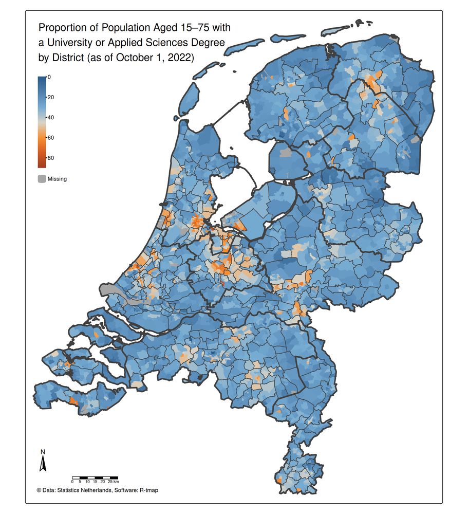
Cédric Vidonne
@cvidonne.bsky.social
3.5K followers 370 following 61 posts
Information Management Officer at UNHCR specialized in #DataViz and #maps. Love #rstats stuff, especially making charts with #ggplot2.
Posts Media Videos Starter Packs
Reposted by Cédric Vidonne
vincentab.bsky.social
{tinytable} 0.14.0 for #RStats makes it super easy to draw tables in html, tex, docx, typ, md & png.

There are only a few functions to learn, but don't be fooled! Small 📦s can still be powerful.

Check out the new gallery page for fun case studies.

vincentarelbundock.github.io/tinytable/vi...
a table about lemurs a table about students and schools a table about wines
Reposted by Cédric Vidonne
gnoblet.bsky.social
🚀 Just released **ggbranding** (v1) – a tiny R package that lets you brand `ggplot2` charts with Font Awesome 7 icons.

📝 Blog: gnoblet.github.io/blog/ggbrand...
💻 Code: github.com/gnoblet/ggbr...

#opensource #branding #package #rstats #dataviz #ggplot2
A ggplot2 chart that showcases adding personal branding thanks to the 'ggbranding' package
Reposted by Cédric Vidonne
thomasp85.com
I am beyond excited to announce that ggplot2 4.0.0 has just landed on CRAN.

It's not every day we have a new major #ggplot2 release but it is a fitting 18 year birthday present for the package.

Get an overview of the release in this blog post and be on the lookout for more in-depth posts #rstats
ggplot2 4.0.0
A new major version of ggplot2 has been released on CRAN. Find out what is new here.
www.tidyverse.org
cvidonne.bsky.social
Couldn’t resist doing the same for countries of asylum.

Turns out the picture is way more stable, with a few ups and downs.
Bump chart faceted by world regions showing the top countries of asylum for refugees, asylum-seekers, and others in need of international protection. Overall patterns are stable, with some short-term ups and downs across regions.
cvidonne.bsky.social
Inspired by @nrennie.bsky.social excellent #TidyTuesday plot on the power of passports, I adapted the idea to look at refugee origins.

This chart ranks countries of origin of refugees, asylum-seekers, and others in need of international protection, grouped by region.

#RStats #ggplot2 #Refugees
Bump chart faceted by world regions showing the top countries of origin of refugees, asylum-seekers, and others in need of international protection. Asia and Africa rank consistently high, driven by long-term crises such as Afghanistan and Sudan. The Americas and Europe also appear high due to more recent crises in Venezuela and Ukraine.
Reposted by Cédric Vidonne
kylewalker.bsky.social
Learned today about @OpenFreeMapOrg - free, high-quality vector tiles for your maps and apps!

Use them in #rstats with mapgl by passing the URL to the style param, e.g.:

maplibre(style = "tiles.openfreemap.or...")

Styles include "positron", "bright", and "liberty" with 3D!
cvidonne.bsky.social
Feeling you on this — {unhcrthemes} is in the same dependencies nightmare right now.
cvidonne.bsky.social
Just published: our new data story on efforts to protect South Sudan’s most vulnerable — including children, women, and persons with disabilities.

Explore how protection monitoring and partnerships are making a difference: dataviz.unhcr.org/product-gall...

#refugees #unhcr #protection
Protecting the most vulnerable in South Sudan
Assessing a Complex Crisis through Protection Risks Analysis
dataviz.unhcr.org
Reposted by Cédric Vidonne
cedricscherer.com
Excited to launch "ggplot2 [un]charted" with @yan-holtz.bsky.social! 🎉

An online course to master #ggplot2 with exercises, quizzes, and modules—and hands-on code running in your browser!

Still WIP—sign up now for a limited discount:
👉 www.ggplot2-uncharted.com

#rstats #DataViz #DataVisualization
The landing page of the course "ggplot2 uncharted" with the title teasing it with "Master Data Visualizations with ggplot2".
Reposted by Cédric Vidonne
andrew.heiss.phd
Thing I just learned in #rstats: unz() lets you connect to a .zip and load files from inside it without actually unzipping it (great for a file I'm working with that's 30 MB zipped and 1+ GB unzipped, with multiple CSVs in it)
# unz() lets you connect to a .zip and treat it like a mini file system, 
# and you can load files from inside it
one_zipped_csv_among_others <- readr::read_csv(
  unz("lotsa_zipped_csvs.zip"), "one_csv.csv"
)

# readr::read_csv() can read a .zip with a single CSV in it
one_zipped_csv <- readr::read_csv("big_zipped_file.zip")
cvidonne.bsky.social
Sudan: Two years already.
Millions displaced. Needs rising. Attention fading.
📊 See the full data story: shorturl.at/wn8HU
#Refugees #dataviz #unhcr
Sudan: Crisis deepens but attention wanes after two years of war
An unprecedented displacement crisis
shorturl.at
cvidonne.bsky.social
The Learning Divide

Our latest data story explores the stark educational challenges facing refugees in Mauritania and Mexico.

Explore the full story: dataviz.unhcr.org/product-gall...

#refugees #education #unhcr #dataviz
Mona Chalabi illustration for the UNHCR 2024 education report showing a pile of books that refugees children are climbing while learning and playing.
Reposted by Cédric Vidonne
neocarto.bsky.social
One day, one map
Far from the reality of state control
#Migrations #Cartography #Walls #Deaths #Camps #Borders
Source: Migreurop, 2022
Map Migreurop 2022
Reposted by Cédric Vidonne
gdeejay.bsky.social
Behold #rstats:

My (draft) variable naming standard
😎
Reposted by Cédric Vidonne
andrew.heiss.phd
One more bonus update with two changes:

1. A diverging color palette centered at 4% lets us see which counties are doing great or doing poorly
2. That size legend was spaced funnily, but we can make it more compact with {legendry}

#rstats

www.andrewheiss.com/blog/2025/02...
Map of the US showing the difference between each county's unemployment rate and the Federal Reserve's 4% target, using colored points sized by county labor force
Reposted by Cédric Vidonne
driven-by-data.net
For the German election we wanted to use a cartogram of German election districts but didn't find anything good, so we created our own. Here's a little nerd thread how the final algorithm worked 🤓 🧵 #gis #cartogram #election #datavis #cartography
Cartogram of 299 German election districts
Reposted by Cédric Vidonne
hrbrmstr.dev
Datawrapper (@datawrapper.de) has some cool new charts (def check them out)! One being these comparison bars.

Here's one way to do it in #RStats #ggplot2

blog.datawrapper.de/comparison-c...

ray.so/KDVci6B
Datawrapper version of a bar chart titled “U.K. election results 2024” shows party vote shares. Labour leads with 35.3% across the U.K., followed by the Conservatives at 23.7%. Reform UK has 14.3%, Liberal Democrats 12.2%, Greens 6.7%, and Others 6.8%. The Scottish National Party (SNP) reaches 30% in Scotland, translating to 2.5% of the total U.K. vote. ggplot2 version of a bar chart titled “U.K. election results 2024” shows party vote shares. Labour leads with 35.3% across the U.K., followed by the Conservatives at 23.7%. Reform UK has 14.3%, Liberal Democrats 12.2%, Greens 6.7%, and Others 6.8%. The Scottish National Party (SNP) reaches 30% in Scotland, translating to 2.5% of the total U.K. vote. R code readabale @ https://ray.so/KDVci6B
Reposted by Cédric Vidonne
andrew.heiss.phd
New blog post! After archiving USAID data last week, I decided to play around with and recreate parts of the ForeignAssistance dot gov dashboard with #QuartoPub and #ObservableJS. I learned a ton about D3 projections and making pretty Javascript plots #dataskyence www.andrewheiss.com/blog/2025/02...
Screenshot of an interactive world map using the Robinson projection showing 2023 aid commitments in each country Western Europe mapped with a cropped Robinson projection with labels for each country Egypt mapped with a cropped Robinson projection with labels for each country Table of contents for the post: 

Working with map data
Get map data
Maps and projections with Observable Plot
Built-in projections
Other projections
Filtering map data and adjusting projections
Removing elements
Quick and dirty cheating method: change the width or height
Built-in projections and domain settings
Other projections and .fitExtent()
Arbitrary areas and .fitExtent()
Working with USAID data
Get USAID data
Connect USAID data to the map data
Improving the map
Fixing labelling issues
Some final tweaks
The full game: Complete final code
Reposted by Cédric Vidonne
lecartographe.bsky.social
Selon “The New York Times”, le gouvernement de Donald Trump veut réduire les effectifs de l’Agence des États-Unis pour le développement international à moins de 300 personnes, contre plus de 10 000 actuellement.
Source : www.courrierinternational.com/article/etat...
Reposted by Cédric Vidonne
thomasp85.com
If you have used #ggplot2 in the last couple of years you owe a great deal to @teunbrand.bsky.social who is behind most of the new features and fixes.

Read about his journey to become a part of the ggplot2 core team here:
Joining the ggplot2 team - Tidyverse
I joined the ggplot2 team and would like to share the experience.
www.tidyverse.org
Reposted by Cédric Vidonne
willgearty.bsky.social
📢 rredlist 📦 1.0.0 is now on #CRAN!!!

- upgrade to API v4 🤖
- handles API timeouts ⌚
- progress bar for multi-page queries 🚧
- IUCN color palette scales for ggplot2 🏳️‍🌈
- research pipeline and benchmarking vignettes 📄
- new logo 🦏

Docs 👉 docs.ropensci.org/rredlist/ind...

#rstats #iucn #redlist #api
IUCN Red List Client
IUCN Red List (<https://api.iucnredlist.org/>) client. The IUCN Red List is a global list of threatened and endangered species. Functions cover all of the Red List API routes. An API key is required.
docs.ropensci.org
Reposted by Cédric Vidonne
weare.rladies.org
Happy #Monday! Here’s something fun to get the week off to a good start!

🔮 What R package would you be based on your #zodiac sign?

Let me know if these resonate! 👀✨ #rstats #rladies

🧵👇 (1/13)
Reposted by Cédric Vidonne
jakubnowosad.com
🚨 After years of development, the new version of #rstats tmap (4) is now available on CRAN! 🎉 Huge thanks to author Martijn Tennekes and all contributors.

🔧 Install: `install.packages("tmap")`
📚 Vignettes: https://buff.ly/4aAYNbq
📖 Book Chapter: https://buff.ly/43TokaF

#maps #tmap #rspatial
A tmap logo A screenshot of the tmap CRAN webpage. A map from tmap vignette A map from tmap vignette
Reposted by Cédric Vidonne
teunbrand.bsky.social
I wrote a bit about what it was like for me to join the tidyverse team to maintain ggplot2!
thomasp85.com
If you have used #ggplot2 in the last couple of years you owe a great deal to @teunbrand.bsky.social who is behind most of the new features and fixes.

Read about his journey to become a part of the ggplot2 core team here:
Joining the ggplot2 team - Tidyverse
I joined the ggplot2 team and would like to share the experience.
www.tidyverse.org