Gregor Aisch
@driven-by-data.net
2.8K followers 440 following 180 posts
Senior Visual Data Journalist at @zeit.de. Co-founder and former CTO of @datawrapper.de. Former @nytimes.com graphics editor #datajournalism #graphics #maps #cartography (he/him)
Posts Media Videos Starter Packs
Pinned
driven-by-data.net
Last week I had the pleasure of finally releasing the #SveltePlot alpha version during my talk at the #SvelteSummit in Barcelona. It's a new visualization framework for @svelte.dev that I've been working on for the past 18 months, so it's about time for a 🧵
SveltePlot logo with the website address https://svelteplot.dev and a few example plots in the background
Reposted by Gregor Aisch
tomcalver.bsky.social
NEW: Since the start of the Ukraine invasion, 17 out of 27 EU nations have spent more on Russian oil and gas than they’ve sent to Ukraine in aid!

Despite an oil embargo, Europe is still sending £1bn a month on Russian energy.

This week’s column:

www.thetimes.com/article/dd9d...
driven-by-data.net
This seems to be a good moment to cancel that Disney+ subscription. I didn’t watch two seasons of brave rebels fighting the evil Empire only to see real world media conglomerates bowing to government pressure at the slightest hint…
driven-by-data.net
3. But why would you look at the distributions side by side (horizontally) when you can learn so much more if they're stacked vertically. You almost lose all of the benefits these 3 chart power-horses can offer us when not stacking them orthogonally to the main dimension.
The horizontal layout in a "raincloud plot" makes it actually harder to compare distributions... A vertical layout makes it a lot easier to compare the distributions. Also a lot more mobile friendly.
driven-by-data.net
2. And yes, it's definitely better to look at your data in different ways than just relying on one chart type. And yes, histogram/density, box plots and scatter are high on the list.
driven-by-data.net
Interesting, didn't know about "raincloud plots". Here are my hot takes:

1. Raincloud plot is not a new plot, but 3 plots stacked (density, box plot, jittered 1d scatter).
Reposted by Gregor Aisch
upshot.nytimes.com
What Malnutrition Does to Children’s Bodies

www.nytimes.com/interactive/...
Reposted by Gregor Aisch
nytimes.com
Israel ordered everyone in Gaza City to leave. Satellite images show how hard that’s going to be. nyti.ms/3VMbtp7
A small map of the Gaza Strip next to the headline "Where Will Everyone In Gaza City Go?" More text reads: "The Israeli military is telling hundreds of thousands of Gaza City residents to find space to shelter in an already densely populated area to the south."
driven-by-data.net
For my latest Weekly Chart at @datawrapper.de I tried a different way of mapping destruction in Gaza using OSM buildings. www.datawrapper.de/blog/mapping...
OSM building footprints in Gaza overlaid with damage assessment by Corey Scher and Jan Van Den Hoek.
Reposted by Gregor Aisch
nytimes.com
In @nytopinion.nytimes.com

“Gaza represents not some distant and inevitable tragedy, but our own moral and practical failing,” our columnist Nicholas Kristof writes. “We have blood on our hands.”
Opinion | Answering My Critics About the War in Gaza
Why I believe American support for Israel in this conflict is a moral and practical failure.
nyti.ms
driven-by-data.net
I've been playing with the new Observable Notebooks 2.0 over the past days and I'm amazed. While still a preview I think it's already a serious alternative to R or Jupyter notebooks. Love that it works locally now and that notebooks are just HTML files with vanilla JS observablehq.com/notebook-kit/
Observable Notebooks 2.0 Technology Preview | Observable
observablehq.com
Reposted by Gregor Aisch
niggi.bsky.social
„In March, Israel imposed an aid blockade on Gaza in an effort to squeeze concessions from Hamas; it also said, without providing evidence, that the militant group was systematically stealing the supplies. That (...) caused widespread hunger among Gazans.“ www.nytimes.com/interactive/...
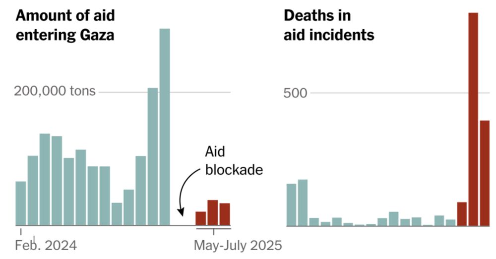
How Did Hunger Get So Much Worse in Gaza?
Less food is going into Gaza now than during most other times in the war. Hundreds of Palestinians have been killed while heading toward aid sites. Many others are suffering from serious malnutrition,...
www.nytimes.com
Reposted by Gregor Aisch
ocks.org
Notebooks 2.0 is here! 📓🔮 Previewing today:
Notebook Kit, an open file format for notebooks with open-source tooling for generating static sites; and
Observable Desktop, a macOS desktop application for editing notebooks as local files, with a radical new approach to AI. observablehq.com/notebooks/2/
Observable Notebooks 2.0 Technology Preview | Observable
observablehq.com
driven-by-data.net
Nein, ich glaube das ist nicht so gern gesehen, wenn man seinen eigenen Artikel schreibt. Fakten korrigieren müsste aber gehen, so lange du sie auch mit externen Quellen belegen kannst (du selbst zählst glaube nicht als Quelle 😅).
driven-by-data.net
*Huge* new feature in Datawrapper! You can now create locator maps using the globe (aka orthographic) projection. Makes small scale maps so much better compared to the Mercator projection! All thanks to the amazing folks at @datawrapper.de and @maplibre.org ❤️
www.datawrapper.de/blog/new-glo...
New: Globe projection in locator maps | Datawrapper Blog
Create locator maps using a globe projection
www.datawrapper.de
Reposted by Gregor Aisch
coveringclimatenow.org
Extreme heat doesn’t receive the same “round-the-clock” coverage as wildfires, hurricanes, or floods. Yet, “Of all the climate disasters we face, heat is the most urgent, and its day-to-day effects are also the trickiest to talk about.” By Meg Bernhard @columjournreview.bsky.social
What Makes Heat So Hard to Cover?
For journalists, the most urgent climate disaster is also the trickiest to report on.
buff.ly
Reposted by Gregor Aisch
gelliottmorris.com
Trump’s approval rating on deportations is currently lower than his approval on the economy

www.gelliottmorris.com/p/data
driven-by-data.net
I feel we can look at data as long as we want without ever grasping how serious this is. This is what 1.5 degrees warming feels like, and on our current course we’re heading for 2.7. There’s no „good side“ to look at in a summer like this.
driven-by-data.net
No map or visualization can tell you how hot 37°C feels like. Walking the streets in Berlin today feels like slowly dying. Spain and Portugal have suffered from this heat wave all week, and I can’t even begin to imagine temperatures in China, India, Iran, etc. www.zeit.de/wissen/2025-...
Hitze in Europa: Hier ist die Hitze am extremsten
Selten war es in ganz Europa so früh so heiß. Für Millionen Menschen wird das zu einer wiederkehrenden Gefahr. Daten zeigen, welche Regionen besonders betroffen sind.
www.zeit.de
Reposted by Gregor Aisch
marcelpauly.bsky.social
The representative electoral statistics show how often each demographic group voted for different parties in the German federal election. This year, I’ve prepared the data as radar charts. What do you think: does this type of chart work well for this kind of data? www.spiegel.de/politik/deut...
Reposted by Gregor Aisch
accuweather.com
Multiple tornadoes tore across parts of South Dakota on Saturday.
Reposted by Gregor Aisch
kylebuchanan.bsky.social
So excited to have this out!

I’ve been working on The 100 Best Movies of the 21st Century for months. We polled over 500 major directors, actors, and other people in and around Hollywood to find out the best films released since 2000. You’re gonna be obsessed. www.nytimes.com/interactive/...
The 100 Best Movies of the 21st Century (Gift Article)
More than 500 influential directors, actors and other notable names in Hollywood and around the world voted on the best films released since Jan. 1, 2000. See how their ballots stacked up.
www.nytimes.com
driven-by-data.net
Special thanks to Prof. Dr. Georg Feulner who compiled data from many different studies into a single time series. Without climate scientists, we wouldn't be able to do this!