


doublearrow.co.uk
@doublearrow64.bsky.social
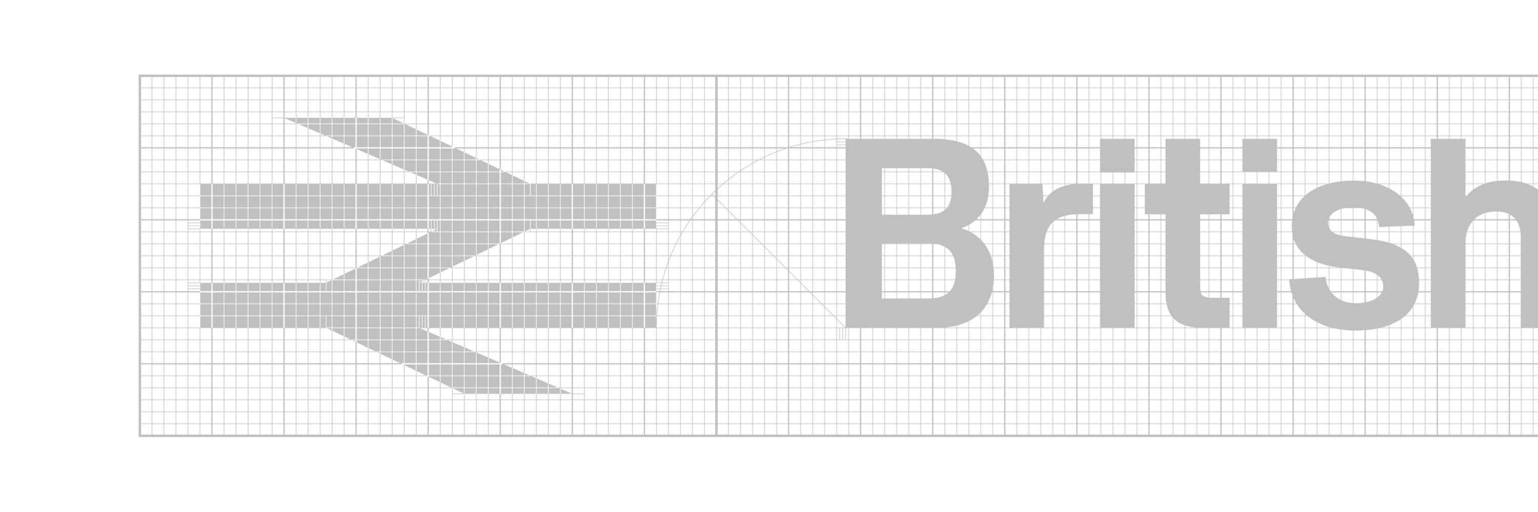
British Rail Corporate Identity 1965-1994
The same arrangement was used on Mark 2 Pullmans in Executive InterCity livery, this example not having any typographic descenders (cf the ‘g‘ in the example above which gets pretty close to the lower edge of the red stripe
flic.kr/p/aFyiok
flic.kr/p/aFyiok

January 19, 2026 at 7:59 PM
The same arrangement was used on Mark 2 Pullmans in Executive InterCity livery, this example not having any typographic descenders (cf the ‘g‘ in the example above which gets pretty close to the lower edge of the red stripe
flic.kr/p/aFyiok
flic.kr/p/aFyiok
Intercity Pullman carriage names were aligned very oddly; the Flame Red stripe was 180mm deep, the x-height was 80mm, the gap below was 35mm and the gap above 65mm and I have absolutely no idea why, text was usually centred on x-height
flic.kr/p/2jjGiEj (Michael J Collins)
flic.kr/p/2jjGiEj (Michael J Collins)


January 19, 2026 at 7:59 PM
Intercity Pullman carriage names were aligned very oddly; the Flame Red stripe was 180mm deep, the x-height was 80mm, the gap below was 35mm and the gap above 65mm and I have absolutely no idea why, text was usually centred on x-height
flic.kr/p/2jjGiEj (Michael J Collins)
flic.kr/p/2jjGiEj (Michael J Collins)
So these numbers are definitely Rail Alphabet, albeit incorrect positive weight and very tightly spaced
flic.kr/p/2qKY3Ak
flic.kr/p/2qKY3Ak

January 18, 2026 at 12:39 AM
So these numbers are definitely Rail Alphabet, albeit incorrect positive weight and very tightly spaced
flic.kr/p/2qKY3Ak
flic.kr/p/2qKY3Ak
Yes, probably the ones repainted at Crewe with knock-off Rail Alphabet, Crewe Works-style, but certainly not Helvetica

January 18, 2026 at 12:31 AM
Yes, probably the ones repainted at Crewe with knock-off Rail Alphabet, Crewe Works-style, but certainly not Helvetica
Prototype InterCity version on 73123 had Helvetica numbers…

January 17, 2026 at 5:26 PM
Prototype InterCity version on 73123 had Helvetica numbers…
That thin washline/cantrail stripe was white in the earlier days which meant the symbol bled into the white stripes both top and bottom; the stripe was orange (mandatory after mid 80s to denote live wires overhead), just looks red in that photograph :)
flic.kr/p/eafPUU
flic.kr/p/eafPUU

January 17, 2026 at 12:28 PM
That thin washline/cantrail stripe was white in the earlier days which meant the symbol bled into the white stripes both top and bottom; the stripe was orange (mandatory after mid 80s to denote live wires overhead), just looks red in that photograph :)
flic.kr/p/eafPUU
flic.kr/p/eafPUU
The APT-P and the prototype HST symbols both ‘bled‘ into the lighter surrounding area; while you could say ‘it works’, I’m not sure if the integrity of a logo is reinforced by this particular approach…?
flic.kr/p/eaa9Bz
flic.kr/p/26ejdnP
flic.kr/p/eaa9Bz
flic.kr/p/26ejdnP


January 17, 2026 at 11:59 AM
The APT-P and the prototype HST symbols both ‘bled‘ into the lighter surrounding area; while you could say ‘it works’, I’m not sure if the integrity of a logo is reinforced by this particular approach…?
flic.kr/p/eaa9Bz
flic.kr/p/26ejdnP
flic.kr/p/eaa9Bz
flic.kr/p/26ejdnP
They could certainly have been bigger (about half as much again)—I think the standard ones were 1m wide but occasionally one would get smaller ones (presumably from old stocks for Rail Blue livery)…
flic.kr/p/9D2yds (David Ford)
flic.kr/p/9D2yds (David Ford)

January 15, 2026 at 10:18 AM
They could certainly have been bigger (about half as much again)—I think the standard ones were 1m wide but occasionally one would get smaller ones (presumably from old stocks for Rail Blue livery)…
flic.kr/p/9D2yds (David Ford)
flic.kr/p/9D2yds (David Ford)
Think it’s Bridge BFO/1B over B4034 Saxon Street, Milton Keynes on the Bletchley Flyover line
Suspected that might be an ELR on the yellow mileage sign (BFO Bletchley Flyover line); don’t those red-bordered bridge signs usually show miles and chains?
Suspected that might be an ELR on the yellow mileage sign (BFO Bletchley Flyover line); don’t those red-bordered bridge signs usually show miles and chains?


January 11, 2026 at 1:16 PM
Think it’s Bridge BFO/1B over B4034 Saxon Street, Milton Keynes on the Bletchley Flyover line
Suspected that might be an ELR on the yellow mileage sign (BFO Bletchley Flyover line); don’t those red-bordered bridge signs usually show miles and chains?
Suspected that might be an ELR on the yellow mileage sign (BFO Bletchley Flyover line); don’t those red-bordered bridge signs usually show miles and chains?
I’m thinking putting a frame around the device wasn’t what Roundel were envisaging…

January 10, 2026 at 7:59 PM
I’m thinking putting a frame around the device wasn’t what Roundel were envisaging…

Who has a copy of this?

January 2, 2026 at 10:11 PM
Who has a copy of this?
Had forgotten (a) there was a double stroke variant, and (b) the dot was all about where the tittle went

January 2, 2026 at 5:33 PM
Had forgotten (a) there was a double stroke variant, and (b) the dot was all about where the tittle went
Even better tiled…

January 2, 2026 at 5:28 PM
Even better tiled…
That’s not even the original ICI roundel by Design Research Unit (that’s the Wolff Olins version—I have the WO identity manual somewhere)

December 31, 2025 at 7:14 PM
That’s not even the original ICI roundel by Design Research Unit (that’s the Wolff Olins version—I have the WO identity manual somewhere)
They don't make logos like they used to #MidlandBank

December 31, 2025 at 5:35 PM
They don't make logos like they used to #MidlandBank
Now then, the headers on your two examples are set in Helvetica Medium (thinner crossbars on the t and f) and your catering symbol has a black outline too which was also used; I can see now—and should really have known—Peter’s version is a direct lift from the Corporate Identity Manual (Sheet 2/301)

December 29, 2025 at 10:01 AM
Now then, the headers on your two examples are set in Helvetica Medium (thinner crossbars on the t and f) and your catering symbol has a black outline too which was also used; I can see now—and should really have known—Peter’s version is a direct lift from the Corporate Identity Manual (Sheet 2/301)
But if you go round to the other (Brighton) side of the box there is an unlikely (Rail Blue?) sign with positive Rail Alphabet (but incorrectly used for negative lettering); hard to tell the era though, especially in view of the unusual layout, might be some sort of impostor

December 24, 2025 at 3:25 PM
But if you go round to the other (Brighton) side of the box there is an unlikely (Rail Blue?) sign with positive Rail Alphabet (but incorrectly used for negative lettering); hard to tell the era though, especially in view of the unusual layout, might be some sort of impostor
Here in Lancing there is a fine Network SouthEast sign on the signal box which has been battered by the elements—sun, wind, salt—and it looks beautiful because of it :)

December 24, 2025 at 3:25 PM
Here in Lancing there is a fine Network SouthEast sign on the signal box which has been battered by the elements—sun, wind, salt—and it looks beautiful because of it :)
Gorgeous and crazy, look how the main carriageway isn’t even depicted vertically on the sign and the half has a solidus at 60° (no solidus today) just as the arrows are cut at 60° (rather than today’s 45°); Margaret Calvert’s Transport working hard since 1958 though :)

December 24, 2025 at 1:02 PM
Gorgeous and crazy, look how the main carriageway isn’t even depicted vertically on the sign and the half has a solidus at 60° (no solidus today) just as the arrows are cut at 60° (rather than today’s 45°); Margaret Calvert’s Transport working hard since 1958 though :)
I understand the point of adding a hook to the lower case ‘l’ but would love to know the rationale about making the leg of the R straight; I don’t think these minor changes to Rail Alphabet 2 certainly justify the existence of a new typeface called ‘Rail Alphabet 3’

December 23, 2025 at 2:22 PM
I understand the point of adding a hook to the lower case ‘l’ but would love to know the rationale about making the leg of the R straight; I don’t think these minor changes to Rail Alphabet 2 certainly justify the existence of a new typeface called ‘Rail Alphabet 3’
Don’t look too closely at the symbol either btw (extra heavy in the horizontal track department and parallel arm syndrome too)

December 7, 2025 at 4:11 PM
Don’t look too closely at the symbol either btw (extra heavy in the horizontal track department and parallel arm syndrome too)
Not come across the ‘Travellers-Fare is Quality’ tagline before (I was only five or six years old at that point); interesting that it is set in Univers not Rail Alphabet (or Helvetica) like the actual logotype (compare and contrast)


December 7, 2025 at 4:07 PM
Not come across the ‘Travellers-Fare is Quality’ tagline before (I was only five or six years old at that point); interesting that it is set in Univers not Rail Alphabet (or Helvetica) like the actual logotype (compare and contrast)
Rail Alphabet included some scope for kerning but not between upper case characters because RA was not intended to be used in all upper case; these characters would not have been printed using moveable wooden/metal type but more likely phototypeset (or decals)


December 6, 2025 at 9:35 PM
Rail Alphabet included some scope for kerning but not between upper case characters because RA was not intended to be used in all upper case; these characters would not have been printed using moveable wooden/metal type but more likely phototypeset (or decals)

