


doublearrow.co.uk
@doublearrow64.bsky.social
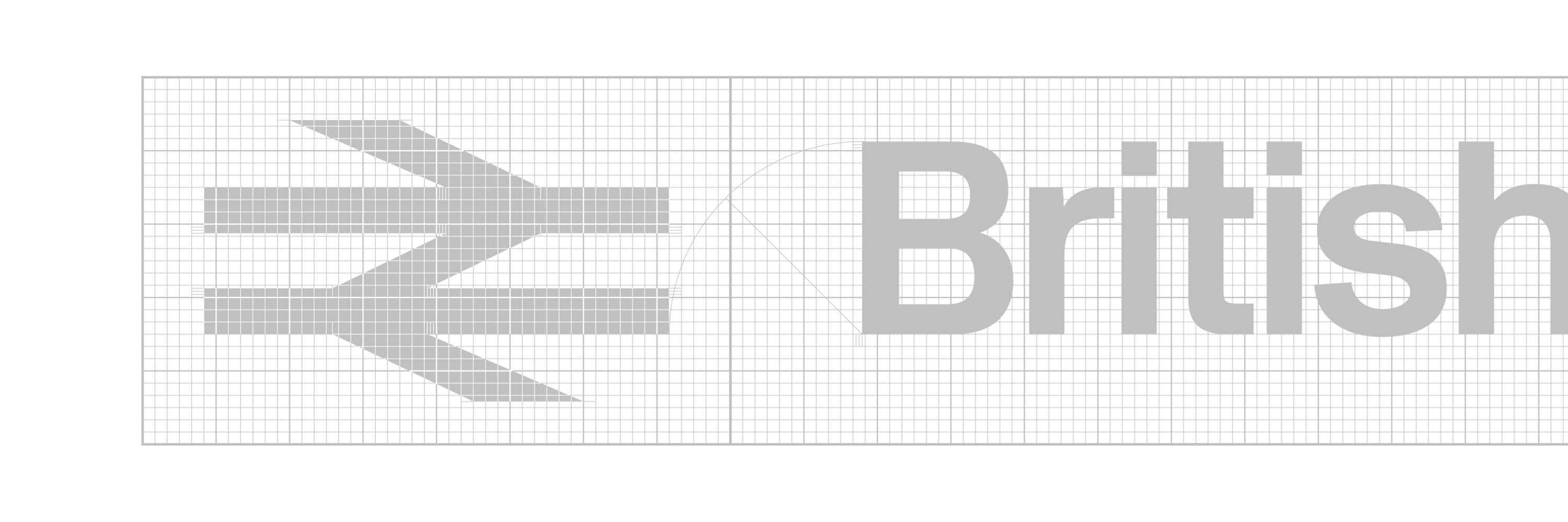
British Rail Corporate Identity 1965-1994
The same arrangement was used on Mark 2 Pullmans in Executive InterCity livery, this example not having any typographic descenders (cf the ‘g‘ in the example above which gets pretty close to the lower edge of the red stripe
flic.kr/p/aFyiok
flic.kr/p/aFyiok

January 19, 2026 at 7:59 PM
The same arrangement was used on Mark 2 Pullmans in Executive InterCity livery, this example not having any typographic descenders (cf the ‘g‘ in the example above which gets pretty close to the lower edge of the red stripe
flic.kr/p/aFyiok
flic.kr/p/aFyiok
I think there was probably a small but reliable pool of suppliers (e.g. Doric Signs) who were carefully supervised to ensure high standards
There is a desire to improve things but there is very little buy-in; the railway is too fragmented now to achieve anything of worth when it comes to wayfinding
There is a desire to improve things but there is very little buy-in; the railway is too fragmented now to achieve anything of worth when it comes to wayfinding
January 19, 2026 at 7:14 PM
I think there was probably a small but reliable pool of suppliers (e.g. Doric Signs) who were carefully supervised to ensure high standards
There is a desire to improve things but there is very little buy-in; the railway is too fragmented now to achieve anything of worth when it comes to wayfinding
There is a desire to improve things but there is very little buy-in; the railway is too fragmented now to achieve anything of worth when it comes to wayfinding
No, hadn’t seen them and they’re not very nice for various reasons, not least the use of symbols/roundels with the original thin arrow which was addressed in the most recent Wayfinding guidance; I also don’t like ampersands much
January 19, 2026 at 11:50 AM
No, hadn’t seen them and they’re not very nice for various reasons, not least the use of symbols/roundels with the original thin arrow which was addressed in the most recent Wayfinding guidance; I also don’t like ampersands much
Amaryllis, amaryllis
Amaryllis
Amaryllis, amaryllis
Amaryllis
Amaryllis, amaryllis
Rock me amaryllis
Amaryllis
Amaryllis, amaryllis
Amaryllis
Amaryllis, amaryllis
Rock me amaryllis
January 18, 2026 at 1:00 PM
Amaryllis, amaryllis
Amaryllis
Amaryllis, amaryllis
Amaryllis
Amaryllis, amaryllis
Rock me amaryllis
Amaryllis
Amaryllis, amaryllis
Amaryllis
Amaryllis, amaryllis
Rock me amaryllis
So these numbers are definitely Rail Alphabet, albeit incorrect positive weight and very tightly spaced
flic.kr/p/2qKY3Ak
flic.kr/p/2qKY3Ak

January 18, 2026 at 12:39 AM
So these numbers are definitely Rail Alphabet, albeit incorrect positive weight and very tightly spaced
flic.kr/p/2qKY3Ak
flic.kr/p/2qKY3Ak
Yes, probably the ones repainted at Crewe with knock-off Rail Alphabet, Crewe Works-style, but certainly not Helvetica

January 18, 2026 at 12:31 AM
Yes, probably the ones repainted at Crewe with knock-off Rail Alphabet, Crewe Works-style, but certainly not Helvetica
Yes, very unusual, they were usually Rail Alphabet
January 17, 2026 at 7:01 PM
Yes, very unusual, they were usually Rail Alphabet
Prototype InterCity version on 73123 had Helvetica numbers…

January 17, 2026 at 5:26 PM
Prototype InterCity version on 73123 had Helvetica numbers…
Promise me you won’t pull any punches 🥊
January 17, 2026 at 12:32 PM
Promise me you won’t pull any punches 🥊
of course you can; it makes objective sense :)
January 17, 2026 at 12:29 PM
of course you can; it makes objective sense :)
That thin washline/cantrail stripe was white in the earlier days which meant the symbol bled into the white stripes both top and bottom; the stripe was orange (mandatory after mid 80s to denote live wires overhead), just looks red in that photograph :)
flic.kr/p/eafPUU
flic.kr/p/eafPUU

January 17, 2026 at 12:28 PM
That thin washline/cantrail stripe was white in the earlier days which meant the symbol bled into the white stripes both top and bottom; the stripe was orange (mandatory after mid 80s to denote live wires overhead), just looks red in that photograph :)
flic.kr/p/eafPUU
flic.kr/p/eafPUU
Reposted by doublearrow.co.uk

Possibly only works because that logo had become *so* distinctive by this point, and a the impact of a considered choice to bleed is better than the impact of unconsidered sizing and placement. Iconic looks though, the pair of 'em.
January 17, 2026 at 12:17 PM
Possibly only works because that logo had become *so* distinctive by this point, and a the impact of a considered choice to bleed is better than the impact of unconsidered sizing and placement. Iconic looks though, the pair of 'em.
The APT-P and the prototype HST symbols both ‘bled‘ into the lighter surrounding area; while you could say ‘it works’, I’m not sure if the integrity of a logo is reinforced by this particular approach…?
flic.kr/p/eaa9Bz
flic.kr/p/26ejdnP
flic.kr/p/eaa9Bz
flic.kr/p/26ejdnP


January 17, 2026 at 11:59 AM
The APT-P and the prototype HST symbols both ‘bled‘ into the lighter surrounding area; while you could say ‘it works’, I’m not sure if the integrity of a logo is reinforced by this particular approach…?
flic.kr/p/eaa9Bz
flic.kr/p/26ejdnP
flic.kr/p/eaa9Bz
flic.kr/p/26ejdnP
They could certainly have been bigger (about half as much again)—I think the standard ones were 1m wide but occasionally one would get smaller ones (presumably from old stocks for Rail Blue livery)…
flic.kr/p/9D2yds (David Ford)
flic.kr/p/9D2yds (David Ford)

January 15, 2026 at 10:18 AM
They could certainly have been bigger (about half as much again)—I think the standard ones were 1m wide but occasionally one would get smaller ones (presumably from old stocks for Rail Blue livery)…
flic.kr/p/9D2yds (David Ford)
flic.kr/p/9D2yds (David Ford)
I think this quite suited the 73s, not sure why it wasn’t used on other classes (especially 86 and 87)
January 14, 2026 at 11:29 PM
I think this quite suited the 73s, not sure why it wasn’t used on other classes (especially 86 and 87)
Looks a bit like the chubby Inter-City 125 variant (4th one down)…
Some notes on the design of the Inter-City 125 logotype (and the rationale for the dodgy chubby symbol version)

January 14, 2026 at 8:12 PM
Looks a bit like the chubby Inter-City 125 variant (4th one down)…
Reposted by doublearrow.co.uk

From the same book, thought of you when I saw the state of the double arrow on this Brush pre-production model of the Class 89. Interesting treatment of the Inter-City livery too.

January 14, 2026 at 12:52 PM
From the same book, thought of you when I saw the state of the double arrow on this Brush pre-production model of the Class 89. Interesting treatment of the Inter-City livery too.
Yes, not great, especially as Banks & Miles had done a perfectly good job the first time around
January 14, 2026 at 12:43 PM
Yes, not great, especially as Banks & Miles had done a perfectly good job the first time around