


doublearrow.co.uk
@doublearrow64.bsky.social
British Rail Corporate Identity 1965-1994
Pinned

‘Arrows of desire’, a book all about the illustrious British Rail symbol, published by the modernist® is now available for pre-order at…
the-modernist.org/products/arr...
the-modernist.org/products/arr...
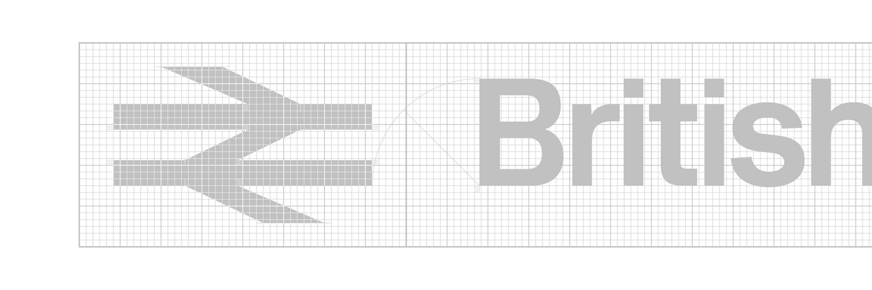
Intercity Pullman carriage names were aligned very oddly; the Flame Red stripe was 180mm deep, the x-height was 80mm, the gap below was 35mm and the gap above 65mm and I have absolutely no idea why, text was usually centred on x-height
flic.kr/p/2jjGiEj (Michael J Collins)
flic.kr/p/2jjGiEj (Michael J Collins)


January 19, 2026 at 7:59 PM
Intercity Pullman carriage names were aligned very oddly; the Flame Red stripe was 180mm deep, the x-height was 80mm, the gap below was 35mm and the gap above 65mm and I have absolutely no idea why, text was usually centred on x-height
flic.kr/p/2jjGiEj (Michael J Collins)
flic.kr/p/2jjGiEj (Michael J Collins)
Admittedly this is only temporary but “We’ll do our own thing, thanks” is the scourge of wayfinding across the British rail network…

@doublearrow64.bsky.social Have you seen the temporary signs in RA2 at Waterloo? Escalators out of service so an alternative route is signposted in what looks like the new wayfinding style - but all on LU property! One is on an existing LU sign so uses New Johnston.


January 19, 2026 at 11:54 AM
Admittedly this is only temporary but “We’ll do our own thing, thanks” is the scourge of wayfinding across the British rail network…
Reposted by doublearrow.co.uk

Morning all. A bitterly cold morning as I recall, as 37408 ‘Loch Rannoch’ traversed the Oban line with the Grangemouth to Connell Ferry oil train. Another service that was lost to road transport shortly after. Hope you all have a great day.
#Class37 #Tractor #LargeLogo
#Class37 #Tractor #LargeLogo

January 18, 2026 at 6:28 AM
Morning all. A bitterly cold morning as I recall, as 37408 ‘Loch Rannoch’ traversed the Oban line with the Grangemouth to Connell Ferry oil train. Another service that was lost to road transport shortly after. Hope you all have a great day.
#Class37 #Tractor #LargeLogo
#Class37 #Tractor #LargeLogo
Reposted by doublearrow.co.uk

Possibly only works because that logo had become *so* distinctive by this point, and a the impact of a considered choice to bleed is better than the impact of unconsidered sizing and placement. Iconic looks though, the pair of 'em.
January 17, 2026 at 12:17 PM
Possibly only works because that logo had become *so* distinctive by this point, and a the impact of a considered choice to bleed is better than the impact of unconsidered sizing and placement. Iconic looks though, the pair of 'em.
The Class 73s in Executive InterCity livery had an unusually large symbol (not reflected in the AC electrics)—I don’t mind a big symbol although this one sails perilously close to the white stripe…
Well before hybrids became popular, we had the class 73. These unassuming locos were obviously way ahead of their time!
73123 ‘Gatwick Express’ stands at the buffer stops at London Waterloo.
#Class73 #Shoebox #ElectroDiesel #LondonWaterloo #BritishRail
73123 ‘Gatwick Express’ stands at the buffer stops at London Waterloo.
#Class73 #Shoebox #ElectroDiesel #LondonWaterloo #BritishRail

January 17, 2026 at 11:47 AM
The Class 73s in Executive InterCity livery had an unusually large symbol (not reflected in the AC electrics)—I don’t mind a big symbol although this one sails perilously close to the white stripe…
Reposted by doublearrow.co.uk

From the same book, thought of you when I saw the state of the double arrow on this Brush pre-production model of the Class 89. Interesting treatment of the Inter-City livery too.

January 14, 2026 at 12:52 PM
From the same book, thought of you when I saw the state of the double arrow on this Brush pre-production model of the Class 89. Interesting treatment of the Inter-City livery too.
Thread 👀
This, from the definitive history of the APT ("APT A Promise Unfulfilled" by Hugh Williams) resonates today.
"...the APT-S proposal marked the beginning of a series of 'paper APTs' which had two big advantages for BR. Firstly the trains could be designed and developed cheaply and quickly..."
"...the APT-S proposal marked the beginning of a series of 'paper APTs' which had two big advantages for BR. Firstly the trains could be designed and developed cheaply and quickly..."
January 14, 2026 at 12:45 PM
Thread 👀
Pretty sure Frank Pick (and DRU for that matter), would be apoplectic due to the blurring of wayfinding and promotional messaging (I could also have written this post for the Underground’s ill-judged Heineken 0.0 campaign btw)
#UnintelligentDesign
#UnintelligentDesign
I am absolutely here for decluttering, BSL screens, accessibility improvements, but why on earth are GTR inventing a whole new wayfinding schema when (a) Network Rail's Wayfinding manual already exists, and (b) GBR wants to re-sign stations too in the near future?
www.mynewsdesk.com/uk/govia-tha...
www.mynewsdesk.com/uk/govia-tha...

Enfield Chase sets standard for future station improvements – smoother, simpler, more enjoyable journeys
The first example of Govia Thameslink Railway’s (GTR’s) new Model Stations concept has seen customer satisfaction among passengers at Enfield Chase surge to 93%
www.mynewsdesk.com
January 12, 2026 at 10:03 PM
Pretty sure Frank Pick (and DRU for that matter), would be apoplectic due to the blurring of wayfinding and promotional messaging (I could also have written this post for the Underground’s ill-judged Heineken 0.0 campaign btw)
#UnintelligentDesign
#UnintelligentDesign
Ah now @danielhwright.bsky.social knows full well I won’t be able to resist reposting this totem that uses NSE red (which was quite pink irrespective of weathering) and original NSE blue; don’t think much signage used the later blue
(Also see stationheritageartefacts.org.uk for rail related goodies)
(Also see stationheritageartefacts.org.uk for rail related goodies)
Ten new or updated records added to the Mainline Station Heritage Artefacts Collection thanks to seven different contributors. If you're inspired to join them, full details are on the website. (NSE totem image by Lewis Collard / rail.lewiscollard.com)

Latest stations added to site
Basingstoke (submitted by Paul Webster) Canley (submitted by Paul Webster) Coventry (updated) (submitted by Hazel Nicholson) Dorridge (updated) (submitted by Paul Webster) Edinburgh Waverley (updated) (submitted by Mike Mellor) Shipley (updated) (submitted by Mark Morton) Shoeburyness (submitted by Christopher Huang) Southend Central (updated) (submitted by Christopher Huang) Watlington (submitted by Lewis Collard / www.rail.lewiscollard.com) Welwyn North (submitted by George Barnard)
stationheritageartefacts.org.uk
January 12, 2026 at 1:55 PM
Ah now @danielhwright.bsky.social knows full well I won’t be able to resist reposting this totem that uses NSE red (which was quite pink irrespective of weathering) and original NSE blue; don’t think much signage used the later blue
(Also see stationheritageartefacts.org.uk for rail related goodies)
(Also see stationheritageartefacts.org.uk for rail related goodies)
These books are stunning btw

Please buy my 3 in-print titles direct from @CrecyRail, thank you! 👍
Birmingham & West Midlands Railway Atlas 2nd edition: crecy.co.uk/product/birm...
London Railway Atlas 6th edition: crecy.co.uk/product/lond...
Rail Atlas of GB & Ireland 16th edition: crecy.co.uk/product/rail...
Birmingham & West Midlands Railway Atlas 2nd edition: crecy.co.uk/product/birm...
London Railway Atlas 6th edition: crecy.co.uk/product/lond...
Rail Atlas of GB & Ireland 16th edition: crecy.co.uk/product/rail...

January 12, 2026 at 1:52 PM
These books are stunning btw
0.0/10
Unforgivable. Mixing basic passenger information with advertising to the confusion of the former. Brand prostitution.
flic.kr/p/2rRd5mF
flic.kr/p/2rRd5mF

IMG_5292
flic.kr
January 11, 2026 at 8:25 PM
0.0/10
One for the trackies…

January 10, 2026 at 7:56 PM
One for the trackies…
Shiny; am I right in thinking these were Res locomotives?
Spot on Sir.
January 10, 2026 at 12:16 AM
Shiny; am I right in thinking these were Res locomotives?
Reposted by doublearrow.co.uk
It's the day! 6 January 1980 & you can save with a #London Crosstown ticket. British Rail publicity for what was the old North London Line, then still running to Broad St. station, & now, over time, utterly transformed as part of the Overground. #railways #transport
↘️ flic.kr/p/2ndLbg1
↘️ flic.kr/p/2ndLbg1


January 6, 2026 at 11:12 AM
It's the day! 6 January 1980 & you can save with a #London Crosstown ticket. British Rail publicity for what was the old North London Line, then still running to Broad St. station, & now, over time, utterly transformed as part of the Overground. #railways #transport
↘️ flic.kr/p/2ndLbg1
↘️ flic.kr/p/2ndLbg1
Imagine having the option of putting this in any livery in preservation and actually choosing EWS over this? 😩
Two tone Railfreight Metals liveried 37250 stands at Perth station awaiting fuelling. Thankfully a locomotive that is still with us in preservation on the Wensleydale Railway, albeit now in EWS colours.
#Class37 #Tractor #RailfreightMetals #Perth #BritishRail
#Class37 #Tractor #RailfreightMetals #Perth #BritishRail

January 4, 2026 at 11:00 AM
Imagine having the option of putting this in any livery in preservation and actually choosing EWS over this? 😩
Reposted by doublearrow.co.uk
Survived at Barking on platform buildings as late as 2022...
stationheritageartefacts.org.uk/artefacts-re...
stationheritageartefacts.org.uk/artefacts-re...

January 4, 2026 at 10:48 AM
Survived at Barking on platform buildings as late as 2022...
stationheritageartefacts.org.uk/artefacts-re...
stationheritageartefacts.org.uk/artefacts-re...
Reposted by doublearrow.co.uk

This would be quite a good dating filter TBH
January 2, 2026 at 10:13 PM
This would be quite a good dating filter TBH
Who has a copy of this?

January 2, 2026 at 10:11 PM
Who has a copy of this?
Reposted by doublearrow.co.uk

Has anyone mentioned this one yet?

January 1, 2026 at 9:49 AM
Has anyone mentioned this one yet?
Glorious bunch of flowers 💐
British Rail West Riding - to get you out and about : eight of the pocket sized train timetables issued 1973 - 75 with the pre-WYPTE/Metro branding, line names but using the wider county's white rose symbol. Quite a 'family' feel. #yorkshire #railways #graphicdesign @doublearrow64.bsky.social

December 31, 2025 at 8:15 PM
Glorious bunch of flowers 💐
That’s not even the original ICI roundel by Design Research Unit (that’s the Wolff Olins version—I have the WO identity manual somewhere)

December 31, 2025 at 7:14 PM
That’s not even the original ICI roundel by Design Research Unit (that’s the Wolff Olins version—I have the WO identity manual somewhere)
Reposted by doublearrow.co.uk


They don't make logos like they used to #MidlandBank

December 31, 2025 at 5:35 PM
They don't make logos like they used to #MidlandBank
Just too tempting for some to extend parallel tracks from the British Rail symbol, even Newell and Sorrell did it for InterCity in the late 1980s; not sure it’s what the purists at DRU would have wanted
Awayday saves in so many ways : part of a 1975 British Rail map folder giving details of journeys & fares; although the map covers SE England the fares also included the Scottish Lochs - not in a day I don't think. The panel borders inc the BR symbol, @doublearrow64.bsky.social

December 31, 2025 at 12:41 AM
Just too tempting for some to extend parallel tracks from the British Rail symbol, even Newell and Sorrell did it for InterCity in the late 1980s; not sure it’s what the purists at DRU would have wanted
Gorgeous; it certainly has the Bernard Slatter feel to it, I’m not sure when he/British Rail started to attribute and reference for version control purposes but this seems to be an embryonic version of what would become the Network SouthEast map, albeit with a LT copyright for the Underground
1975 British Rail SE England journey planner; the diagram in 2 scans showing the then railway network now much changed by Thameslink, Crossrail & Overground. Probably by Bernard Slatter, it shows routes & service patterns. #map #cartography #railway @doublearrow64.bsky.social
↘️ flic.kr/p/2rPnw7P
↘️ flic.kr/p/2rPnw7P


December 30, 2025 at 1:06 PM
Gorgeous; it certainly has the Bernard Slatter feel to it, I’m not sure when he/British Rail started to attribute and reference for version control purposes but this seems to be an embryonic version of what would become the Network SouthEast map, albeit with a LT copyright for the Underground