John V Hurley
@jvh-h2oclimate.bsky.social
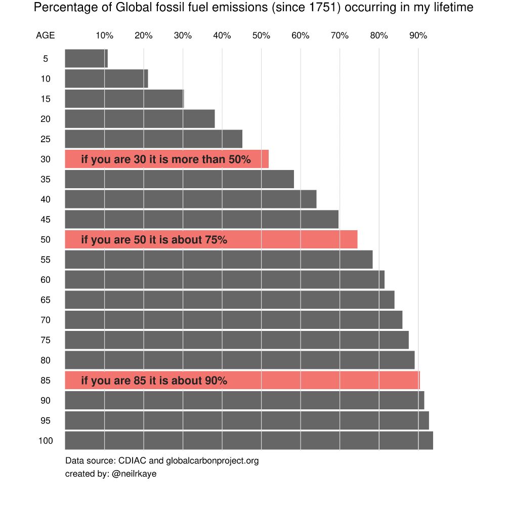
1.3K followers 560 following 120 posts
Climate Scientist -Earth -Water -Data. PhD, PG https://scholar.google.co.uk/citations?hl=en&pli=1&user=aEgv38gAAAAJ
Posts Media Videos Starter Packs
jvh-h2oclimate.bsky.social
@geosociety.bsky.social who will you be endorsing in this final match-up between kyanite and tugtupite?
jvh-h2oclimate.bsky.social
The decline of alpine snow is under appreciated as it will impact flooding, infrastructure and water resource planning
pnas.org
Future #winters promise less #snow in the #mountains and more #rain. That shift could have major implications for #WaterSupplies in regions around the world. In PNAS Front Matter: www.pnas.org/doi/10.1073/...

#snowpack #flood #ClimateChange #SNOTEL #floodplains
In high-elevation Utah, near 9,000 feet, snow should accumulate and stick all winter. Researcher McKenzie Skiles and her team dig a pit to track shifts in snow depth and the volume of water stored there. 
Image credit: Otto Lang and McKenzie Skiles/The University of Utah, Salt Lake City.
jvh-h2oclimate.bsky.social
I mean you could just refer to us as scientists
Reposted by John V Hurley
jvh-h2oclimate.bsky.social
Hawaii's Kilauea is erupting again today with interesting atmospheric interactions, live streaming... #Geology
www.youtube.com/live/BqmpkUd...
jvh-h2oclimate.bsky.social
A real Don Quixote...I guess that makes JD Sancho Panza
jvh-h2oclimate.bsky.social
They're not killing a bedrock scientific finding, they're denying the reality of it by blinding their eyes to facts. The bedrock scientific finding remains but the willfully ignorant turn away from it. This administration is an embarrassment to us all and the NY Times could write a better headline
Reposted by John V Hurley
davidho.bsky.social
Motherfucking wind farms…
jvh-h2oclimate.bsky.social
Tidal gauge data from Midway Islands northwest of Hawaii showing a rapid retreat and then surge of tsunami #tsunami

tidesandcurrents.noaa.gov/map/index.ht...
jvh-h2oclimate.bsky.social
Tsunami watch for Hawaii and advisory for Aleutian Islands following 8.3 earthquake near Kamchatka Russia #Geology

www.tsunami.gov

earthquake.usgs.gov/earthquakes/...
U.S. Tsunami Warning Centers
www.tsunami.gov
jvh-h2oclimate.bsky.social
Great to see you here. Will forecast offices be joining as well?
Reposted by John V Hurley
ufw.bsky.social
ADVISORY: Statement, media avail. from unjustly detained U.S. veteran George Retes

Ventura County, CA—
Wed 7/16 at 3 pm PT, George Retes, U.S. citizen and Army veteran unjustly detained by federal agents during last week’s raid will hold a virtual press availability. 1/
jvh-h2oclimate.bsky.social
She should be receiving a Nobel prize instead of sanctions by ghouls
Reposted by John V Hurley
edhawkins.org
Every country is warming.

Every country is experiencing more extreme weather events because of climate change, mainly caused by burning fossil fuels. www.ShowYourStripes.info

Time to #ShowYourStripes and start climate conversations to prompt actions to reduce emissions, personally & collectively.
jvh-h2oclimate.bsky.social
And warming stripes from near my current home.
Reposted by John V Hurley
sundaedivine.bsky.social
North Korea out there calling balls and strikes.
Reposted by John V Hurley
davidho.bsky.social
If you think climate change has gotten worse during your lifetime, you're right and there's a good reason.

If you're Gen X like me, more than 3/4 of fossil fuel CO₂ emissions have occurred in your lifetime. Even if you're a Millennial, it's at least half.

📊: @neilrkaye.bsky.social
A horizontal bar chart titled "Percentage of Global fossil fuel emissions (since 1751) occurring in my lifetime." The chart shows how much of the total historical global fossil fuel emissions have occurred within the lifetime of individuals of different ages, from 5 to 100 years old. The vertical axis on the left lists ages in increments of 5 years, from age 5 at the top to age 100 at the bottom. The horizontal axis represents the percentage of fossil fuel emissions, marked in 10% increments from 10% to 90%.

The black bars represent the proportion of fossil fuel emissions that have occurred during each age group's lifetime. The bars increase in length as the age increases, meaning older individuals have lived through a larger percentage of the cumulative emissions since 1751.

Three specific age groups are highlighted with red bars and white text annotations:

Age 30: "if you are 30 it is more than 50%"

Age 50: "if you are 50 it is about 75%"

Age 85: "if you are 85 it is about 90%"

The source of the data is cited at the bottom: "CDIAC and globalcarbonproject.org." The graphic is credited to "@neilrkaye."
Reposted by John V Hurley
johnmoralestv.bsky.social
Cuts have consequences, illustrated. As seen on TV 📺
Reposted by John V Hurley
edwardsanthonyb.bsky.social
The National Science Foundation budget proposal would be a devastating blow to American science. 240,000 fewer people would be involved in federally-funded science in fiscal year 2026, according to estimates in the document.

nsf-gov-resources.nsf.gov/files/00-NSF...