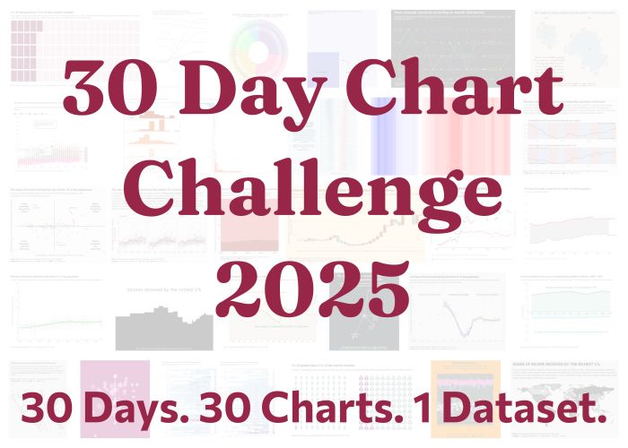
#30DayChartChallenge
@30daychartchall.bsky.social
1.9K followers
2.1K following
40 posts
A #DataViz challenge 📊 by @cedricscherer.com and @drxeo.eu
Supported by @wendyshijia.bsky.social and @ansgarw.bsky.social
More info on Github: https://github.com/30DayChartChallenge/Edition2024
Posts
Media
Videos
Starter Packs
Pinned
Reposted by #30DayChartChallenge

Reposted by #30DayChartChallenge
Reposted by #30DayChartChallenge

Reposted by #30DayChartChallenge

Reposted by #30DayChartChallenge

Reposted by #30DayChartChallenge

Reposted by #30DayChartChallenge
Reposted by #30DayChartChallenge
Reposted by #30DayChartChallenge
Reposted by #30DayChartChallenge

Reposted by #30DayChartChallenge
Reposted by #30DayChartChallenge

Reposted by #30DayChartChallenge

Reposted by #30DayChartChallenge

Reposted by #30DayChartChallenge

Reposted by #30DayChartChallenge

Cédric Scherer
@cedricscherer.com
· May 2
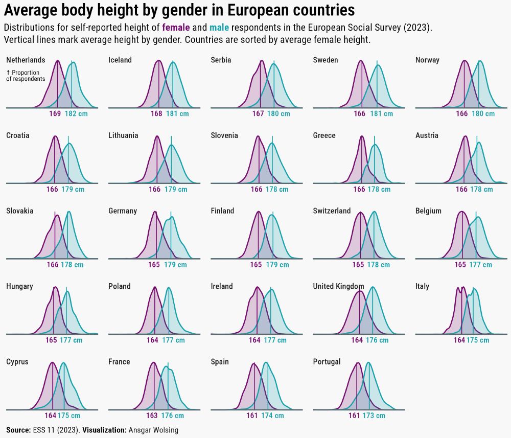
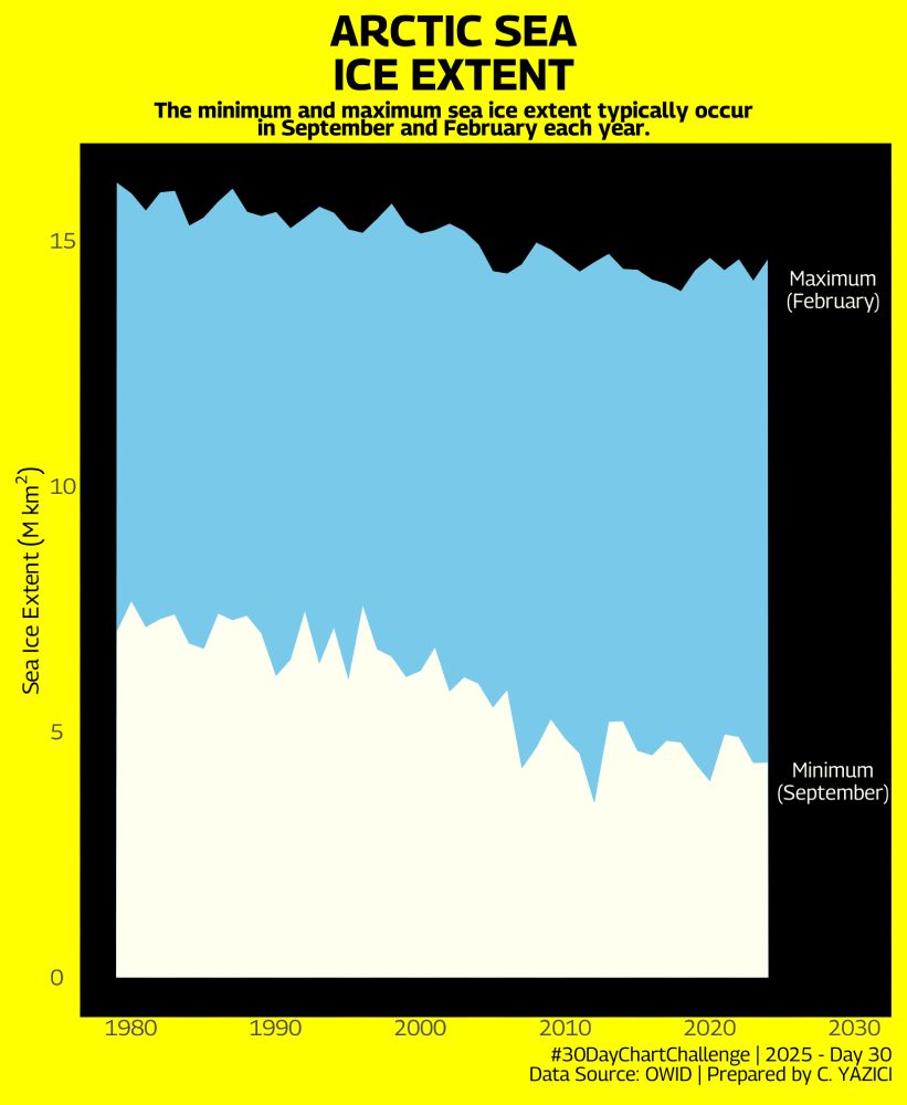
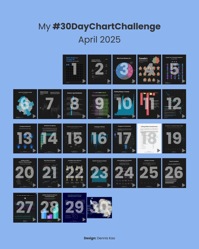
0 days, 30 prompts - it's a wrap! 🎉
Huge thanks to everyone who joined the #30DayChartChallenge - daily, occasionally, or cheering from the sidelines.
We're amazed, inspired, and above all, grateful for all the creativity, learning, and sense of community! 💛
#dataviz #datavisualization
Huge thanks to everyone who joined the #30DayChartChallenge - daily, occasionally, or cheering from the sidelines.
We're amazed, inspired, and above all, grateful for all the creativity, learning, and sense of community! 💛
#dataviz #datavisualization

Reposted by #30DayChartChallenge
0 days, 30 prompts - it's a wrap! 🎉
Huge thanks to everyone who joined the #30DayChartChallenge - daily, occasionally, or cheering from the sidelines.
We're amazed, inspired, and above all, grateful for all the creativity, learning, and sense of community! 💛
#dataviz #datavisualization
Huge thanks to everyone who joined the #30DayChartChallenge - daily, occasionally, or cheering from the sidelines.
We're amazed, inspired, and above all, grateful for all the creativity, learning, and sense of community! 💛
#dataviz #datavisualization
Reposted by #30DayChartChallenge

Reposted by #30DayChartChallenge

Reposted by #30DayChartChallenge

Reposted by #30DayChartChallenge

Reposted by #30DayChartChallenge