


Tan G.
@tangandhara.bsky.social
Data analyst and data viz geek
Reposted by Tan G.

You know what food I hate? Your personal favourite food. Inedible garbage.
November 25, 2025 at 9:48 PM
You know what food I hate? Your personal favourite food. Inedible garbage.
Day 26 #30DayMapChallenge - Disused railway stations in East Sussex
One for the train spotters and urban explorers based on the data from Wikipedia and OpenStreetMap
#rstats #dataviz
One for the train spotters and urban explorers based on the data from Wikipedia and OpenStreetMap
#rstats #dataviz

November 25, 2025 at 11:29 PM
Day 26 #30DayMapChallenge - Disused railway stations in East Sussex
One for the train spotters and urban explorers based on the data from Wikipedia and OpenStreetMap
#rstats #dataviz
One for the train spotters and urban explorers based on the data from Wikipedia and OpenStreetMap
#rstats #dataviz
Reposted by Tan G.

#30daymapchallenge | Day 25 Hexagons | Youth & Senior Population
Admittedly not my best hex grid bivariate choropleth… I think the color selection isn’t quite right. But here we are! Comparing the distribution of Madisonians under 18 and 65+ across the city based on the 2023 ACS 5-year estimates.
Admittedly not my best hex grid bivariate choropleth… I think the color selection isn’t quite right. But here we are! Comparing the distribution of Madisonians under 18 and 65+ across the city based on the 2023 ACS 5-year estimates.

November 25, 2025 at 12:53 PM
#30daymapchallenge | Day 25 Hexagons | Youth & Senior Population
Admittedly not my best hex grid bivariate choropleth… I think the color selection isn’t quite right. But here we are! Comparing the distribution of Madisonians under 18 and 65+ across the city based on the 2023 ACS 5-year estimates.
Admittedly not my best hex grid bivariate choropleth… I think the color selection isn’t quite right. But here we are! Comparing the distribution of Madisonians under 18 and 65+ across the city based on the 2023 ACS 5-year estimates.
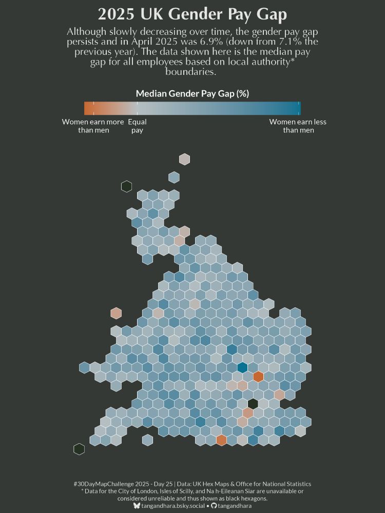
Day 25 #30DayMapChallenge - UK Gender Pay Gap in hexagons
For the hexagons prompt, I profiled the median gender pay gap in the UK.
#rstats #dataviz
For the hexagons prompt, I profiled the median gender pay gap in the UK.
#rstats #dataviz
November 24, 2025 at 11:25 PM
Day 25 #30DayMapChallenge - UK Gender Pay Gap in hexagons
For the hexagons prompt, I profiled the median gender pay gap in the UK.
#rstats #dataviz
For the hexagons prompt, I profiled the median gender pay gap in the UK.
#rstats #dataviz
Reposted by Tan G.

#30DayMapChallenge day 19: projections
@jennahgosciak.bsky.social created a gif that visualizes NYC neighborhoods under different map projections. While most atrocities are clear only at national or global levels, her maps show interesting local deformities!
@jennahgosciak.bsky.social created a gif that visualizes NYC neighborhoods under different map projections. While most atrocities are clear only at national or global levels, her maps show interesting local deformities!
November 24, 2025 at 2:42 PM
#30DayMapChallenge day 19: projections
@jennahgosciak.bsky.social created a gif that visualizes NYC neighborhoods under different map projections. While most atrocities are clear only at national or global levels, her maps show interesting local deformities!
@jennahgosciak.bsky.social created a gif that visualizes NYC neighborhoods under different map projections. While most atrocities are clear only at national or global levels, her maps show interesting local deformities!


Reposted by Tan G.

#30DayMapChallenge
Day 24: Places and their names
I wanted to try something... but it needs a bit more work :-)
Day 24: Places and their names
I wanted to try something... but it needs a bit more work :-)

November 24, 2025 at 4:51 PM
#30DayMapChallenge
Day 24: Places and their names
I wanted to try something... but it needs a bit more work :-)
Day 24: Places and their names
I wanted to try something... but it needs a bit more work :-)
Day 24 #30DayMapChallenge - Places and their names, or in Olde English...
Settlements of olde bearing the '-ing' suffix in the shire of Sussex
#rstats #dataviz
Settlements of olde bearing the '-ing' suffix in the shire of Sussex
#rstats #dataviz

November 24, 2025 at 8:15 AM
Day 24 #30DayMapChallenge - Places and their names, or in Olde English...
Settlements of olde bearing the '-ing' suffix in the shire of Sussex
#rstats #dataviz
Settlements of olde bearing the '-ing' suffix in the shire of Sussex
#rstats #dataviz
Reposted by Tan G.

Day 23 - Process
Create a Joy Plot Map in QGIS
I created a workflow for creating a Joy Plot Map in QGIS. I plan on adding more workflows or tutorials in the future.
antonioantoine.com/2025/11/23/c...
#30DayMapChallenge
Create a Joy Plot Map in QGIS
I created a workflow for creating a Joy Plot Map in QGIS. I plan on adding more workflows or tutorials in the future.
antonioantoine.com/2025/11/23/c...
#30DayMapChallenge

Create a Joy Plot Map in QGIS
In this Workflow, I will show you how I created a Joy Plot style map from the 2025 30DayMapChallenge. There are multiple ways to achieve this; however, this method worked best for me. Tools Needed …
antonioantoine.com
November 23, 2025 at 7:24 PM
Day 23 - Process
Create a Joy Plot Map in QGIS
I created a workflow for creating a Joy Plot Map in QGIS. I plan on adding more workflows or tutorials in the future.
antonioantoine.com/2025/11/23/c...
#30DayMapChallenge
Create a Joy Plot Map in QGIS
I created a workflow for creating a Joy Plot Map in QGIS. I plan on adding more workflows or tutorials in the future.
antonioantoine.com/2025/11/23/c...
#30DayMapChallenge
Day 22 #30DayMapChallenge - UK National Parks
What's your nearest national park? Using voronoi plot using the national parks' centroid to determine your nearest park. Also, since I didn't do the icon prompt justice for day 20, dropped in some icons too.
#rstats #dataviz
What's your nearest national park? Using voronoi plot using the national parks' centroid to determine your nearest park. Also, since I didn't do the icon prompt justice for day 20, dropped in some icons too.
#rstats #dataviz

November 23, 2025 at 7:06 PM
Day 22 #30DayMapChallenge - UK National Parks
What's your nearest national park? Using voronoi plot using the national parks' centroid to determine your nearest park. Also, since I didn't do the icon prompt justice for day 20, dropped in some icons too.
#rstats #dataviz
What's your nearest national park? Using voronoi plot using the national parks' centroid to determine your nearest park. Also, since I didn't do the icon prompt justice for day 20, dropped in some icons too.
#rstats #dataviz
Day 21 #30DayMapChallenge - Football icons of Birmingham
Reworked a map from earlier in the challenge to help viewers understand just how iconic a football Birmingham City are...
#rstats #dataviz #bcfc #kro
Reworked a map from earlier in the challenge to help viewers understand just how iconic a football Birmingham City are...
#rstats #dataviz #bcfc #kro

November 23, 2025 at 11:09 AM
Day 21 #30DayMapChallenge - Football icons of Birmingham
Reworked a map from earlier in the challenge to help viewers understand just how iconic a football Birmingham City are...
#rstats #dataviz #bcfc #kro
Reworked a map from earlier in the challenge to help viewers understand just how iconic a football Birmingham City are...
#rstats #dataviz #bcfc #kro
Reposted by Tan G.

Ever wonder which international border is closest? This map divides Germany into 9 zones, showing the nearest neighbor for any given point. Germany borders more European countries than any other nation.*
#30DayMapChallenge Day 22: Natural Earth #rstats #ggplot2
#30DayMapChallenge Day 22: Natural Earth #rstats #ggplot2

November 22, 2025 at 4:59 PM
Ever wonder which international border is closest? This map divides Germany into 9 zones, showing the nearest neighbor for any given point. Germany borders more European countries than any other nation.*
#30DayMapChallenge Day 22: Natural Earth #rstats #ggplot2
#30DayMapChallenge Day 22: Natural Earth #rstats #ggplot2
Day 20 #30DayMapChallenge - Ecological classification of river water bodies
The majority of England's river water bodies do not have a good classification
#rstats #dataviz
The majority of England's river water bodies do not have a good classification
#rstats #dataviz

November 22, 2025 at 9:12 PM
Day 20 #30DayMapChallenge - Ecological classification of river water bodies
The majority of England's river water bodies do not have a good classification
#rstats #dataviz
The majority of England's river water bodies do not have a good classification
#rstats #dataviz
Reposted by Tan G.

Transit Study I
Nine gel pens on 24x32cm black paper.
New item in the shop! Adding more this weekend.
www.timwallace.art/product/tran...
Nine gel pens on 24x32cm black paper.
New item in the shop! Adding more this weekend.
www.timwallace.art/product/tran...

November 22, 2025 at 1:31 AM
Transit Study I
Nine gel pens on 24x32cm black paper.
New item in the shop! Adding more this weekend.
www.timwallace.art/product/tran...
Nine gel pens on 24x32cm black paper.
New item in the shop! Adding more this weekend.
www.timwallace.art/product/tran...

November 22, 2025 at 6:31 AM
Reposted by Tan G.

Find you somebody who looks at you like Donald Trump looks at Zohran Mamdani.

November 21, 2025 at 9:29 PM
Find you somebody who looks at you like Donald Trump looks at Zohran Mamdani.
Day 19 #30DayMapChallenge - Map Projections
Wanted to do something fancy but I am not skilled enough so this is what you're getting!
#rstats #dataviz
Wanted to do something fancy but I am not skilled enough so this is what you're getting!
#rstats #dataviz

November 21, 2025 at 10:16 PM
Day 19 #30DayMapChallenge - Map Projections
Wanted to do something fancy but I am not skilled enough so this is what you're getting!
#rstats #dataviz
Wanted to do something fancy but I am not skilled enough so this is what you're getting!
#rstats #dataviz
I love and hate this at the same time

"Join ICE" - Jesse Welles (LIVE on The Late Show)
YouTube video by The Late Show with Stephen Colbert
youtu.be
November 21, 2025 at 1:36 PM
I love and hate this at the same time
Who could’ve predicted that apart from absolutely everyone?

The UK's anti-migrant mania is destroying the health system with a 26% rise in overseas-trained doctors quitting the UK in 2024
www.theguardian.com/society/2025...
www.theguardian.com/society/2025...

Overseas-trained doctors leaving the UK in record numbers
Medical bodies warn that hostility towards migrants is behind a 26% rise in departures last year that imperils NHS
www.theguardian.com
November 21, 2025 at 9:22 AM
Who could’ve predicted that apart from absolutely everyone?
Clipse were very good last night …
November 21, 2025 at 2:29 AM
Clipse were very good last night …
Reposted by Tan G.

#30DayMapChallenge | Day 20 - Water
For today's challenge, I created a representation of the Mississippi River in the United States using its digital elevation model and light detection and ranging.
Tools: QGIS
For today's challenge, I created a representation of the Mississippi River in the United States using its digital elevation model and light detection and ranging.
Tools: QGIS

November 20, 2025 at 6:56 PM
#30DayMapChallenge | Day 20 - Water
For today's challenge, I created a representation of the Mississippi River in the United States using its digital elevation model and light detection and ranging.
Tools: QGIS
For today's challenge, I created a representation of the Mississippi River in the United States using its digital elevation model and light detection and ranging.
Tools: QGIS
Reposted by Tan G.

How do data journalists turn raw data into stories that inform and inspire? Join experts from Reuters, Axios, and The Pudding on Dec 4 for a behind-the-scenes look at how newsrooms approach storytelling with graphics. Register now:

Storytelling with graphics: From raw data to reader impact
Newsrooms have long been the frontier of data visualization, turning messy datasets into clear, powerful stories that resonate with broad audiences. In this panel, leading data journalists will take…
buff.ly
November 20, 2025 at 10:30 PM
How do data journalists turn raw data into stories that inform and inspire? Join experts from Reuters, Axios, and The Pudding on Dec 4 for a behind-the-scenes look at how newsrooms approach storytelling with graphics. Register now:
Reposted by Tan G.

‘A modern-day Colosseum’: Birmingham City unveil 62,000-capacity stadium plans

‘A modern-day Colosseum’: Birmingham City unveil 62,000-capacity stadium plans
*
Stadium planned to feature 12 chimney-like towers
*
Club chair Tom Wagner sees it as ‘beacon for excellence’
Birmingham City have unveiled designs of their striking new 62,000-capacity stadium, the Birmingham City Powerhouse, which the Championship club say will open for the 2030-31 season.
The stadium, which features 12 chimney-like towers inspired by the city’s industrial heritage, will dominate the Birmingham skyline and be visible up to 40 miles away. One tower will include a lift to Birmingham’s highest bar, offering city-wide views. Continue reading...
dlvr.it
November 20, 2025 at 6:40 PM
‘A modern-day Colosseum’: Birmingham City unveil 62,000-capacity stadium plans
New meaning to “habemus papam” 😂

November 20, 2025 at 6:59 PM
New meaning to “habemus papam” 😂