


Bren Macdonald
@brenmacdonald.bsky.social
Comedian, Engineer, Podcaster, Sometimes-Writer. I grew up in the SF/F community, my folks wrote The Mageworlds series.
When you see your old work appear in a Defunctland video...

So you made a robot stand up and talk... now what? In this over 4-hour journey, Kevin follows the promise of Disney's Living Character Initiative, an effort to populate Disney theme parks with free-roaming, interactive beings. It was touted as the future. How's it going? Watch here: bit.ly/49C6vng

November 24, 2025 at 12:58 AM
When you see your old work appear in a Defunctland video...
Reposted by Bren Macdonald
What's happened to book covers is simple:
The title has to be READABLE on a thumbnail image on a phone to make a sale. It has to look good in black and white.
Which means san serif fonts in bright colors in large type with wide spacing/kerning over a dark background.
The title has to be READABLE on a thumbnail image on a phone to make a sale. It has to look good in black and white.
Which means san serif fonts in bright colors in large type with wide spacing/kerning over a dark background.

The thing I find very odd is how little most authors seem to care about their book’s covers, & not just ones that have been created with AI
If you want to make a case for the decline & fall of civilisation then comparing older book covers -especially sci-fi/fantasy- to modern ones is a good start
If you want to make a case for the decline & fall of civilisation then comparing older book covers -especially sci-fi/fantasy- to modern ones is a good start

www.theguardian.com/world/2025/n...
"Wilson said it was also upsetting for the production and design team, who had worked hard on the books."
I would have thought "working hard" might involve bothering to get an actual cover artist to do actual art for the covers but that's just me
"Wilson said it was also upsetting for the production and design team, who had worked hard on the books."
I would have thought "working hard" might involve bothering to get an actual cover artist to do actual art for the covers but that's just me
November 22, 2025 at 1:53 PM
What's happened to book covers is simple:
The title has to be READABLE on a thumbnail image on a phone to make a sale. It has to look good in black and white.
Which means san serif fonts in bright colors in large type with wide spacing/kerning over a dark background.
The title has to be READABLE on a thumbnail image on a phone to make a sale. It has to look good in black and white.
Which means san serif fonts in bright colors in large type with wide spacing/kerning over a dark background.
Upcoming shows! I have one show at a Monroeville fall festival on Saturday. I then have a Halloween show on Halloween night at 9PM at the Arcade Comedy Theater!
October 23, 2025 at 6:58 PM
Upcoming shows! I have one show at a Monroeville fall festival on Saturday. I then have a Halloween show on Halloween night at 9PM at the Arcade Comedy Theater!
Reposted by Bren Macdonald
Cat is a treasure and if you are looking for a writer community this is a great place to start.
If you're a writer of fantasy, SF, or horror looking for an online community dedicated to cooperation, kindness, encouragement, and craft, please check out my Patreon.
www.patreon.com/c/catrambo
www.patreon.com/c/catrambo

Cat Rambo | Patreon
creating Stories, Community, and Love since 2007 on Patreon
www.patreon.com
September 18, 2025 at 2:42 PM
Cat is a treasure and if you are looking for a writer community this is a great place to start.
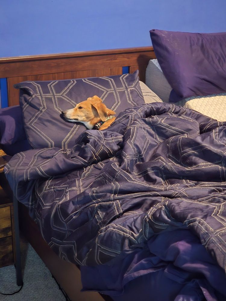
My dog is like a world champion in looking relaxed.

September 12, 2025 at 3:44 PM
My dog is like a world champion in looking relaxed.
Reposted by Bren Macdonald
Hey, it's been a little while. Have a new episode! And yeah,managing creative ventures can be like trying to herd feral cats. Though I wonder if comedians would respond as well to a can of tuna.

Live from the internet! It's a new episode of No Story is Sacred! Ok,it was prerecorded several months ago. But it's still a new episode about the movie Saturday Night!
nostoryissacred.com/episode-133-...
nostoryissacred.com/episode-133-...
Episode 133: Saturday Night - No Story Is Sacred
In this episode we discuss the 2024 film Saturday Night. You can stream it on Netflix, or rent it on Amazon or Apple. Content warnings for strong language, fictionalized stories about still-living peo...
nostoryissacred.com
August 27, 2025 at 1:55 PM
Hey, it's been a little while. Have a new episode! And yeah,managing creative ventures can be like trying to herd feral cats. Though I wonder if comedians would respond as well to a can of tuna.
I contain multitudes.

August 26, 2025 at 6:27 PM
I contain multitudes.
Reposted by Bren Macdonald
My sister, @katherinecrighton.bsky.social, has a new story out. It is, as the title suggests, about how to win against the robots. It is also about our mother. I cried~
www.lightspeedmagazine.com/fiction/how-...
www.lightspeedmagazine.com/fiction/how-...
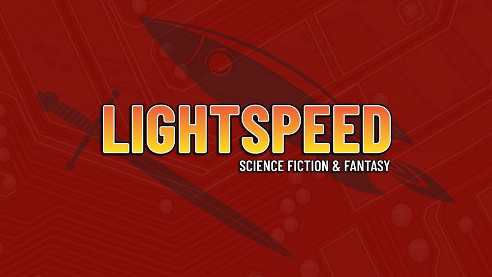
How to Win Against the Robots - Lightspeed Magazine
Mom lives in a little place off the old meat-packing district, the streets full of cobblestones peeking through asphalt as hipsters turn the bones of slaughterhouses into bespoke gin bars. It’s expens...
www.lightspeedmagazine.com
July 10, 2025 at 2:02 PM
My sister, @katherinecrighton.bsky.social, has a new story out. It is, as the title suggests, about how to win against the robots. It is also about our mother. I cried~
www.lightspeedmagazine.com/fiction/how-...
www.lightspeedmagazine.com/fiction/how-...
Went and watched Superman, kinda refreshing to have a classic super hero flick, ya know? Also, we need more Mr. Terrific.
July 11, 2025 at 1:12 AM
Went and watched Superman, kinda refreshing to have a classic super hero flick, ya know? Also, we need more Mr. Terrific.
Ya know what, the dog knows what's best.
March 29, 2025 at 1:19 PM
Ya know what, the dog knows what's best.
Had one improv show on Friday which I also wrote up sketch runners for it, and then I had an on-book stage read of another sketch. Overall a good sketch weekend for me!
March 2, 2025 at 1:40 PM
Had one improv show on Friday which I also wrote up sketch runners for it, and then I had an on-book stage read of another sketch. Overall a good sketch weekend for me!
Reposted by Bren Macdonald
Here’s something easy you can do today. Block USA Today on Blue Sky.
If thousands of us can do it, we can have an immediate impact on their reach on social media.
If thousands of us can do it, we can have an immediate impact on their reach on social media.

January 26, 2025 at 3:27 PM
Here’s something easy you can do today. Block USA Today on Blue Sky.
If thousands of us can do it, we can have an immediate impact on their reach on social media.
If thousands of us can do it, we can have an immediate impact on their reach on social media.
Time for a cup of tea at my local favorite place.
January 20, 2025 at 8:07 PM
Time for a cup of tea at my local favorite place.
Reposted by Bren Macdonald
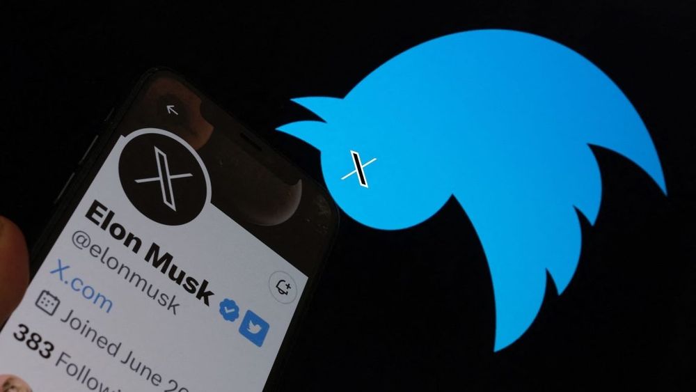
every time you post a great joke and people laugh you should say to yourself, “wow, one of the richest men in the world bought one of the internet’s most vital global communications platforms and stomped it into rubble in a fit of shrieking toddler hysterics because he cannot do what I am doing”
January 13, 2025 at 8:11 AM
every time you post a great joke and people laugh you should say to yourself, “wow, one of the richest men in the world bought one of the internet’s most vital global communications platforms and stomped it into rubble in a fit of shrieking toddler hysterics because he cannot do what I am doing”
Here I am, in a coffee shop on my day off from my day job. Laptop open. Really feeling like a typical creative today.
January 9, 2025 at 3:35 PM
Here I am, in a coffee shop on my day off from my day job. Laptop open. Really feeling like a typical creative today.
Reposted by Bren Macdonald

It's not too late to get downtown to Arcade & see a great, great comedy team perform...
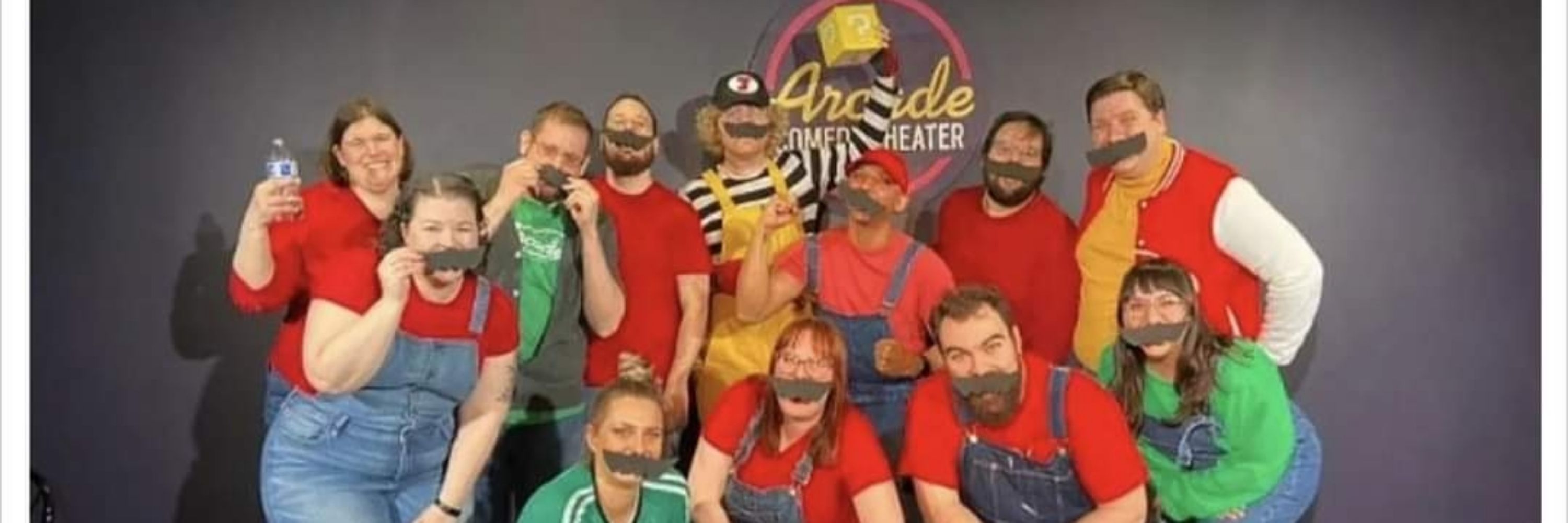
I have a show tonight! My team, Select Start, has their semi-annual comedy variety act at 9pm with nights at the Arcade Comedy Theater! Come down! Bring a friend! We've got improv, we've got sketch, we've got standup, and two drag performances! Something for everyone.
December 28, 2024 at 12:59 AM
It's not too late to get downtown to Arcade & see a great, great comedy team perform...
I have a show tonight! My team, Select Start, has their semi-annual comedy variety act at 9pm with nights at the Arcade Comedy Theater! Come down! Bring a friend! We've got improv, we've got sketch, we've got standup, and two drag performances! Something for everyone.
December 28, 2024 at 12:16 AM
I have a show tonight! My team, Select Start, has their semi-annual comedy variety act at 9pm with nights at the Arcade Comedy Theater! Come down! Bring a friend! We've got improv, we've got sketch, we've got standup, and two drag performances! Something for everyone.
Reposted by Bren Macdonald

Glenn Close But No Cigar
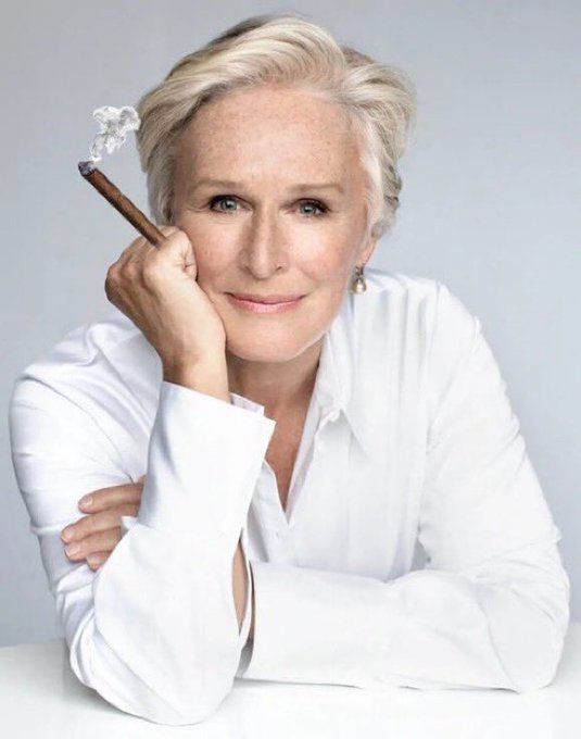

December 26, 2024 at 11:03 PM
Glenn Close But No Cigar
Sometimes I get to make very silly things for my shows.
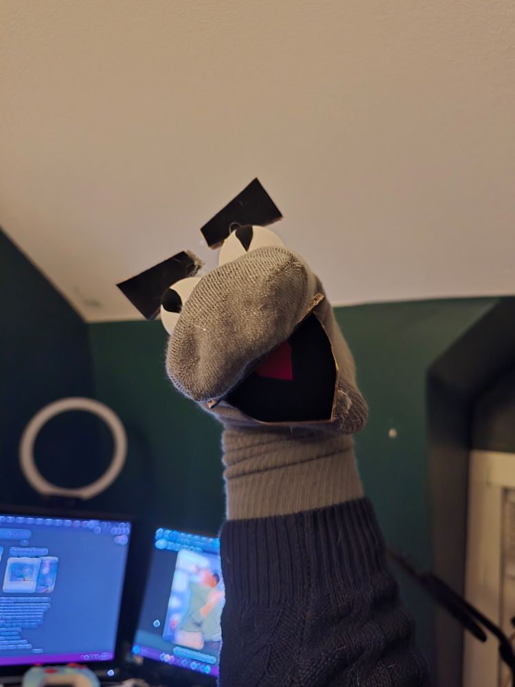
December 22, 2024 at 2:03 AM
Sometimes I get to make very silly things for my shows.
Reposted by Bren Macdonald
I'm fundraising for Arcade Comedy Theater, Pittsburgh's only non-profit comedy theater, but the thing is that other more ingenious people are also fundraising for Arcade and I'm going to tell you why you should donate to their campaigns instead of mine. #givebigpittsburgh
December 4, 2024 at 1:52 AM
I'm fundraising for Arcade Comedy Theater, Pittsburgh's only non-profit comedy theater, but the thing is that other more ingenious people are also fundraising for Arcade and I'm going to tell you why you should donate to their campaigns instead of mine. #givebigpittsburgh