


Gary Hornseth
@garyhornseth.bsky.social
Minnesota ephemerist. History, music, visual arts, a bit of baseball. Work = PR. Posts = else. Also the westerly half of Trademark Issues 🎸
Reposted by Gary Hornseth
Wabasha at 5th
St. Paul, Minnesota
Nov. 23, 1949
Image: St. Paul Dispatch-Pioneer Press via Minnesota Historical Society
St. Paul, Minnesota
Nov. 23, 1949
Image: St. Paul Dispatch-Pioneer Press via Minnesota Historical Society

November 23, 2023 at 3:02 PM
Wabasha at 5th
St. Paul, Minnesota
Nov. 23, 1949
Image: St. Paul Dispatch-Pioneer Press via Minnesota Historical Society
St. Paul, Minnesota
Nov. 23, 1949
Image: St. Paul Dispatch-Pioneer Press via Minnesota Historical Society
Star, Star, Star A
1969
Yoshida Chizuko (1924-2017)
Woodblock print, color on paper with embossing
On view today at @artsmia.bsky.social as part of the exhibition “The Abstract Worlds of Yoshida Hodaka and Chizuko”
1969
Yoshida Chizuko (1924-2017)
Woodblock print, color on paper with embossing
On view today at @artsmia.bsky.social as part of the exhibition “The Abstract Worlds of Yoshida Hodaka and Chizuko”

November 23, 2025 at 11:11 PM
Star, Star, Star A
1969
Yoshida Chizuko (1924-2017)
Woodblock print, color on paper with embossing
On view today at @artsmia.bsky.social as part of the exhibition “The Abstract Worlds of Yoshida Hodaka and Chizuko”
1969
Yoshida Chizuko (1924-2017)
Woodblock print, color on paper with embossing
On view today at @artsmia.bsky.social as part of the exhibition “The Abstract Worlds of Yoshida Hodaka and Chizuko”
Reposted by Gary Hornseth

Always been a big fan of train station tiles. Such an easy way to bring long lasting color and uniqueness to each station.
Chicago, London, Berlin, New York
Chicago, London, Berlin, New York


November 22, 2025 at 4:16 PM
Always been a big fan of train station tiles. Such an easy way to bring long lasting color and uniqueness to each station.
Chicago, London, Berlin, New York
Chicago, London, Berlin, New York
Book cover spotted while searching for something else on @archive.org: A biography of the British painter Ford Madox Brown (1821-1893). Cover artist not credited.
Image: Getty Research Institute; archive.org/details/ford...
Image: Getty Research Institute; archive.org/details/ford...

November 23, 2025 at 3:37 PM
Book cover spotted while searching for something else on @archive.org: A biography of the British painter Ford Madox Brown (1821-1893). Cover artist not credited.
Image: Getty Research Institute; archive.org/details/ford...
Image: Getty Research Institute; archive.org/details/ford...
Reposted by Gary Hornseth

Eiichi Ohtaki’s A Long Vacation (1981) is one of the most beloved albums in Japanese pop music.
Ohtaki, born in Iwate Prefecture, blended American pop influences with a uniquely Japanese melodic sensibility.
Ohtaki, born in Iwate Prefecture, blended American pop influences with a uniquely Japanese melodic sensibility.

November 23, 2025 at 2:35 AM
Eiichi Ohtaki’s A Long Vacation (1981) is one of the most beloved albums in Japanese pop music.
Ohtaki, born in Iwate Prefecture, blended American pop influences with a uniquely Japanese melodic sensibility.
Ohtaki, born in Iwate Prefecture, blended American pop influences with a uniquely Japanese melodic sensibility.
Watercolor specimens from “Paint and Colour Mixing: A Practical Handbook (6th ed.)” by Arthur Seymour Jennings, London, 1921
Image: Getty Research Institute via @archive.org; archive.org/details/pain...
Image: Getty Research Institute via @archive.org; archive.org/details/pain...

November 23, 2025 at 3:27 AM
Watercolor specimens from “Paint and Colour Mixing: A Practical Handbook (6th ed.)” by Arthur Seymour Jennings, London, 1921
Image: Getty Research Institute via @archive.org; archive.org/details/pain...
Image: Getty Research Institute via @archive.org; archive.org/details/pain...
Reposted by Gary Hornseth

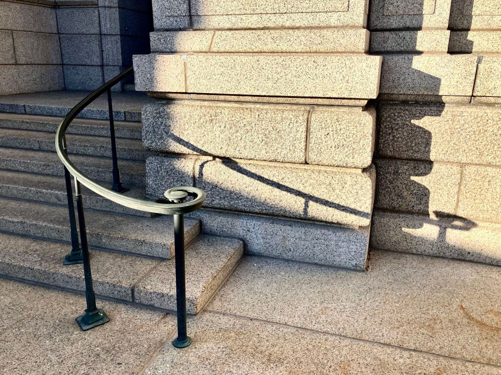
Spiraling into the weekend like ...
November 21, 2025 at 9:04 PM
Spiraling into the weekend like ...
Reposted by Gary Hornseth

Look, I know the Grammys already happened, but if it's not too late I'd like to humbly request an entry for song of the year:
"The Vegetable Song-KidsLearningTube" on YouTube, uploaded in 2016 that my toddler randomly found and which sounds like the greatest lost 1995 "120 Minutes" performance ever
"The Vegetable Song-KidsLearningTube" on YouTube, uploaded in 2016 that my toddler randomly found and which sounds like the greatest lost 1995 "120 Minutes" performance ever
February 5, 2025 at 12:25 AM
Look, I know the Grammys already happened, but if it's not too late I'd like to humbly request an entry for song of the year:
"The Vegetable Song-KidsLearningTube" on YouTube, uploaded in 2016 that my toddler randomly found and which sounds like the greatest lost 1995 "120 Minutes" performance ever
"The Vegetable Song-KidsLearningTube" on YouTube, uploaded in 2016 that my toddler randomly found and which sounds like the greatest lost 1995 "120 Minutes" performance ever
A page of index stamps
From: “Matthews' Book of Marking Devices and Metal Signs”
Jas. H. Matthews & Co., Pittsburgh
1914
Image: TheHoard Collection via @archive.org; archive.org/details/matt...
From: “Matthews' Book of Marking Devices and Metal Signs”
Jas. H. Matthews & Co., Pittsburgh
1914
Image: TheHoard Collection via @archive.org; archive.org/details/matt...

November 21, 2025 at 3:16 AM
A page of index stamps
From: “Matthews' Book of Marking Devices and Metal Signs”
Jas. H. Matthews & Co., Pittsburgh
1914
Image: TheHoard Collection via @archive.org; archive.org/details/matt...
From: “Matthews' Book of Marking Devices and Metal Signs”
Jas. H. Matthews & Co., Pittsburgh
1914
Image: TheHoard Collection via @archive.org; archive.org/details/matt...
Mezquita-Catedral de Córdoba, Spain
Nov. 3, 2025
11:50 a.m.
Nov. 3, 2025
11:50 a.m.

November 19, 2025 at 11:48 PM
Mezquita-Catedral de Córdoba, Spain
Nov. 3, 2025
11:50 a.m.
Nov. 3, 2025
11:50 a.m.
Three illustrations from “Air Marking,” a U.S. Dept. of Commerce Aeronautics Bulletin with design guidelines for ground-based pilot navigation aids, July 1, 1929.
Image: TheHoard Collection via @archive.org; archive.org/details/depa...
Image: TheHoard Collection via @archive.org; archive.org/details/depa...


November 19, 2025 at 1:05 AM
Three illustrations from “Air Marking,” a U.S. Dept. of Commerce Aeronautics Bulletin with design guidelines for ground-based pilot navigation aids, July 1, 1929.
Image: TheHoard Collection via @archive.org; archive.org/details/depa...
Image: TheHoard Collection via @archive.org; archive.org/details/depa...
Discos Bora-Bora, at which a signed 2015 Jayhawks setlist is among many framed on a wall #localangle
Granada, Spain
Nov. 7, 2025
6:52 p.m.
Granada, Spain
Nov. 7, 2025
6:52 p.m.

November 18, 2025 at 11:26 PM
Discos Bora-Bora, at which a signed 2015 Jayhawks setlist is among many framed on a wall #localangle
Granada, Spain
Nov. 7, 2025
6:52 p.m.
Granada, Spain
Nov. 7, 2025
6:52 p.m.
Cádiz, Spain
Nov. 4, 2025
2:30 p.m.
Nov. 4, 2025
2:30 p.m.

November 18, 2025 at 1:54 AM
Cádiz, Spain
Nov. 4, 2025
2:30 p.m.
Nov. 4, 2025
2:30 p.m.
Detergente Líquido at Bar Mutante, Sevilla
Nov. 2, 2025
2:10 p.m.
Nov. 2, 2025
2:10 p.m.

November 16, 2025 at 1:06 PM
Detergente Líquido at Bar Mutante, Sevilla
Nov. 2, 2025
2:10 p.m.
Nov. 2, 2025
2:10 p.m.
Ceiling, Catedral de Granada, Spain
November 5, 2025
5:08 p.m.
November 5, 2025
5:08 p.m.

November 15, 2025 at 9:19 PM
Ceiling, Catedral de Granada, Spain
November 5, 2025
5:08 p.m.
November 5, 2025
5:08 p.m.
Sevilla Santa Justa Station, Spain
Nov. 1, 2025
1:06 pm
Nov. 1, 2025
1:06 pm

November 14, 2025 at 10:12 PM
Sevilla Santa Justa Station, Spain
Nov. 1, 2025
1:06 pm
Nov. 1, 2025
1:06 pm
Coin telephone, c. 1960s
Compañía Telefónica Nacional de España
Seen on display last Saturday as part of a numismatics exhibit at the National Archaeological Museum, Madrid
Compañía Telefónica Nacional de España
Seen on display last Saturday as part of a numismatics exhibit at the National Archaeological Museum, Madrid

November 14, 2025 at 1:04 AM
Coin telephone, c. 1960s
Compañía Telefónica Nacional de España
Seen on display last Saturday as part of a numismatics exhibit at the National Archaeological Museum, Madrid
Compañía Telefónica Nacional de España
Seen on display last Saturday as part of a numismatics exhibit at the National Archaeological Museum, Madrid
Old telephone sign as tapas bar wall decoration, last Saturday afternoon, Madrid

November 12, 2025 at 10:51 AM
Old telephone sign as tapas bar wall decoration, last Saturday afternoon, Madrid
A minute or so of a pharmacy sign seen last week along a street in Sevilla
November 12, 2025 at 12:45 AM
A minute or so of a pharmacy sign seen last week along a street in Sevilla
Reposted by Gary Hornseth
For the midnight crew on this #EdmundFitzgwtald50 anniversary, I have added more markups to the Newsweek article that gave Gordon Lightfoot his template for His "Wreck of" song lyrics.

November 10, 2025 at 6:29 AM
For the midnight crew on this #EdmundFitzgwtald50 anniversary, I have added more markups to the Newsweek article that gave Gordon Lightfoot his template for His "Wreck of" song lyrics.
Reposted by Gary Hornseth

Went through my collection of old roller skate skate labels and scanned/rescanned them all. I did not realize that I had amassed 182 different ones.
The original purpose of these things was to affix them to your roller skate case and showcase all the different places you skated.
The original purpose of these things was to affix them to your roller skate case and showcase all the different places you skated.

November 11, 2025 at 2:44 AM
Went through my collection of old roller skate skate labels and scanned/rescanned them all. I did not realize that I had amassed 182 different ones.
The original purpose of these things was to affix them to your roller skate case and showcase all the different places you skated.
The original purpose of these things was to affix them to your roller skate case and showcase all the different places you skated.
Reposted by Gary Hornseth

26 pages from a 1940 label sample catalogue. Type & shape inspiration!
www.presentandcorrect.com/blogs/blog/f...
www.presentandcorrect.com/blogs/blog/f...


November 3, 2025 at 12:49 PM
26 pages from a 1940 label sample catalogue. Type & shape inspiration!
www.presentandcorrect.com/blogs/blog/f...
www.presentandcorrect.com/blogs/blog/f...
“I think I spent just an afternoon on it.”
An annual repost as the World Series opens: From 2008, writer Paul Lukas (Uni Watch) interviews retired graphic designer Jerry Dior (1932-2015) about his creation of the MLB logo in 1968. ⚾️
Full article: espn.com/espn/page2/story?page=lukas/081105
An annual repost as the World Series opens: From 2008, writer Paul Lukas (Uni Watch) interviews retired graphic designer Jerry Dior (1932-2015) about his creation of the MLB logo in 1968. ⚾️
Full article: espn.com/espn/page2/story?page=lukas/081105

![Excerpt:
UW: What sort of thought process did you go through at the outset of the project? Did you know right away that you'd use a silhouetted image?
JD: No, it just came about.
UW: Did you know from the start that you wanted to show a human figure, instead of just type or other graphics?
JD: No, I just went through some magazines and tried to figure out some ideas. I really don't know how the process worked -- I just did it, y'know? It was fast. I think I spent just an afternoon on it.
UW [incredulous]: The whole thing took one afternoon?
JD: Yeah.](https://cdn.bsky.app/img/feed_thumbnail/plain/did:plc:kvunw5xlsqxgzgumjslnatlj/bafkreiefntbwypv4e2peptkowxzuuxid3lhciyslbmoag7wkth3aytcpg4@jpeg)
![Excerpt:
UW: Did Major League Baseball accept the logo pretty much as you designed it, or did they ask you to make adjustments?
JD: Nope, no adjustments. I cleaned it up and that was it.
UW: What do you mean "cleaned it up"?
JD: You tighten it up so it can be reproduced. What I had originally created was just a Magic Marker sketch.
UW [incredulous again]: The original version that you created in one afternoon, and that was presented to Major League Baseball, was rendered in Magic Marker?
JD: Right.](https://cdn.bsky.app/img/feed_thumbnail/plain/did:plc:kvunw5xlsqxgzgumjslnatlj/bafkreiacazury4k4grntsqj3k2raichm3jau7fz5d6zbhjk7e2xaqsarfq@jpeg)
October 25, 2025 at 12:09 AM
“I think I spent just an afternoon on it.”
An annual repost as the World Series opens: From 2008, writer Paul Lukas (Uni Watch) interviews retired graphic designer Jerry Dior (1932-2015) about his creation of the MLB logo in 1968. ⚾️
Full article: espn.com/espn/page2/story?page=lukas/081105
An annual repost as the World Series opens: From 2008, writer Paul Lukas (Uni Watch) interviews retired graphic designer Jerry Dior (1932-2015) about his creation of the MLB logo in 1968. ⚾️
Full article: espn.com/espn/page2/story?page=lukas/081105
Reposted by Gary Hornseth

Know Your BL Colours:
No:52 Saffron
Triumph’s dull colour palette had an injection of vibrancy in the early ‘70’s & showed they could’ve been a lot more daring with their colour choices for cars like the Vitesse as this v late car looks rather fetching…
(📸: IG a/c classicsbychance)
No:52 Saffron
Triumph’s dull colour palette had an injection of vibrancy in the early ‘70’s & showed they could’ve been a lot more daring with their colour choices for cars like the Vitesse as this v late car looks rather fetching…
(📸: IG a/c classicsbychance)

October 20, 2025 at 12:23 AM
Know Your BL Colours:
No:52 Saffron
Triumph’s dull colour palette had an injection of vibrancy in the early ‘70’s & showed they could’ve been a lot more daring with their colour choices for cars like the Vitesse as this v late car looks rather fetching…
(📸: IG a/c classicsbychance)
No:52 Saffron
Triumph’s dull colour palette had an injection of vibrancy in the early ‘70’s & showed they could’ve been a lot more daring with their colour choices for cars like the Vitesse as this v late car looks rather fetching…
(📸: IG a/c classicsbychance)
Array of push-pull plates
from: “Tubelite Aluminum Entrances”
Trade catalog
Pittsburgh Plate Glass Co.
1960
Image: Association for Preservation Technology via @archive.org; archive.org/details/pitt...
from: “Tubelite Aluminum Entrances”
Trade catalog
Pittsburgh Plate Glass Co.
1960
Image: Association for Preservation Technology via @archive.org; archive.org/details/pitt...

October 18, 2025 at 5:06 PM
Array of push-pull plates
from: “Tubelite Aluminum Entrances”
Trade catalog
Pittsburgh Plate Glass Co.
1960
Image: Association for Preservation Technology via @archive.org; archive.org/details/pitt...
from: “Tubelite Aluminum Entrances”
Trade catalog
Pittsburgh Plate Glass Co.
1960
Image: Association for Preservation Technology via @archive.org; archive.org/details/pitt...