


Yan Boulanger
@trailgeek.bsky.social
Research scientist in Forest Ecology🌲| Working on climate change stuff and wildfires🔥| Like trail running and singing in my car
Reposted by Yan Boulanger
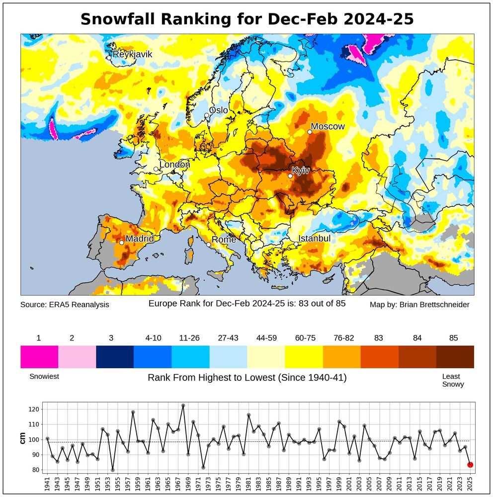
Europe had its least snowy winter (Dec-Feb) in over 50 years. #ThisIsFine
March 9, 2025 at 2:52 PM
Europe had its least snowy winter (Dec-Feb) in over 50 years. #ThisIsFine
Reposted by Yan Boulanger
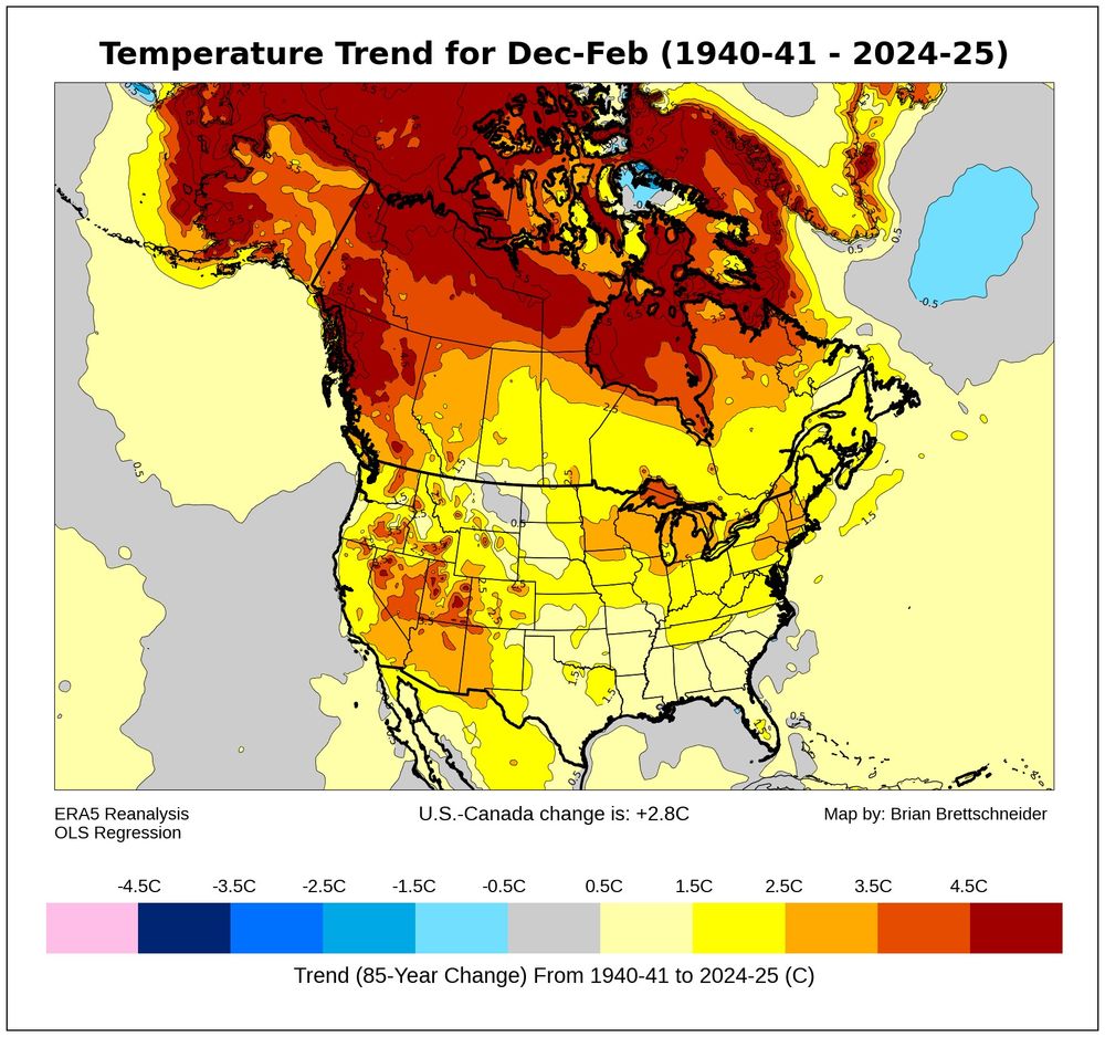
Q: Have winter (Dec-Feb) temperatures have changed (trend) over the last 85 years?
A: F*ck
A: F*ck
March 6, 2025 at 10:33 PM
Q: Have winter (Dec-Feb) temperatures have changed (trend) over the last 85 years?
A: F*ck
A: F*ck
Imagine if they also had to deal with the Phoenix pay system...

Confirmed with a source. Here's a screenshot of the email sent to staff today.
March 3, 2025 at 5:12 PM
Imagine if they also had to deal with the Phoenix pay system...
Reposted by Yan Boulanger

While all of this is happening to our scientific agencies, the current extent of sea ice globally remains at record low levels...
More visuals at zacklabe.com/global-sea-i...
More visuals at zacklabe.com/global-sea-i...
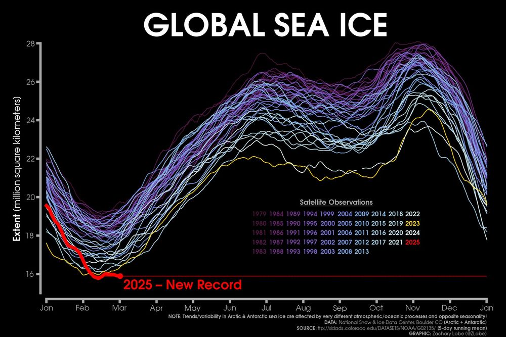
March 3, 2025 at 4:39 PM
While all of this is happening to our scientific agencies, the current extent of sea ice globally remains at record low levels...
More visuals at zacklabe.com/global-sea-i...
More visuals at zacklabe.com/global-sea-i...
Reposted by Yan Boulanger
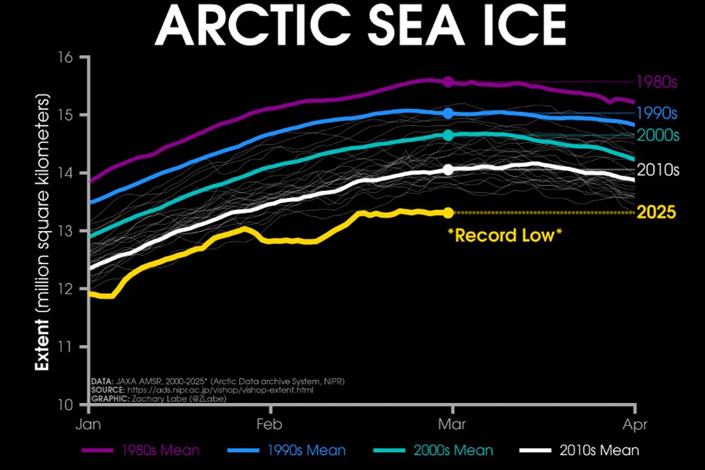
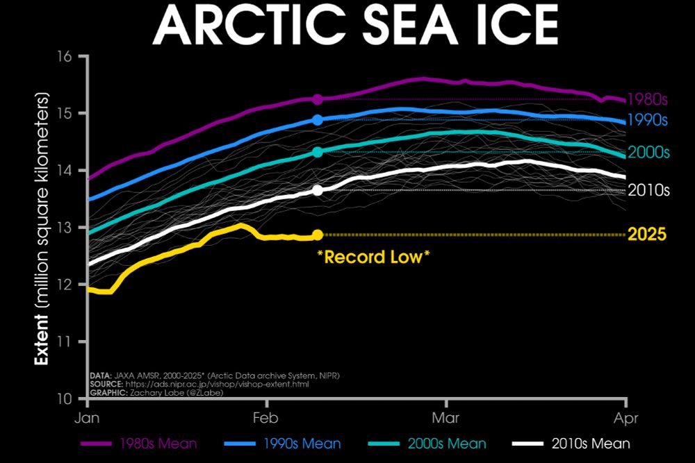
Sunday ice update - #Arctic sea ice extent is currently the lowest on record (JAXA data)
• about 740,000 km² below the 2010s mean
• about 1,340,000 km² below the 2000s mean
• about 1,720,000 km² below the 1990s mean
• about 2,260,000 km² below the 1980s mean
Plots: zacklabe.com/arctic-sea-i... 🌊
• about 740,000 km² below the 2010s mean
• about 1,340,000 km² below the 2000s mean
• about 1,720,000 km² below the 1990s mean
• about 2,260,000 km² below the 1980s mean
Plots: zacklabe.com/arctic-sea-i... 🌊
March 3, 2025 at 12:38 AM
Sunday ice update - #Arctic sea ice extent is currently the lowest on record (JAXA data)
• about 740,000 km² below the 2010s mean
• about 1,340,000 km² below the 2000s mean
• about 1,720,000 km² below the 1990s mean
• about 2,260,000 km² below the 1980s mean
Plots: zacklabe.com/arctic-sea-i... 🌊
• about 740,000 km² below the 2010s mean
• about 1,340,000 km² below the 2000s mean
• about 1,720,000 km² below the 1990s mean
• about 2,260,000 km² below the 1980s mean
Plots: zacklabe.com/arctic-sea-i... 🌊
Reposted by Yan Boulanger
Just another typical late winter season in the Pyrocene -- "Wildfires rage across the Carolinas...More than 175 wildfires burning across SC and additional fires in NC... Much of eastern US seaboard under increased fire risk." www.yahoo.com/news/wildfir...
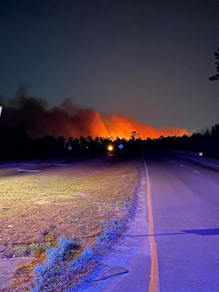
Wildfires rage across the Carolinas; SC governor issues state of emergency
The National Weather Service issued advisories on Sunday from Georgia to New Jersey warning of an increased risk of wildfires.
www.yahoo.com
March 2, 2025 at 6:36 PM
Just another typical late winter season in the Pyrocene -- "Wildfires rage across the Carolinas...More than 175 wildfires burning across SC and additional fires in NC... Much of eastern US seaboard under increased fire risk." www.yahoo.com/news/wildfir...
Reposted by Yan Boulanger
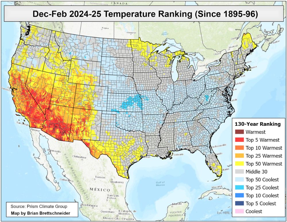
December-February 2024-25 temperature ranking since 1895-96 according to Prism climate data. Globally, this was the 2nd warmest Dec-Feb period, but the Contiguous U.S. was the outlier. Congrats!
March 1, 2025 at 4:16 PM
December-February 2024-25 temperature ranking since 1895-96 according to Prism climate data. Globally, this was the 2nd warmest Dec-Feb period, but the Contiguous U.S. was the outlier. Congrats!
Reposted by Yan Boulanger


Reposted by Yan Boulanger
This is very concerning.
"Earth’s plants and soils reached peak carbon dioxide sequestration in 2008 but proportion absorbed has been declining since, study finds"
"Earth’s plants and soils reached peak carbon dioxide sequestration in 2008 but proportion absorbed has been declining since, study finds"
Plants losing appetite for carbon dioxide amid effects of warming climate
Earth’s plants and soils reached peak carbon dioxide sequestration in 2008 but proportion absorbed has been declining since, study finds
www.theguardian.com
February 27, 2025 at 8:48 AM
This is very concerning.
"Earth’s plants and soils reached peak carbon dioxide sequestration in 2008 but proportion absorbed has been declining since, study finds"
"Earth’s plants and soils reached peak carbon dioxide sequestration in 2008 but proportion absorbed has been declining since, study finds"
Reposted by Yan Boulanger

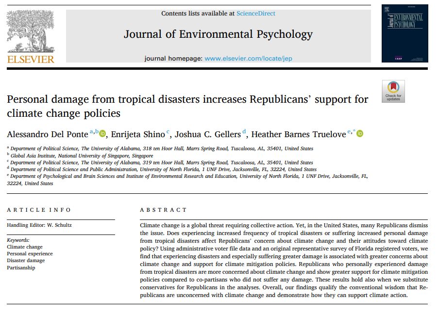
Another paper showing climate shocks lead to support for climate action among conservatives. Analyzing data collected in Florida, the paper finds Republican positions change after personally experiencing loss from climate-exacerbated extreme events.
www.sciencedirect.com/science/arti...
www.sciencedirect.com/science/arti...
February 27, 2025 at 11:28 AM
Another paper showing climate shocks lead to support for climate action among conservatives. Analyzing data collected in Florida, the paper finds Republican positions change after personally experiencing loss from climate-exacerbated extreme events.
www.sciencedirect.com/science/arti...
www.sciencedirect.com/science/arti...
Such conclusions also apply to #forest landscape #model projections over species distribution models

Interesting work by van der Meersch et al. out in Ecology Letters, nicely illustrating that process-based models are more robust than correlative models for predicting species distributions under novel climatic conditions doi.org/10.1111/ele....
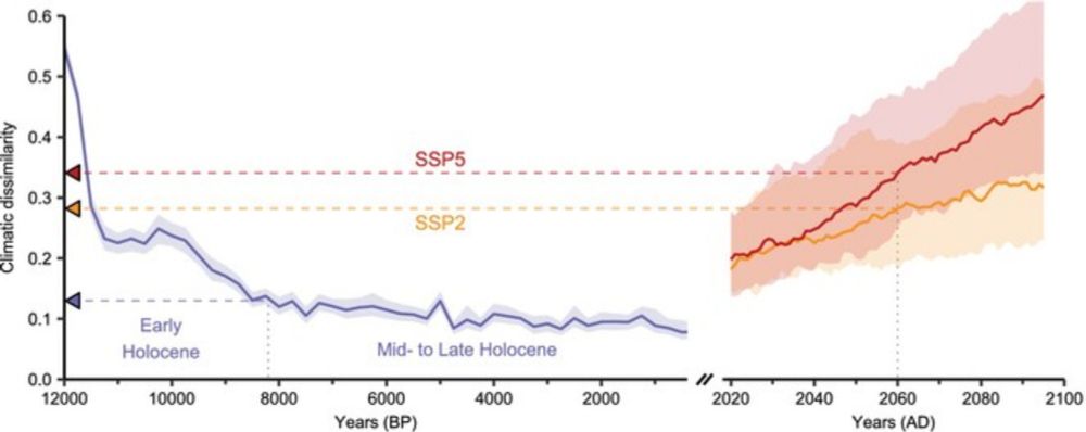
Paleorecords Reveal Biological Mechanisms Crucial for Reliable Species Range Shift Projections Amid Rapid Climate Change
Climate change has created an urgent need for reliable projections of species distributions. By hindcasting forest tree range shifts across Europe over the last 12,000 years, we show that process-exp...
doi.org
February 24, 2025 at 1:35 PM
Reposted by Yan Boulanger
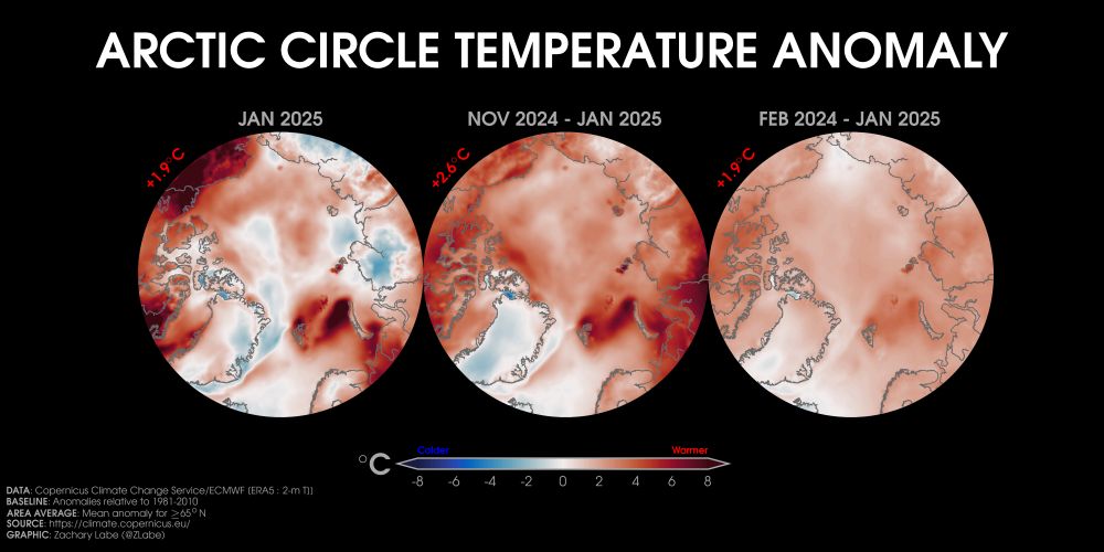
Looking at temperature anomalies over the last month (left), 3 months (center), and 12 months (right) across the #Arctic...
Data from doi.org/10.24381/cds... ⚒️
Data from doi.org/10.24381/cds... ⚒️
February 23, 2025 at 9:37 PM
Looking at temperature anomalies over the last month (left), 3 months (center), and 12 months (right) across the #Arctic...
Data from doi.org/10.24381/cds... ⚒️
Data from doi.org/10.24381/cds... ⚒️
Reposted by Yan Boulanger
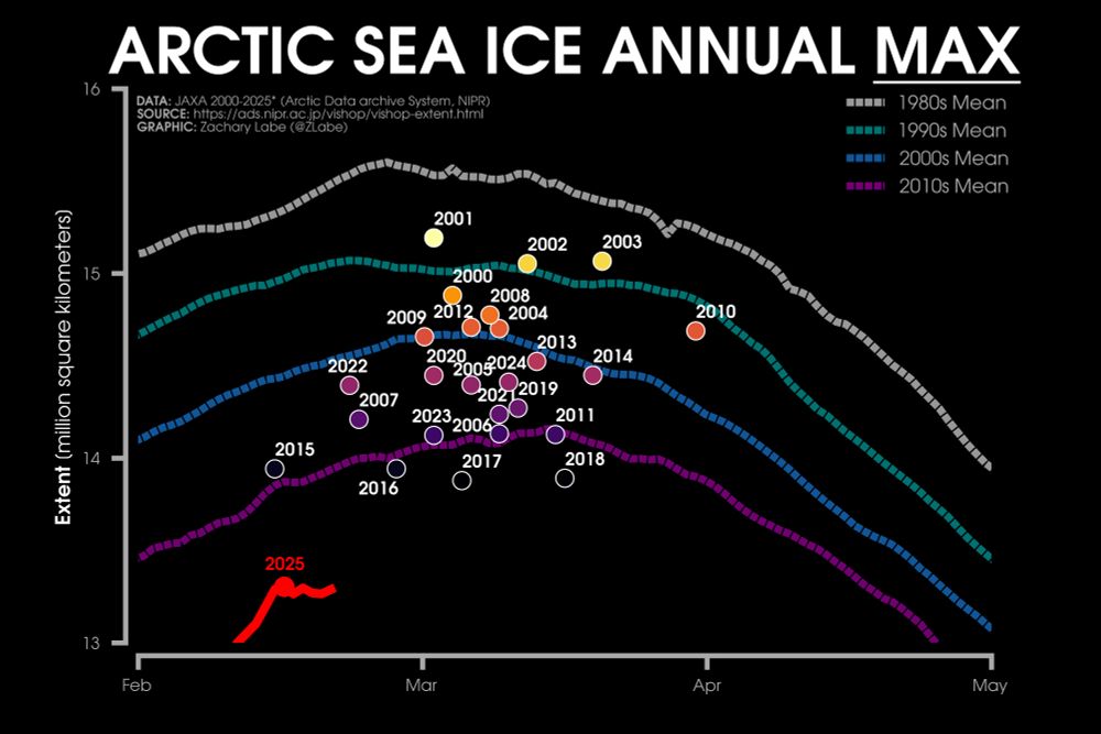
Ice Watch - Time to start tracking the annual maximum #Arctic sea ice extent. A new record is definitely possible this winter. Stay tuned.
Follow the daily data at zacklabe.com/arctic-sea-i.... Data from JAXA. ⚒️🥼❄️
Follow the daily data at zacklabe.com/arctic-sea-i.... Data from JAXA. ⚒️🥼❄️
February 22, 2025 at 2:56 PM
Ice Watch - Time to start tracking the annual maximum #Arctic sea ice extent. A new record is definitely possible this winter. Stay tuned.
Follow the daily data at zacklabe.com/arctic-sea-i.... Data from JAXA. ⚒️🥼❄️
Follow the daily data at zacklabe.com/arctic-sea-i.... Data from JAXA. ⚒️🥼❄️
Reposted by Yan Boulanger

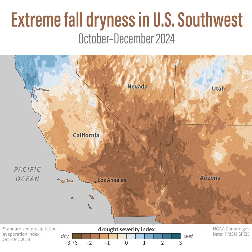
A trifecta of fire-friendly climate conditions fueled the January 2025 fires around Los Angeles: back-to-back wet winters that boosted vegetation, a record-dry fall, and extremely strong Santa Ana winds. See the map for how drought helped set the stage.
www.climate.gov/news-feature...
www.climate.gov/news-feature...
February 20, 2025 at 3:25 PM
A trifecta of fire-friendly climate conditions fueled the January 2025 fires around Los Angeles: back-to-back wet winters that boosted vegetation, a record-dry fall, and extremely strong Santa Ana winds. See the map for how drought helped set the stage.
www.climate.gov/news-feature...
www.climate.gov/news-feature...
🔥🌲 Feux de forêt & climat : un sujet brûlant au Machin Club !
J’ai eu le plaisir de discuter de la saison record de 2023 et du rôle de la science pour mieux comprendre ces événements extrêmes. 🌍🔥
🎥 À voir ici 👉 www.youtube.com/watch?v=q_c0...
#FeuxDeForêt #Climat #ScienceEnAction #MachinClub
J’ai eu le plaisir de discuter de la saison record de 2023 et du rôle de la science pour mieux comprendre ces événements extrêmes. 🌍🔥
🎥 À voir ici 👉 www.youtube.com/watch?v=q_c0...
#FeuxDeForêt #Climat #ScienceEnAction #MachinClub
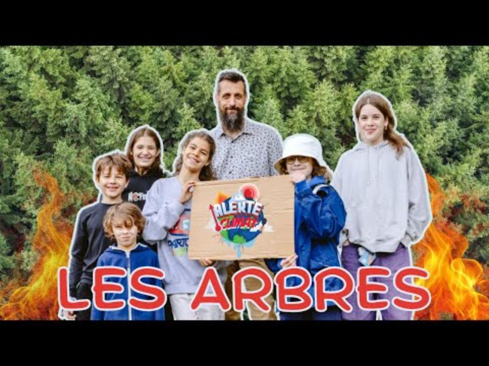
Alerte climat - Les arbres
YouTube video by Machin Club
www.youtube.com
February 20, 2025 at 2:49 PM
🔥🌲 Feux de forêt & climat : un sujet brûlant au Machin Club !
J’ai eu le plaisir de discuter de la saison record de 2023 et du rôle de la science pour mieux comprendre ces événements extrêmes. 🌍🔥
🎥 À voir ici 👉 www.youtube.com/watch?v=q_c0...
#FeuxDeForêt #Climat #ScienceEnAction #MachinClub
J’ai eu le plaisir de discuter de la saison record de 2023 et du rôle de la science pour mieux comprendre ces événements extrêmes. 🌍🔥
🎥 À voir ici 👉 www.youtube.com/watch?v=q_c0...
#FeuxDeForêt #Climat #ScienceEnAction #MachinClub
Reposted by Yan Boulanger
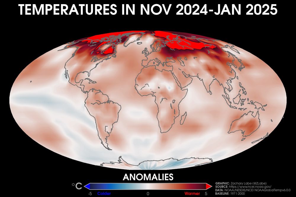
Looking back at temperatures averaged over the last 3 months - find your location...
🟥 warmer than average
🟦 colder than average
Dataset (NOAAGlobalTempv6) described in doi.org/10.1175/BAMS...
🟥 warmer than average
🟦 colder than average
Dataset (NOAAGlobalTempv6) described in doi.org/10.1175/BAMS...
February 19, 2025 at 1:02 PM
Looking back at temperatures averaged over the last 3 months - find your location...
🟥 warmer than average
🟦 colder than average
Dataset (NOAAGlobalTempv6) described in doi.org/10.1175/BAMS...
🟥 warmer than average
🟦 colder than average
Dataset (NOAAGlobalTempv6) described in doi.org/10.1175/BAMS...
Reposted by Yan Boulanger

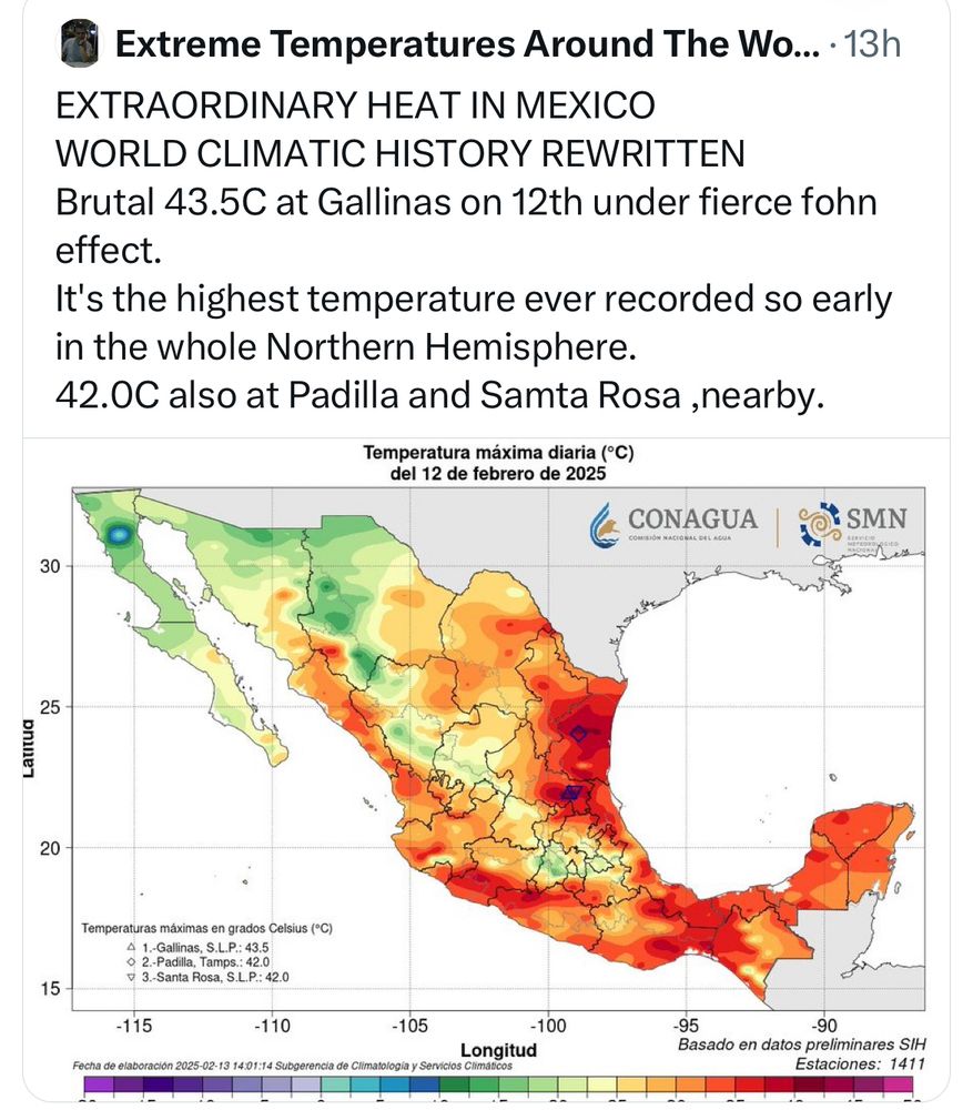
❗️Highest temperature ever recorded this early in the year across the Northern Hemisphere.
February 15, 2025 at 2:42 PM
❗️Highest temperature ever recorded this early in the year across the Northern Hemisphere.
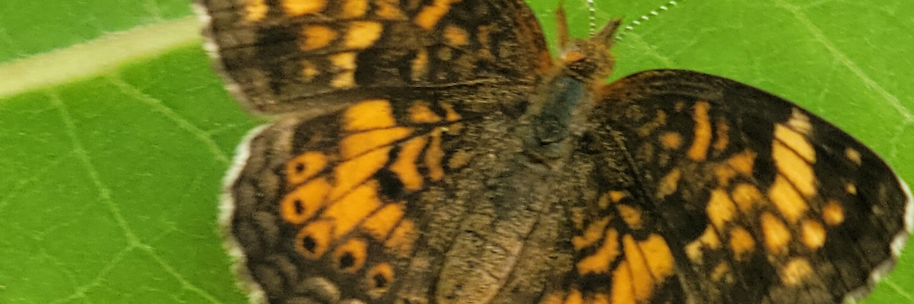
1/ 🌲🔬 New Research Alert! 🌡️🦋
#ClimateChange is reshaping forest ecosystems, and the spruce budworm (Choristoneura fumiferana), a major boreal forest defoliator, is feeling the heat! 🔥
Our latest study in PLOS Climate reveals some striking trends. 🧵👇
#ClimateChange is reshaping forest ecosystems, and the spruce budworm (Choristoneura fumiferana), a major boreal forest defoliator, is feeling the heat! 🔥
Our latest study in PLOS Climate reveals some striking trends. 🧵👇

February 15, 2025 at 2:35 PM
1/ 🌲🔬 New Research Alert! 🌡️🦋
#ClimateChange is reshaping forest ecosystems, and the spruce budworm (Choristoneura fumiferana), a major boreal forest defoliator, is feeling the heat! 🔥
Our latest study in PLOS Climate reveals some striking trends. 🧵👇
#ClimateChange is reshaping forest ecosystems, and the spruce budworm (Choristoneura fumiferana), a major boreal forest defoliator, is feeling the heat! 🔥
Our latest study in PLOS Climate reveals some striking trends. 🧵👇
Reposted by Yan Boulanger
Monday ice update - #Arctic sea ice extent is currently the *lowest* on record (JAXA data)
• about 780,000 km² below the 2010s mean
• about 1,450,000 km² below the 2000s mean
• about 2,010,000 km² below the 1990s mean
• about 2,370,000 km² below the 1980s mean
Plots: zacklabe.com/arctic-sea-i... 🧪
• about 780,000 km² below the 2010s mean
• about 1,450,000 km² below the 2000s mean
• about 2,010,000 km² below the 1990s mean
• about 2,370,000 km² below the 1980s mean
Plots: zacklabe.com/arctic-sea-i... 🧪
February 10, 2025 at 1:02 PM
Monday ice update - #Arctic sea ice extent is currently the *lowest* on record (JAXA data)
• about 780,000 km² below the 2010s mean
• about 1,450,000 km² below the 2000s mean
• about 2,010,000 km² below the 1990s mean
• about 2,370,000 km² below the 1980s mean
Plots: zacklabe.com/arctic-sea-i... 🧪
• about 780,000 km² below the 2010s mean
• about 1,450,000 km² below the 2000s mean
• about 2,010,000 km² below the 1990s mean
• about 2,370,000 km² below the 1980s mean
Plots: zacklabe.com/arctic-sea-i... 🧪
Reposted by Yan Boulanger
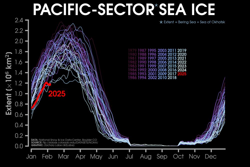
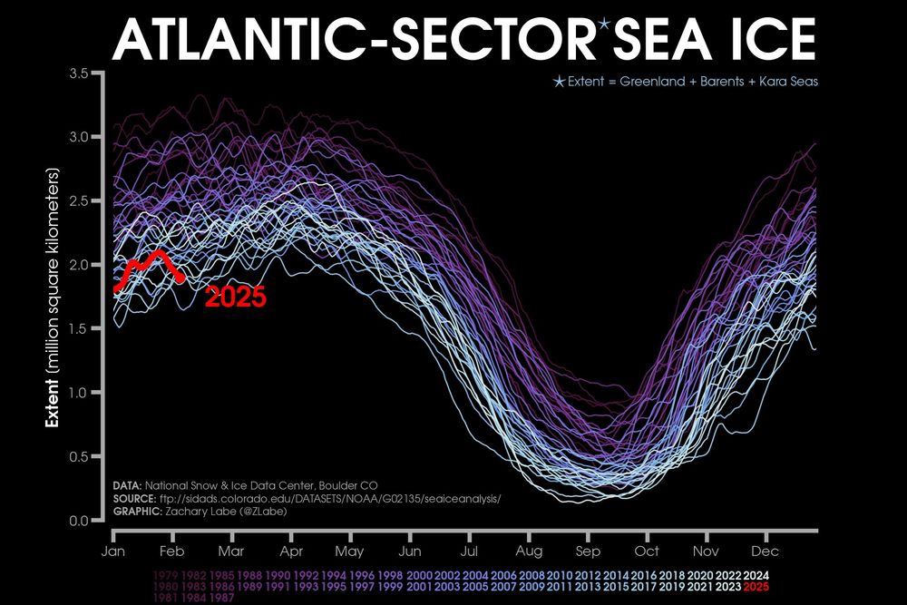
Sometimes it is only one side of the #Arctic that experiences anomalously low conditions during winter, but this year we are seeing the sea ice edge on *both* the Atlantic & Pacific sectors at very low levels for this time of year. This is contributing to the historic record low for early February.
February 7, 2025 at 1:12 AM
Sometimes it is only one side of the #Arctic that experiences anomalously low conditions during winter, but this year we are seeing the sea ice edge on *both* the Atlantic & Pacific sectors at very low levels for this time of year. This is contributing to the historic record low for early February.
Reposted by Yan Boulanger

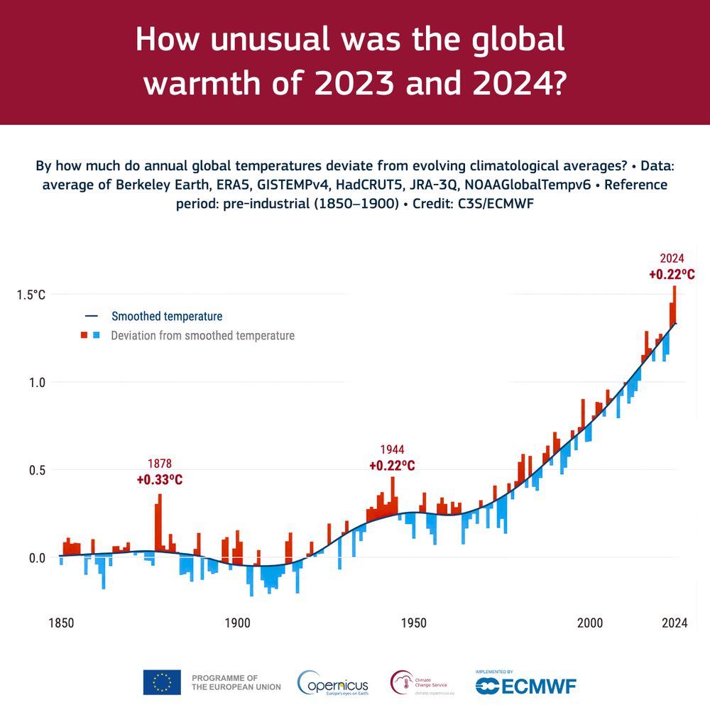
How unusual were 2023 and 2024 compared to the global warming trend, averaging an increase of around 0.2°C per decade?
Dive into the analysis of anthropogenic and natural factors 👉 bit.ly/40kQpcz
Dive into the analysis of anthropogenic and natural factors 👉 bit.ly/40kQpcz
February 5, 2025 at 11:06 AM
How unusual were 2023 and 2024 compared to the global warming trend, averaging an increase of around 0.2°C per decade?
Dive into the analysis of anthropogenic and natural factors 👉 bit.ly/40kQpcz
Dive into the analysis of anthropogenic and natural factors 👉 bit.ly/40kQpcz
Reposted by Yan Boulanger

More acres have been burned by wildfires in January 2025 across California than in all the Januarys of the past 30+ years combined.
Unreal.
Unreal.
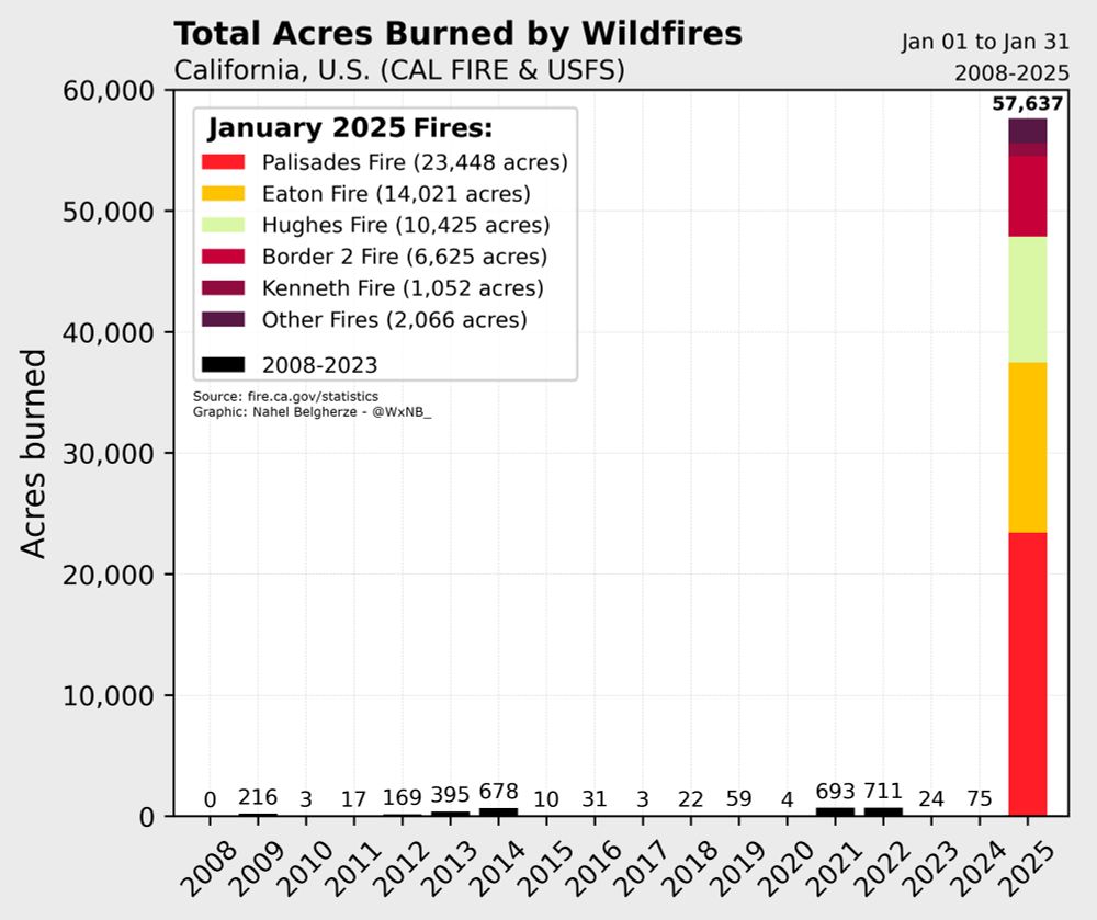
February 1, 2025 at 6:24 PM
More acres have been burned by wildfires in January 2025 across California than in all the Januarys of the past 30+ years combined.
Unreal.
Unreal.
Reposted by Yan Boulanger

Why I’m not leaving the federal workforce (for now). A thread about my career goals, and how an elementary school student changed my entire worldview.

January 29, 2025 at 9:42 PM
Why I’m not leaving the federal workforce (for now). A thread about my career goals, and how an elementary school student changed my entire worldview.
Reposted by Yan Boulanger

🚨 After years of development, the new version of #rstats tmap (4) is now available on CRAN! 🎉 Huge thanks to author Martijn Tennekes and all contributors.
🔧 Install: `install.packages("tmap")`
📚 Vignettes: https://buff.ly/4aAYNbq
📖 Book Chapter: https://buff.ly/43TokaF
#maps #tmap #rspatial
🔧 Install: `install.packages("tmap")`
📚 Vignettes: https://buff.ly/4aAYNbq
📖 Book Chapter: https://buff.ly/43TokaF
#maps #tmap #rspatial

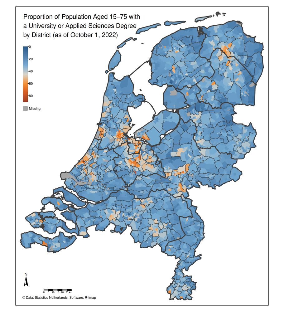
January 29, 2025 at 3:00 PM
🚨 After years of development, the new version of #rstats tmap (4) is now available on CRAN! 🎉 Huge thanks to author Martijn Tennekes and all contributors.
🔧 Install: `install.packages("tmap")`
📚 Vignettes: https://buff.ly/4aAYNbq
📖 Book Chapter: https://buff.ly/43TokaF
#maps #tmap #rspatial
🔧 Install: `install.packages("tmap")`
📚 Vignettes: https://buff.ly/4aAYNbq
📖 Book Chapter: https://buff.ly/43TokaF
#maps #tmap #rspatial
Reposted by Yan Boulanger

Interested in how climate model projections have matched up to reality?
RealClimate: Comparison Update 2024 www.realclimate.org/index.php/ar...
RealClimate: Comparison Update 2024 www.realclimate.org/index.php/ar...

Comparison Update 2024
One more dot on the graphs for our annual model-observations comparisons updates. Given how extraordinary the last two years have been, there are a few highlights to note. First, we have updated...
www.realclimate.org
January 27, 2025 at 10:48 PM
Interested in how climate model projections have matched up to reality?
RealClimate: Comparison Update 2024 www.realclimate.org/index.php/ar...
RealClimate: Comparison Update 2024 www.realclimate.org/index.php/ar...