Althea Archer
@aaarcher.bsky.social
62 followers
76 following
3 posts
multipassionate, broadly-trained ecologist who can do stats, make maps, and paint pretty, too; opinions are my own | Data Visualization Specialist /Science Communicator
Posts
Media
Videos
Starter Packs
Reposted by Althea Archer


Reposted by Althea Archer


Althea Archer
@aaarcher.bsky.social
· May 20
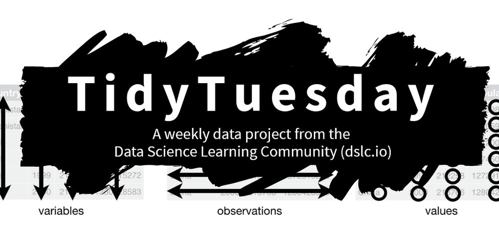
Duplicating Quarto elements with code templates to reduce copy and paste errors
Quarto provides easier-than-ever ways to create data-driven, reproducible documents. This blog demonstrates how to use custom code templates to easily replicate code chunks with a reproducible USGS st...
waterdata.usgs.gov

Reposted by Althea Archer


Reposted by Althea Archer

Giles
@gdeejay.bsky.social
· May 13
Reposted by Althea Archer


Reposted by Althea Archer

Frank Elavsky ⌁
@frank.computer
· Apr 23
Minimalism and the absurdity of the data-to-ink-ratio
How much minimalism is too much minimalism? I explore this question and propose the most minimalist, highest scoring data-to-ink ratio on a visualization ever made as a thought piece. Why? Well novice...
www.frank.computer
Reposted by Althea Archer


Reposted by Althea Archer


Reposted by Althea Archer
Reposted by Althea Archer

Reposted by Althea Archer
Reposted by Althea Archer


Reposted by Althea Archer

Reposted by Althea Archer

Katie Langin
@klangin.bsky.social
· Feb 14
Reposted by Althea Archer

Reposted by Althea Archer


Reposted by Althea Archer


Reposted by Althea Archer

Anne Bergen
@annebergen.bsky.social
· Jan 31

an alternative to error bars — storytelling with data
So many data visualization and design-related questions are context-dependent. For example, if someone asks if one chart type is better or worse than another, the answer is, “It depends.” Who's the au...
www.storytellingwithdata.com
Reposted by Althea Archer

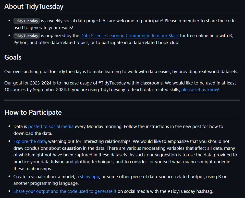
Data Science Learning Community
@dslc.io
· Jan 28


Reposted by Althea Archer
Reposted by Althea Archer