


Diego Quintero Balbas
@diego-qb.bsky.social
Conservator and Heritage Scientist studying Heritage with lasers and more. Data Viz enthusiasts
Our latest paper on the restoration of daguerreotypes using laser and atmospheric non-thermal plasma methods is now available. Have a look at the link below

Daguerreotypes, with fragile surfaces, suffer from tarnish and harmful residues left by cleaning attempts. Our latest study explores innovative ways to restore them, safely and effectively, using laser pulses and non-thermal plasma.
bit.ly/4kKx1g1
@laserlab-europe.bsky.social @diego-qb.bsky.social
bit.ly/4kKx1g1
@laserlab-europe.bsky.social @diego-qb.bsky.social

Setting up a methodology for restoring degraded daguerreotypes using UV lasers and atmospheric non-thermal plasma cleaning techniques
Since the early years of the development of daguerreotypes – the first commercial form of photography made public in 1839 – cleaning procedures have b…
bit.ly
July 15, 2025 at 1:12 PM
Our latest paper on the restoration of daguerreotypes using laser and atmospheric non-thermal plasma methods is now available. Have a look at the link below
Reposted by Diego Quintero Balbas
#TodayinHistory #dataviz #Onthisday #OTD 📊
🎂May 23, 1667 Jacob Cristoph Le Blon born in Frankfurt am Main, Germany 🇩🇪
In 1710 he invented three color printing using an RYB or RYG color model which later morphed into the modern CMYK system, better for printing.
🎂May 23, 1667 Jacob Cristoph Le Blon born in Frankfurt am Main, Germany 🇩🇪
In 1710 he invented three color printing using an RYB or RYG color model which later morphed into the modern CMYK system, better for printing.


May 24, 2025 at 12:00 AM
#TodayinHistory #dataviz #Onthisday #OTD 📊
🎂May 23, 1667 Jacob Cristoph Le Blon born in Frankfurt am Main, Germany 🇩🇪
In 1710 he invented three color printing using an RYB or RYG color model which later morphed into the modern CMYK system, better for printing.
🎂May 23, 1667 Jacob Cristoph Le Blon born in Frankfurt am Main, Germany 🇩🇪
In 1710 he invented three color printing using an RYB or RYG color model which later morphed into the modern CMYK system, better for printing.
Reposted by Diego Quintero Balbas


Reposted by Diego Quintero Balbas
#TodayinHistory #dataviz #Onthisday #OTD 📊
🎂Apr 19, 1801 Gustav Theodor Fechner born in Groß Särchen, Germany 🇩🇪
Oct 22, 1850: Fechner's Law: the subjective sensation is proportional to the log of stimulus intensity -- used as an early idea for accuracy of graphic elements -- length, angle, area,..
🎂Apr 19, 1801 Gustav Theodor Fechner born in Groß Särchen, Germany 🇩🇪
Oct 22, 1850: Fechner's Law: the subjective sensation is proportional to the log of stimulus intensity -- used as an early idea for accuracy of graphic elements -- length, angle, area,..


April 20, 2025 at 2:50 AM
#TodayinHistory #dataviz #Onthisday #OTD 📊
🎂Apr 19, 1801 Gustav Theodor Fechner born in Groß Särchen, Germany 🇩🇪
Oct 22, 1850: Fechner's Law: the subjective sensation is proportional to the log of stimulus intensity -- used as an early idea for accuracy of graphic elements -- length, angle, area,..
🎂Apr 19, 1801 Gustav Theodor Fechner born in Groß Särchen, Germany 🇩🇪
Oct 22, 1850: Fechner's Law: the subjective sensation is proportional to the log of stimulus intensity -- used as an early idea for accuracy of graphic elements -- length, angle, area,..
Reposted by Diego Quintero Balbas

Want to know how I made the Arctic sea ice animation? You can now the read the ‘How we made it’ section of our Climate Graphic: Explained newsletter on FT.com
www.ft.com/content/6d26...
#dataviz
www.ft.com/content/6d26...
#dataviz
April 15, 2025 at 4:40 PM
Want to know how I made the Arctic sea ice animation? You can now the read the ‘How we made it’ section of our Climate Graphic: Explained newsletter on FT.com
www.ft.com/content/6d26...
#dataviz
www.ft.com/content/6d26...
#dataviz
Reposted by Diego Quintero Balbas

I updated this chart, which I made a few years ago. I like the clustering and how the tails help tell a story. This is a particularly useful application of connected scatterplots. Not sure if two juxtaposed line charts would communicate better. #30dayChartChallenge.

April 16, 2025 at 9:49 AM
I updated this chart, which I made a few years ago. I like the clustering and how the tails help tell a story. This is a particularly useful application of connected scatterplots. Not sure if two juxtaposed line charts would communicate better. #30dayChartChallenge.
Reposted by Diego Quintero Balbas

We use this prism in our workshops to help create an impactful, communicable, beautiful #infographic
Learn more in our forthcoming seminars:
2 x virtual half days:
24th & 25th Jun 🇬🇧 UK/EU/AUS
17th & 18th Jul 🇺🇸 USA
bit.ly/IIBWAB #iibwab
Reviews: geni.us/WABreviews
Learn more in our forthcoming seminars:
2 x virtual half days:
24th & 25th Jun 🇬🇧 UK/EU/AUS
17th & 18th Jul 🇺🇸 USA
bit.ly/IIBWAB #iibwab
Reviews: geni.us/WABreviews

April 15, 2025 at 7:55 PM
We use this prism in our workshops to help create an impactful, communicable, beautiful #infographic
Learn more in our forthcoming seminars:
2 x virtual half days:
24th & 25th Jun 🇬🇧 UK/EU/AUS
17th & 18th Jul 🇺🇸 USA
bit.ly/IIBWAB #iibwab
Reviews: geni.us/WABreviews
Learn more in our forthcoming seminars:
2 x virtual half days:
24th & 25th Jun 🇬🇧 UK/EU/AUS
17th & 18th Jul 🇺🇸 USA
bit.ly/IIBWAB #iibwab
Reviews: geni.us/WABreviews
Our recently published paper focuses on the stratigraphic structure and chemical composition of historical photographic negatives. We used linear and nonlinear techniques to investigate the gelatin-base emulsion layers over glass supports. Have a look here 👇🏾
Historical photographic negatives are fragile due to their composition and stratigraphic structure. Our study, part of the #DIAGNOSE project, used advanced techniques to analyze these factors, contributing to conservation strategies bit.ly/42mQiNB
@sciencedirect.bsky.social @csicdivulga.bsky.social
@sciencedirect.bsky.social @csicdivulga.bsky.social

Insights into the stratigraphy of gelatin-based emulsion in historical dry plate photographic negatives: A multi-analytical approach
This research investigates historical gelatin dry plate negatives’ chemical composition and stratigraphic structure through a comprehensive multi-anal…
bit.ly
March 25, 2025 at 11:19 AM
Our recently published paper focuses on the stratigraphic structure and chemical composition of historical photographic negatives. We used linear and nonlinear techniques to investigate the gelatin-base emulsion layers over glass supports. Have a look here 👇🏾
Reposted by Diego Quintero Balbas

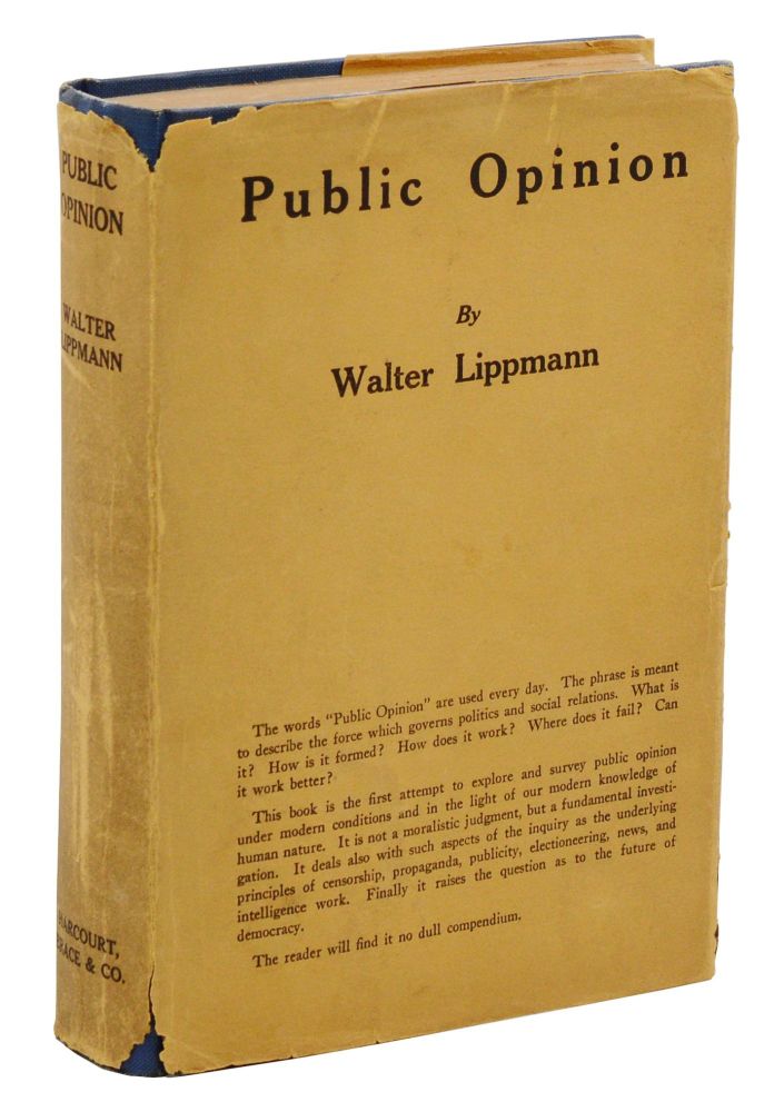
Thread - I've been thinking a lot about Walter Lippmann’s Public Opinion lately, especially in the context of Musk’s role in dismantling the federal workforce through DOGE. It’s a perfect example of what Lippmann warned about over a century ago.
February 23, 2025 at 3:24 PM
Thread - I've been thinking a lot about Walter Lippmann’s Public Opinion lately, especially in the context of Musk’s role in dismantling the federal workforce through DOGE. It’s a perfect example of what Lippmann warned about over a century ago.
Reposted by Diego Quintero Balbas

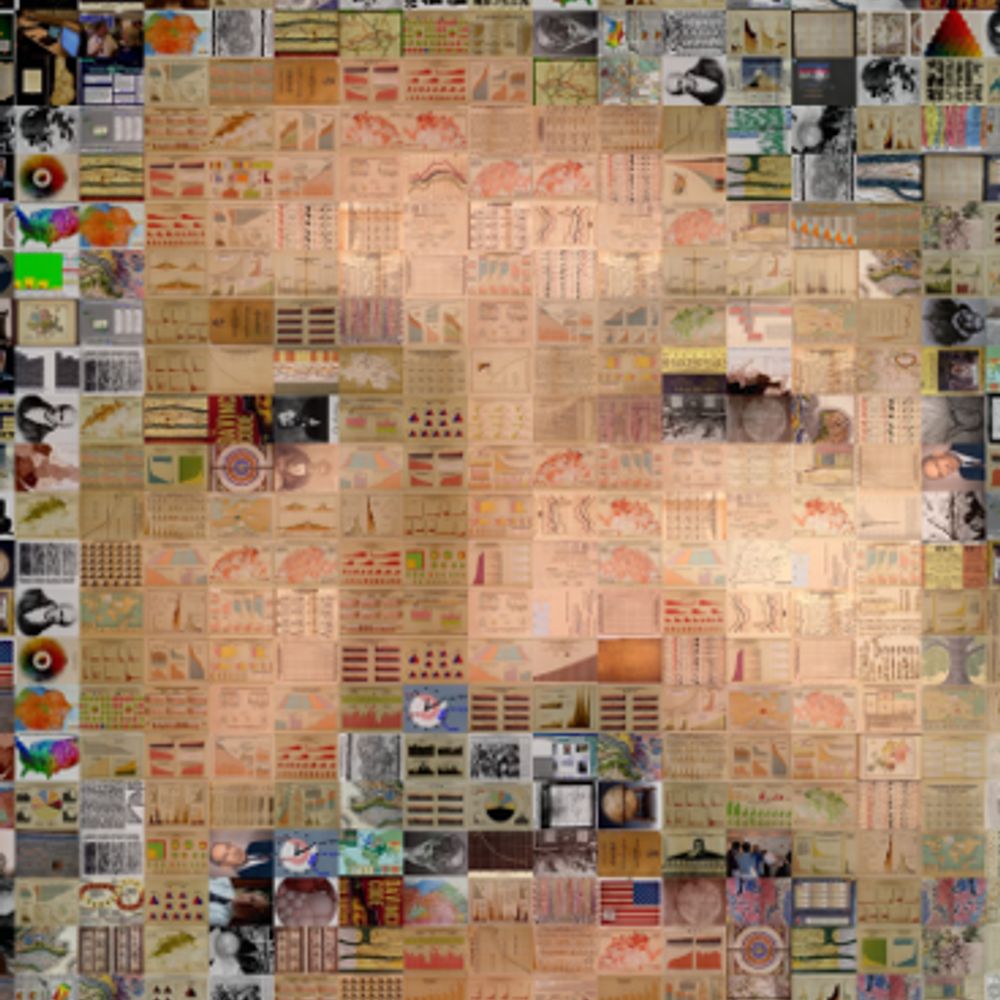
A data descriptor in Scientific Data presents Style Aligned Artwork Datasets (SALAD), and an example of fruit-SALAD with 10,000 images of fruit depictions, which provides a benchmark dataset for computer vision. https://go.nature.com/4ba23L0 🧪

February 21, 2025 at 2:36 PM
A data descriptor in Scientific Data presents Style Aligned Artwork Datasets (SALAD), and an example of fruit-SALAD with 10,000 images of fruit depictions, which provides a benchmark dataset for computer vision. https://go.nature.com/4ba23L0 🧪
Reposted by Diego Quintero Balbas

"You want to stop, but the amount of time and energy you’ve put into this makes it hard to quit."

Elden Ring or Tenure-Track Professor?
1. You’ve invested an enormous amount of time and energy, and you still have no idea what is happening. 2. Everybody you meet speaks in half riddle...
buff.ly
February 15, 2025 at 9:09 PM
"You want to stop, but the amount of time and energy you’ve put into this makes it hard to quit."
Reposted by Diego Quintero Balbas


Reposted by Diego Quintero Balbas
#TodayinHistory #dataviz #OTD 📊
🎂Feb 17, 1723 Johanes Tobias Mayer born in Marbach, Germany 🇩🇪
In 1758, Mayer developed a system of constructing and naming many of the possible colors, extending the idea of a theory of colors. His diagrams reflected the idea of color blending of three primaries
🎂Feb 17, 1723 Johanes Tobias Mayer born in Marbach, Germany 🇩🇪
In 1758, Mayer developed a system of constructing and naming many of the possible colors, extending the idea of a theory of colors. His diagrams reflected the idea of color blending of three primaries


February 18, 2025 at 2:47 AM
#TodayinHistory #dataviz #OTD 📊
🎂Feb 17, 1723 Johanes Tobias Mayer born in Marbach, Germany 🇩🇪
In 1758, Mayer developed a system of constructing and naming many of the possible colors, extending the idea of a theory of colors. His diagrams reflected the idea of color blending of three primaries
🎂Feb 17, 1723 Johanes Tobias Mayer born in Marbach, Germany 🇩🇪
In 1758, Mayer developed a system of constructing and naming many of the possible colors, extending the idea of a theory of colors. His diagrams reflected the idea of color blending of three primaries
Reposted by Diego Quintero Balbas

I'm agonizing over an essay I'm writing about storyFINDING vs. StoryTELLING vs StorySPINNING. I'm in the "it's easier to research than to write" phase. I came across this terrific post (and viewpoint) from @visualisingdata.com. See visualisingdata.com/2015/02/visu...
Is it the visualisation or the data we like? - Data Viz Excellence, Everywhere
I'm musing about this visualisation work that has received a lot of love and attention on blogs and social media over the past few days. Created by the excellent people in the Wall Street Journal grap...
visualisingdata.com
January 27, 2025 at 6:14 PM
I'm agonizing over an essay I'm writing about storyFINDING vs. StoryTELLING vs StorySPINNING. I'm in the "it's easier to research than to write" phase. I came across this terrific post (and viewpoint) from @visualisingdata.com. See visualisingdata.com/2015/02/visu...
Reposted by Diego Quintero Balbas

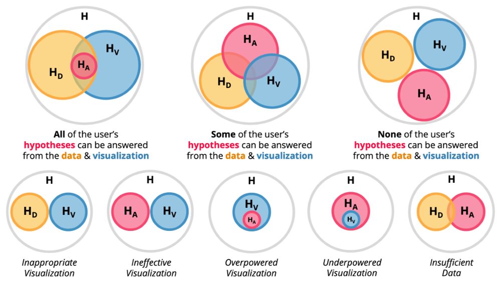
Very interesting paper: "A Grammar of Hypotheses for Visualization, Data, and Analysis", by Remco Chang's group
arxiv.org/abs/2204.14267 This will definitely go into my #dataviz course, and can anchor several of the discussions we have with collaborators.
arxiv.org/abs/2204.14267 This will definitely go into my #dataviz course, and can anchor several of the discussions we have with collaborators.
January 15, 2025 at 8:26 PM
Very interesting paper: "A Grammar of Hypotheses for Visualization, Data, and Analysis", by Remco Chang's group
arxiv.org/abs/2204.14267 This will definitely go into my #dataviz course, and can anchor several of the discussions we have with collaborators.
arxiv.org/abs/2204.14267 This will definitely go into my #dataviz course, and can anchor several of the discussions we have with collaborators.
Reposted by Diego Quintero Balbas

I'm starting off a series of posts aimed at helping Tableau beginners understand some of Tableau's weirder behaviors.
Number 1 in the series is the problem of a single-dot scatterplot! What common stumbling block do you think I should cover next?
#tableau #dataviz
annpregler.com/2025/01/13/w...
Number 1 in the series is the problem of a single-dot scatterplot! What common stumbling block do you think I should cover next?
#tableau #dataviz
annpregler.com/2025/01/13/w...

Why Is My Scatterplot a single point? (Tableau Troubleshooting) — Ann Pregler
The “Show Me” pane in Tableau makes it look like building a scatterplot should be so easy – just drag in 2-4 measures, click the chart type, and you should be good to go! But often when you follow the...
annpregler.com
January 14, 2025 at 6:04 AM
I'm starting off a series of posts aimed at helping Tableau beginners understand some of Tableau's weirder behaviors.
Number 1 in the series is the problem of a single-dot scatterplot! What common stumbling block do you think I should cover next?
#tableau #dataviz
annpregler.com/2025/01/13/w...
Number 1 in the series is the problem of a single-dot scatterplot! What common stumbling block do you think I should cover next?
#tableau #dataviz
annpregler.com/2025/01/13/w...