Louise Murphy
@louisemurphy.bsky.social
5.4K followers 780 following 360 posts
Senior Economist at the Resolution Foundation, focusing on employment, young people and health | views my own
Posts Media Videos Starter Packs
louisemurphy.bsky.social
Of course, researchers try to make sense of this by collating lots of different DWP data releases...

But we shouldn't expect journalists to do this every month. Until DWP publish their data more clearly, we shouldn't be surprised if misleading and unforgiving headlines keep coming.
Chart showing: Number of families claiming a health-related benefit: Great Britain
louisemurphy.bsky.social
What makes this more frustrating is that DWP knows this is an issue and has the data it needs to publish clearer stats. It published a whole article on the various factors contributing to the rise in health-related benefit claims back in January: www.gov.uk/government/s...
Decomposition of growth in the number of claimants of Universal Credit with Limited Capability for Work and Work-Related Activity, or in the Employment and Support Allowance Support Group
www.gov.uk
louisemurphy.bsky.social
...Again, this isn't inevitable. DWP could publish, as standard, time-series charts of people claiming UC or equivalent legacy benefits. UC has been rolling out for over a decade now - it's not like this has come as a surprise!
louisemurphy.bsky.social
Case study 2: UC stats get written up as 'rise in claimants not required to work' - and anyone glancing at this chart would think there's been an extraordinary change in benefit claims. You have to read footnotes/surrounding text to know that there's been a corresponding fall in ESA claims...
Screenshot of chart: Rise in claimants not required to work
louisemurphy.bsky.social
...Yet it's impossible to know how much of this relates to people moving from one part of the benefits system to another or a genuine rise in people making new claims for sickness benefits. Surely it's in DWP's interest to prioritise publishing WCA data for new claimants vs those migrating from ESA?
louisemurphy.bsky.social
Case study 1: DWP count people who go through a Work Capability Assessment when they move from ESA to UC as a 'new' claimant. So when you draw a time-series chart of Work Capability Assessments - even if you limit it to 'initial' assessments - you see a big spike in recent months...
Screenshot of headline saying: Long-term sickness claims rising by 5,000 a day Screenshot of chart: Monthly Universal Credit WCA decisions, Great Britain, April 2019 to May 2025
louisemurphy.bsky.social
It's increasingly perplexing that DWP aren't prioritising improving their stats to better reflect the move from legacy benefits to UC.

Until then, we'll keep getting misleading headlines like 'Long-term sickness claims rising by 5,000 a day' - you can't blame journalists when the stats are so bad!
Reposted by Louise Murphy
eduinlatimer.bsky.social
New work out on children receiving support for disabilities in school and/or benefit system.

50% of children with most severe needs aged 15 were not in work, education or training (NEET) aged 22.

Improving outcomes for this group is vital if gov wants to cut NEET rate
theifs.bsky.social
Children who receive support are more likely to be out-of-work or education, receiving out-of-work benefits, or receiving health-related benefits at age 22.

There is very little evidence on how systems of support could improve these long-term outcomes.
Chart shows outcomes at age 22 for children aged 15 in 2021, by type of support received. Title states: "Children receiving SEND or disability support are more likely to receive support in adulthood and be out of work or not in education."
louisemurphy.bsky.social
Good news that the Govt will offer more support to young people who are out of work.

But while there are almost a million NEET young people, the support announced today (focusing just on 18-21-year-olds who are long-term unemployed and claiming UC) will reach less than 5% of this group...
Chart showing - Number of young people who are NEET, by age and benefit receipt: UK, 2025
Reposted by Louise Murphy
jamessmithrf.bsky.social
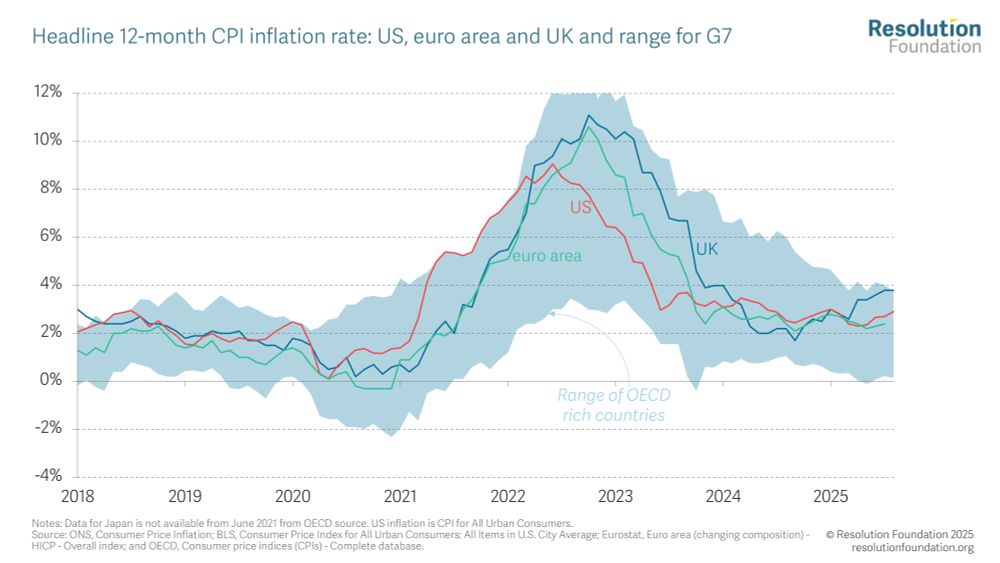
Inflation holding steady at 3.8% leaves the UK with the highest headline CPI inflation in the G7 and the joint highest (with Iceland, also 3.8% in Aug) among OECD rich countries. A chunk of this is policy related (NI rise, higher administered prices, eg water bills, and food packaging regulation).
Reposted by Louise Murphy
nyecominetti.bsky.social
Today’s ONS data show a labour market continuing to cool, but there are signs of calming after a jobs crunch in the first part of 2025. Here is our thread (fom me and @charliemccurdy.bsky.social)

Standout stat if you can't make it to the end: real wages haven't grown since October
Reposted by Louise Murphy
jamessmithrf.bsky.social
New piece out today on recent market moves.
Key takeaway is that we shdnt be surprised UK borrowing costs are high given inflation struggles & reliance on foreign investors. Much of this is not about govt fiscal policy BUT risks mean a decisive response is needed from the Chancellor, BoE and DMO.
The Macroeconomic Policy Outlook: Q3 2025 • Resolution Foundation
UK Government borrowing costs have once again been in the headlines. Recent moves have, however, been overblown: since benchmark 10-year yields peaked at post-financial-crisis highs of 4.9 per cent in...
www.resolutionfoundation.org
Reposted by Louise Murphy
lukesibieta.bsky.social
Today, we publish a new piece on SEND reform. The problems and risks are well known, so I just wanted to reflect on the solutions... [1/6]

ifs.org.uk/articles/eng...
louisemurphy.bsky.social
The uptick in health-related benefit claims is clearly not just a Covid-19 story, with the caseload continuing to riss. The Government has responded by cutting benefit rates for new UC health claimants from 2026 – but it remains to be seen how much this will impact future claims for UC-health...
louisemurphy.bsky.social
… More than three-quarters of new UC claimants who go through a Work Capability Assessment end up in the LCWRA group (shown in red), up hugely since the introduction of UC, and up by around 9 percentage points over the past year.
Chart showing: Proportion of initial Work Capability Assessments that result in incapacity-related payments: Great Britain
louisemurphy.bsky.social
Second, an increasing share of health-related benefit claimants who go through a Work Capability Assessment are ending up in the ‘LCWRA’ group, where they have no work requirements and receive an additional payment of £423/month….
Chart showing: Proportion of initial Work Capability Assessments that result in incapacity-related payments: Great Britain
louisemurphy.bsky.social
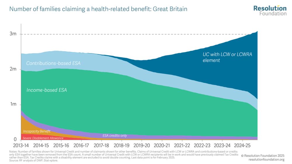
First, the total number of households in receipt of a health-related benefit is rising. Although part of the uptick in the UC-health caseload reflects migration from ESA, the overall number of families on any type of health-related benefit is now over 3m (compared to 2.3m pre-pandemic).
Chart showing: Number of families claiming a health-related benefit: Great Britain
louisemurphy.bsky.social
We hear a lot about the rising cost of health-related benefits. Two charts from today’s data summarises why this is the case…
louisemurphy.bsky.social
...And although the overall *number* of women with UC health claims is greater than the number of men with UC health claims, a higher *proportion* of male UC claimants receive a health element. This reflects gender differences in other types of UC claims (e.g. due to caring responsibilities).
Chart showing: Proportion of UC claimants who are on UC Health, by age band and gender: Great Britain, June 2025
louisemurphy.bsky.social
Turning to look at patterns by age, and it’s unsurprising that UC claims with a health component are most common among older people: more than three-fifths (62%) of UC claimants aged 60-64 have a health element...
Chart showing: Proportion of UC claimants who are on UC Health, by age band and gender: Great Britain, June 2025
louisemurphy.bsky.social
…Both the regional and the local authority trends reflect the different patterns of ill health and ageing across Britain – but also the high prevalence of non-health-related UC claims in and around London, where housing costs are high.
louisemurphy.bsky.social
When we zoom in to look at local authority data, we see even greater variation.

Over half of claimants in Inverclyde have a UC health award, compared to only a quarter in Newham. It’s noticeable that the top 10 LAs are in Scotland and Wales, and the bottom 10 are in and around London…
Chart showing: Proportion of UC claimants who are on UC Health, for top ten and bottom ten local authorities and Great Britain average: Great Britain, June 2025
louisemurphy.bsky.social
Of course, the proportion of UC claimants who are in receipt of UC health reflects not just trends in ill health, but also the prevalence of other types of UC claims (e.g. because housing costs are high, or because people have caring responsibilities).
louisemurphy.bsky.social
Across GB as a whole, 37% of UC claimants are in receipt of UC health – but this varies hugely between different parts of the UK.

Almost half (46%) of claimants in Scotland have a UC health award, compared to less than a third (29%) in London.
Chart showing: Proportion of UC claimants who are on UC Health, by region/nation: Great Britain, June 2025