Transit Maps
@transitmap.net
4.3K followers
91 following
290 posts
A celebration of transit maps and diagrams from around the world. Visit the blog at transitmap.net. 🔁 Reposts appreciated!
Transit map prints sold at: transitmap.net/store
Transit mappers starter pack: https://go.bsky.app/32jXV41
Posts
Media
Videos
Starter Packs


Reposted by Transit Maps


Reposted by Transit Maps


Reposted by Transit Maps


Transit Maps
@transitmap.net
· 18d
Reposted by Transit Maps


Transit Maps
@transitmap.net
· 19d
Transit Maps
@transitmap.net
· 19d
Reposted by Transit Maps

Transit Maps
@transitmap.net
· 19d
Transit Maps
@transitmap.net
· 19d
Transit Maps
@transitmap.net
· 19d


Transit Maps
@transitmap.net
· 19d
Transit Maps
@transitmap.net
· 19d
Reposted by Transit Maps
Transit Maps
@transitmap.net
· 20d

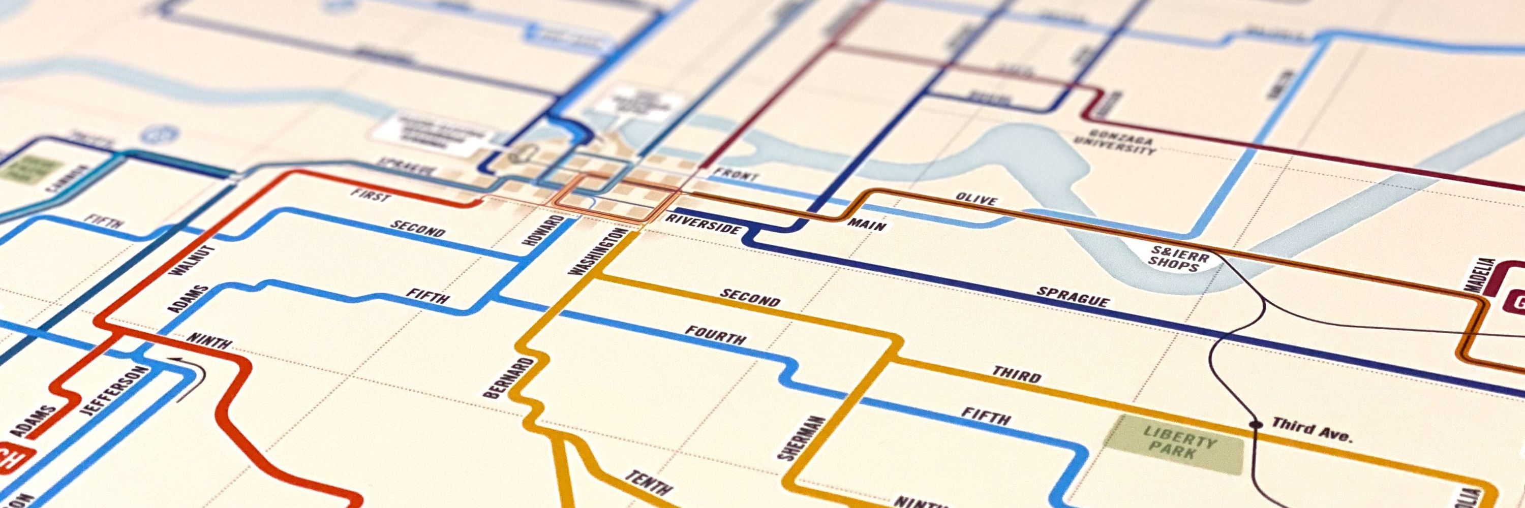
Official Map: DART System Map, Texas, 2025
DART's long-awaited Silver Line is opening at the end of October, and the agency already has a map out well in advance, so let's take a look, shall we? Look, this diagram is perfectly functional and does its job, but there are some absolutely baffling design decisions that have been made. First and foremost is the decision to put a big "Effective September 15, 2025" label on the diagram, and then hiding the fact that the Silver Line doesn't…
transitmap.net
Transit Maps
@transitmap.net
· 20d
Transit Maps
@transitmap.net
· 20d