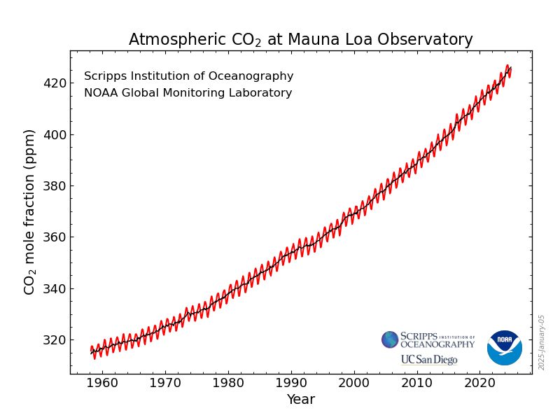
Yuri Engelhardt 🌳🌿 🟥
@yuriengelhardt.bsky.social
1.7K followers
250 following
28 posts
Information Visualization 📊📉✍🏼 at University of Twente
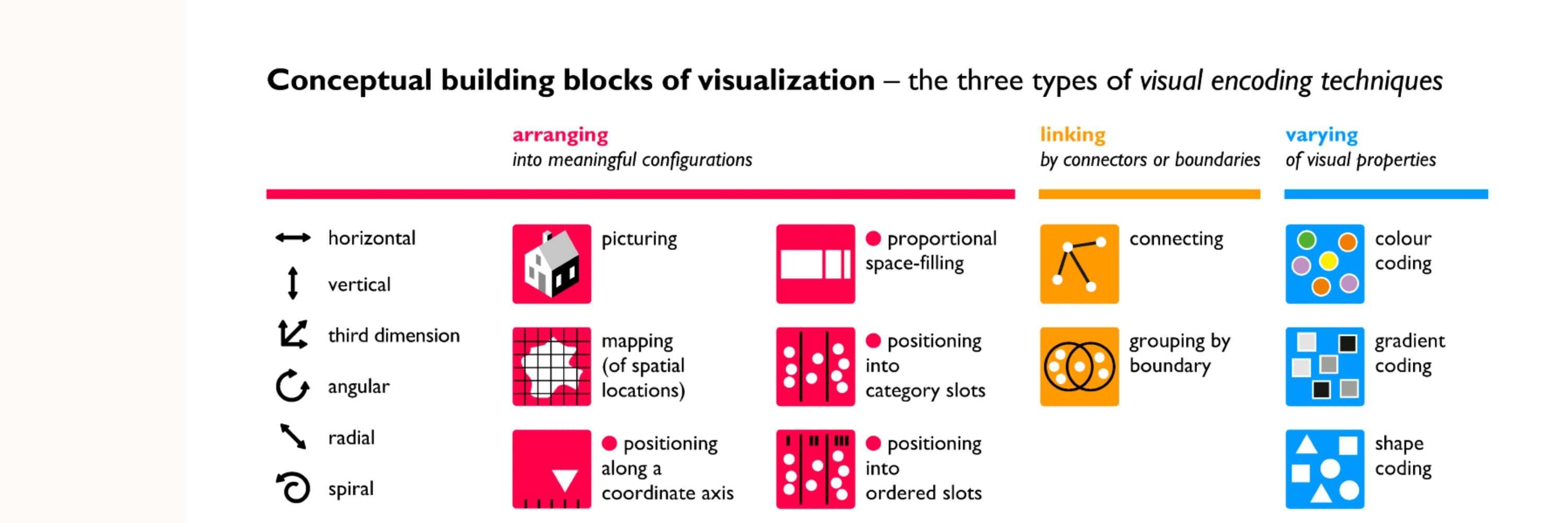
Core project: The Languages of Visualization, with Clive Richards
Also at UT Climate Centre @utclimate.bsky.social
LinkedIn: https://linkedin.com/in/yuriengelhardt
Mastodon: https://vis.social/@yuri
Posts
Media
Videos
Starter Packs


Reposted by Yuri Engelhardt 🌳🌿 🟥


Reposted by Yuri Engelhardt 🌳🌿 🟥


Reposted by Yuri Engelhardt 🌳🌿 🟥


Reposted by Yuri Engelhardt 🌳🌿 🟥


Reposted by Yuri Engelhardt 🌳🌿 🟥

Reposted by Yuri Engelhardt 🌳🌿 🟥

Reposted by Yuri Engelhardt 🌳🌿 🟥

Reposted by Yuri Engelhardt 🌳🌿 🟥
Reposted by Yuri Engelhardt 🌳🌿 🟥

Reposted by Yuri Engelhardt 🌳🌿 🟥

Reposted by Yuri Engelhardt 🌳🌿 🟥


Reposted by Yuri Engelhardt 🌳🌿 🟥