Reposted by: John Kennedy
Declining sea ice is part of the answer but increasingly heavy and frequent atmospheric rivers are most important factor.
Lots of important subtleties:
arxiv.org/abs/2510.03590

by John Kennedy — Reposted by: John Kennedy
In which I attempt maths and experience regret. But at least my mean ends up in about the right place.
diagrammonkey.wordpress.com/2025/10/06/o...

Reposted by: John Kennedy, Dorothy Bishop, Ben Bond‐Lamberty
@agu.org invites you to nominate an impactful dataset!
📊Submissions will be considered for inclusion in an upcoming featured commentary published in AGU Advances.
Submit nominations by 20 October.
docs.google.com/forms/d/e/1F...
@agubiogeosciences.bsky.social

by John Kennedy
bsky.app/profile/mice...
by John Kennedy

by John Kennedy

by John Kennedy — Reposted by: John Kennedy
by John Kennedy — Reposted by: John Kennedy
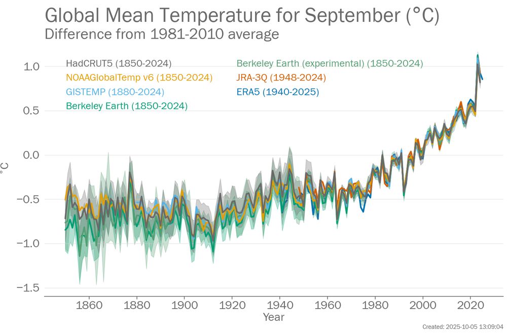
Extending the SST data further back in time and the wonderful horrors of ICOADS.
diagrammonkey.wordpress.com/2025/10/01/o...

by John Kennedy — Reposted by: John Kennedy, Peter Thorne
Using a simple interpolation scheme to estimate biases in the ship data and create a bias adjusted dataset.
diagrammonkey.wordpress.com/2025/09/30/o...

by John Kennedy
by John Kennedy — Reposted by: John Kennedy
Implementing a pattern-based reconstruction technique that works by – I swear – pure magic.
diagrammonkey.wordpress.com/2025/09/28/o...

by John Kennedy — Reposted by: Peter Jacobs
Interpolating anomalies in the simple gridder to produce globally complete fields.
diagrammonkey.wordpress.com/2025/09/27/o...

by John Kennedy — Reposted by: John Kennedy
In which I estimate sampling uncertainties for my simple gridder.
diagrammonkey.wordpress.com/2025/09/26/o...

by John Kennedy
by John Kennedy
by John Kennedy — Reposted by: John Kennedy
Estimating ship-buoy biases with a simple gridder.
diagrammonkey.wordpress.com/2025/09/24/o...

by John Kennedy
by John Kennedy
At the risk of saying something I will come to regret, the world needs more blogging scientists.
by John Kennedy
by John Kennedy
by John Kennedy
Reposted by: John Kennedy, Peter Thorne, Ed Hawkins

by John Kennedy
Neural nets have been used for interpolation of global temperature datasets.
by John Kennedy
brohan.org/AI_daily_pre...
Reposted by: John Kennedy
Reposted by: John Kennedy, Peter Thorne, John K. Pinnegar , and 3 more John Kennedy, Peter Thorne, John K. Pinnegar, Du Toit, Ed Hawkins, Flavio Lehner
by John Kennedy
"As of 31 May 2025, iQuam data is not being monitored by SST team members."
by John Kennedy — Reposted by: John Kennedy
In which I go through the steps of writing a simple gridder for in situ sea surface temperature data.
diagrammonkey.wordpress.com/2025/09/21/o...


